Exercise 4.1: Look, no hands.
The first task for this exercise was to list as many different mark-making materials and processes as possible, then to make some drawings using pairs from the lists.
I began by making a list of materials:
Charcoal (willow, compressed, pencils, powder)
Graphite (sticks, pencils, powder)
Coloured pencils
Water-soluble coloured pencils
Oil pastels
Chalk pastels
Wax crayons
Ink (drawing, printing)
Fineliner pens
Felt tip pens
Florescent pens
Biro
Watercolour paint
Acrylic paint
Oil paint
Gouache paint
House paint (emulsion, gloss)
Carbon paper
Gesso (white, clear)
Rubber
Then, a list of mark-making processes:
Dragging
Pushing
Hatching
Shading
Stippling
Rolling
Sweeping
Smudging
Scraping
Flaking
Erasing
Dabbing
Scoring
Shaving
Dripping
Splattering
Sticking
Cutting
Rubbing
Pressing
Blowing
Crushing
Printing
These lists seemed very incomplete because ways of making marks, and materials with which and on which to make them are endless. When it came to choosing pairs from these lists, I began with graphite:
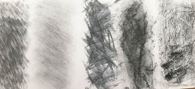
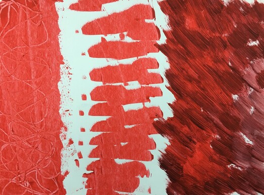
21 X 9 in. Graphite powder on Cartridge paper.
L to R: dabbed with a rubber using diagonal movements.
Brushed with a stiff house painting brush
Drawn into with the edge of a white chalk pastel stick
Rolled with a printing roller, with string underneath
Sprinkled onto wet paper, and drawn into with a palette knife.
I felt all these drawing processes produced interesting results, apart from the last one, where I discovered that graphite doesn't work well with water.
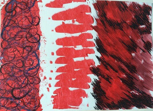
Then I tried drawing ink on sugar paper, which was covered with an acrylic wash:
L to R: dabbed with a rubber using diagonal movements.
Brushed with a stiff house painting brush
Drawn into with the edge of a white chalk pastel stick
Rolled with a printing roller, with string underneath
Sprinkled onto wet paper, and drawn into with a palette knife.
I felt all these drawing processes produced interesting results, apart from the last one, where I discovered that graphite doesn't work well with water.
Then I tried drawing ink on sugar paper, which was covered with an acrylic wash:
A2 Ink on sugar paper.
L to R: Blue ink dripped onto a wet surface, and paper tipped up to vertical position.
Purple ink dripped onto a dry surface and paper tipped to vertical position.
Red ink dabbed with a sponge onto a dry surface (top), and a wet surface (below). A compressed charcoal stick used lengthways to make marks over the ink when dry.
Purple ink splattered from a brush onto a dry surface ( top), and a wet surface (below).
The second part of this exercise involved looking at the drawings, and deciding whether to affect them with a further act or process. I felt some of these marks could be made more interesting:
L to R: Over the blue ink, using yellow and purple chalk pastels I borrowed one of my dog's chews, and took a rubbing of it. I thought the blue ink looked very flat, and liked the textured marks superimposed on it.
I liked the lines that the purple ink dripped onto a dry surface had made, so didn't feel the need to add to this.
As with the blue ink, I felt the red ink dabbed onto a dry surface produced a flat mark, so I used a marker pen to pick out some of the negative spaces.
The purple splattered ink on the wet surface had dried into a vague, blurred image, so instead of trying to add texture or definition to this, as I had with the previous examples, I accentuated its quality by smudging white and purple chalk pastels into it, using the heel of my hand.
I preferred all these drawings after these processes had been added, because I think they're visually more interesting.
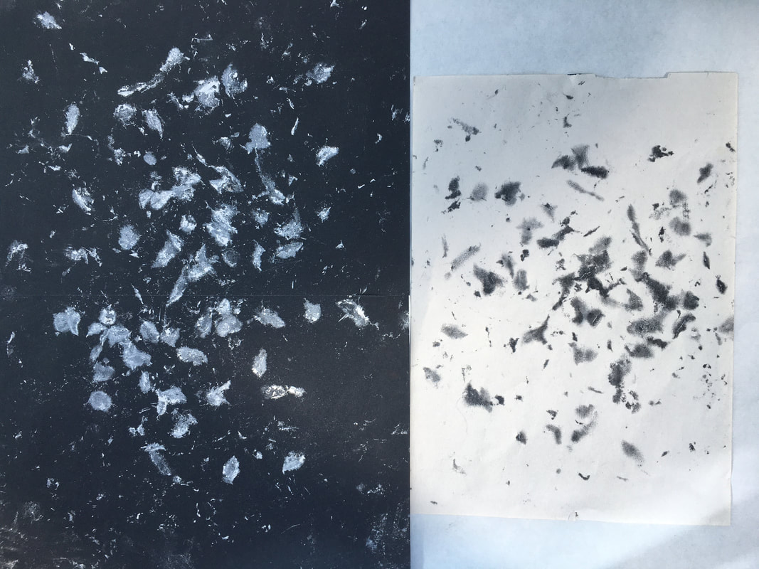
I experimented with carbon paper next:
A4.
I used various objects to draw into the carbon paper:
Top L: A fork and the end of a spoon handle.
Top R: The bottom of a glass jar, and a the end of a glue stick, using circular movements.
Bottom: A plastic ruler.
I liked these drawings and enjoyed discovering different types of line that could be made with this material, so I didn't feel the need to change them in any way.
My next experiment was with acrylic paint:
10 X 14in acrylic paper. Acrylic paint.
L to R: Spread and drawn into using a pointed palette knife.
Dragged across the paper using an old plastic credit card, moving my hand up and down to create the negative spaces.
Thicker paint dabbed and brushed with the end of a small sponge.
Some of these marks looked quite flat, so I tried drawing into them using blue oil pastel and a black acrylic marker pen:
L to R: Blue oil pastel and white spirit, black marker pen. I think this has resulted in a more interesting image because the tonal differences added by the other media have introduced layers and depth.
: I left the marks made by the credit card because I liked the positive and negative shapes it had created.
: Black marker-pen marks added in the darker areas, using short stroking movements. I prefer this to the original because, like the first example, it has added tone and depth.
Thinking back to part 3, I remembered how much I enjoyed using acrylic, ink and gesso to make drawings where I scraped away the layer of gesso with a palette knife to reveal the media underneath. I thought oil pastels would be a good media to experiment further with this:
A4.
Layers of oil pastel scraped into using thumbnail.
At this point I became aware that all the drawings I had made so far involved direct action from myself, and given that the exercise was named, 'Look, No Hands', I referred back to the course material and read that this exercise was really about making drawings 'simply by allowing the materials to be themselves', allowing materials to assert their nature, then designing a process to generate marks which suited the material.
With this in mind, I continued to explore and discovered that fluid media was easier to work with in this way:
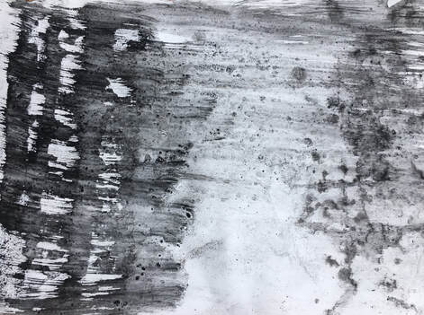
9 X 12in. Compressed charcoal and water.
I brushed the paper with water, then used a knife to shave the charcoal onto the wet paper. Then I lifted the paper which caused the charcoal to run and make marks, which I then brushed across with a thick brush using sweeping movements. This produced a variety of marks and tones.
I still wanted to find a process which allowed the materials to 'be themselves', with minimum intervention from myself. I brought a big piece of South Downs chalk back from a walk:
A3 A4. Southdowns chalk.
This drawing was made by dropping the chalk from a height of about a metre onto the black paper, underneath which was carbon paper and newsprint, so that it formed a reverse image. When the chalk began to break up, I tried throwing it at the paper to make more marks. I feel this technique has potential to produce some really interesting drawings, but would require several big pieces of chalk, because it's very soft and breaks easily. I didn't feel the need to change these drawings with any further processes because I really liked their simplicity. This drawing is discussed further in Study point 10, in 'Research & Reflection.'
I wanted to experiment with using oil and water based media together, so the next three drawings are prints taken from the sink, where I was clearing up oil paint which was combined with white spirit:
3 X A4 newsprint. Oil paint, white spirit, water.
It was interesting to notice how the detail and energy in these decreased as the oil paint became more diluted by the white spirit and the water. I didn't feel the need to change these drawings with a further process because I enjoyed what the media expressed on its own; tonal change, energy, shape, variety of marks and fluidity.
Staying with fluid media, I collaged some strips of newsprint onto a long piece of cartridge paper, and used ready-mix water based paint for the next experiment:
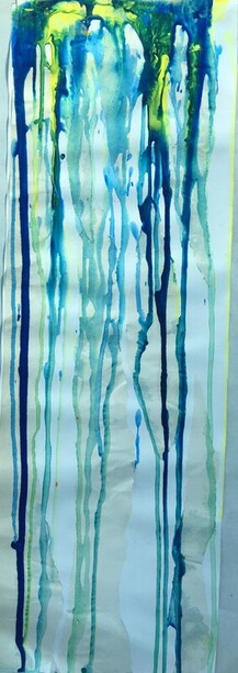
8 X 23in.
I stuck the paper to a drawing board and propped it against a wall so the paint would drip down. When this was dry, I felt I wanted to add more colour to it, so I used florescent marker pens:
I stuck the paper to a drawing board and propped it against a wall so the paint would drip down. When this was dry, I felt I wanted to add more colour to it, so I used florescent marker pens:
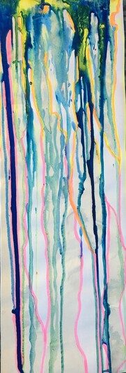
I had the paintings of Frank Bowling in mind when I did this drawing. I prefer the second version, with the added pink, yellow and orange, and enjoyed discovering the lines the paint had made. I hoped the collaged pieces of newsprint might affect it more, but can see how further collage might make this a more interesting image.
Using the edge of the drawing board, I took a print of the paint that had pooled at the bottom:
Using the edge of the drawing board, I took a print of the paint that had pooled at the bottom:
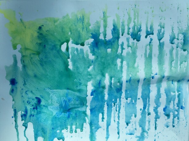
A3 cartridge paper, ready mix paint.
When I looked at this, I felt it had potential to be changed by a further process. I looked through my collection of collage materials and found this photocopy of one of the insects I had used in part two:
When I looked at this, I felt it had potential to be changed by a further process. I looked through my collection of collage materials and found this photocopy of one of the insects I had used in part two:
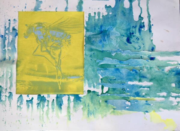
I cut out a rectangle from the print, mounted the picture of the insect in this space, then cut some of the negative shapes from the piece I had cut out, and collaged it horizontally on the right hand side. I liked the effect of combining the vertical marks of the print with the horizontal marks of the collaged piece. This has given it a layered feeling. Adding the collaged insect works well, because the print looks like water, or a swamp, but I wonder whether it may have worked better if I had cut out the silhouette of the insect instead of the rectangular shape, because this would have been a better fit for the organic feel of the image.
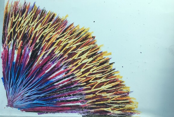
Chalk pastel and frottage were used for the next drawing:
Chalk pastel and frottage were used for the next drawing:
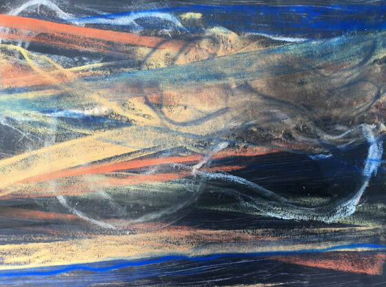
A3. Newsprint with a dark grey ink wash, chalk pastels.
This was made by dragging the pastels over pieces of thick elastic and shoelaces underneath the paper. It was enjoyable to make, and using this process with these materials produces a subtle, evocative image.
This was made by dragging the pastels over pieces of thick elastic and shoelaces underneath the paper. It was enjoyable to make, and using this process with these materials produces a subtle, evocative image.
Reflection:
This exercise was not only about media and processes, but also very much about the type of support as well. It has highlighted how some media and materials can produce interesting visual effects with very little intervention; fluid media such as paint, ink, white spirit, and certain media in conjunction with water, for example, are more dynamic and produce interesting results on their own. Dry media such as graphite, oil pastels, chalk pastels, coloured or water soluble pencils require more interventional processes.
Some of the work in this exercise has inspired ideas for further work, and I have found it interesting to notice which experiments I feel excited about. Those which depict layering such as scraping through oil pastels, frottage or collage for example, are all especially interesting, and I look forward to discovering how exercise 4.2 impacts on me, because it calls for different processes.
Exercise 4.2: Labour and Time:
When I read through the course material for this exercise, I was instantly taken back in time to childhood. From the age of six I lived in a rural, isolated area of North Norfolk. I spent quite a lot of time on my own, having to make my own amusement, and when I was approximately eight or nine years old, I invented what I called my 'Sand sifting and brick grinding factory.' This was an area of the garden where I had found an old, partially buried piece of smooth concrete. I collected as many different coloured bricks as I could find, and ground them down on the concrete to make lots of different coloured brick dusts, which I collected in different containers. I also collected a variety of sieves and meshes of different thicknesses, and sifted sand through these, to collect a range of different textured sand. These were time consuming, methodical and thoroughly absorbing activities, and it occurred to me that they were some of my earliest creative processes.
The first task of Ex 4.2 was to research drawing methods that take time, so I experimented with a variety of media and mark making techniques:
L to R:
1) Figures of 8 with a fine liner pen
2) Repetitive sweeping movements with 8B graphite pencil.
3)Short, repetitive, overlapping straight marks, black marker pen.
4) Blue water soluble pencils, and water.
5) Jabbing movements with compressed charcoal.
6) Began as white chalk pastel cross-hatched over smudged charcoal, but this didn't work as a drawing method that takes time - at least, not on a small piece of paper - because it was quite quick, so I changed to cross-hatching and shading with coloured pencils, inspired by the drawing of Eric Ravilious.
L to R:
1) 2H pencil - drawing inspired by a bath sponge.
2) Sticks of compressed charcoal, held on the side and tapped.
3) 4) & 5), all made with black drawing ink and a brush from a hair colouring kit.
6) Drawing ink and dip pen.
I looked at three different artists for inspiration with this exercise; Bernard Cohen, Eric Ravilious and Daniel Zeller. I was fairly familiar with the work of Ravilious, having researched him during my Drawing Foundations course, and taken a special interest in his work because he lived and worked in the South Downs, very close to where I live. Bernard Cohen's work was new to me, and I felt very drawn to it.
I felt I needed to clarify the term 'Process', and found this definition on https://www.tate.org.uk/art/art-terms/p/process-art
'The term process art refers to where the process of its making art is not hidden but remains a prominent aspect of the completed work, so that a part or even the whole of its subject is the making of the work.'
The emergence of process in making art can be traced back to Jackson Pollock and his abstract expressionist paintings. The actions of the artist and the effects of the media on the support, or of the elements or gravity on the media, are all important aspects of process.
Bernard Cohen (b.1933)
From the early 1960s Cohen's paintings were influenced by several different styles, but primarily by Abstract Expressionism. Later, his work became more colourful and intricately detailed, driven by a process of layered motifs and patterns. See fig 1:
Fig 1. Bernard Cohen. 1965. In That moment. Oil and tempera on canvas. 2438 X 2438mm
https://www.tate.org.uk/art/artworks/cohen-in-that-moment-t00800 (Accessed 20/02/21)
Cohen was an admirer of the French writer, Albert Camus, and his belief in 'stoical persistence combined with life's absurdity.' Camus wrote an essay entitled, 'The Myth of Sisyphus'(1942), which describes how Sisyphus was condemned by the gods to repeatedly roll a rock to the top of a mountain, whereupon it would roll back down to the bottom again. The title of this painting, 'In That Moment', is a phrase from 'The Myth of Sisyphus', and it refers to the unbroken line returning to the bottom of the canvas, where it started.
In this work Cohen established a process of mark making which he used to fill the entire canvas. He painted it in sections, changing the colour randomly, using oil paint to draw the single continuous line, then sprayed it with a mixture of oil and egg tempera, which resulted in the line having two different textures.
I am really drawn to the colour and the texture of this painting, and the sense of depth in it.
Another work by Cohen that is a similar display of persistent mark making covering the whole surface, is a painting called Floris. See Fig 2:
Fig 2. Bernard Cohen. 1964. Floris. Oil and tempera on canvas. 1830 X 1834mm.
https://www.tate.org.uk/ art/artworks/cohen-floris-t01162 (Accessed 20/02/21)
As with Fig 1, Cohen has named this painting after something he admired, which in this case was a Soho patisserie whose decorations he enjoyed. Another source of inspiration for this painting was the world of Arthurian legend, and the repeated close lines which may have been inspired by ancient terrain and landscape, are reminiscent of contour lines.
The artist that sprang to mind when I first read the requirements for this exercise, however, was Eric Ravilious. Ravilious is best known for his watercolour paintings, often enhanced by drawing, of the South Downs landscape. He used the techniques of shading and cross hatching to produce beautiful, atmospheric work. See fig 3:
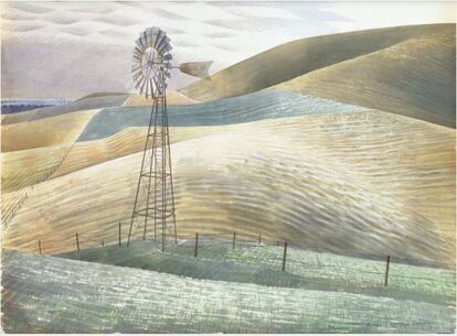
Fig 3. Eric Ravilious. 1935. Windmill. Watercolour and pencil. 61.5 X 71cm.
https://leoframes.com/shop/style/contemporary/windmill-by-eric-ravilious/
I was surprised to discover, however, that it wasn't the work of Ravilious that most inspired and excited me for this exercise, but the work of Bernard Cohen, which may be an indication of how my work has changed and developed over the past two or three years.
I experimented with four different ways of doing this exercise, and to begin with, I decided to make a drawing using a simple 'loop' motif, which covered the paper, and to combine this with a technique I had used for a drawing in exercise 4.1 - scraping away the surface to reveal earlier layers of colour:
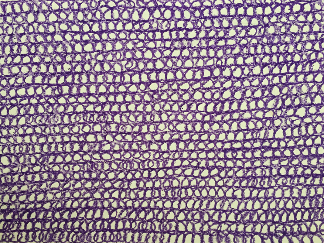
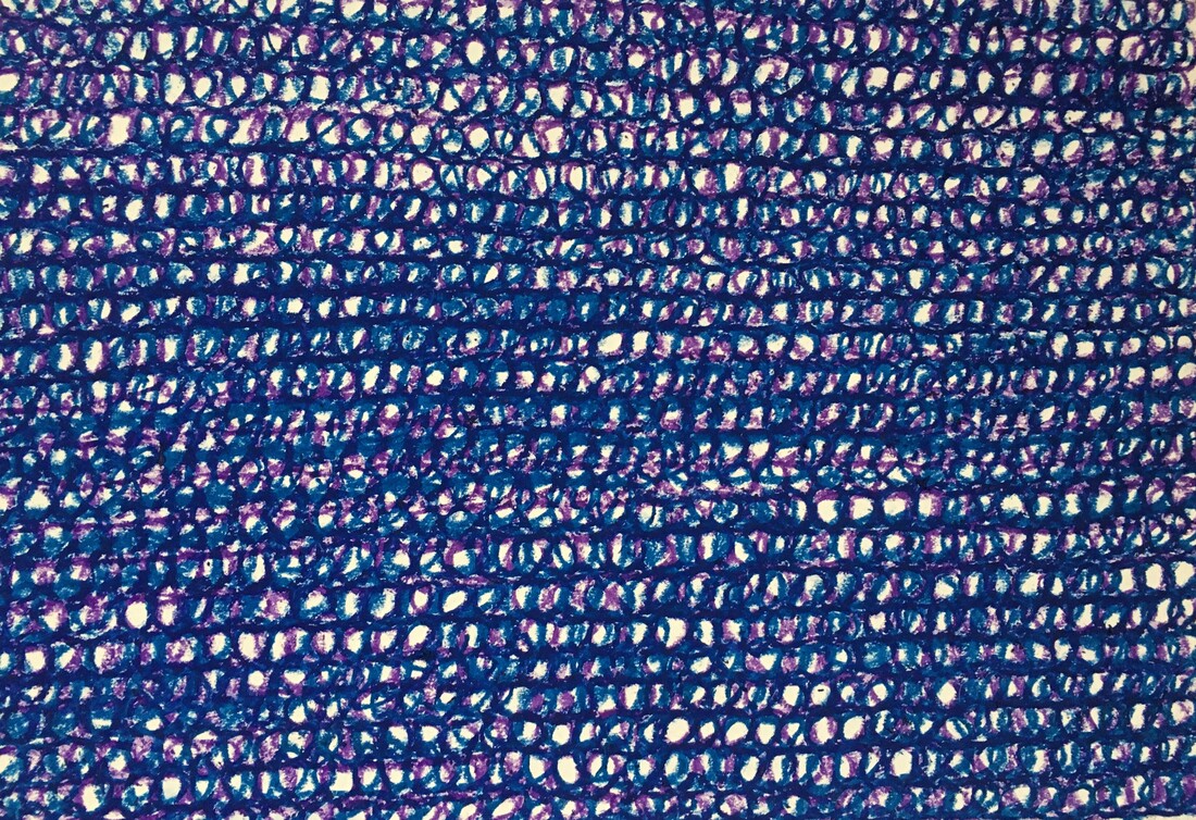
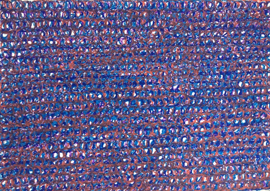
A3 cartridge paper. Oil pastel. Drawings 1 - 3. Using a repetitive loop, I superimposed one colour over the next.
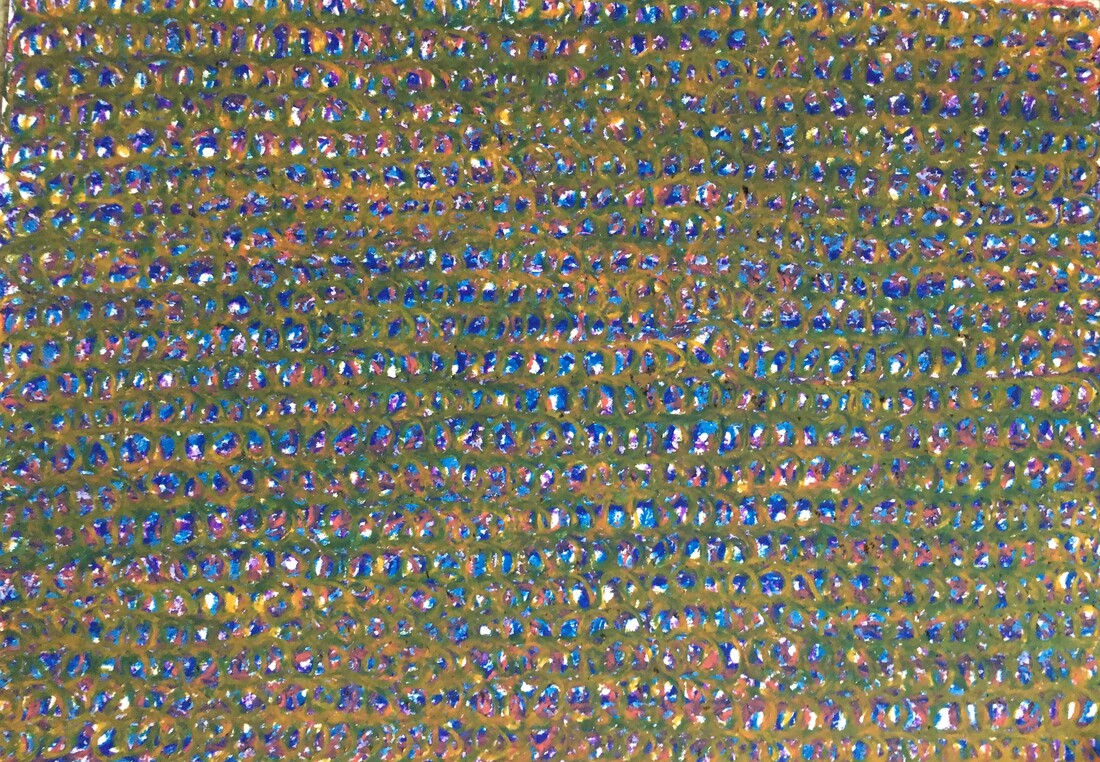
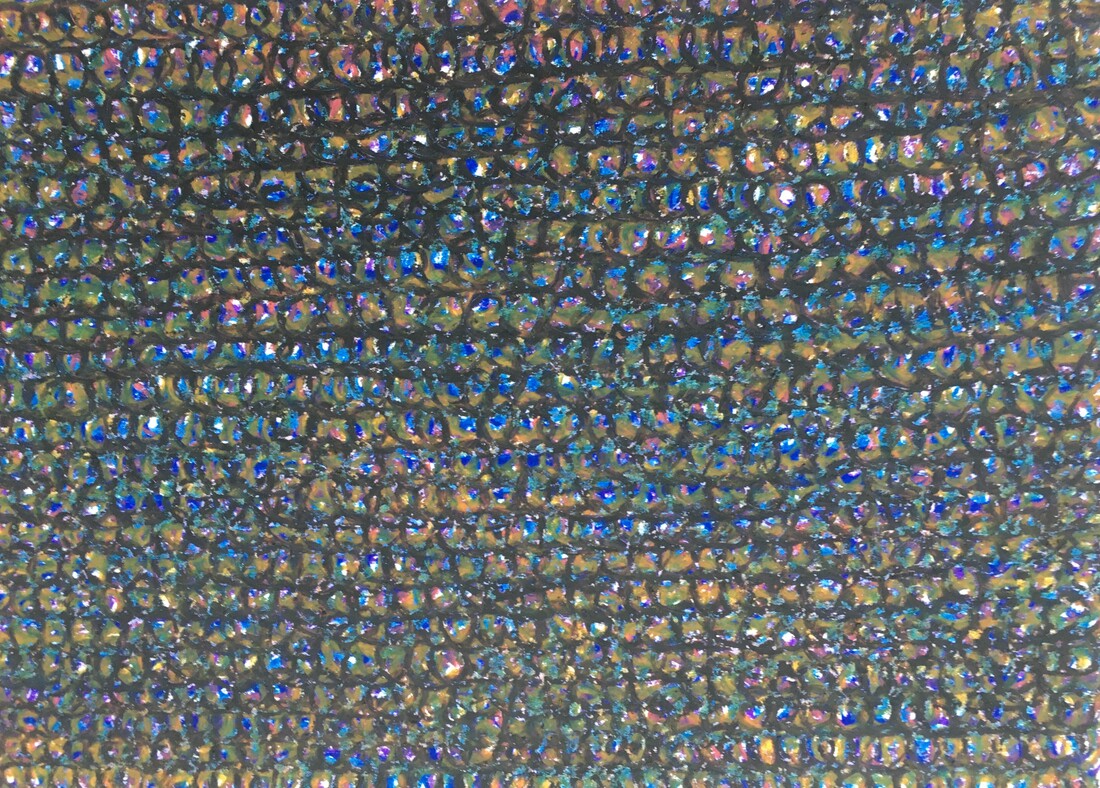
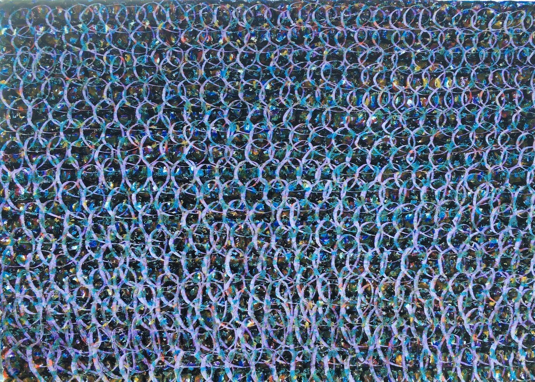
Drawings 4 - 6. In drawing 6 I used my thumbnail to draw into the layers of oil pastel.
Towards the end of this experiment I found the drawing quite hard work, and was aware of feeling impatient, always looking forward to the next colour, and ultimately to making the final marks to see what would be revealed underneath. Despite this, I was surprised at how effective these overlapping repetitive marks in oil pastel were, and I especially like the 5th because of its colour, and the final one, because of the luminosity of the marks created by scraping away the layers. The drawings remind me of an old stone wall, or chain mail.
For the next drawing I took inspiration from racks of wires in a telephone exchange:
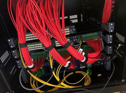
I liked the sweeping lines and dramatic colour and tones of this image, and decided to try a bigger drawing using coloured pencils:
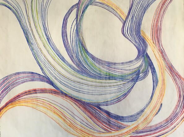
A1. Newsprint covered with gesso. Coloured pencils.
I began by following the line of one group of wires then improvised the rest from this starting point, so compositionally, I didn't plan it, but just took my cue from the marks I had already made. This drawing took between five and six hours, completed in one hour stretches. It was enjoyable to begin with, but as the drawing progressed I felt my choice of media might have worked better on a thicker paper, because the paper began to split in places where I tried to get a darker tone with the pencils. I especially enjoyed creating the movement in the lines, and trying to create the illusion of the lines continuing beyond the edges of the paper.
For the next drawing I felt I needed to accept the challenge of making very small marks to cover bigger paper. The work of Daniel Zeller was inspirational. See figs 1 and 2:
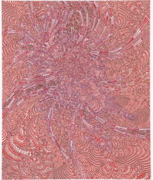
Fig 1. Daniel Zeller. 2008. Inconclusive Relay. Ink and acrylic on paper. 41.9 X 35.6cm
Fig 2. Daniel Zeller. 2015. SitA Ink on paper. 76.2 X 94cm
https://www.artsy.net/artist/daniel-zeller
Daniel Zeller (b.1965) lives and works in New York. Having started out as a sculptor, Zeller stated, .....'it's sort of inevitable that I'm pulling back and forth with space.' (Vitamin D. New Perspectives in Drawing. p332 - 335. Phaidon.) His microscopic marks create compositions that are reminiscent of landscapes, maps, aerial photography, anatomy, MRI scans or organic matter. I was particularly drawn to Zeller's work for its rich, interesting textures and sinuous movement, which reminded me of the moving three-dimentional aerial shapes created by murmurations of starlings.
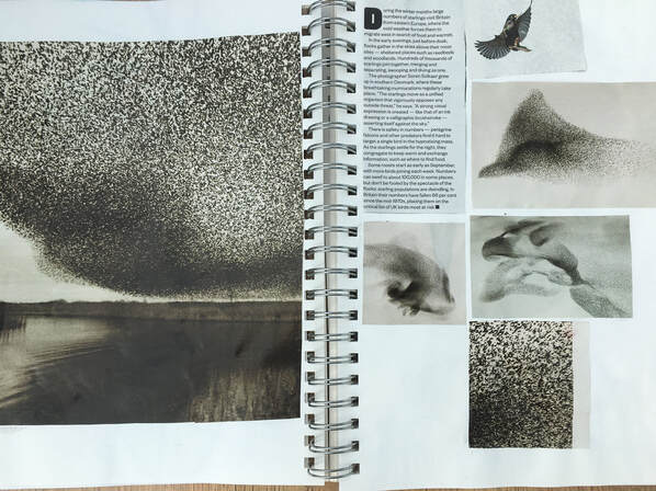
I had found these photos of starling murmurations, and stuck them into my sketchbook.
When I began this next drawing , I believe these images, together with the work of Daniel Zeller, unconsciously influenced the way it progressed.
When I began this next drawing , I believe these images, together with the work of Daniel Zeller, unconsciously influenced the way it progressed.
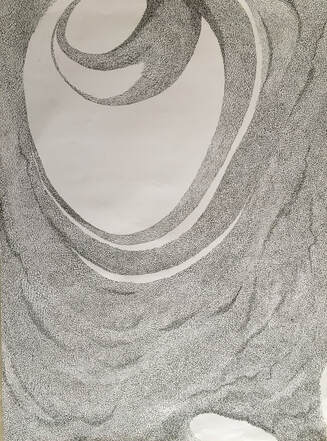
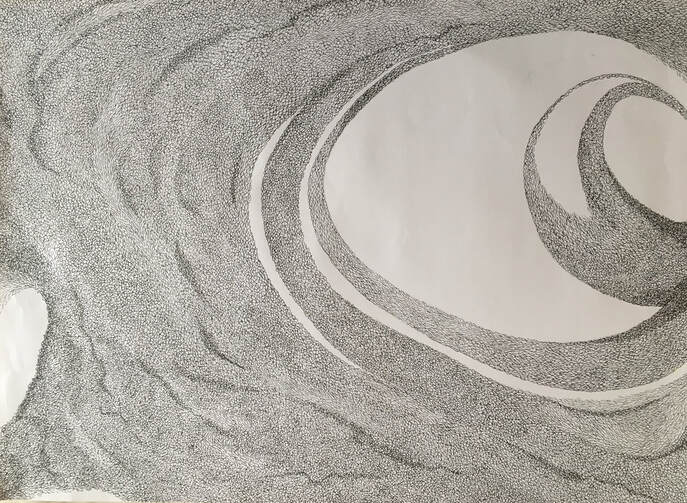
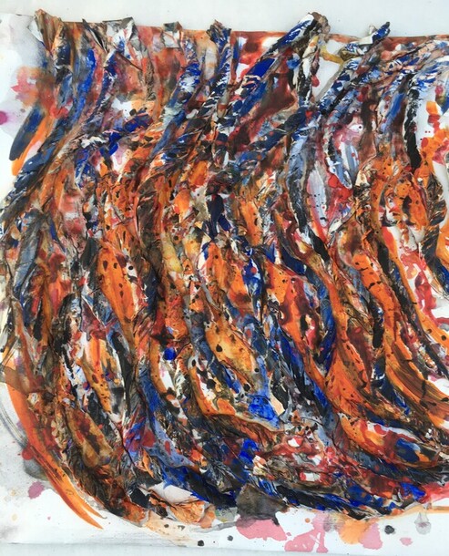
A2 cartridge paper. Fine liner pen.
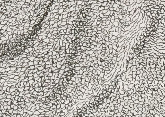
Detail from above A2 drawings.
This drawing took between twelve and thirteen hours in total, completed in stints of an hour or thirty minutes. I tried to create movement and tone by varying the shape, density and direction of the marks. As with the previous drawing, I didn't plan the composition before I began, but developed it intuitively as it progressed.
Zeller described his drawing as being like meditation, and very like the first drawing of repeated marks, this drawing felt quite meditative to begin with, but as it progressed I grew impatient and tired of it. I am aware that being in the situation of needing to complete a body of work to fulfil the requirements of this part of the course created some pressure, which mitigated against a meditative frame of mind. If I'd had unlimited time to spend on it, I may have felt differently about this drawing. This is an interesting thought, because I am aware that I feel different depending on the type of work I'm doing - I was noticeably more relaxed and content doing the work for Ex 4.1 than I have been doing the work for Ex 4.2. However, I am also aware of the importance of doing work that is sometimes counterintuitive, which can produce interesting results and insights. This all feels like part of the important journey towards developing a personal voice.
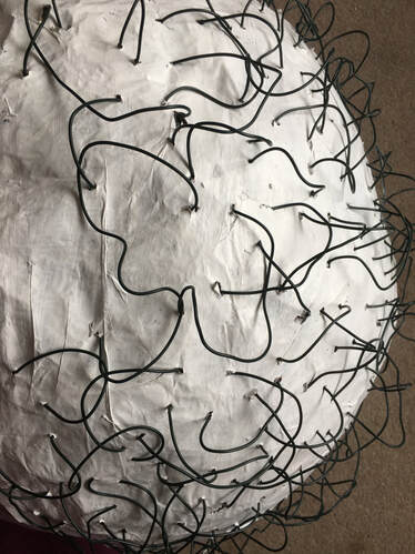
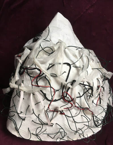
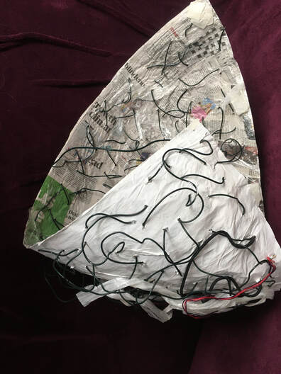
The fourth drawing I made for this exercise was another interesting experience. Following an experiment for assignment 4, which was inspired by tree fungus, I felt this would be a good subject to use to follow up on one of my tutor's comments from his feedback for part 3, and decided to attempt a 3D construction. I was undecided about whether this fitted into Ex 4.2, but the action of sewing with the wire was certainly time consuming and labour intensive.
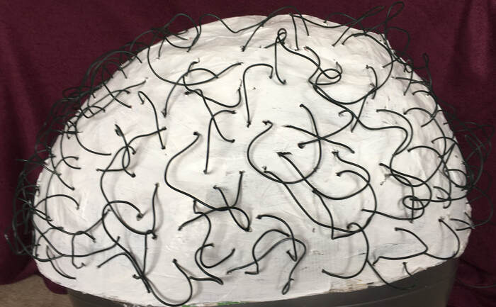
Papier mache, white emulsion, wire. 26 X 12in.
This was made by building a papier mache dome shape, using a 'gym ball', then using thin wire to sew over the surface.
This was made by building a papier mache dome shape, using a 'gym ball', then using thin wire to sew over the surface.
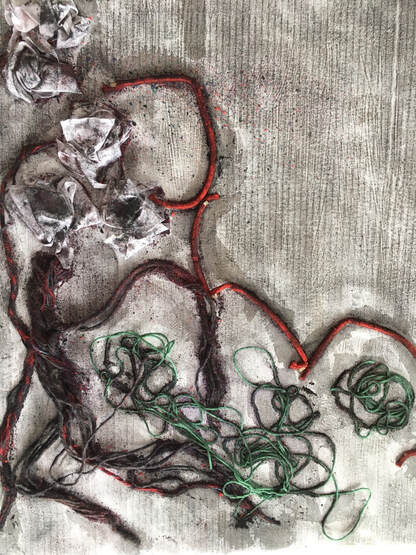
I wanted to add some interest to the lines made by the wire, so I used black shoelaces, silk threads and plastic tape to draw around and over the wire:
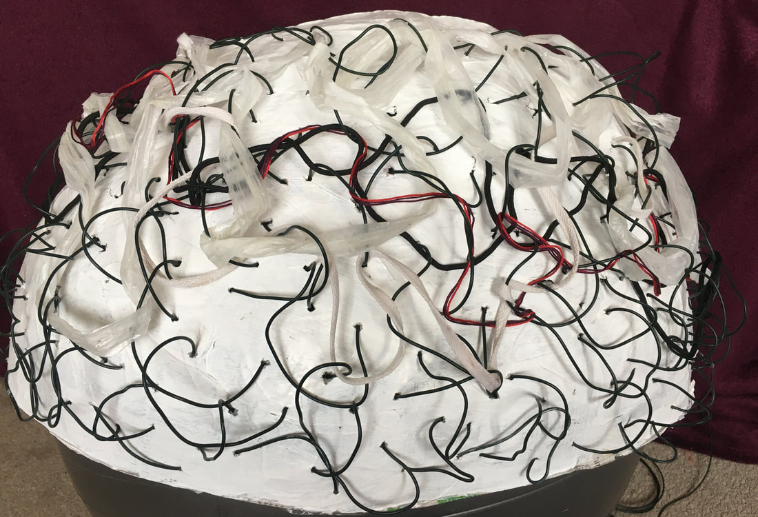
This created an area of interest by adding some lines of different thickness and colour and tone.
Up until this point I hadn't felt very inspired or excited by this piece of work, but remembering how, in the past when I used to knit items of clothing and often liked the 'wrong' side of the work more than the 'right' side, I turned it round and looked at the inside:
Up until this point I hadn't felt very inspired or excited by this piece of work, but remembering how, in the past when I used to knit items of clothing and often liked the 'wrong' side of the work more than the 'right' side, I turned it round and looked at the inside:
The text and areas of colour on the newspaper, combined with the sewn marks of the wire, made this more visually interesting to me.
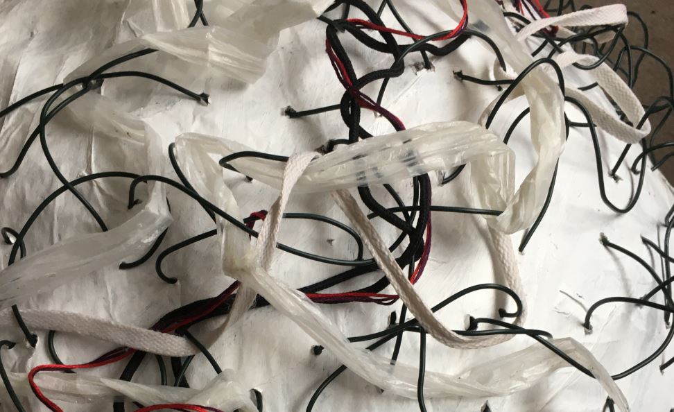
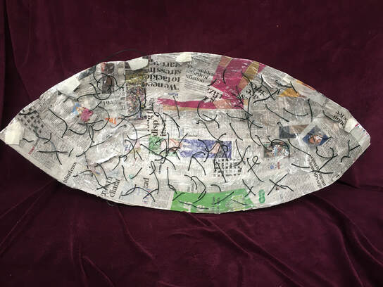
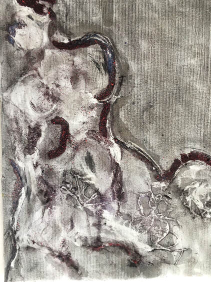
Then I decided to look at it in different positions:
Then I decided to look at it in different positions:

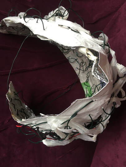
The process of looking at this structure in different positions, especially where I was able to combine the outside with the inside, transformed it into a much more interesting object. This was because moving it into different positions, with natural light coming from different angles, produced a variety of shapes, lines, tones and shadow.
Reflection:
I discovered that what happened when I made a drawing that took time and labour to produce, was that I sometimes lost interest, and didn't enjoy the process as much as I had in Ex 4.1, where the task was to explore materials and ways of making marks. However, I did enjoy the first experiment in Ex 4.2, because I have learned that I enjoy working into layers; making drawings into other drawings, which is something I've explored in the sketchbook work.
I also discovered how important media and materials are in making a drawing which takes time and labour, because if they're not suitable for a lengthy piece of work, this will add to the feelings of impatience and frustration.
What worked well, and why?
For all these drawings I choose to make the labour the subject, and this resulted in four very different drawings which were all interesting in different ways. I also learned how my interest and focus has shifted over the past two to three years, because I think I would have tackled this exercise in a different way in the past, and been inspired by different artists. I learned a lot about my own response to different materials and drawing processes.
What worked less well, and why?
The things that didn't work well were to do with suitability of materials. In the second drawing, for example, the coloured pencils needed a thicker paper, which would have enabled me to produce more vibrant colours and deeper tones, and in the fourth, structural drawing, the papier mache dome was a little too flexible, which made the sewing action with the wire difficult - however, its flexibility allowed it to bend into some interesting shapes, so this was a mixed blessing.
Were there any surprises?
The dome structure's ability to transform into a more interesting object when viewed from inside out, upside down, and from a variety of angles was a revelation.
What would you do differently if you repeated the exercise?
I would experiment with different colours and motifs for the first drawing, and spend more time with it which hopefully would be more enjoyable, because of all four drawings, this is the process I enjoyed most.
I would use a stronger support for the second drawing.
I would make a stronger model for the fourth drawing.
Exercise 4.3. Drawing and Thinking:
Honks, Horns, Howls and Laughter. from 'Drawing Ambiguity' (Sawdon & Marshall. 2015. p.83) Karl Hyde.
In this chapter from the book, 'Drawing Ambiguity', Karl Hyde describes seeing and recording his environment in a series of snapshot images. The process of noting words, shop signs, truck signs, place names, and other images began for him as a way of combatting boredom as he toured America with his group, 'Underworld', but what began as a way to cope with boredom developed into a source of constant motivation for his artwork. The streets of New York, bursting with imagery which assaulted all the senses is where his 'daily discipline to document the fragments of my day began.', and where the title of this chapter originated. He began with a notebook, then added photography, and over time began to get more selective about the things he recorded.
Hyde talks about capturing 'conversation' between different media and the surface of the paper, about making 'intuitive choices without the encumbrance of technique or ability', about making ugly choices deliberately, and 'returning to them to discover that they're not', and about visual 'collisions.'
All these concepts seem very relevant to the work I'm currently developing from Ex 4.1 for assignment 4.
Ex 4.3 felt daunting, and the direct opposite of Ex 4.2. Telling a story visually inevitably involves the quick drawing of figures, and I am aware that this isn't one of my strengths, but having read the above chapter from 'Drawing Ambiguity', I had a better understanding of the value of drawing in this way.
I instinctively felt I needed to work on a big scale, with drawing materials that would make quick, bold marks, so I choose A1 flip chart paper and charcoal and florescent marker pens:
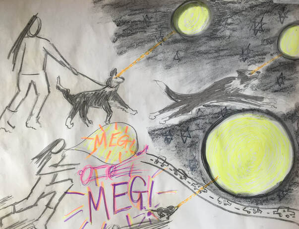
3 X A1 flip chart paper. Charcoal, florescent marker pens.
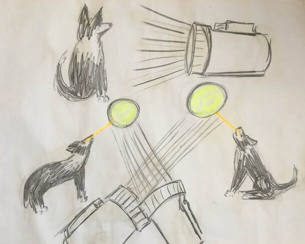
When I initially read Ex 4.3 in the course material, my first thought was to portray this story, and although I tried to think of a different one, I couldn't get this out of my mind. I came to the conclusion that I needed to tell this story, which isn't surprising because, although it happened about twenty years ago, it was very traumatic and unforgettable!
At this time I had a young border collie called Megan, who had developed a fixation about torch beams. Being a natural herding dog, her eyes would follow a torch beam wherever it went, thinking it might be something to chase and round-up. One evening when out on a walk, she looked up and saw a full moon, and thinking it was a giant torch, proceeded to try and round it up. Being in the 'collie zone' it was impossible to get her attention, as she moved progressively closer to a main road, at speed. Eventually, she ran herself to near exhaustion and I was able to get her back on the lead, but every day thereafter for many years, it wasn't possible to let her run freely if there was a moon in the sky, and a busy road close by.
(The extraordinary postscript to this tale is that, although we named her Megan, her pedigree, 'kennel club' name was 'Andslyn Moonglow'.)
Reflection
What worked well, and how might you use these features in future work?
Scale: The drawing of the moon increased as the story progressed, which emphasized its importance, and in the second and third drawings, the dog is much smaller when chasing the moon and finally coming to a stop, which portrayed the power the fixation with the moon held over her.
Materials: The charcoal and marker pens were good media for quick drawing, because they made clear, smooth marks over the surface of the paper.
Marks: Straight, rapidly-drawn lines to indicate light and speed.
Colour: I used yellow florescent pen for both the torch beam and the moon, to indicate how one translated into the other . I used the brightly coloured pens for the text, to indicate my own anxiety, and again to try and show how the obsession developed with the moon through the use of a yellow/orange line linking the moon to Megan's gaze.
Text: was useful to indicate my anxiety in calling the dog, and to symbolize her asleep.
There is much here that could be used in future work, but I think the main things are the use of scale, colour and text to emphasize importance and portray emotion.
Can you see any benefit to varying the pace of your work to include more spontaneous lines and marks?
Drawing in this way helps to break down the obsessive need to 'get it right'. It is also good for capturing certain emotions well, such as urgency, fear and anxiety. My recent research into Grayson Perry has revealed how he often draws spontaneously and quickly, to capture important thoughts and ideas which he may later go on to develop more detailed work from.
I am aware that my natural way of working is to have a slow, thoughtful approach to my work, which can be hard work sometimes, and may result in a certain type of drawing, so I will aim to practise some spontaneous drawing in my sketchbook work.
What about juxtaposing an urgently scribbled drawing next to a more highly finished one?
This would produce strong contrasts which would add visual interest to a composition. This is an emerging theme at the moment, because my tutor highlighted the issue of juxtaposing more carefully considered marks with urgent, energetic marks in his last feedback, and in study point 10, about the Notations Exhibition, the concept of, 'generative tension between the random and the orderly', which Barry Le Va aimed to create in some of his early work, was one of the ideas that stood out for me as important in Meredith Malone's essay, 'The Porus Practice of Drawing.'
Can you see a way to 'cut to the chase' more now? Sketchbook drawing can capture key information and leave other things out.
This is something I am aware that I need to practise. I have been concerned that drawing in this way will compromise structural accuracy, but as a method of capturing ideas quickly before they're lost, it could be invaluable.
How do you feel about your drawing?
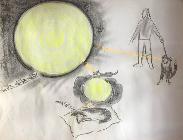
I feel reasonably pleased that I was able to overcome my resistance to drawing spontaneously, although the drawing took a bit longer than the telling of the story, so it wasn't as quick as the exercise suggested it should be. I find it interesting that I was more comfortable with drawing the dog quickly than I was with the drawings of the figure. I like parts of the drawing more than others - the giant moon in the night sky, and the small dog running at speed towards it, for example. I like these areas of the drawing because they succeed in expressing what I was trying to convey. In the third drawing, the image of Megan asleep is drawn too close to the one of her being transfixed by the moon, so it's a bit confusing, but because I was drawing quickly, I didn't notice this until afterwards.
When I initially read Ex 4.3 in the course material, my first thought was to portray this story, and although I tried to think of a different one, I couldn't get this out of my mind. I came to the conclusion that I needed to tell this story, which isn't surprising because, although it happened about twenty years ago, it was very traumatic and unforgettable!
At this time I had a young border collie called Megan, who had developed a fixation about torch beams. Being a natural herding dog, her eyes would follow a torch beam wherever it went, thinking it might be something to chase and round-up. One evening when out on a walk, she looked up and saw a full moon, and thinking it was a giant torch, proceeded to try and round it up. Being in the 'collie zone' it was impossible to get her attention, as she moved progressively closer to a main road, at speed. Eventually, she ran herself to near exhaustion and I was able to get her back on the lead, but every day thereafter for many years, it wasn't possible to let her run freely if there was a moon in the sky, and a busy road close by.
(The extraordinary postscript to this tale is that, although we named her Megan, her pedigree, 'kennel club' name was 'Andslyn Moonglow'.)
Reflection
What worked well, and how might you use these features in future work?
Scale: The drawing of the moon increased as the story progressed, which emphasized its importance, and in the second and third drawings, the dog is much smaller when chasing the moon and finally coming to a stop, which portrayed the power the fixation with the moon held over her.
Materials: The charcoal and marker pens were good media for quick drawing, because they made clear, smooth marks over the surface of the paper.
Marks: Straight, rapidly-drawn lines to indicate light and speed.
Colour: I used yellow florescent pen for both the torch beam and the moon, to indicate how one translated into the other . I used the brightly coloured pens for the text, to indicate my own anxiety, and again to try and show how the obsession developed with the moon through the use of a yellow/orange line linking the moon to Megan's gaze.
Text: was useful to indicate my anxiety in calling the dog, and to symbolize her asleep.
There is much here that could be used in future work, but I think the main things are the use of scale, colour and text to emphasize importance and portray emotion.
Can you see any benefit to varying the pace of your work to include more spontaneous lines and marks?
Drawing in this way helps to break down the obsessive need to 'get it right'. It is also good for capturing certain emotions well, such as urgency, fear and anxiety. My recent research into Grayson Perry has revealed how he often draws spontaneously and quickly, to capture important thoughts and ideas which he may later go on to develop more detailed work from.
I am aware that my natural way of working is to have a slow, thoughtful approach to my work, which can be hard work sometimes, and may result in a certain type of drawing, so I will aim to practise some spontaneous drawing in my sketchbook work.
What about juxtaposing an urgently scribbled drawing next to a more highly finished one?
This would produce strong contrasts which would add visual interest to a composition. This is an emerging theme at the moment, because my tutor highlighted the issue of juxtaposing more carefully considered marks with urgent, energetic marks in his last feedback, and in study point 10, about the Notations Exhibition, the concept of, 'generative tension between the random and the orderly', which Barry Le Va aimed to create in some of his early work, was one of the ideas that stood out for me as important in Meredith Malone's essay, 'The Porus Practice of Drawing.'
Can you see a way to 'cut to the chase' more now? Sketchbook drawing can capture key information and leave other things out.
This is something I am aware that I need to practise. I have been concerned that drawing in this way will compromise structural accuracy, but as a method of capturing ideas quickly before they're lost, it could be invaluable.
How do you feel about your drawing?
I feel reasonably pleased that I was able to overcome my resistance to drawing spontaneously, although the drawing took a bit longer than the telling of the story, so it wasn't as quick as the exercise suggested it should be. I find it interesting that I was more comfortable with drawing the dog quickly than I was with the drawings of the figure. I like parts of the drawing more than others - the giant moon in the night sky, and the small dog running at speed towards it, for example. I like these areas of the drawing because they succeed in expressing what I was trying to convey. In the third drawing, the image of Megan asleep is drawn too close to the one of her being transfixed by the moon, so it's a bit confusing, but because I was drawing quickly, I didn't notice this until afterwards.
Assignment 4.
In considering which exercises in part 4 most intrigued me, and which I enjoyed most, the issue of control emerged as something important to think about. I struggled with the control required for Ex 4.2, and even although I enjoyed some of the results, I found that making a drawing which required labour and time generally resulted in feelings of impatience and frustration. I wonder whether this may have been different had I had unlimited time to complete Ex 4.2, in which case, I may have had a more relaxed attitude.
By contrast, I enjoyed exploring media and materials in Ex 4.1; combining fluid and dry media, water and oil-based media, and finding out what could be achieved with little intervention, then adding further marks if needed. Consequently I decided to develop Ex 4.1 for assignment 4.
Artist statement:
I will explore combinations of mark-making materials and processes to investigate texture, pattern and line in the natural world, with particular emphasis on the Echium Pininana plant.
Research for Assignment 4:
Having researched the work of Australian artist John Wolseley in part 1, I am aware that he is an influential artist for me. This is an extract from part 1:
John Wolseley (b.1938)
Another artist who draws inspiration from the natural environment is John Wolseley. Wolseley uses mixed media, and a variety of techniques including watercolour, graphite, frottage, collage, etching, and printing from nature. He is deeply concerned about the endangered species in the environment, and it is his sensitivity and ability to relate to and to portray the small, vulnerable and threatened life within it that I find very moving and inspirational. See fig 1.
Ashley Crawford, writing about Wolseley's work in 'The Vizard Foundation Art Collection of the 1990s' at the Potter Museum in Australia said, 'Wolseley's work is remarkable for its detail, as though the artist is obsessed with the minutia of life: 'the subtle and gentle things', according to Wolseley.'
https://www.johnwolseley.net
https://www.vizardfoundationartcollection.com.au/the-nineties/explore/john-wolseley/
Fig 1. John Wolseley. 101 Insect Life Stories No.13 Ur-Beetle. Relief print and watercolour on paper. 41.3 X 36cm
https://ocula.com/artists/john-wolseley/ (Accessed 26/03/21)
I enjoy the subtle mark making and ethereal quality quality that Wolseley achieves in his work.
I discovered that, among many others, American painter Mark Tobey (1890-1976) was one of Wolseley's influences. I researched Tobey's work and found that I liked some of it very much, especially his dense compositions that cover the whole surface of the support. See fig 2.
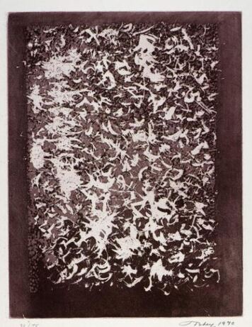
Fig 2. Mark Tobey. 1970. Evocation. Aquatint. 31.9 X 24.4
https://americanart.si.edu/artwork/evocation/24127 (Accessed 26/03/21)
Through the use of meditation, Tobey developed a calligraphic style known as his 'white writing' which covered the whole of his small-scale canvasses and paper with many lines and forms. See fig 3.
Although he worked mainly with water-based media such as tempera and gouache, his work was reminiscent of Abstract Expressionism, but Tobey illustrated how his work differed from Abstract Expressionism with this quote:
'I believe that painting should come through the awareness of meditation rather than the canals of action.'
https://www.theartstory.org/artist/tobey-mark/
(Accessed 29/03/21)
Fig 3. Mark Tobey. 1974. Flame of Colors. Lithograph on Arches paper. 42.6 X 29.8cm
https://americanart.si.edu/artwork/homage-tobey-portfolio-flame-colors-24131
(Accessed 29/03/21)
https://americanart.si.edu/artwork/homage-tobey-portfolio-flame-colors-24131
(Accessed 29/03/21)
I was attracted to Tobey's work for his use of texture, pattern and tone, recurring elements that I am noticing in some of the work I am doing for assignment 4.
Following on from the work of Ex 4.1, I continued to explore media and process:
Following on from the work of Ex 4.1, I continued to explore media and process:
A3 white tissue paper covered with gesso. Diluted drawing ink, willow and compressed charcoal.
I poured the ink in a circular motion, then used a knife to shave and sprinkle the charcoal over the ink. This has produced an interesting mottled texture, where the ink and charcoal meet.
I poured the ink in a circular motion, then used a knife to shave and sprinkle the charcoal over the ink. This has produced an interesting mottled texture, where the ink and charcoal meet.
A3 white tissue paper with gesso and a diluted black ink wash. Diluted ink, compressed charcoal, white chalk pastel.
L: White chalk shaved onto the wet ink, but when dry, this was unnoticeable, so I added a diluted mix of PVA, sprinkled this with compressed charcoal and dripped orange ink on top. Then I used a stick to make sweeping movements.
R: Compressed charcoal shaved onto the wet ink, and diluted black ink splattered on top. Sweeping lines drawn with the stick before dry.
These two experiments taught me that compressed charcoal produces much more dramatic results than willow charcoal. There is also a delicate balance between achieving an interesting, visually pleasing result, and a sludgy mess, because with the experiment on the left it felt as if I was adding increasing amounts of media and marks in a bid to find something interesting, whereas the one on the right worked much more quickly and easily. I think this was because it retained more simplicity and clarity in the mark making, and the media worked better together.
A3 cartridge paper. Compressed charcoal, ink, acrylic, tissue paper.
This was another experiment which became quite complex as I worked to find an interesting result. To start with, I covered the paper with charcoal and rubbed it into the surface, then used a rubber to draw into this. Then I poured diluted black ink over the drawing and used a tissue to draw into it, which left some of the erased marks showing more clearly. Finally I added the collaged twists of black tissue paper, and poured diluted white acrylic over it.
The result is an image which has some depth because of the different tonal areas, the transparency of the white paint, and the textural surface.
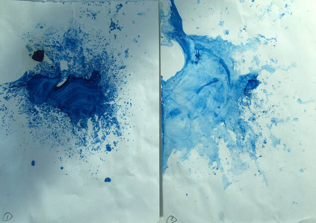
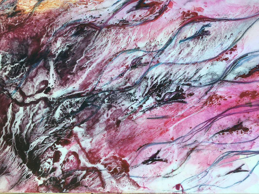
A3 tracing paper. Oil paint and white spirit.
I covered the tracing paper with white spirit, then thinned the oil paint with white spirit, dropped it onto the paper, and gently tipped the paper in different directions. One thicker blob of paint has created the darker, thicker line.
I enjoyed how this changed with the slightest movement. This combination of media and process has produced some very delicate textures and an atmospheric image.
A4 tracing paper. White spirit, diluted oil paint, ink.
I used the tracing paper to take a print from the newspaper that had been underneath the previous experiment, dropped orange and red drawing ink onto this then moved the paper in a circular motion. I was surprised that the water based ink made clear circular lines over the white spirit and diluted oil paint, and that it formed an image of the red and orange marks floating above the purple background.
I used the tracing paper to take a print from the newspaper that had been underneath the previous experiment, dropped orange and red drawing ink onto this then moved the paper in a circular motion. I was surprised that the water based ink made clear circular lines over the white spirit and diluted oil paint, and that it formed an image of the red and orange marks floating above the purple background.
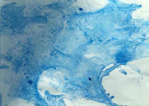
A3 tracing paper. Oil paint and white spirit.
I used the same method as with the purple/pink experiment above, then sprayed it with water, and blotted it with tissue in places. When it had dried, I used compressed charcoal to highlight some of the shapes made by the oil paint. This resulted in a dramatic image, which changed as it dried.
I enjoyed these experiments with oil paint and white spirit on tracing paper, which produced effects that I haven't been able to achieve with any other media. I was especially intrigued with them from a compositional point of view, because I had very little control over the media, yet it sometimes resulted in very evocative, atmospheric compositions, particularly in the A3 example above, and in the earlier purple/pink/blue one. From a practical point of view, however, they take a very long time to dry!
A3 white tissue paper, with gesso. Oil paint, white spirit, oil pastels.
I decided to try the same process, of oil paint diluted with white spirit, poured onto a different support. Then I sprinkled oil pastel shavings over this, dripped more white spirit on top, and tipped it in different directions. This produced an image that, very like the A4 experiment with diluted oil paint and ink above, gives the illusion of foreground and background and has depth. It reminds me again of the starling murmurations.
I decided to try the same process, of oil paint diluted with white spirit, poured onto a different support. Then I sprinkled oil pastel shavings over this, dripped more white spirit on top, and tipped it in different directions. This produced an image that, very like the A4 experiment with diluted oil paint and ink above, gives the illusion of foreground and background and has depth. It reminds me again of the starling murmurations.
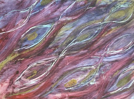
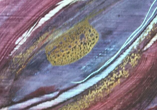
A4 cartridge paper covered with a diluted PVA mix. Chalk pastels.
I shaved and sprinkled the chalk pastels over the PVA then used a thin stick to draw into this. This was really enjoyable, and I think this combination of media works well together to produce interesting line and texture
.
I shaved and sprinkled the chalk pastels over the PVA then used a thin stick to draw into this. This was really enjoyable, and I think this combination of media works well together to produce interesting line and texture
.
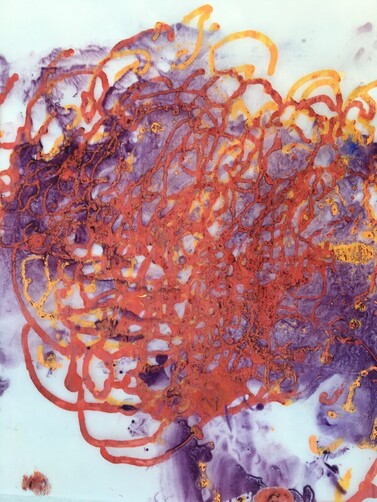
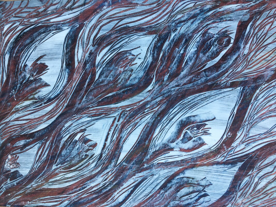
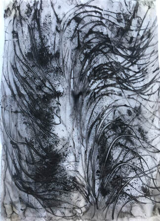
13 X 12in cartridge paper. Oil paint, white spirit, ink, acrylic, ready-mix paint, newspaper.
I made the textured surface from rolled, twisted newspaper and painted this with white acrylic. I then covered this with a mixture of thinned oil paint, ink, and ready-mix paint. This was an experiment of combining water and oil based mediums, which I found exciting to work with because the way they reacted together was unpredictable and surprising. This feels like a balanced composition, and reminds me a little of the work of Jackson Pollock, albeit on a much smaller scale. The initial inspiration for this was tree fungus, and following this I had the idea of using wire to sew the structure in Ex 4.2.
I continued to explore the idea of a textured surface, inspired by 'It has come to this' by Sue Gilmore, See fig 1.
14 X 12in. String, laces, tissue collaged onto card. Compressed charcoal and chalk pastels.
I wanted to see what happened when I rubbed shavings of compressed charcoal and chalk pastels into the textured surface. It made it more interesting because it created tone and more varied lines; the lines around the items where the charcoal stuck to the glue were delicate and shadowy.
Then I removed the collaged items:
I applied a thin PVA solution, tipped the dust from the charcoal and pastels over this, then used a small sponge to draw into it in places. This resulted in a ghostly, more evocative image, which I prefer to the first one. However, the card I used as a support had a covering of white house paint which had a very slight sheen, and I think this experiment could have worked better with a more absorbent support. I enjoy working into a textured support because I think the structural element adds visual interest.
Fig 1. Sue Gilmore. It has come to This. Charcoal, charcoal dust, sand. 60 X60cm.
https://sue-gilmore.com/work/trace-drawings/
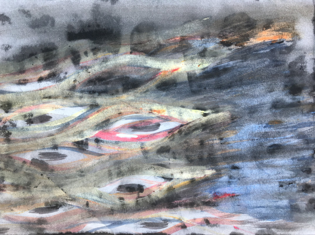
Throughout these explorations of materials and processes, I was sometimes inspired by textures and patterns I had seen in nature, and at other times, just inspired by the materials and the process. Some of the results I achieved reminded me, either by chance or by design, of the Echium plant that a friend has in her garden, so I decided to focus on that, because it is so rich in texture and pattern:
https://sue-gilmore.com/work/trace-drawings/
Throughout these explorations of materials and processes, I was sometimes inspired by textures and patterns I had seen in nature, and at other times, just inspired by the materials and the process. Some of the results I achieved reminded me, either by chance or by design, of the Echium plant that a friend has in her garden, so I decided to focus on that, because it is so rich in texture and pattern:
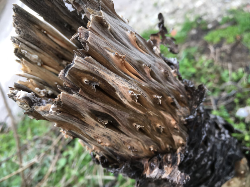
Images of the dead Echium Pininina plant.
Stalk. Dead flowers. Dead leaves.
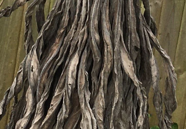
I started by concentrating on the texture and pattern of the stalk:
Stalk. Dead flowers. Dead leaves.
I started by concentrating on the texture and pattern of the stalk:
Oil and white spirit on tracing paper. Gesso over acrylic, scraped away. Ink painted over gouache, and washed.
Gesso over A3 newsprint, painted with acrylic and oil paint, drawn into with a stick.
I prefer the results with oil and white spirit on tracing paper, and ink over gouache, washed with water, because these are more subtle. The combination of acrylic and oil paint in the fourth one was interesting though, because it resulted in some areas of texture where the water based acrylic has come through the oil in small dots:
Detail.
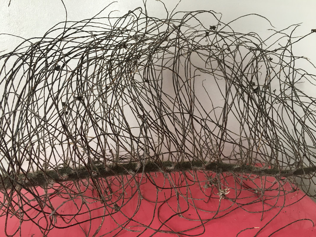
Then I concentrated on the texture of the dead flowers:
Then I concentrated on the texture of the dead flowers:
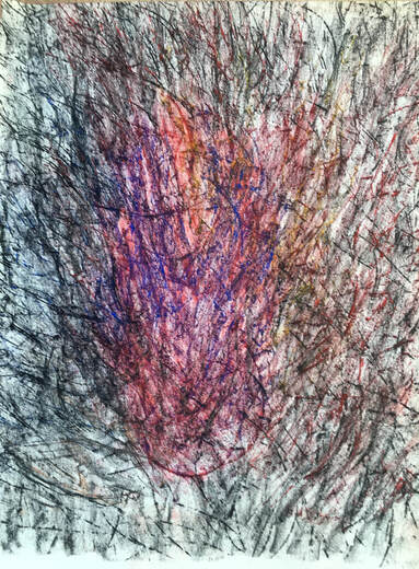
11.5 X 8in tracing paper. Compressed charcoal and ink wash.
I used a knife to shave the charcoal onto the ink, then used a stick to draw into it. This worked best where the ink was more sparse, but this media was good for free, spontaneous drawing, and the charcoal dust resulted in areas of darker tone.
I used a knife to shave the charcoal onto the ink, then used a stick to draw into it. This worked best where the ink was more sparse, but this media was good for free, spontaneous drawing, and the charcoal dust resulted in areas of darker tone.
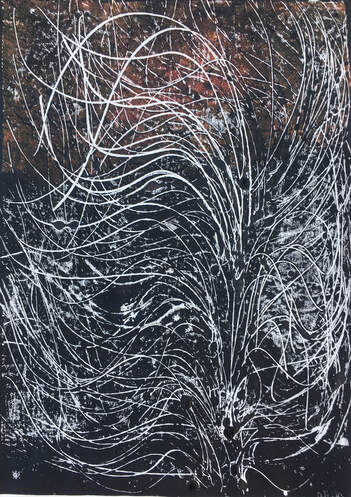
A3 monoprint on newsprint.
This was made by drawing directly onto the inked-up plate. The dead flowers left curved, stick-like linear shapes which still retained energy and movement even though the flowers had long gone. These called for free, expressive drawing, and the water-based printing ink was another good media to draw into in this way. I tried to add some interest to this drawing by adding chalk pastels:
This was made by drawing directly onto the inked-up plate. The dead flowers left curved, stick-like linear shapes which still retained energy and movement even though the flowers had long gone. These called for free, expressive drawing, and the water-based printing ink was another good media to draw into in this way. I tried to add some interest to this drawing by adding chalk pastels:
Above monoprint with chalk pastels.
I like the added colour the pastels bring, but the drawing with them is less spontaneous and free than the marks drawn into the ink, and consequently are less true to the subject, so on balance I prefer the original monoprint for its immediacy.
I like the added colour the pastels bring, but the drawing with them is less spontaneous and free than the marks drawn into the ink, and consequently are less true to the subject, so on balance I prefer the original monoprint for its immediacy.
A3 monoprint on newsprint. Chalk pastels.
This print was taken from the same plate as the above ,but the ink is much more sparse, which gives a fainter image. When this was dry I used plants to add some frottage with chalk pastels. I like the added marks made by the frottage, but they changed the feeling of the original image, which had been delicate and ethereal.
This print was taken from the same plate as the above ,but the ink is much more sparse, which gives a fainter image. When this was dry I used plants to add some frottage with chalk pastels. I like the added marks made by the frottage, but they changed the feeling of the original image, which had been delicate and ethereal.
A3 newsprint. Chalk pastels, charcoal.
Frottage, using some of the dead flowers in a random arrangement. As the dead flowers were quite hard and brittle, this was difficult, but I like the energetic marks it made.
Frottage, using some of the dead flowers in a random arrangement. As the dead flowers were quite hard and brittle, this was difficult, but I like the energetic marks it made.
Next I explored the dead leaves:
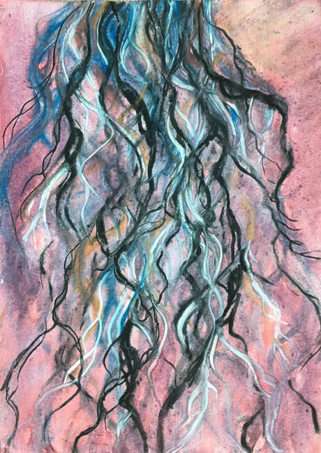
A3 cartridge paper. Watercolour, compressed charcoal, white chalk pastel.
I used diluted watercolour over a watercolour wash, and built layers of charcoal, pastels and paint to try and achieve the feeling of depth and the flowing lines of the leaves. Like the dead flowers, the leaves are also quite brittle but more delicate, and although I like this for its colour, feeling of depth and variety of line, it doesn't really capture the feeling of the leaves. It was an interesting exploration of watercolour, charcoal and chalk pastels, however, and I discovered they work together well, the strong compressed charcoal making a good contrast with the more subtle watercolour and pastels.
I used diluted watercolour over a watercolour wash, and built layers of charcoal, pastels and paint to try and achieve the feeling of depth and the flowing lines of the leaves. Like the dead flowers, the leaves are also quite brittle but more delicate, and although I like this for its colour, feeling of depth and variety of line, it doesn't really capture the feeling of the leaves. It was an interesting exploration of watercolour, charcoal and chalk pastels, however, and I discovered they work together well, the strong compressed charcoal making a good contrast with the more subtle watercolour and pastels.
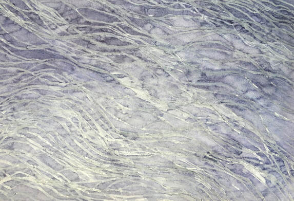
A3 newsprint. Wax crayon, diluted ink.
Marks drawn with the wax crayon, and painted with ink. I like the simplicity and subtle quality of this. I was curious to find out whether using ink that was more concentrated would result in clearer marks, so I tried another experiment:
Marks drawn with the wax crayon, and painted with ink. I like the simplicity and subtle quality of this. I was curious to find out whether using ink that was more concentrated would result in clearer marks, so I tried another experiment:
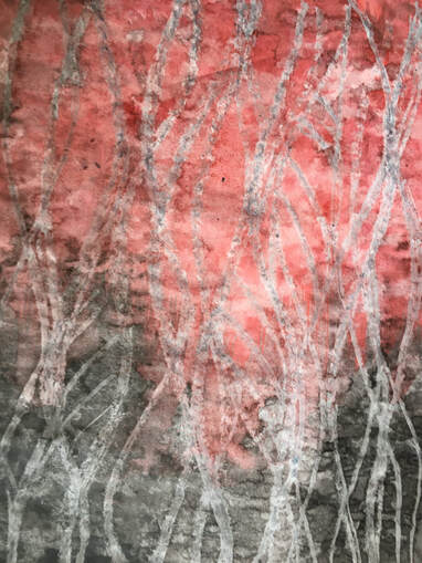
A3 newsprint. Wax crayon, ink.
I used red and black ink that were less diluted than the blue in the previous experiment, but found that it obliterated the wax marks completely, so I blotted the ink with tissue, which resulted in a slightly mottled texture.
I used red and black ink that were less diluted than the blue in the previous experiment, but found that it obliterated the wax marks completely, so I blotted the ink with tissue, which resulted in a slightly mottled texture.
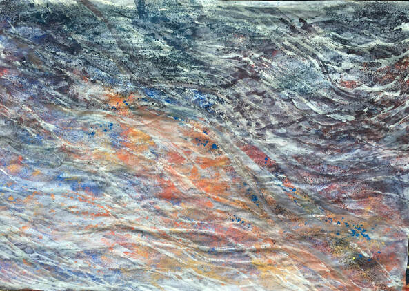
I returned to the first drawing, and added diluted PVA, shavings of chalk pastels, and water. I think the colour adds interest and depth.
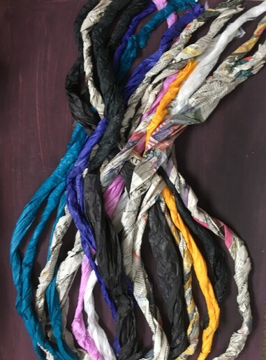
I made this A2 collagraph plate using twisted newspaper and tissue, trying to replicate the twisted lines of the leaves. I like the textural, sculptural and tonal qualities of this, despite the fact that it doesn't capture the delicacy of the leaves.
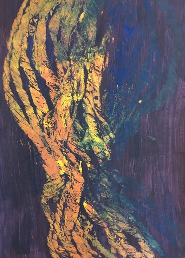
A2 print from the above.
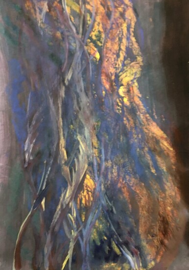
Above A2 print with oil and white spirit.
Using the diluted oil paint, I tried to achieve the more delicate look of the dead leaves by tipping and shaking the paper whilst the oil paint was still wet, which has worked fairly well in places:
Using the diluted oil paint, I tried to achieve the more delicate look of the dead leaves by tipping and shaking the paper whilst the oil paint was still wet, which has worked fairly well in places:
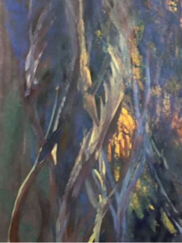
Detail.
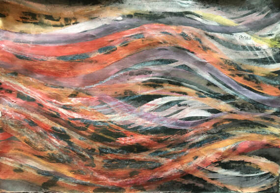
A3 cartridge paper. Gouache, indian ink, wax crayon, diluted ink.
I painted indian ink over the gouache, partially dried it, then washed it with running water, which left some of the painted marks. When dry, I did more drawing with wax crayon then brushed this with diluted red ink. I like the subtle marks made by the gouache/indian ink/washing technique, and have used this before, so I was interested to see what the addition of wax crayon and a different coloured ink would bring. The red ink has deepened the colour slightly, but hasn't altered the visual appearance significantly.
My aim for this assignment had been to develop and continue to explore Ex 4.1. I really enjoyed the process of exploring a variety of media and techniques. An important learning point during this was that it is important to notice the journey as well as the destination, because sometimes I was aware of focussing too much on achieving a satisfactory or good result, and perhaps not paying enough attention to the stages in between which might have been just as interesting. I had a good range of experiments with different media and processes at this stage, but I felt I wanted to pull them all together into a composition in some way. Aware that my tutor had encouraged me to continue to incorporate structural, 3D work, I thought about how I might use the other section of the papier mache dome I had made for an experiment in Ex 4.2, and realised it would be an interesting form for collage.
This structure is 35 X 14in, and although it was quite difficult to photograph suspended, by experimenting with different light I discovered that it created some interesting compositions when combined with shadow:
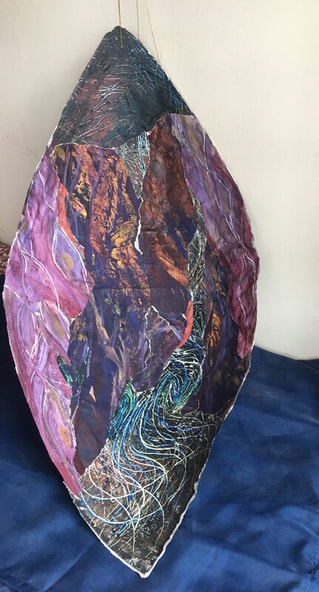
1) The concave interior of the structure. I used pieces of torn and cut paper from the experiments I had done.
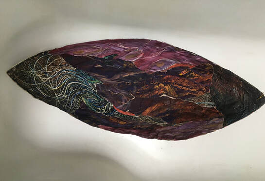
2)
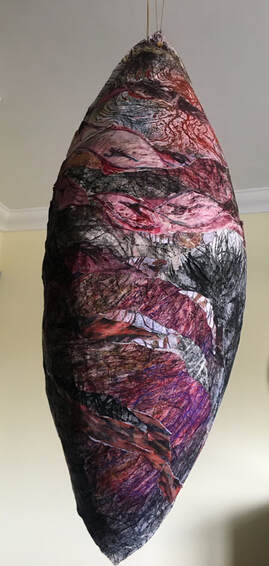
3). The convex exterior of the structure.
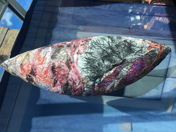
4)
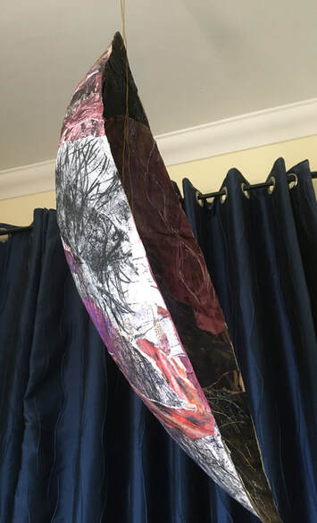
5)
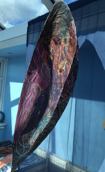
6)
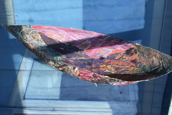
7)
What worked well, and why?
The remit for this assignment was to develop one of the exercises, and continue to explore without explicit instructions. I decided to develop Ex 4.1, and explored a wide range of fluid and dry media, as well as combinations of oil and water based media. This experimentation became more focussed on the plant as I continued to work, which required me to try and understand the different textures and patterns within it, and to translate them into marks through exploring different media. This process improved my understanding of how certain materials react together, and what the visual results are, which was a good learning experience. I like the 3D piece, and feel it worked well as a way of combining the experiments into a composition. This required thinking about how the collaged pieces would work together. I deliberately made the outside, convex area lighter in tone and the concave interior darker, which I think works well when the piece is suspended. The shadows in some of the photos add interest to the composition.
What worked less well?
Some of the experiments with materials and process didn't work well visually - white chalk pastel on wet ink in the second experiment for example, because the chalk became lost and the marks weren't visible. but this was essentially an exercise in exploration, so any result was valuable learning.
Were there any surprises or 'happy accidents'?
There were several surprises, but the ones that stand out for me were the thinned oil paint and white spirit on tracing paper, because these changed as they dried, and produced some intriguing images, and the reaction between acrylic and oil paint in the experiment focussing on the plant stalk. The combination of oil and water based mediums often produced surprises; the experiment with acrylic, ready-mix paint, ink, oil paint, white spirit and water over textured newspaper for example, felt like a surprisingly balanced composition.
Sketchbook work:
I used my sketchbook work to experiment with a variety of ideas, some arising from the exercises, assignment and research of part 4, and others from my tutor's previous feedback.
Quick recording of information has been one of the recurring themes of part 4, both in Ex 4.3 and also in Study Points 10 and 11. I am aware that this is an aspect of drawing that I find quite difficult, so I decided to take an A5 sketchbook out on a walk and do some quick drawings from nature.
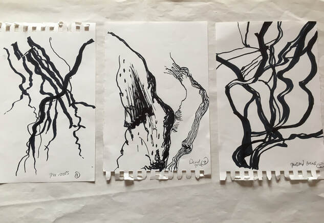
All A5. Fibre tip pen.
I did each of these in 2 - 3 minutes. This was a good exercise in trying to record information quickly, such as shape, angles, texture and tone. I learned that this is a skill requiring constant practise.
I also did a small drawing which juxtaposed quick drawing with more carefully considered drawing:
A4. 8B graphite.
This is the end of a shelving unit, with a curtain twisted round the metal upright. I spent 30 minutes drawing the curtain, paying careful attention to tone, angles, and shape, then did the rest of the drawing of the items on the shelf quickly and spontaneously. The more carefully drawn tones of the curtain and the end of the unit bring it into the foreground, but the drawing hasn't captured the feeling of the curtain because it looks quite stiff. The more quickly drawn objects appear in the background, but in reality there was little physical distance between them.
Continuing with the theme of quick spontaneous drawing, and using a stone as the subject, I used carbon paper to draw 'blind'
for this drawing:
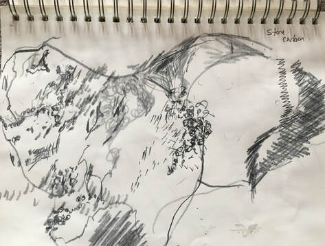
9 X 12in. Carbon paper.
Using the end of a paintbrush, I tried to make marks into the carbon paper to represent the textures in the stone. I achieved some tonal areas by concentrating marks in certain areas. This was a liberating way to draw, and exciting to discover what marks had been made.
Using the end of a paintbrush, I tried to make marks into the carbon paper to represent the textures in the stone. I achieved some tonal areas by concentrating marks in certain areas. This was a liberating way to draw, and exciting to discover what marks had been made.
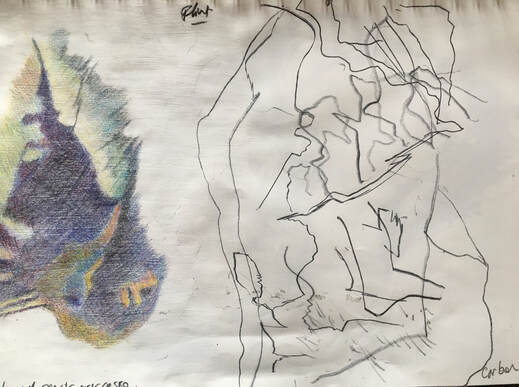
9 X 12in. L: Coloured pencils over gesso. R: Carbon paper drawing.
I wanted to compare two very different drawings of this piece of flint. I enjoyed looking closely at the textures and marks in the flint, and the coloured pencil drawing was very enjoyable to do because the gesso was a good surface to achieve both subtle and dramatic colour and tonal changes. The drawing on the right was done in the same way as the one above, drawn blind, using carbon paper. I didn't try to achieve tonal areas with this drawing, but concentrated only on line, which produced a variety of lines, depending on how hard I pressed. I thought it should be possible to achieve more variety in line thickness by using different objects to draw into the carbon, so I did a quick experiment:
I wanted to compare two very different drawings of this piece of flint. I enjoyed looking closely at the textures and marks in the flint, and the coloured pencil drawing was very enjoyable to do because the gesso was a good surface to achieve both subtle and dramatic colour and tonal changes. The drawing on the right was done in the same way as the one above, drawn blind, using carbon paper. I didn't try to achieve tonal areas with this drawing, but concentrated only on line, which produced a variety of lines, depending on how hard I pressed. I thought it should be possible to achieve more variety in line thickness by using different objects to draw into the carbon, so I did a quick experiment:
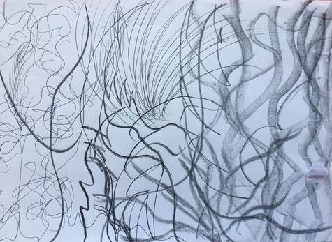
A4 carbon paper drawing using, from L to R: the point of a thin knitting needle, the end of a pencil, the end of a thick marker pen, and far right, the end of a florescent marker pen.
It was easier to press hard with some objects than with others without tearing the carbon paper, hence the differences in tone, but it was possible to achieve different thicknesses of line with different objects.
One of the suggestions made by my tutor in my last feedback, was to think about making objects to draw. As I had constructed a dome shaped object to use in Ex 4.2, I thought it would make a good subject for some 2D drawings:
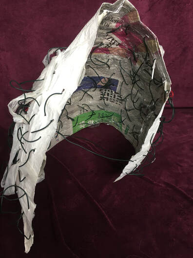
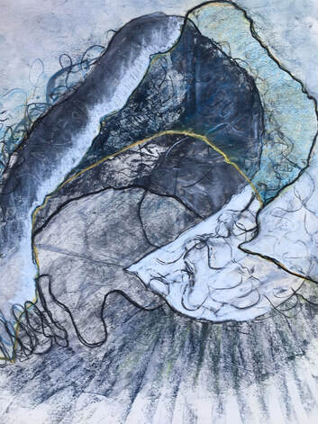
A1 flipchart paper. Compressed charcoal on wet surface, chalk pastel.
I enjoy using compressed charcoal on wet surfaces because it makes marks that are very dense, but can also make very delicate marks, if used lightly and sensitively. When dry, I added more charcoal and also chalk pastels. I was interested in the positive and negative shapes combined with the lines made by the wire in this composition.
I enjoy using compressed charcoal on wet surfaces because it makes marks that are very dense, but can also make very delicate marks, if used lightly and sensitively. When dry, I added more charcoal and also chalk pastels. I was interested in the positive and negative shapes combined with the lines made by the wire in this composition.
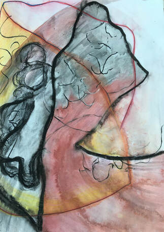
A2 cartridge paper. Compressed charcoal, ink.
With this drawing, again, I was interested in the interaction between positive and negative shapes, line, texture, and colour.
I felt there was much more to explore with the technique of drawing from the 3D structure and, just as I had been surprised at how much more interesting this object had become when I started to manipulate it into different shapes in Ex 4.2, I was also surprised at its potential for making interesting drawings of form in two dimensions.
I also experimented with some 2D drawings of the collaged structure I made for assignment 4:
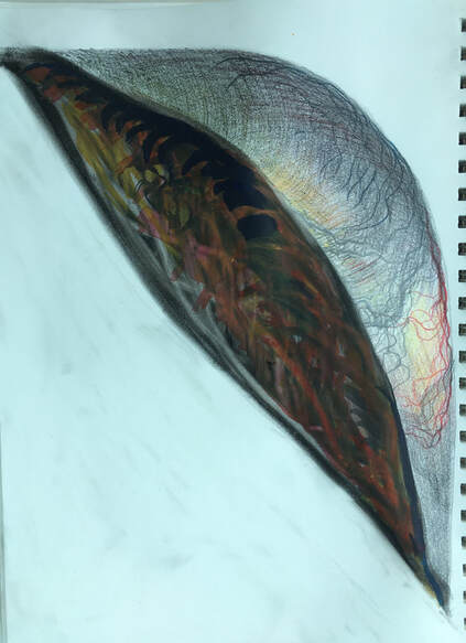
9 X 12in. Water soluble pencils, compressed charcoal, ink.
I covered the interior of the shape with compressed charcoal, used a rubber to draw into it, then did some drawing over this with inks. I didn't set out with a specific aim in mind, but I like the shape and the strong tonal contrast of this.
I covered the interior of the shape with compressed charcoal, used a rubber to draw into it, then did some drawing over this with inks. I didn't set out with a specific aim in mind, but I like the shape and the strong tonal contrast of this.
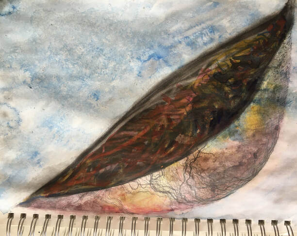
I used a pale blue ink wash and water to brush over the above drawing. This has resulted in a less striking, but more atmospheric image.
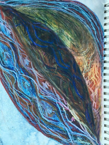
Looking at some of the shapes and marks in the 3D structure, I used oil pastels to draw over the above drawing, then used various objects including a palette knife, the end of a pencil and my finger nail, to draw into the oil pastels. This has now turned into a composition about pattern, line, texture and colour.
I enjoyed developing a drawing through the use of different media and techniques, and discovering how it changed.
Another recommendation by my tutor was to experiment with making drawings to draw into, as I had explored this in part 3 with some interesting results. I am aware that the previous three drawings fit this description, but I hadn't set out to deliberately do this with them, they just evolved in that way. However, with the following five, I consciously made drawings to draw into further, and began with this splintered wood:
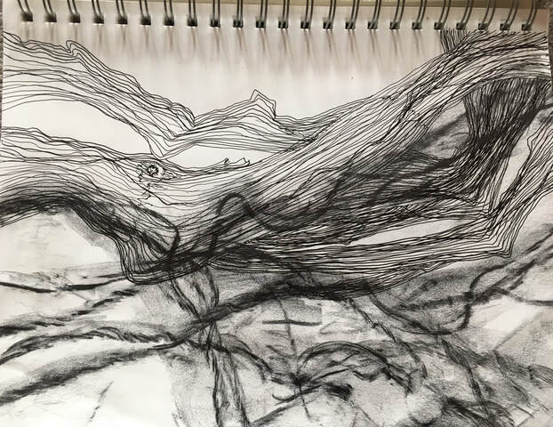
9 X 12in. Fine liner pen, graphite.
I did the pen drawing first, concentrating on the lines and shape made by the splintered wood. Then I used graphite to make a frottage drawing of dead plant stalks over this. The different marks made by the frottage were a contrast to the thin, clear pen lines, and I think this added visual interest to the drawing.
Then I did three drawings of the Echium plant, which became the subject for assignment 4:
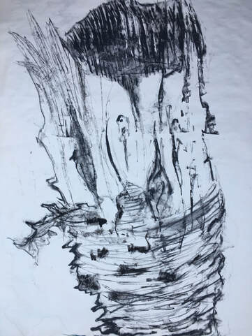
25 X 19in. Compressed charcoal on wet paper.
I covered this drawing with a pale blue ink wash then, when it was dry, using the subject of the splintered wood again did a drawing into this with white chalk;
I covered this drawing with a pale blue ink wash then, when it was dry, using the subject of the splintered wood again did a drawing into this with white chalk;
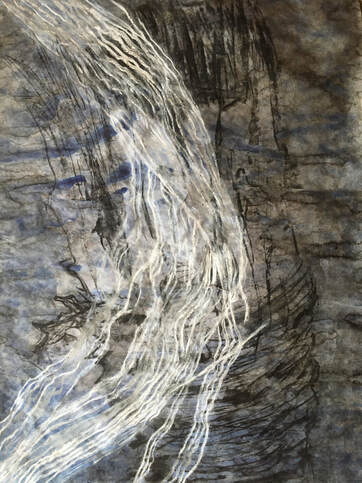
I liked the fact that the chalk drawing appeared to float on top of the charcoal drawing, so I darkened part of the blue ink wash with a diluted black ink wash to accentuate this. This drawing reminds me of the previous one, because the different marks made by the media to draw into the original drawing have added visual interest and in this case, also give a feeling of depth.
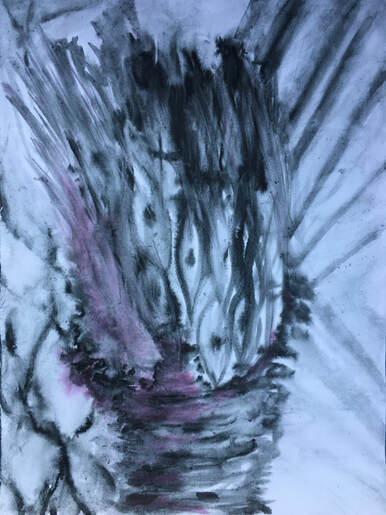
A2 cartridge paper. Ink on wet paper.
I was influenced by the work I've been doing for Ex 4.2 with this drawing, and used coloured pencils to do some detailed pattern in some of the spaces:
I was influenced by the work I've been doing for Ex 4.2 with this drawing, and used coloured pencils to do some detailed pattern in some of the spaces:
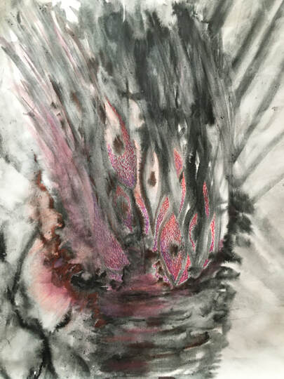
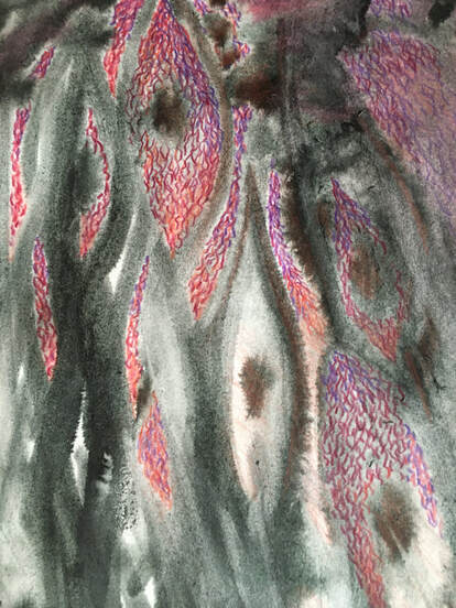
Detail.
I enjoyed the juxtaposition of the controlled pencil drawing with the more free, expressive ink drawing. I think this, and the addition of colour adds visual interest to the original drawing.
I enjoyed the juxtaposition of the controlled pencil drawing with the more free, expressive ink drawing. I think this, and the addition of colour adds visual interest to the original drawing.
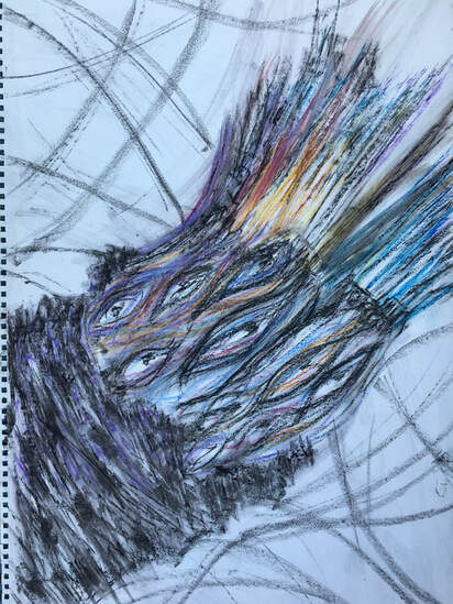
15 X 20in cartridge paper. Oil pastel and white spirit.
I liked the varied texture and colour of this drawing, so decided not to draw into it.
I found I really enjoyed the process of drawing into drawings, and seeing how the original drawing transformed, and became more interesting, so I continued to explore this:
I liked the varied texture and colour of this drawing, so decided not to draw into it.
I found I really enjoyed the process of drawing into drawings, and seeing how the original drawing transformed, and became more interesting, so I continued to explore this:
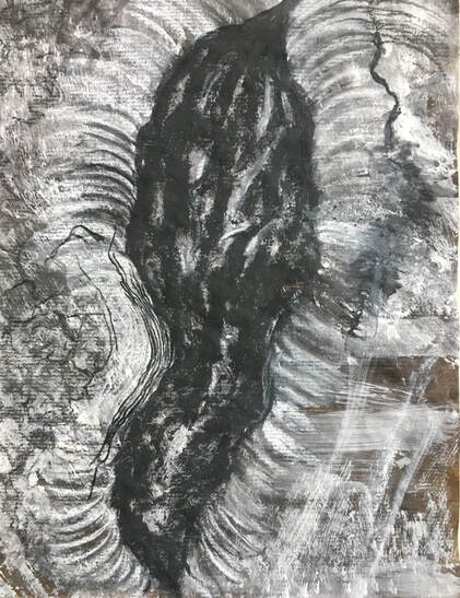
A3 brown paper. Charcoal, white chalk pastel.
The subject for this was a split in a tree trunk. I had originally intended to use this as an experiment for combining detailed drawing alongside more spontaneous, expressive drawing, but came to the conclusion that it might be better used to draw into in some way:
The subject for this was a split in a tree trunk. I had originally intended to use this as an experiment for combining detailed drawing alongside more spontaneous, expressive drawing, but came to the conclusion that it might be better used to draw into in some way:
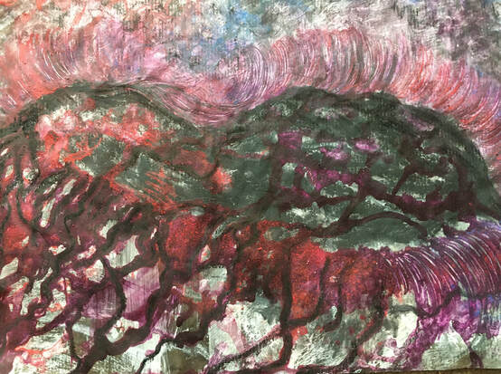
Ink, chalk pastels, compressed charcoal, diluted PVA
I covered the drawing with a diluted PVA solution and shavings of chalk pastels, then dripped ink onto it. Before it was dry I used compressed charcoal and a stick to draw into it, accentuating some of the lines and marks created by the ink.
I think this grew into a significant improvement on the original drawing; the ink and charcoal created tonal changes with the white pastel and seemed to bring it to life - almost literally, because it reminded me of a giant insect. Using a stick to draw with enabled me to make some very detailed, thin lines which were a contrast to some of the thicker, bolder lines made by the ink, and these contrasts all added interest.
I wanted to think of some different ways of making a drawing, and one day, when I had more energy than usual, had the idea of experimenting with movement. I taped a long sheet of lining paper to the wall, and holding charcoal or chalk pastel in my right hand, did 20 standing jumps, reaching as high as I could with the charcoal and pastels:
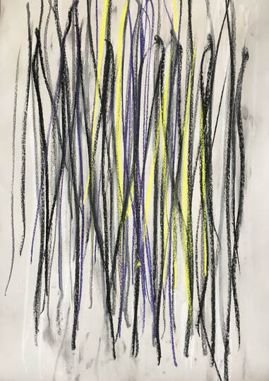
21 X 36in. Compressed charcoal, chalk pastel.
I liked the energy captured in this drawing, and intended to leave it in its original state, until it occurred to me that it would be interesting to draw into it, using the image of the tree fungus as an inspiration:
I liked the energy captured in this drawing, and intended to leave it in its original state, until it occurred to me that it would be interesting to draw into it, using the image of the tree fungus as an inspiration:
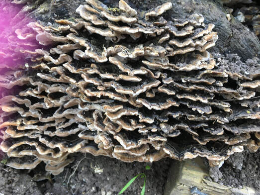
Tree fungus.
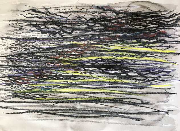
Diluted ink, compressed charcoal, water soluble pencils.
I covered the drawing with a very diluted ink wash, then used charcoal and water soluble pencils. This was very enjoyable to work on because the charcoal and pencils moved easily over the wet surface, producing a variety of lines, depending on the pressure I used. It has transformed the original energetic drawing into a more interesting one because of the addition of texture, tone, colour and different types of line. I liked the original drawing for its uncompromising energy and strength, but I prefer this one because I find it less difficult to look at and I enjoy the conversation between the layers.
The conversation between layers was very much the subject of the next two drawings. Both had been discarded as unsuccessful bits of work, but following the previous experiment, I saw them in a different light. The first one had also been made in response to the image of the tree fungus:
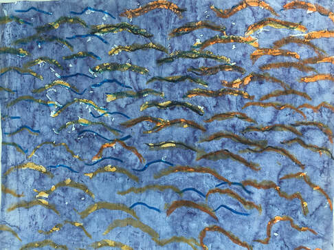
A3. White tissue paper covered with gesso. Ink.
The next three drawings were made in this sequence, each a response to the previous one:
The next three drawings were made in this sequence, each a response to the previous one:
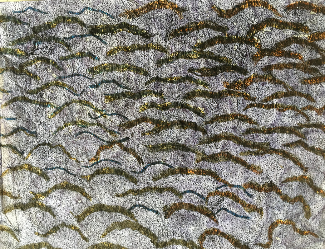
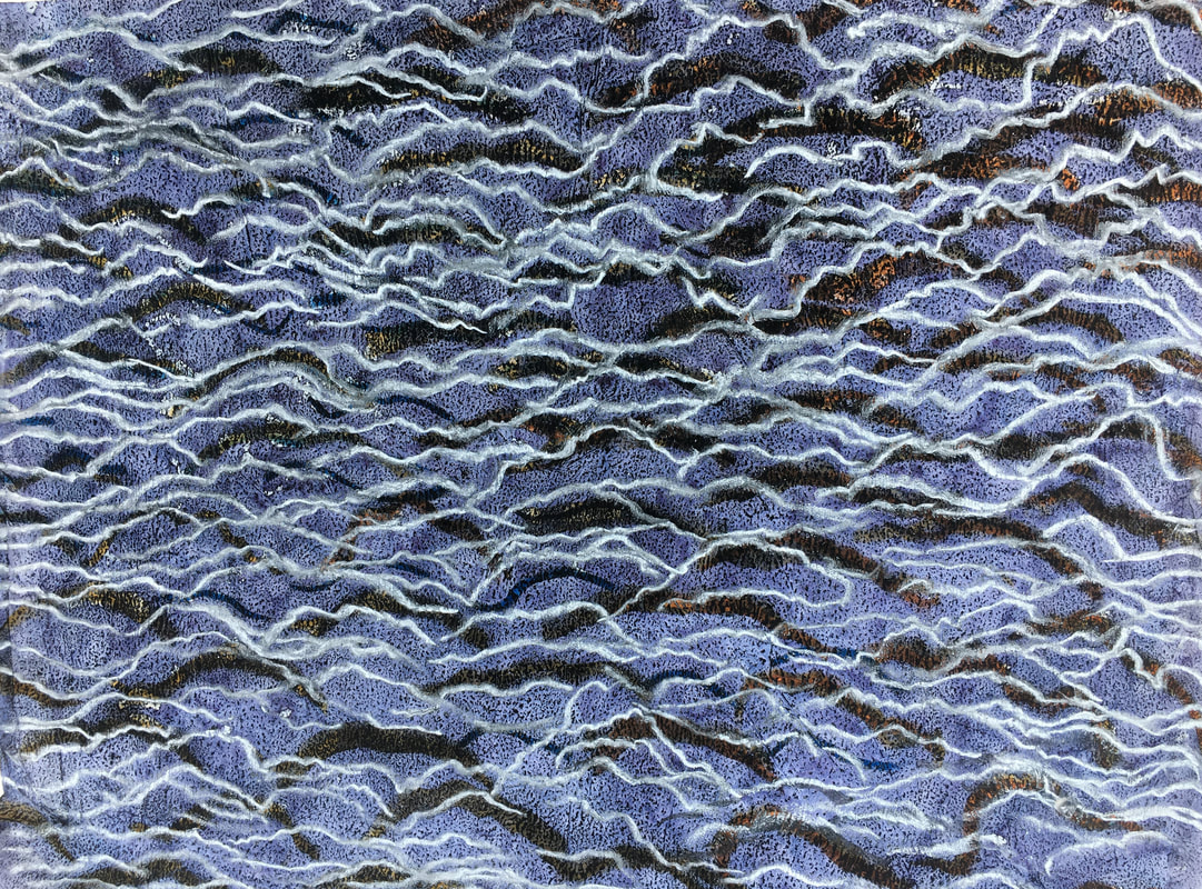
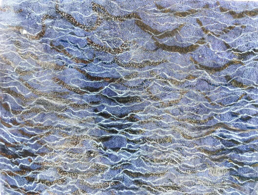
1. 2. 3.
1: Compressed charcoal rubbed into the ink drawing.
2: White chalk pastel marks added.
3: White and brown sticks of chalk pastel used on the side to create some areas of light tone.
I think these all became more interesting than the original drawing due to the addition of tone, line and colour. The white chalk also gave it an illusion of depth in much the same way as the white chalk in the earlier drawing of the echium plant did.
The other drawing had been made during Ex 4.1, when I was experimenting with how the elements affected materials:
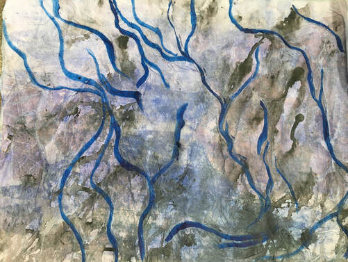
A3 sugar paper with white tissue. Ink.
I covered the sugar paper with a pale blue ink wash, dropped black ink onto this and left it in the rain. The blue ink lines were drawn after it had dried.
As with the previous drawing, the next two were made in response to the one before:
I covered the sugar paper with a pale blue ink wash, dropped black ink onto this and left it in the rain. The blue ink lines were drawn after it had dried.
As with the previous drawing, the next two were made in response to the one before:
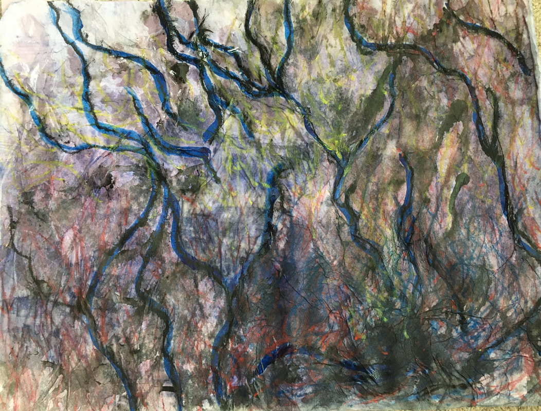
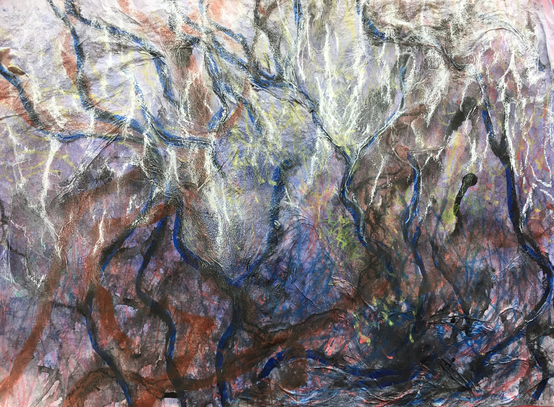
1. 2.
1: Water added to original drawing. Compressed charcoal and water soluble pencils.
2: Diluted red ink and charcoal. White chalk pastel added when dry.
As these progressed the drawing began to resemble a wood, and it reminded me of some of Nicholas Herbert's work, which I had researched in my 'Drawing Skills' course last year:
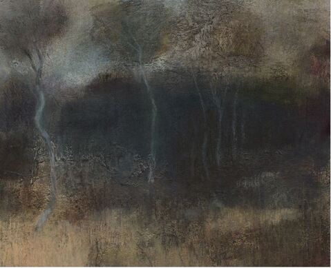
Nicholas Herbert. 2020. Chobham Common, Winter. Mixed media: graphite, soluble crayon, acrylic, conte crayon, pastel on white paper.
https://nicholasherbert.wordpress.com (Accessed 08/04/21)
Nicholas Herbert's mixed media landscapes are very subtle, tonal compositions. They are evocative and atmospheric, with sometimes only the slightest suggestion of form.
https://nicholasherbert.wordpress.com (Accessed 08/04/21)
Nicholas Herbert's mixed media landscapes are very subtle, tonal compositions. They are evocative and atmospheric, with sometimes only the slightest suggestion of form.
Review of Part 4:
Demonstration of technical & visual skills.
I explored a wide range of dry and fluid media, experimenting with combinations of water and oil based materials using a range of different techniques. Following my tutor's suggestion, I continued to combine both two and three dimensional work and to explore the interaction between the two. I learned that sometimes, interesting composition can result from processes where the media behaves naturally, with little further intervention, and that the composition of 3D work can change and become dramatically more interesting from a simple change of position. In Ex 4.3 I found the quick, spontaneous drawing quite challenging, and outside my 'comfort zone.' For this reason I incorporated some spontaneous drawing in my sketchbook work, and have made a mental note to keep practising it.
Quality of outcome.
I think the content of part 4 was quite varied throughout, and I feel I was able to develop Ex 4.1 in the work of the assignment My knowledge and understanding of media and materials increased as I worked.
Demonstration of creativity.
I found the whole of part 4 to be mainly about experimentation, imagination, and discovering which process I felt most drawn to and wanted to develop. I think I was most experimental and imaginative in Ex 4.1 and the assignment, as well as in some of the sketchbook work. I was pleased with the 3D construction for the assignment, because I think it was a good vehicle to present the 2D drawing in a structural composition. This was an interesting indication of how my personal voice may develop. I tried to apply imagination and creativity to Ex 4.2 as well, although I found this harder work.
Context.
I found the work of Bernard Cohen and Daniel Zeller especially inspirational for Ex 4.2, and John Wolseley and Mark Tobey inspiring for the work of the assignment. Retrospectively, some of the artists suggested for research by my tutor relating to part 3 were also very relevant; Richard Deacon for his exploration of contradictions and opposites in 3D work, and Richard Wilson for his 20:50 installation, and in particular, Michael Glover's review of it in 'The Independent' on 18/01/10. I have tried to reflect on the results of my experiments, to improve my critical thinking, and to document it as clearly as possible.
Reflections on tutor feedback from part 4.
Main points:
- Working back into drawings and pushing them further has produced some good results.
- I have noticed that I really enjoy the process of responding to a drawing in this way.
- The drawing made by jumping, whilst holding charcoal & pastels is interesting.
- I will try and think of other drawings that can be done using movement in this way. I liked this drawing, and found it fascinating that it seemed to contain the energy that it took to make it.
- Think about the speed of different processes - speeding up or slowing down could achieve different effects, which would be interesting to compare.
- Most of my work is fairly slow and considered, so it would be useful to think about processes that are quick and/or out of my control.
- Be aware of the possibility of becoming so involved with the material processes that they 'lose their anchor in the world', so use your sketchbook work to investigate line, gestures, shapes and forms of your subjects.
- Building structures to draw has resulted in some interesting work. Think about light with the 3D structures - creating holes in them to let light through, also, lighting them to create shadows.
- This is inspiring, because I was surprised at the exciting work the 3D structures I made in part 4 generated. Although it is sometimes difficult to solve the practical problems of actually making the structures, they invariably facilitate different ways of seeing and drawing, which wouldn't have happened without the structures. I think the 'movement' drawings are similar in that I think it would be difficult to arrive at them in any other way.
- Think about building a glossary of terms that are relevant to your personal voice: 'layering', 'nature', 'depth', 'process' - for example. This may help you to recognise these qualities in the work of other artists as well.
- I have already begun to do this in my head, and writing them down will help to clarify them.
- Think about either making short films or photographing your work in stages. This can be especially helpful for illustrating practice.
- This would be especially useful for some of the work where I draw back into old drawings, or add several layers, as well as with 3D constructions.
- Therese Oulton, for her oil paintings.
- Eva Hesse, for her sculpture.
- Anthony Caro - in particular, his sculptures constructed to sit on tables, and extend below them.
Throughout part 4 I tried to 'go with the flow' of the work - to go on a journey with it and see where it led me, without a clear idea of the end result. This involved making decisions and assessments about what I thought was working and what wasn't, which seems like a very instinctive process. During this part I believe I came a step closer to understanding what my 'personal voice' may be. I was extremely encouraged by my tutor's feedback, and look forward to part 5.
