Part 3.
Drawing in three dimensions.
Ex 3.1: Constructing a drawing.
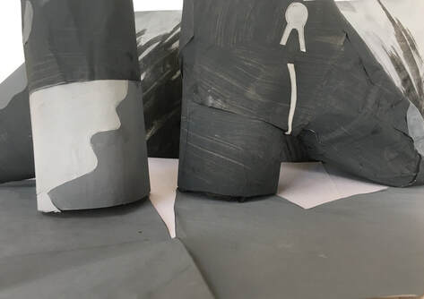
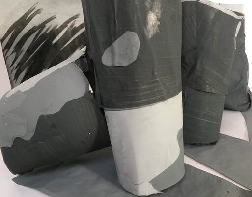
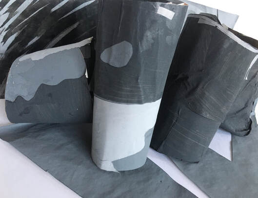
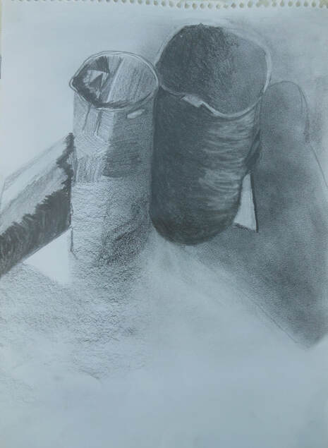
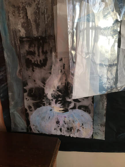
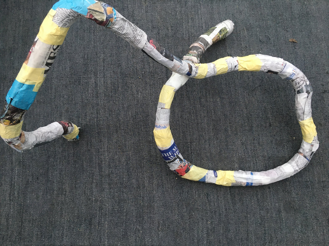
Making a spatial construction of either of the collages I had made in Ex 2.2 was quite a daunting prospect, because the shapes were quite complex, however I decided to use the collage of the boots, rather than the one of the stile. I struggled to imagine how to make a construction of them by using card, so my first attempt was to try making a papier mache construction. When I tried attaching the three tonal areas of grey to this, using painted paper, I realised that I had fallen into the trap of creating a three dimensional drawing that was as complex as the collage itself, and the remit for this exercise was about simplification and abstraction.
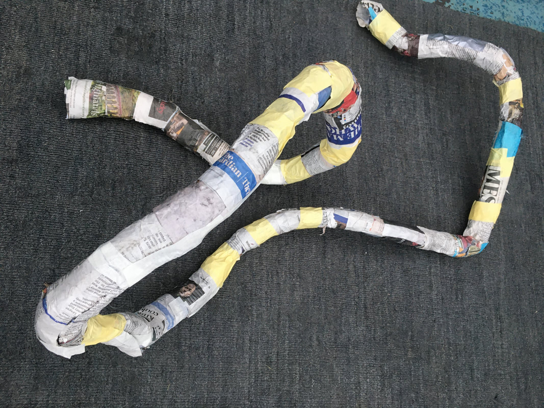
So I tried a different way of 'lifting the drawing out', and constructed some models, mainly composed of cylindrical shapes, to try and replicate the shapes of the boots, attaching the shapes together with masking tape. Then I found some thin card to paint the three different tones of grey, and applied them to the construction using PVA.
Drawing in three dimensions.
Ex 3.1: Constructing a drawing.
Making a spatial construction of either of the collages I had made in Ex 2.2 was quite a daunting prospect, because the shapes were quite complex, however I decided to use the collage of the boots, rather than the one of the stile. I struggled to imagine how to make a construction of them by using card, so my first attempt was to try making a papier mache construction. When I tried attaching the three tonal areas of grey to this, using painted paper, I realised that I had fallen into the trap of creating a three dimensional drawing that was as complex as the collage itself, and the remit for this exercise was about simplification and abstraction.
So I tried a different way of 'lifting the drawing out', and constructed some models, mainly composed of cylindrical shapes, to try and replicate the shapes of the boots, attaching the shapes together with masking tape. Then I found some thin card to paint the three different tones of grey, and applied them to the construction using PVA.
Reflection:
How accurate were you able to be in capturing the tonal relationships?
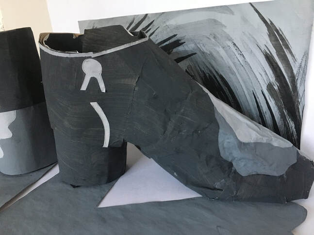
I think the collage from Ex 2.2 has more extreme tonal contrast than the 3D construction, because it had some large areas of black contrasting directly with the white of the table, and the dark grey of the construction didn't provide such a strong contrast. However, using just the three different tones, I think I was able to capture the tonal relationships from the collage fairly accurately, especially in the boot on the left.
How do you feel when you look at the photo of the 3D construction next to your drawing?
Although I found this a difficult exercise because of the practicalities of constructing complex shapes using card, I feel excited about the possibilities of investigating the subject further through different techniques and media.
What do I feel worked well, and why?
Despite initial difficulties, I feel I was able to make a spatial construction that succeeded in 'lifting out' the drawing from the collage.
The left hand boot was more successful in its simplification and abstraction than the right, because it was more easily constructed using simple cylindrical shapes.
Through careful observation of the collage, the tonal relationships of the construction worked quite well.
What worked less well, and why?
I was less satisfied with the right boot in the spatial construction than with the left, because I felt it looked too much like a direct copy of the collage, instead of a simplification or abstraction. This was because it was a more difficult shape to work with, and consequently more difficult to build in 3D.
I felt the pieces I cut for the shadows cast by the boots were not as accurate as they had been in the collage. I think this was because the construction itself was less accurate, and the shadows were, literally, a reflection of that.
Were there any surprises or 'happy accidents'?
I was surprised at how this process, despite its difficulty, resulted in feelings of potential and inspiration for further exploration.
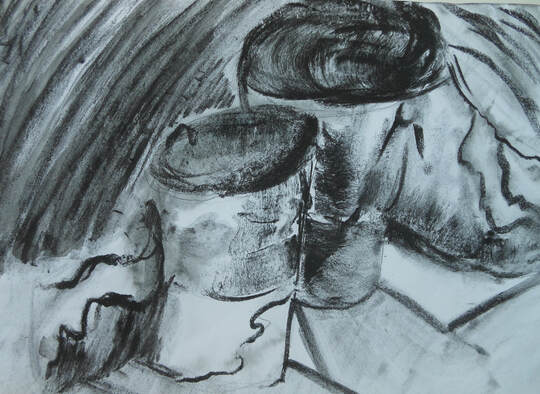
Ex 3.2. Back to two dimensions.
The focus of this exercise was to make a drawing directly from observation of the 3D drawing constructed in Ex 3.1, but first, to make some interesting sketchbook drawings of it.
I began with these two A4 drawings:
How accurate were you able to be in capturing the tonal relationships?
I think the collage from Ex 2.2 has more extreme tonal contrast than the 3D construction, because it had some large areas of black contrasting directly with the white of the table, and the dark grey of the construction didn't provide such a strong contrast. However, using just the three different tones, I think I was able to capture the tonal relationships from the collage fairly accurately, especially in the boot on the left.
How do you feel when you look at the photo of the 3D construction next to your drawing?
Although I found this a difficult exercise because of the practicalities of constructing complex shapes using card, I feel excited about the possibilities of investigating the subject further through different techniques and media.
What do I feel worked well, and why?
Despite initial difficulties, I feel I was able to make a spatial construction that succeeded in 'lifting out' the drawing from the collage.
The left hand boot was more successful in its simplification and abstraction than the right, because it was more easily constructed using simple cylindrical shapes.
Through careful observation of the collage, the tonal relationships of the construction worked quite well.
What worked less well, and why?
I was less satisfied with the right boot in the spatial construction than with the left, because I felt it looked too much like a direct copy of the collage, instead of a simplification or abstraction. This was because it was a more difficult shape to work with, and consequently more difficult to build in 3D.
I felt the pieces I cut for the shadows cast by the boots were not as accurate as they had been in the collage. I think this was because the construction itself was less accurate, and the shadows were, literally, a reflection of that.
Were there any surprises or 'happy accidents'?
I was surprised at how this process, despite its difficulty, resulted in feelings of potential and inspiration for further exploration.
Ex 3.2. Back to two dimensions.
The focus of this exercise was to make a drawing directly from observation of the 3D drawing constructed in Ex 3.1, but first, to make some interesting sketchbook drawings of it.
I began with these two A4 drawings:
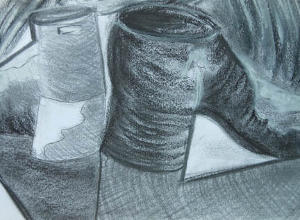
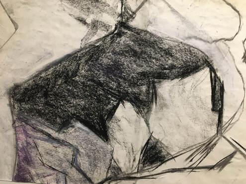
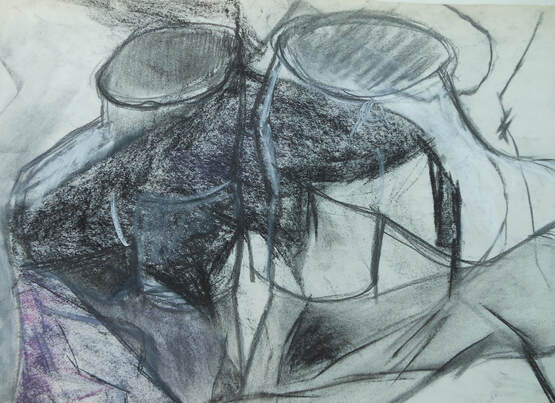
Top drawing: graphite, charcoal, fine liner pen, white chalk pastel.
Bottom drawing: Ink and charcoal on damp paper.
I think the second of these is more interesting, because there is more tonal contrast. I enjoy working with charcoal on damp paper, because I find it frees my drawing up, and usually enables me to produce interesting marks because I'm less concerned about accuracy and likeness.
I remembered from part 1 that I had enjoyed the technique of drawing into areas of tone, especially before they had completely dried:
A3. Acrylic and ink. Compressed charcoal and white chalk pastel used to draw into the acrylic and ink before dry.
At this point I was beginning to feel a bit bored with the subject. I felt there was much more to explore, but I was struggling to think of interesting ways to draw it. In thinking about how to move forward I remembered a comment my tutor had made in his feedback for part 2: 'Try and remember how it felt when you made some of the best work'. I thought back to the monoprints I had done in part 2, and remembered that it had felt exciting, experimental, enjoyable, unplanned and intuition-led to make these. Then I thought about the materials and techniques I really enjoy, such as mono-printing, drawing into damp and wet surfaces, drawing into other drawings, and using graphite powder and charcoal as a base for drawings 'in reverse'. This unlocked some more creative solutions to the problem of 'making some interesting drawings' of the 3D structure:
At this point I was beginning to feel a bit bored with the subject. I felt there was much more to explore, but I was struggling to think of interesting ways to draw it. In thinking about how to move forward I remembered a comment my tutor had made in his feedback for part 2: 'Try and remember how it felt when you made some of the best work'. I thought back to the monoprints I had done in part 2, and remembered that it had felt exciting, experimental, enjoyable, unplanned and intuition-led to make these. Then I thought about the materials and techniques I really enjoy, such as mono-printing, drawing into damp and wet surfaces, drawing into other drawings, and using graphite powder and charcoal as a base for drawings 'in reverse'. This unlocked some more creative solutions to the problem of 'making some interesting drawings' of the 3D structure:
A3. Graphite.
I enjoyed this drawing, and like it compositionally because the shapes and lines feel well balanced. As it progressed it began to feel more like a drawing of two tall buildings.
I enjoyed this drawing, and like it compositionally because the shapes and lines feel well balanced. As it progressed it began to feel more like a drawing of two tall buildings.
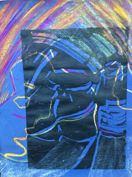
A3. Monoprint and chalk pastels on blue sugarpaper.
I started this by drawing some of the main lines of the composition in bright pastels. When I did the monoprint over this I was surprised at the effectiveness of the bright yellow and purple marks showing through the spaces.
I started this by drawing some of the main lines of the composition in bright pastels. When I did the monoprint over this I was surprised at the effectiveness of the bright yellow and purple marks showing through the spaces.
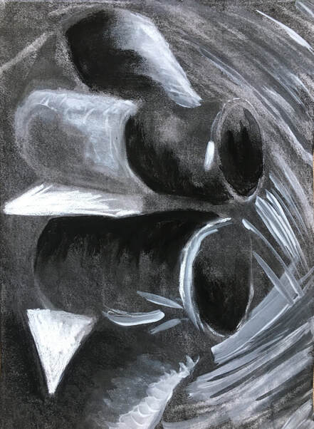
A3. Charcoal, white acrylic, ink, white chalk pastel.
I decided this composition was more interesting in portrait format. I covered the cartridge paper in charcoal to form a base, then did a drawing 'in reverse' using a rubber, and added the paint, ink and chalk afterwards, to accentuate tonal change.
I decided this composition was more interesting in portrait format. I covered the cartridge paper in charcoal to form a base, then did a drawing 'in reverse' using a rubber, and added the paint, ink and chalk afterwards, to accentuate tonal change.
This is part of an old drawing of flint, which I thought would make a good support for a drawing of the 3D structure:
22 X 15 in. Charcoal and chalk pastel on newsprint.
My instinct was that a fairly quick, uncomplicated line drawing which was in sympathy with the existing marks and tones of the old drawing would work. I like the result because I think the two drawings are complimentary, and the line and tone work together well. It also has the qualities of transparency and reflection, which make it more interesting. I enjoyed doing this drawing, and it is a technique I would like to develop further.
My instinct was that a fairly quick, uncomplicated line drawing which was in sympathy with the existing marks and tones of the old drawing would work. I like the result because I think the two drawings are complimentary, and the line and tone work together well. It also has the qualities of transparency and reflection, which make it more interesting. I enjoyed doing this drawing, and it is a technique I would like to develop further.
A4 cartridge paper. Ink, acrylic covered with gesso; graphite powder, charcoal and white chalk pastel.
This was the first of several experiments with ink, acrylic, charcoal, graphite, and gesso. I have included more in Sketchbook work. I used the acrylic and ink first, to establish areas of tone, then painted over this with white gesso when dry. Before the gesso dried completely, I used a small palette knife to draw into it, which revealed the tonal areas underneath. I discovered that the gesso dried very quickly, however, and the paper began to tear in places when I used the palette knife, but I thought this technique had potential, so I explored it further.
This was the first of several experiments with ink, acrylic, charcoal, graphite, and gesso. I have included more in Sketchbook work. I used the acrylic and ink first, to establish areas of tone, then painted over this with white gesso when dry. Before the gesso dried completely, I used a small palette knife to draw into it, which revealed the tonal areas underneath. I discovered that the gesso dried very quickly, however, and the paper began to tear in places when I used the palette knife, but I thought this technique had potential, so I explored it further.
A4. Ink, acrylic & 8B graphite covered with white gesso, drawn into with palette knife.
This is a more successful experiment than the previous one, because the graphite was a better base for the gesso, and I also worked more quickly, so that the gesso didn't dry out too quickly to be scraped away. This technique is very dependent on timing!
I liked these results, and decided to make a final drawing for Ex 3.2 using this technique:
Ex 3.2. A2 cartridge paper. Ink, acrylic graphite, white gesso.
Using the same technique of drawing into the gesso with a palette knife to reveal the tonal areas drawn with ink, acrylic and graphite underneath produced an evocative, atmospheric drawing. The gesso had dried a little too quickly, which was probably the result of trying to dry the ink more quickly with a heater which made the paper warm, - but this impatience was the result of my excitement and anticipation about the outcome! However, it meant that I wasn't able to achieve quite the same depth of tone as I had in the previous drawing, so I added charcoal, white chalk pastel, and graphite powder in some areas to achieve darker tones.
What do I feel worked well, and why?
I like this A2 drawing, and looking at it beside the collage from Ex 2.2, I think I prefer it because it is atmospheric and textural. The technique of drawing into the gesso with a palette knife has produced some interesting marks and lines, and this, together with the tonal changes, seem to give the impression of the subject being in bright sunlight, or moonlight.
What worked less well, and why?
The gesso drying too quickly, with the result that drawing into it achieved less tonal change than I was hoping for, especially in the background area. The addition of graphite powder, charcoal and pastel to improve this had limited success. However, I don't think this result was entirely disappointing, because perhaps the more muted tones add to the evocative feeling? Compositionally, I prefer the collage drawing from Ex 2.2 because the forms work better together, but the A2 drawing for Ex 3.2 was of the 3D construction, rather than of the actual boots, hence I think this was inevitable.
Were there any surprises, or happy accidents?
I was pleasantly surprised at the atmospheric results of using the technique of drawing into wet gesso.
What would I do differently?
I would allow the ink and acrylic to dry naturally, before applying the gesso, so that it didn't dry as quickly.
I would experiment more with drawing the construction from other angles. I am intending to experiment further with this in my sketchbook work however.
Collage, 3D construction, and A2 drawing of construction.
Reflection:
Which drawing do you prefer?
Of all three, I prefer the A2 drawing, because of its atmospheric feel, and its textural marks. I find it a more interesting image to look at than the other two drawings for these reasons.
How has switching back and forth between 2D and 3D supported your understanding of a possible art process that encourages experimentation, investigation and development?
Working in 2D from the 3D drawing inspired a lot of experimentation for me. I think this was because the drawing became more abstract when I was making a drawing of the 3D construction, and the pressure I had felt to produce a realistic representation of the subject when making the 2D collage in Ex 2.2 was no longer present.
I felt a greater sense of freedom, which led to more investigation.
How has your understanding of drawing as a discipline been informed by the course so far?
My understanding of drawing has developed since I began the course in that I now understand that any media can be used, on any surface, using any technique to produce either two dimensional or three dimensional work. Drawing that is interesting and/or different need not be produced by using media in the conventional ways, but media, materials and techniques can be used in any combination to explore a subject, an idea, a feeling, or to explore the potential of the media itself. The element of time is also significant; a 'good' or interesting drawing is not confined to taking a long time to execute, and quick spontaneous marks can be as interesting as meticulous drawing that takes a long time. Emotions are important, and can affect a drawing; I have experienced both boredom and enjoyment being evident in some of the work I have done. Learning from, and gaining inspiration from other artists is important, and can lead to new and unique work.
This course is about experimentation and discovery, which I understand as a way of increasing and improving my 'toolkit' with which to work, and a way of beginning the process of discovering recurring themes in my work, which will eventually lead to finding my 'personal voice.'
Ex. 3.3:Affecting the way a space is experienced.
My initial idea for this exercise was to use the bathroom to construct an installation, but I subsequently decided that this space was too limited. The main idea I had before moving on to work in a different space, was to make a giant chain for the bath plug, using black bin bags:
A4 sketch for the idea.
Giant plug chain made from linked bin bags.
After thinking about the rooms and spaces I had to work with, I finally decided to use the hallway, which is a long narrow space with five doors leading off it. I tried to plan some ideas, but found the best way to tackle this exercise was to collect some materials and start trying out ideas.
After thinking about the rooms and spaces I had to work with, I finally decided to use the hallway, which is a long narrow space with five doors leading off it. I tried to plan some ideas, but found the best way to tackle this exercise was to collect some materials and start trying out ideas.
A4 sketch for an idea, using rope and tape.
I tried to get a combination of straight and curved lines. This became more interesting when lit from underneath, because the shadows on the walls and ceiling added to the installation.
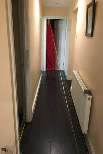
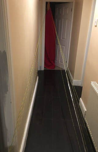
The idea of this was to try to create a long, narrow pathway down the centre of the hallway, by attaching nylon cord to a low point at one end, and stretching it up to a high point at the other end. This didn't work as well as I had hoped because there wasn't enough contrast between the colour and tone of the cord, and the walls. Consequently it wasn't as visible as I hoped. If I tried this idea again I would find some darker material to work with.
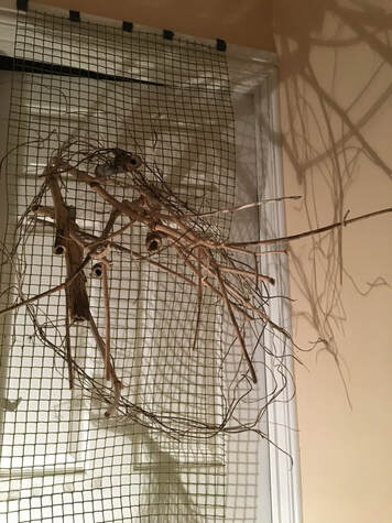
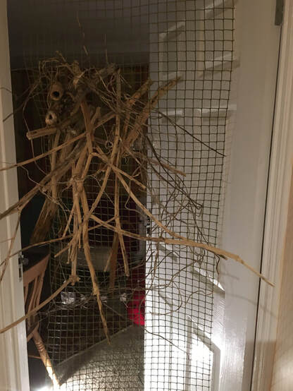
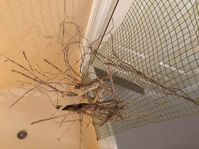
This is constructed by fastening dried stalks of hemlock into a plastic mesh, which is suspended from a doorway. I thought this idea worked much better than the previous ones, because the shapes it, and its shadows, created were more interesting. I tried to make this installation more dramatic by adding colour:
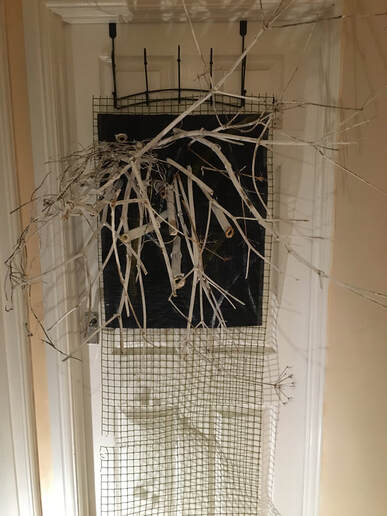
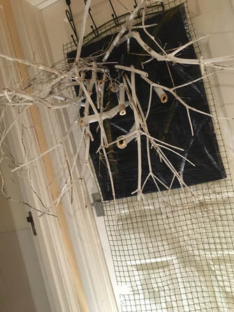
I prefer the dried stalks painted white, against a dark background, but don't think this made a significant difference to the visual impact.
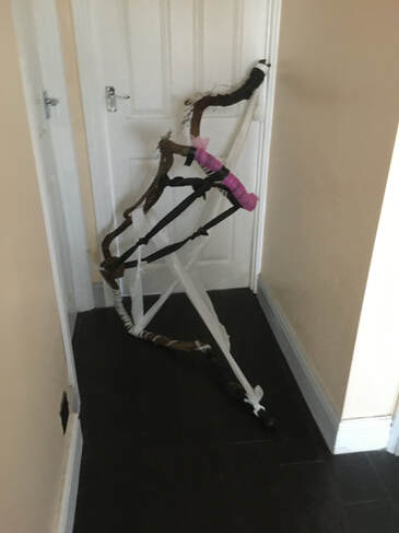
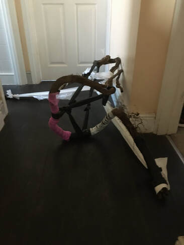
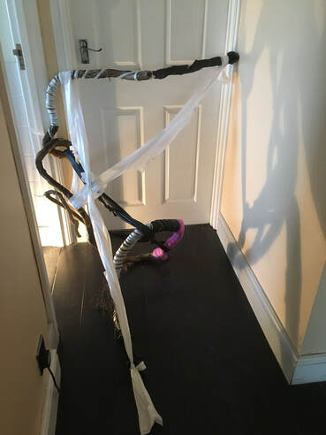
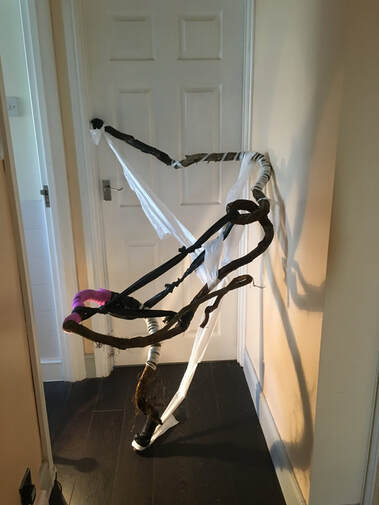
For the next idea I found an old piece of dead ivy, which had grown into a very interesting shape. I used various materials to twist around it, such as black and white bin bags, white tape, and an old shower sponge which had become unravelled.
For the next idea I found an old piece of dead ivy, which had grown into a very interesting shape. I used various materials to twist around it, such as black and white bin bags, white tape, and an old shower sponge which had become unravelled.
I found this exercise a challenge, and struggled to think of ways I might change the perception of the space. This passageway is quite an anonymous space, with no interesting features or furniture - somewhere that is moved through to get from one room to another, with little character of its own. For these reasons, I feel these last two installations have been the most successful. The dried hemlock created a dramatic image, and the ivy an interesting, and I think, beautiful shape in a space which is usually characterised by blandness.
The materials wrapped around the wood emphasized certain areas and angles, adding further interest. I enjoyed finding different views, and think this is the one I preferred:
The materials wrapped around the wood emphasized certain areas and angles, adding further interest. I enjoyed finding different views, and think this is the one I preferred:
What do I feel worked well, and why?
The first idea, using tape, succeeded in creating some interesting shapes, and also in affecting how the space is experienced, as it prevented access to three other rooms. Visually, I prefer the installations using natural, organic materials, because I was able to create more interest with them. As a way of changing how the space is experienced, I think the dried hemlock stalks on the door work well, because they can appear to be growing out of the door, and the dead ivy wrapped with a variety of materials introduces an interesting object into an otherwise bland, characterless space.
What worked less well, and why?
I was disappointed that the second experiment, of trying to construct a long V shaped pathway with nylon cord didn't work as well as I'd hoped. I think this would have been more successful with black tape, or a material which would have created darker lines. I think with the right materials, this idea has the potential to change the way the space is experienced, because it would form a tunnel to walk down, which would grow progressively more narrow.
Ex 3.4: Installing a Drawing.
Site-specific and installation art.
I looked at the work of three different artists in relation to this exercise; Janet Harding, Cornelia Parker, and Julio Le Parc.
Janet Harding's site specific installation entitled 'Flow' was described as 'elemental', and was created to be experienced outside, in the elements, which inevitably changed and affected it. See fig 1.
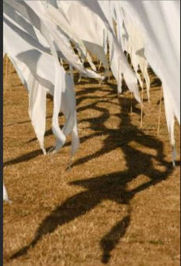
Fig 1. Janet Harding. Flow. Site specific installation.
https://www.bing.com (Accessed 28/12/20)
I was interested in this site specific installation because the shadows and reflections are very much part of the whole, and I am thinking about making shadow and reflection the main focus of exercise 3.4. Although the drawing I will make will not be as directly affected by the elements as this is, light and the time of day will inevitably affect the way it is experienced.
I was curious to discover more of Janet Harding's work, and discovered that much of her work in mixed media has an ethereal, translucent quality, which is reminiscent of the temporary, shifting nature of shadows and reflections. See figs 2 and 3.
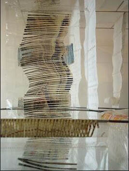
Fig 2. Janet Harding. Detail from installation, Outer and Inner constant. Mixed media in steel cube.
www.janetharding.co.uk
www.janetharding.co.uk
Fig 3. Janet Harding. detail from Artemis and Acteau. Oil.
www.janetharding.co.uk
Cornelia Parker's installation 'Cold Dark Matter: An Exploded View' also uses shadow and reflection as an important part of the whole. See fig 4.
www.janetharding.co.uk
Cornelia Parker's installation 'Cold Dark Matter: An Exploded View' also uses shadow and reflection as an important part of the whole. See fig 4.
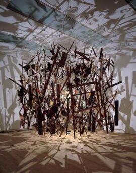
Fig 4. Cornelia Parker. 1991. Cold Dark Matter: An Exploded View. Wood, metal, plastic, ceramic, paper, textile and wire. 4000 X 5000 X 4000 (unconfirmed).
https://www.tate.org.uk/art/artworks/parker-cold-dark-matter-an-exploded-view-t06949. (Accessed 28/12/20)
This installation is composed of the reassembled contents of an exploded garden shed, which have been suspended from the ceiling and lit from inside by a light bulb.
Although this is a three dimensional construction, it doesn't have the solidity of a traditional sculpture, and is more concerned with disintegration, transition and change than with solidity. This quote from Cornelia Parker describes her motivation for creating the piece:
'I've never made a solid sculpture; I am more interested in the space with and around the mass, in atmosphere.'
There are some parallels between the work of these two artists in that both Janet Harding's 'Flow', and Cornelia Parker's 'Cold Dark Matter: An Exploded View' are as much about the space around the objects, and the shadows cast by the objects, as they are about the objects that the installations are composed of.
Argentinian artist Julio Le Parc's kinetic installation, 'Continual mobile, continual light' was a different source of inspiration. See fig 5.
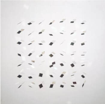
Fig 5. Julio Le Parc. 1963. Continual mobile, continual light. Painted wood, aluminium and nylon thread. 1575 X 1600 X 505mm.
https://www.tate.org.uk/art/artworks/le-parc-continual-mobile-continual-light-t00678 (Accessed 28/12/20)
This installation is made up of mirror-plate squares suspended on thread, which move and create shadows against a white background. Le Parc stated that the work should be kept in motion, because he wanted to break away from the idea of static, definitive artwork, and to explore ideas of movement and instability. There is another parallel here with the installation by Janet Harding, which was created in the open air, and subject to change and instability.
For Ex 3.4 I choose a corner of the living room as a space that I have an affinity with. Firstly, it is adjacent to the conservatory, where at certain times of the day, light floods through and casts shadows on the wall, which change as the sun moves round. My main motivation was the challenge of making a site specific installation for this space which focussed on the shadows and reflections, but another reason for choosing it was because it is the home of an antique oil lamp, which belonged to my mother.
I began with some quick sketches of the space:
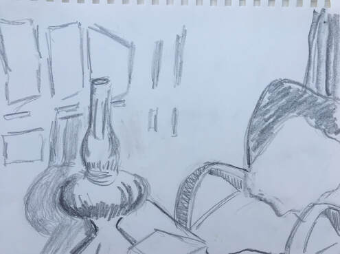
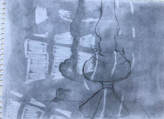
A4. Graphite.
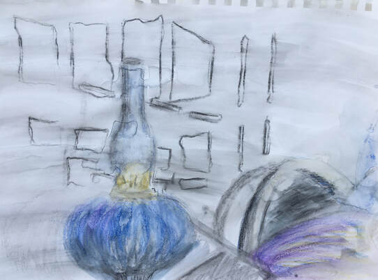
A4. Water soluble pencils
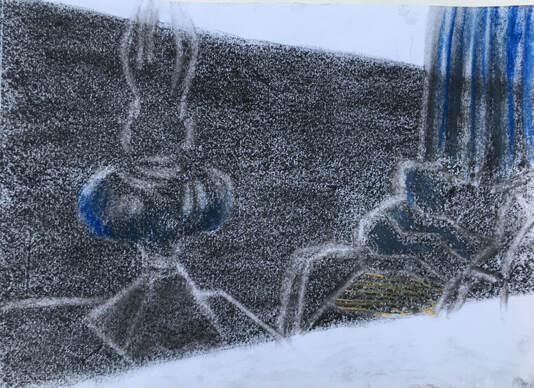
A3. Charcoal, chalk pastel, rubber.
I was beginning to think about the shape of the drawing, and this was based on the direction of the light coming through panes of glass in the door.
I was beginning to think about the shape of the drawing, and this was based on the direction of the light coming through panes of glass in the door.
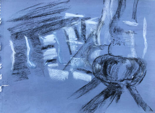
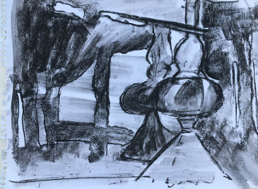
A3. Charcoal and white pastel on blue ink wash.
As these sketches progressed, the lamp and the shadows seemed to grow more important, and other objects, such as the chair, curtain and book, seemed less important.
As these sketches progressed, the lamp and the shadows seemed to grow more important, and other objects, such as the chair, curtain and book, seemed less important.
A4. Graphite, rubber, fine liner pen.
A3. Compressed charcoal on wet paper.
Having decided that the main focus of the drawing should be the shadows and reflections, along with the oil lamp, I decided to do the final drawing on a large scale because I felt this would work well for the the technique I wanted to use to depict the shadows:
Having decided that the main focus of the drawing should be the shadows and reflections, along with the oil lamp, I decided to do the final drawing on a large scale because I felt this would work well for the the technique I wanted to use to depict the shadows:
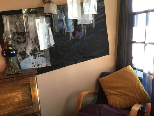
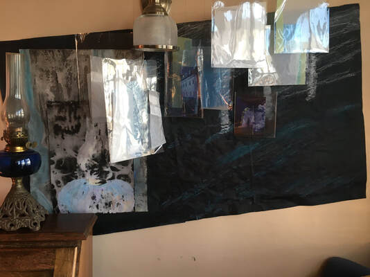
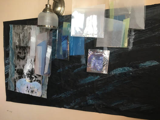
Ex 3.4. 51 X 29 in (130 X 74 cm) Support: acrylic, ready-mix paint, ink. A2 drawing of lamp: gouache, indian ink. Reflections: cellophane pockets, tissue paper, and magazine cuttings.
I covered A1 newsprint sheets with a dark blue acrylic wash, and taped them together when dry. Later, when the different elements of the composition had been added, I felt the dark support was too strong, so added some pale blue and white marks to indicate shadows, using diluted acrylic and ink.
Then I made the reflections and shadows by putting combinations of white and pale yellow tissue, blue freezer bags, and cuttings from magazines inside the transparent pockets, before suspending them from the ceiling to drop at different lengths in front of the dark blue background.
To make the drawing of the lamp, I used the technique of gouache paint on cartridge paper, covered with indian ink, and washed off before completely dry. As I wasn't entirely happy with the A2 image I made of the lamp, I superimposed an A3 drawing, using the same technique of gouache and indian ink, on top of it, which I felt had been more successful.
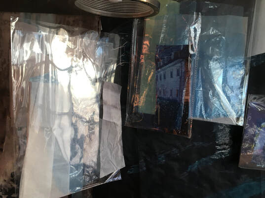
Ex 3.4 Detail.
Ex 3.4 Detail.
Reflection:
How does your drawing relate to the research you did?
I wanted to achieve an atmospheric quality in this installation, and was influenced by the work of Janet Harding and Cornelia Parker specifically through their use of shadow and reflection. Janet Harding's painting was also influential in this respect, because of the translucent, evocative nature of her work, which I tried to achieve through the use of gouache and indian ink in drawing the lamp as well as using the transparent cellophane and delicate colours of the tissue paper for the shadows.
Cornelia Parker,s 'Cold Dark Matter: An Exploded View', and Julio Le Parc's 'Continual mobile, continual light' are both installations composed of suspended materials, which were inspirational from the point of view of constructing the work, especially Le Parc's kinetic installation, as it is composed of suspended reflective materials. These helped me to see how I might represent shadow and reflection.
Which aspects of the room did you find yourself responding to? Was it the space itself, or the story of its usage?
I responded more to the space itself because of the interesting light, reflections, and shadows, but combined with this, I responded to the emotional connection with the lamp.
What do I feel worked well about this and why?
I think using the transparent cellophane pockets in conjunction with tissue paper, blue freezer bags, and magazine cuttings worked well to represent the shadows and reflections, especially when the shadows made by strong sunlight at certain times of the day are also present, and become part of the installation.
The drawing of the lamp seems to work well with this, because the technique of gouache and washed indian ink produces marks that give the illusion of transparency.
I think the scale works for a site specific installation in this position.
I decided to mount the drawing at a slight angle, in keeping with the direction of the shadows, and when seen from a distance, I think this works well.
The colours work well for the location within the room.
What do I feel worked less well, and why?
I felt strongly that it needed a dark background, to provide a dark tone behind the transparent pockets with their contents to project them forwards. I felt this was too dark, however, and resulted in a 'dead' area in the bottom right corner, which I tried to mitigate by adding marks to denote shadows. I think this improved it a little, but I wasn't completely happy with it.
I made an A2 drawing of the lamp using the gouache and washed indian ink technique, but wasn't happy with the result because it didn't contain enough tonal change - hence I superimposed the A3 drawing which had more tonal variety over the A2. This technique is quite difficult to do on larger sized paper, because it is dependent on timing, and I think the paint had dried too much before the ink was applied on the A2 drawing.
What would I do differently?
Experiment more with different coloured backgrounds, and with the gouache and indian ink technique.
Assignment 3.
Many of the trees I see every day in my local environment are being strangled by ivy, and I discovered this extraordinary piece of dead ivy, which had been cut from a tree:
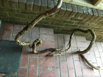
I carried it home, and used it in Ex 3.3. I was so inspired by its form and line, and decided to use it as the subject for this assignment. It was both linear and three dimensional, so presented quite a challenge. I began by trying to identify exactly what made this subject so interesting and attractive to me, and decided that it was the way it occupied space; rising and falling, twisting and turning, advancing and receding. I thought that if I had tried to draw such an interesting line, I wouldn't be able to match the beauty, flow and complexity of this wood.
Research for assignment.
The next thing I needed to consider was how to represent it. I looked to other artists for inspiration. Speaking about abstraction, Frank Stella (b.1936), once said that, 'you could have a sense of an abstract piece flowing along and being part of an action or activity.' This seemed relevant to the subject, especially as it had once been a living organism, and the evidence of its activity when living was still present. Frank Stella's construction paintings were a source of inspiration. See fig 1.
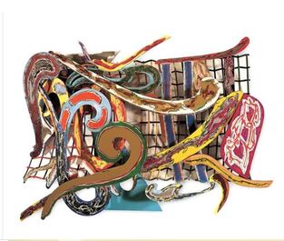
Fig 1. Frank Stella. 1978. Shoubeegi. Enamel, metal, glitter. 243.21 X 330.2 X 82.23cm.
https://www.wikiart.org (Accessed 21/01/21)
This is from Stella's 'Indian and Exotic Bird' series (1978 - 1979).In this series, Stella often used lightweight aluminium combined with glass to create the 3D structures, which he would then paint, or stain. He wanted to minimise the background and create forms that extended outwards into space. From the late 1970s onwards, when Stella moved away from minimalist work, he produced brightly coloured mixed-media structures, such as fig 1. His aim was to eliminate symbolic meaning and illusion, and rely solely on the material work itself for its impact. He is reputed to have said, 'What you see is what you see.'
https://blogs.uoregon.edu
Although I didn't feel I wanted to make this assignment as brightly coloured as Stella's construction paintings, this idea of minimising background to create forms that extended into space, seemed to fit well with the subject I had chosen. I was also hoping to produce a piece of work which was about the line and form of the wood, and the interaction between the different types of line, and I would rely on this, along with colour and scale, to create an impact.
Henry Moore (1898-1986), was another source of inspiration, because he saw form and rhythm in natural objects, as well as in the human form. Moore had a collection of natural objects, such as bones, shells, stones, and wood which often served as inspiration for his figurative work, and his work inspired by organic objects is a demonstration of how the natural processes of growth, death and rebirth create endlessly varied sculpture in the natural world.
'.....There is in nature a limitless variety of shapes and rhythms....from which the sculptor can enlarge his form-knowledge experience.' Henry Moore.
https://www.thelightbox.org.uk/henry-moore-sculpting-from-nature
See fig 2.
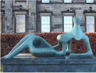
Fig 2. Henry Moore. 1951. Reclining Figure: Festival. Bronze. 228.5cm. Owned by the Scottish National Gallery of Modern Art.
catalogue.henry-moore.org/objects/17371/reclining-figure-festival (Accessed 11/01/21)
In speaking about the importance of space, Moore once remarked, 'A hole can have as much shape meaning as a solid mass.'
https://www.tate.org.uk/art/art-terms/form
This comment really resonated with me and seemed highly relevant to this assignment piece. It helped me to make sense of what I was trying to do. I found the above website very helpful on the subject of 'form', as it outlined how, before the emergence of modern art, form which was based mainly on the human figure, dominated painting. Later the idea that form could be expressive even when used in an abstract way began to grow, and that it could 'refer to the element of shape among the various elements that make up a work.'
Some of the early work of sculptor William Tucker, was also of interest. In the 1970s Tucker used metal and wood to make his 'Beulah' series, which consisted of seven sculptures which were linear, rather than solid structures. See fig 3.
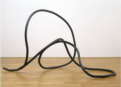
Fig 3. William Tucker. 1971. Beulah i Painted iron. 1511 X 2661 X 1499 mm. https://www.tate.org.uk/art/artworks/tucker_beulah-i-to1818 (Accessed 24/12/20)
In a video on https://www.royalacademy.org.uk/art-artists/name/william-tucker-ra (Accessed 28/12/20), Tucker talks about his later bronze sculptures, saying how he enjoys the 'rich surfaces' that bronze can create, which change continually depending on the light. He explains that these sculptures change as the viewer moves around them, causing you to have to sense them, 'with your body as well as with your eyes.'
I think the same could be said of Tucker's more linear structures; whilst they don't have the same rich surfaces as the solid bronze sculptures, they would certainly change as you move around them. Looking at the wood I have chosen as the subject for this assignment, I have noticed that different negative and positive shapes emerge with just the slightest change of position, and there is a sense of trying to physically feel its movement and shape, as well as trying to see it.
Returning to the https://www.tate.org.uk/art/art-terms/form website, the following quotation was extremely helpful in enabling me to clarify the aim of this assignment:
'In treating or creating form in art the artist aims to modify natural appearances in order to make a new form that is expressive, that is, conveys some sensation or meaning in itself.'
Preparation work for assignment:
I had begun to explore different techniques and media for drawing the wood in my sketchbook work, and my preparation work for the assignment developed this further as I began to explore ways of combining 2D and 3D drawing:
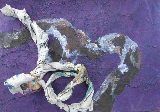
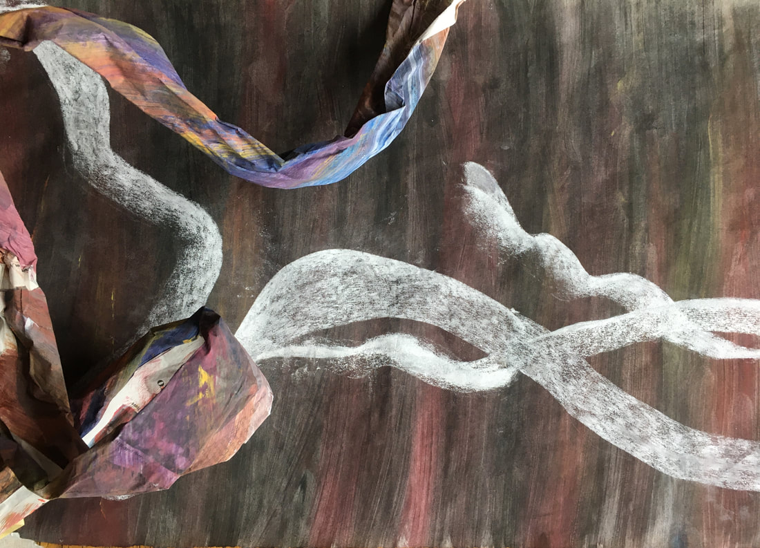
A3. Acrylic, ink, newspaper.
Painted tissue paper stuck to sugar paper, ink drawing, twisted newspaper.
Painted tissue paper stuck to sugar paper, ink drawing, twisted newspaper.
20 X 15in. cartridge paper. Ink wash, charcoal, chalk pastel, newspaper, tissue paper.
This started as a charcoal and pastel drawing over a grey ink wash, and I added the newspaper, partially covered with tissue, to explore the idea of combining 2D and 3D drawing.
This started as a charcoal and pastel drawing over a grey ink wash, and I added the newspaper, partially covered with tissue, to explore the idea of combining 2D and 3D drawing.
A3. Acrylic, ink, newspaper, tissue paper.
Newspaper stuck to sugar paper, painted with white acrylic. Structural line built with newspaper and tissue, and painted with inks.
Newspaper stuck to sugar paper, painted with white acrylic. Structural line built with newspaper and tissue, and painted with inks.
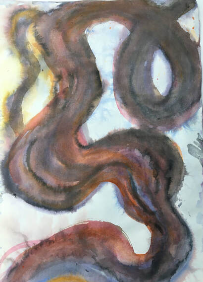
33 X 6in. Compressed charcoal on wet cartridge paper.
Alongside the structural element, I was also thinking about how to draw the wood two dimensionally. This long, narrow support emphasized the linear shape of the wood, and the compressed charcoal on wet paper worked well for achieving the flowing, twisting line.
Alongside the structural element, I was also thinking about how to draw the wood two dimensionally. This long, narrow support emphasized the linear shape of the wood, and the compressed charcoal on wet paper worked well for achieving the flowing, twisting line.
22 X 16in. Acrylic, compressed charcoal, gesso.
I like the results from drawing into wet gesso, and I am in the process of trying to decide which technique will produce a drawing that will work best for this composition. This drawing is done with a plastic ruler, rather than a palette knife, because of its size.
I like the results from drawing into wet gesso, and I am in the process of trying to decide which technique will produce a drawing that will work best for this composition. This drawing is done with a plastic ruler, rather than a palette knife, because of its size.
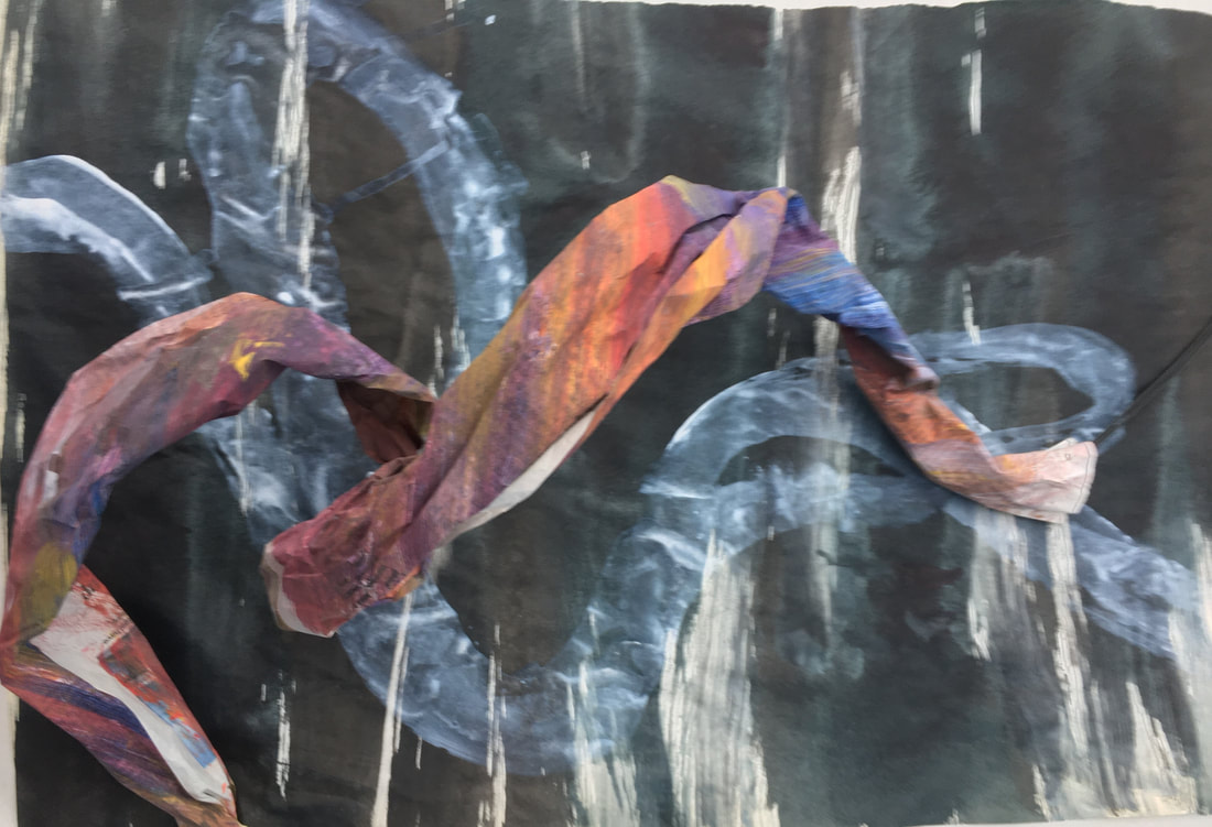
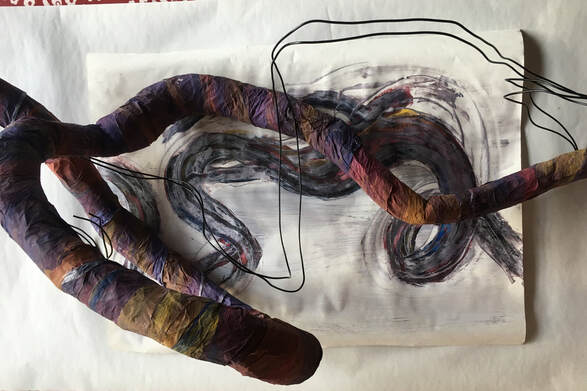
2X A3. Acrylic, ink, white chalk pastel (L). Ink, acrylic (R) with painted newsprint structure.
These were experiments with colour. I thought I wanted the structural element to be blue/purple/orange in colour, so I painted a length of newsprint in these colours, which I then twisted into a shape that could represent the wood, and experimented with different ways of drawing the wood, on different coloured backgrounds and combined them with the coloured structure.
There were several different elements all progressing alongside one another; the media, technique and colour for the two dimensional drawing, the technique and colour of the structural element, the background, and the question of shape and scale. I also wanted to include wire, to introduce another layer of 3D line, but felt this would be added when the other elements had been resolved.
Because they all needed to work together, I found that I had to work on all these aspects simultaneously, rather than concentrate on one at a time. This felt a bit overwhelming at times, but overall, I felt it was gradually falling into place, and moving towards the sort of composition I wanted to make.
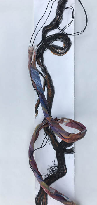
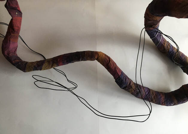
33 X 6in. Above compressed charcoal drawing, with painted, twisted newspaper structure, and wire.
This was an experiment to combine the charcoal drawing with a 3D coloured structure, and wire, to get an idea of how these three ways of drawing the subject might work together.
This was an experiment to combine the charcoal drawing with a 3D coloured structure, and wire, to get an idea of how these three ways of drawing the subject might work together.
The preparatory experiments that I've done using newspaper and tissue paper to make structural representations have helped me to understand that making a 3D construction of the wood that would have the impact I was hoping for would be difficult using these methods. I came to the conclusion that I would need to make a papier mache cast of the wood itself, which I knew would be difficult.
However, armed with PVA, newspaper, and thin bin bags, which I used to wrap around the wood first to ensure that the newspaper wouldn't stick to it, I set about this task. Three days later, using a stanley knife, I removed the cast:
I painted some white tissue paper with acrylic, and applied this in strips to the cast when dry. I was then able to combine it with various drawings, and the wire, to compare the results:
39 X 18in (approx) 3D structure, wire.
39 X 18in (approx) 3D structure, acrylic & gesso drawing, wire.
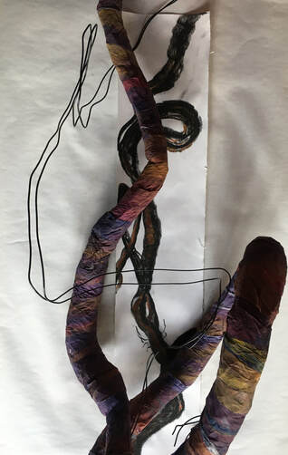
3D structure, compressed charcoal drawing, wire.
After these explorations, I realised that I needed to do more work on the 2D drawing element of the composition. As I liked the compressed charcoal drawing on wet paper, I decided to do a much bigger drawing using this technique.
After these explorations, I realised that I needed to do more work on the 2D drawing element of the composition. As I liked the compressed charcoal drawing on wet paper, I decided to do a much bigger drawing using this technique.
40 X 21in.
This drawing is on lining paper, which didn't work as well as the smaller drawing I had done earlier on cartridge, so I repeated the exercise, using cartridge paper.
This drawing is on lining paper, which didn't work as well as the smaller drawing I had done earlier on cartridge, so I repeated the exercise, using cartridge paper.
50 X 24in.
I preferred this drawing because the colours of the charcoal are more vibrant on cartridge paper, but I didn't feel completely happy with it in conjunction with the other elements of the composition, because it felt too dominant.
I thought about other media and techniques to experiment with, and tried oil pastel:
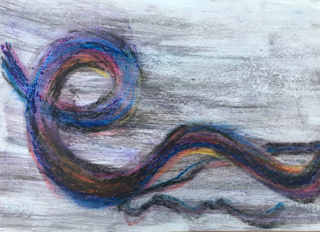
A3. Oil pastel and white spirit.
I liked these colours, but felt oil pastel would be difficult to use on a very big drawing.
At this point I felt I needed to take a step back, and really think about the sort of drawing I wanted to do for this composition, and why. The main focus of it was the line and shape of the wood, and the interaction between the different types of line I was using to draw it. They all needed to work together to produce a composition that I felt was a celebration of the beauty of the wood. The 3D structure was a strong, thick colourful line, and the wire was a much thinner, clean black line, but both seemed quite strong, so I concluded that the 2D drawing needed to be less clear, more subtle and delicate. This led me to explore inks on damp paper:
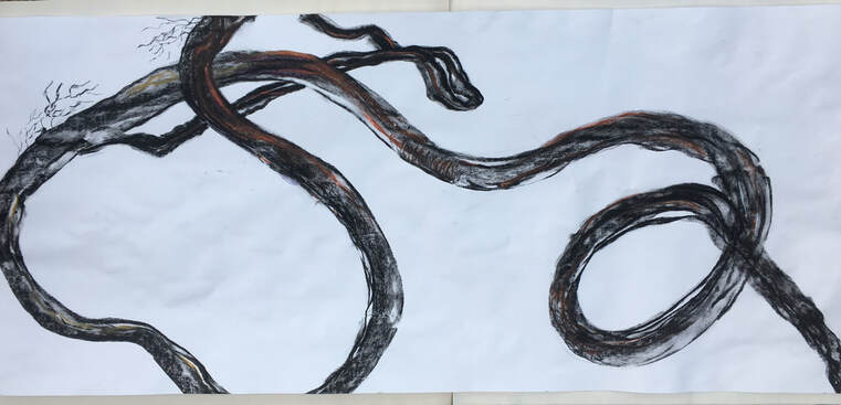
20 X 15in.
This technique felt much better, and was well suited to the flowing, rhythmic nature of the subject. I also felt the colours worked better with the 3D structure than the strong black of the compressed charcoal in the earlier drawing. I combined it with the 3D structure and the wire:
This technique felt much better, and was well suited to the flowing, rhythmic nature of the subject. I also felt the colours worked better with the 3D structure than the strong black of the compressed charcoal in the earlier drawing. I combined it with the 3D structure and the wire:
I felt this combination worked well, because of the contrast in the different types of line. I decided to use this technique for the final drawing:
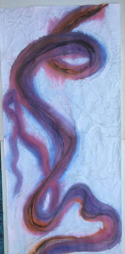
48 X 21in. Ink on wet cartridge paper.
I was happy with this drawing, but not happy with the plain white background, so I added white tissue paper to the background, and applied compressed black charcoal and chalk pastels to it:
I was happy with this drawing, but not happy with the plain white background, so I added white tissue paper to the background, and applied compressed black charcoal and chalk pastels to it:
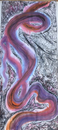
48 X 21in. Ink on wet cartridge paper. White tissue covered with compressed charcoal and chalk pastels.
I felt this drawing would work well with the 3D papier mache construction, and the wire. I mounted the ink drawing on corrugated cardboard, and attached the 3D construction by attaching a small length of wire to the back of it in a few places, then fixing this to the back of the cardboard. Finally, I added the wire:
I felt this drawing would work well with the 3D papier mache construction, and the wire. I mounted the ink drawing on corrugated cardboard, and attached the 3D construction by attaching a small length of wire to the back of it in a few places, then fixing this to the back of the cardboard. Finally, I added the wire:
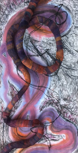
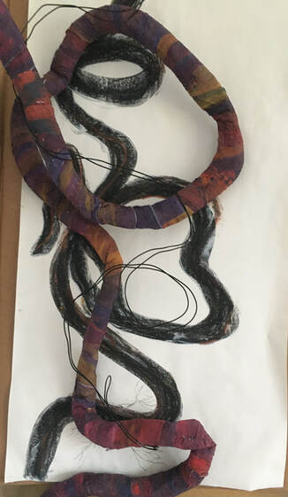
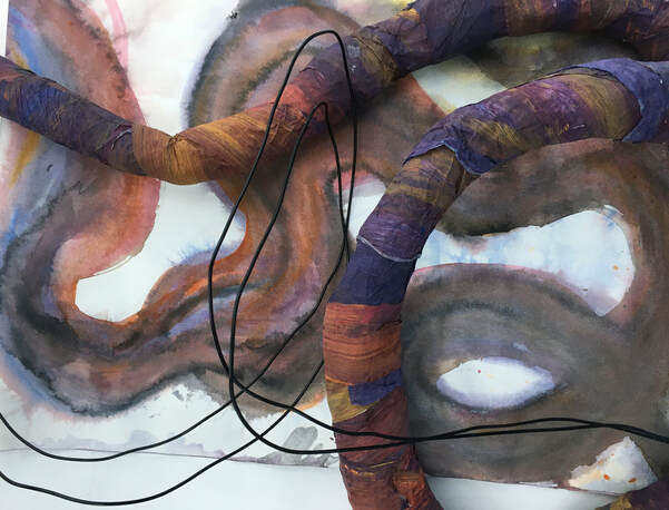
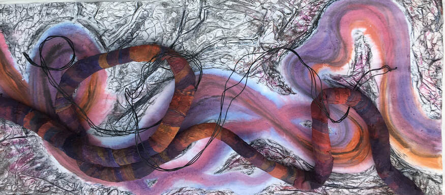
ASSIGNMENT 3
48 X21in.
Ink on wet cartridge paper. White tissue paper, compressed charcoal, chalk pastels, papier mache, acrylic, wire.
48 X21in.
Ink on wet cartridge paper. White tissue paper, compressed charcoal, chalk pastels, papier mache, acrylic, wire.
ASSIGNMENT 3. 48 X 21in.
What do I feel worked well about this assignment, and why?
Scale: I think the large scale works for the subject, because the flowing lines seemed to need 'room to move'.
Line: The three different types of line work well together, and the lines in the textured background add to the movement of the wood.
Colour: I like the colours, and the ink drawing underneath seems to project the darker colours of the 3D structure into the foreground.
Media and materials: The ink drawing on wet cartridge paper works well for the subject, because it captures the flowing lines of the wood. This also contrasts well with the darker tones of the acrylic on the 3D structure. The wire adds another dimension, and fits well with the textured background.
Composition: I think the shapes and the negative space they create form an interesting composition. Referring back to the quotation mentioned earlier about 'form', the new form that has emerged from the natural one seems to have an expression of its own.
What worked less well, and why?
I was pleased with the way the papier mache structure worked, but it wasn't as flexible as I would have liked for capturing some of the more complex twists in the wood.
I was unsure how the wire structure would work until the later stages, and would have liked to make it slightly stronger,
especially because it is similar to the textured background, and merges with it in places.
Were there any surprises, or 'happy accidents'?
I was surprised at the effect of using compressed charcoal over the tissue paper, and really enjoyed the expressive, textural marks this made.
What would I do differently?
This was a real journey of discovery, because I haven't made a piece of work on this scale before, nor combined 2D with 3D drawing. I didn't have a plan, other than to make the work on a large scale, and to use different types of line to create an interesting abstract composition, based on the shapes of the wood. The main thing I might try to do differently would be to explore other ways of constructing the 3D drawing which would allow for more flexibility.
Review of Part 3:
Demonstration of technical and visual skills.
Use of materials and techniques:
I struggled to use the material and technique suggested for Ex 3.1, because of the complexity of the shapes I was trying to build, but other than this exercise, I experimented widely with both wet and dry media, and different techniques throughout part 3. I particularly enjoyed Ex 3.2, where I used ink, acrylic and charcoal covered with gesso, and a palette knife to draw into this, and Ex 3.4, where I used transparent cellophane and a variety of papers to represent shadows and reflections. Assignment 3 was also an exploration of both 2D and 3D materials and techniques.
Observational skills:
I used observational skills in Ex 3.2 to make drawings of the 3D structure, in Ex 3.4, to assess how to represent the shadows and the lamp, but most of all, I think, in making the assignment, where I observed the wood from different angles in attempting to capture its complexity.
Composition:
I feel composition was strong in the assignment, in Ex 3.4, and in some of the drawings of Ex 3.2. Where I feel composition could have been improved was in the background for Ex 3.4, and Ex 3.2, where I could have experimented more with drawing the objects from different angles - although I did explore this further through some sketchbook work.
Quality of outcome.
Content
I think the content of part 3 is very varied, with a wide range of both 2D and 3D experimental work. I found Ex 3.3 quite a challenge, and would have liked to explore more materials for this.
Application of knowledge.
I found this most difficult in some of the 3D work, as this was a new area for me, and more of a journey of discovery than an application of knowledge! I discovered new things about both materials and techniques as I worked through part 3, some of which I was able to apply in more 'finished' work, such as the final drawing of the boots in Ex 3.2, the drawing of the lamp and the shadows in Ex 3.4, and the whole of the assignment.
Demonstration of creativity.
Imagination & experimentation:
I tried to be experimental throughout part 3, not only with media and techniques, but also with scale, colour, and composition. Although I found Ex 3.3 difficult, it was also quite a revelation, in that I discovered I enjoyed working in 3D using organic materials, such as dried plants and wood, and I found it less difficult to be imaginative and experimental with these than I did with man-made materials.
Personal voice:
I found it interesting to notice that some of the recurring themes that emerged in part 2, were also present in part 3, such as my tendency to create compositions which are layered, my fascination with flowing, organic lines, and my tendency to enjoy atmospheric, evocative images. In time, these may all contribute to the development of a personal voice.
Context
Research & links to other artists:
Ex 3.4 specifically required research into the work of other artists which related to my own. This helped me to develop techniques and materials for Ex 3.4, and helped me to understand the relevance and importance of looking at the work of other artists. Similarly, I also found researching the work of Frank Stella, Henry Moore and William Tucker helpful in the assignment. I have come to understand that it doesn't always necessarily have to be purely the physical work itself, but it can also be an idea, a process, or a principle from another artist which can provide inspiration.
Reflection:
I tried to reflect honestly about my work throughout part 3. I feel I learned a lot about my interests, ability and my way of working. Working in 3D was a new experience for me, and most of the exercises, and especially the assignment, were all fairly lengthy processes, where I tried to reflect on my learning at each stage. The assignment especially enabled me to reflect on the process of making a bigger composition, and the experience of combining 2D and 3D drawing.
Reflections on tutor feedback, part 3:
Main points:
My tutor suggested I think about what I found exciting about the work of part 3:
Firstly, I found a subject that I really connected with, and enjoyed exploring (the ivy). I felt I had just scratched the surface, and that I could spend a lot more time with this subject, exploring possibilities. My tutor felt that I have an 'intuitive response to the natural world', which makes sense to me, because since childhood I have been surrounded by nature, and spent my early years playing in woods and fields.
I also discovered that I enjoyed combining 2D with 3D work, and exploring different types of line. I found this exciting, and that it presented endless possibilities. I think this may be connected to my natural inclination to make layered work, which I have noticed in previous parts of the course. This would also tie in with layering drawing over older and previous drawings. I really enjoyed the drawing I did in Ex 3.2 using this technique, and I think this could be because, as with the 2D and 3D combined work, it's about making a response to something, rather than making marks on a blank surface. In the assignment piece, the 2D drawing was a response to the 3D structure, the wire was a response to both, and the background was a response to all three - the composition was about the interrelationship between all the different types of line.
Research:
Continue to research the work of artists who inspire you, and try to link their work to others if possible, as you did in Ex 3.4 with Cornelia Parker, Janet Harding and Julio Le Parc.
Reflective/critical thinking:
You're responding well to the reflective prompts in the course material - try adding some of your own.
Write about the properties of the materials you're using, as well as about the work you make - (eg, the springiness of the ivy.)
When you carry out an experiment, document the findings of the experiment, as well as what you did.
Suggested reading/viewing:
Louise Bourgeois
Richard Deacon.
Richard Wilson - in particular, '20:50'
What do I feel worked well about this assignment, and why?
Scale: I think the large scale works for the subject, because the flowing lines seemed to need 'room to move'.
Line: The three different types of line work well together, and the lines in the textured background add to the movement of the wood.
Colour: I like the colours, and the ink drawing underneath seems to project the darker colours of the 3D structure into the foreground.
Media and materials: The ink drawing on wet cartridge paper works well for the subject, because it captures the flowing lines of the wood. This also contrasts well with the darker tones of the acrylic on the 3D structure. The wire adds another dimension, and fits well with the textured background.
Composition: I think the shapes and the negative space they create form an interesting composition. Referring back to the quotation mentioned earlier about 'form', the new form that has emerged from the natural one seems to have an expression of its own.
What worked less well, and why?
I was pleased with the way the papier mache structure worked, but it wasn't as flexible as I would have liked for capturing some of the more complex twists in the wood.
I was unsure how the wire structure would work until the later stages, and would have liked to make it slightly stronger,
especially because it is similar to the textured background, and merges with it in places.
Were there any surprises, or 'happy accidents'?
I was surprised at the effect of using compressed charcoal over the tissue paper, and really enjoyed the expressive, textural marks this made.
What would I do differently?
This was a real journey of discovery, because I haven't made a piece of work on this scale before, nor combined 2D with 3D drawing. I didn't have a plan, other than to make the work on a large scale, and to use different types of line to create an interesting abstract composition, based on the shapes of the wood. The main thing I might try to do differently would be to explore other ways of constructing the 3D drawing which would allow for more flexibility.
Review of Part 3:
Demonstration of technical and visual skills.
Use of materials and techniques:
I struggled to use the material and technique suggested for Ex 3.1, because of the complexity of the shapes I was trying to build, but other than this exercise, I experimented widely with both wet and dry media, and different techniques throughout part 3. I particularly enjoyed Ex 3.2, where I used ink, acrylic and charcoal covered with gesso, and a palette knife to draw into this, and Ex 3.4, where I used transparent cellophane and a variety of papers to represent shadows and reflections. Assignment 3 was also an exploration of both 2D and 3D materials and techniques.
Observational skills:
I used observational skills in Ex 3.2 to make drawings of the 3D structure, in Ex 3.4, to assess how to represent the shadows and the lamp, but most of all, I think, in making the assignment, where I observed the wood from different angles in attempting to capture its complexity.
Composition:
I feel composition was strong in the assignment, in Ex 3.4, and in some of the drawings of Ex 3.2. Where I feel composition could have been improved was in the background for Ex 3.4, and Ex 3.2, where I could have experimented more with drawing the objects from different angles - although I did explore this further through some sketchbook work.
Quality of outcome.
Content
I think the content of part 3 is very varied, with a wide range of both 2D and 3D experimental work. I found Ex 3.3 quite a challenge, and would have liked to explore more materials for this.
Application of knowledge.
I found this most difficult in some of the 3D work, as this was a new area for me, and more of a journey of discovery than an application of knowledge! I discovered new things about both materials and techniques as I worked through part 3, some of which I was able to apply in more 'finished' work, such as the final drawing of the boots in Ex 3.2, the drawing of the lamp and the shadows in Ex 3.4, and the whole of the assignment.
Demonstration of creativity.
Imagination & experimentation:
I tried to be experimental throughout part 3, not only with media and techniques, but also with scale, colour, and composition. Although I found Ex 3.3 difficult, it was also quite a revelation, in that I discovered I enjoyed working in 3D using organic materials, such as dried plants and wood, and I found it less difficult to be imaginative and experimental with these than I did with man-made materials.
Personal voice:
I found it interesting to notice that some of the recurring themes that emerged in part 2, were also present in part 3, such as my tendency to create compositions which are layered, my fascination with flowing, organic lines, and my tendency to enjoy atmospheric, evocative images. In time, these may all contribute to the development of a personal voice.
Context
Research & links to other artists:
Ex 3.4 specifically required research into the work of other artists which related to my own. This helped me to develop techniques and materials for Ex 3.4, and helped me to understand the relevance and importance of looking at the work of other artists. Similarly, I also found researching the work of Frank Stella, Henry Moore and William Tucker helpful in the assignment. I have come to understand that it doesn't always necessarily have to be purely the physical work itself, but it can also be an idea, a process, or a principle from another artist which can provide inspiration.
Reflection:
I tried to reflect honestly about my work throughout part 3. I feel I learned a lot about my interests, ability and my way of working. Working in 3D was a new experience for me, and most of the exercises, and especially the assignment, were all fairly lengthy processes, where I tried to reflect on my learning at each stage. The assignment especially enabled me to reflect on the process of making a bigger composition, and the experience of combining 2D and 3D drawing.
Reflections on tutor feedback, part 3:
Main points:
- Some good material research, moving through ideas by making work. Moving between 2D and 3D forms has produced some interesting work; try to incorporate this in the rest of the course. Drawing doesn't have to be flat - look at the work of Louise Bourgeois; her big spiders could be described as 'drawings in space.' Also, the work of Sally Barker.
- Layering drawing over older / previous drawings has also produced some interesting work. Consider doing some preparatory drawings to continue experimenting with this.
- Building things to draw is a good way of generating material
- Large, expansive work seems to suit you - the rules of composition eg, negative space, line quality, rhythm, weight, viewpoint, all apply equally to 3D as to 2D.
- Your enthusiastic, sometimes impatient energy needs to be tempered with a more careful, considered energy sometimes. This will introduce a different quality of line and mark, which will add interest to your work.
My tutor suggested I think about what I found exciting about the work of part 3:
Firstly, I found a subject that I really connected with, and enjoyed exploring (the ivy). I felt I had just scratched the surface, and that I could spend a lot more time with this subject, exploring possibilities. My tutor felt that I have an 'intuitive response to the natural world', which makes sense to me, because since childhood I have been surrounded by nature, and spent my early years playing in woods and fields.
I also discovered that I enjoyed combining 2D with 3D work, and exploring different types of line. I found this exciting, and that it presented endless possibilities. I think this may be connected to my natural inclination to make layered work, which I have noticed in previous parts of the course. This would also tie in with layering drawing over older and previous drawings. I really enjoyed the drawing I did in Ex 3.2 using this technique, and I think this could be because, as with the 2D and 3D combined work, it's about making a response to something, rather than making marks on a blank surface. In the assignment piece, the 2D drawing was a response to the 3D structure, the wire was a response to both, and the background was a response to all three - the composition was about the interrelationship between all the different types of line.
Research:
Continue to research the work of artists who inspire you, and try to link their work to others if possible, as you did in Ex 3.4 with Cornelia Parker, Janet Harding and Julio Le Parc.
Reflective/critical thinking:
You're responding well to the reflective prompts in the course material - try adding some of your own.
Write about the properties of the materials you're using, as well as about the work you make - (eg, the springiness of the ivy.)
When you carry out an experiment, document the findings of the experiment, as well as what you did.
Suggested reading/viewing:
Louise Bourgeois
Richard Deacon.
Richard Wilson - in particular, '20:50'
