Part 1. Fluid Media.
Contextual study point 1.
Louise Bourgeois. (1911-2010)
Bourgeois was a French-American artist whose work encompassed such themes as sexuality, death, the unconscious, vulnerability, and motherhood. Such themes are highly emotionally charged, and Bourgeois explored her own emotionally difficult life experiences through her work. In a youtube video, Tracey Emin talks about the feelings she experiences when looking at her work, and about having 'a natural response' to it.(Tracey Emin on Louise Bourgeois: Women Without Secrets - Secret Knowledge. (2013). online video. www.youtube.com/watch?v=TiGjzV7Nk48. (accessed 25/08/20).
'10 am is when you come to me' is a work by Louise Bourgeois made of twenty sheets of music score paper, with images of hands and arms in various positions, depicted in pencil, watercolour and gouache paint, using various shades of red. See fig 1.
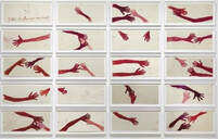
Fig 1. Louise Bourgeois. 2006. 10 am is when you come to me. Etching, with watercolour, pencil, and gouache on paper. https://www.moma.org (accessed 10/08/2020) https://www.tate.org.uk/art/artworks/bourgeois-10-am-is-when-you-come-to-me-al00345. (accessed 14/09/2020)
The work of Louise Bourgeois was very much about emotions, and her relationships with other people. In this work, the hands are those of herself and her long-term friend, assistant, and carer, Jerry Gorovoy. In the top left corner is a clock, its hands, in the shape of nude male and female figures, set at 10am, and the phrase, '10am is when you come to me' written in red across its face. This was a reference to the time that Gorovoy arrived each day at her home or studio. Their very close relationship can be summarised by this well-known quotation from Bourgeois:
'When you are at the bottom of a well, you look around and you say, 'who is going to get me out?' In this case it is Jerry who comes and he presents a rope, and I hook myself on the rope, and he pulls me out.' (https://www.tate.org.uk/art/artworks/bourgeois-10-am-is-when-you-come-to-me-al00345)
The reaching and stretching positions of most of the hands suggests someone reaching out for help, and this work seems very much about the support, security, connection and love that characterised the relationship between Bourgeois and Jerry Gorovoy. For many years Bourgeois struggled with depression and anxiety, for which she sought psychoanalysis. I wonder whether this may indicate the reason she favoured fluid media, since water is thought to be symbolic of the unconscious. My own experience of using fluid media in part 1 of this course has made me aware that it induces a feeling of calm, and is subject to less conscious control than dry media.
Contextual study point 2.
Geraldine Swayne. (b. 1965)
Geraldine Swayne is best known for her portrait and figure paintings on copper or aluminium, using enamel paint. She states that her work is about the uniqueness of her subjects; about capturing atmosphere and humanity. A particular mood, expression or light can inspire her imagination about the lives and personalities of her subjects, and she draws inspiration from a variety of sources, including both her own, and vintage photographs.
Swayne's work is, first and foremost, figurative. The subject matter for much of her drawing using fluid media seems very similar to the subject matter for most of her painting. In the description of her work for the exhibition entitled, 'Annunciation', which was scheduled to be held at the Charlie Smith gallery in London from March 20th-April 18th 2020, but postponed due to the coronavirus pandemic, it was stated, 'Technically Swayne's style is uniquely fluid, and transfers expertly from miniature through to monumental.' https://www.artlyst.com/whats-on-archive/geraldine-swayne-annunciation/
Looking at Swayne's work, there are some examples of where it appears she has built a painting from a fluid media drawing. See figs 1 and 2.
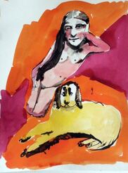
Fig 1. Geraldine Swayne. 2010. Ink on A4 paper
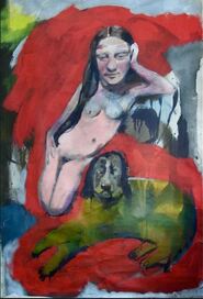
Fig 2. Geraldine Swayne. 2012. Oil on canvas.
Similarly, in the following series of four, she seems to be exploring the subject matter and composition through oil and acrylic. See figs 3 to 6.
Similarly, in the following series of four, she seems to be exploring the subject matter and composition through oil and acrylic. See figs 3 to 6.
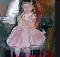
Fig 3. Geraldine Swayne. 2009. Oil on canvas.
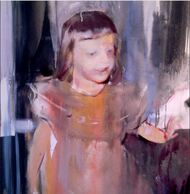
Fig 4. Geraldine Swayne. 2012. Oil on canvas.
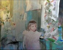
Fig 5. Geraldine Swayne. 2010. Oil and acrylic on canvas.
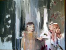
Fig 6. Geraldine Swayne. 2010. Oil and acrylic on canvas.
Figs 1 - 6: https://www.geraldineswayne.org/gallery_519306html (date accessed 19/8/2020)
In an interview with Darren Coffield in March 2017, in response to a question about the scale of her work, Swayne commented that she had begun painting on a larger scale again whilst simultaneously working on her smaller pieces, so that there was, 'a dialogue going on between the pieces.'
https://www.artlyst.com/features/geraldine-swayne-people-verge-action-interview-darren-coffield/
I think this phrase may also describe the connection between Swayne's work which could be described as 'drawing', and her more finished painting - there seems to be a dialogue between the two. The drawing is not different in subject matter to her painting, and sometimes seems to act as a vehicle for her to work towards exactly what she wants to express through her painting, and sometimes, stands alone.
Contextual study point 3.
Franz Kline. (1910-1962)
In the late 1930s-1940s, the American painter Franz Kline was painting traditional cityscapes and interiors in New York, but his friend and fellow artist Willem de Kooning introduced him to abstraction. Kline's imagination was captured when De Kooning used a projector to project small drawings onto a wall, thereby transforming them into gigantic abstract images. This experience led Kline to develop the large black and white gestural abstract works that he is well known for.
Working through the night, Kline used bright light to deliberately create strong tonal contrasts. I find it difficult to distinguish between positive and negative space in some of his large black and white paintings, because the white spaces seem to balance the black painted ones. 'I paint the white as well as the black, and the white is just as important', he once stated. See fig 1.
He used house paint, with house-painting brushes, creating textures that were records of his physical movements in making the painting. His large abstract expressionist paintings, in thick oil and enamel paint, 'convey the emotion embedded in the act of painting itself.'
https://gagosian.com/artists/franz-kline/
Kline differed from some of his fellow American abstract expressionists, such as Jackson Pollock, Willem de Kooning, or Mark Rothko, in that, although his work had the appearance of spontaneity, it was in fact, constructed in a much more considered way, using his earlier compositions as reference.
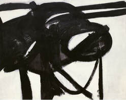
Fig 1. Franz Kline. 1950. Chief. oil on canvas.
https://www.moma.org/learn/moma_learning/franz-kline-chief-1950/ (accessed 21/08/2020)
Contextual study point 4.
William Blake and Henry Moore:
William Blake. (1757-1827)
Although considered eccentric, even insane, by his contemporaries, Blake later came to be highly acclaimed for his unique vision and creativity. His poetry and paintings and etchings have been classified as belonging to the 'Romantic' movement. The nineteenth-century scholar William Rossetti described Blake's uniqueness:, 'a man not forestalled by predecessors, nor to be classed with contemporaries, nor to be replaced by known or readily surmisable successors.'
From an early age Blake claimed to see visions; it was as if he had one foot in the real, material world, and another in the spiritual, and this informed his highly original, unique artwork and poetry. See fig 1.
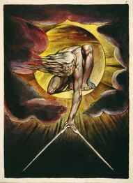
Fig 1. William Blake. 1794. The Ancient of Days, setting a compass to the earth.
https:// en.wikipedia.org/wiki/The_Ancient_of_Days (date accessed 26/08/2020)
Henry Moore. (1898-1986)
Henry Moore used drawing for a number of reasons, including to study the work of other artists, as a form of note-taking in galleries and museums, to explore and study natural forms, as preparatory work for sculptures or prints, and also as finished work in its own right.
Beth Williamson, writing about the exhibition entitled, 'Henry Moore Drawings: The Art of Seeing'(April 3rd-October 27th2019) - describes how, in the 1930s, his drawing developed more as a way of developing ideas for his sculptures.
Moore's interest in surrealism, biomorphism, and to a lesser extent, constructivism, led him towards the fragmentation of the human form into essential parts, and to creating abstract human forms from natural objects.
See fig 1.
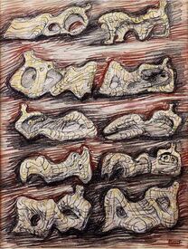
Fig 1. Henry Moore. Studies for a Reclining Figure. Henry Moore. Watercolour, coloured chalks, and black ink on paper.
https://www.bridgemaneducation.com (date accessed 31/08/2020)
It is this aspect of Moore's drawing that I found to be the most relevant and inspirational for Exercise 1.4 in part 1. Seeking out new forms from the drawing of two objects was sometimes a difficult, but always a fascinating process.
Assignment 1. Research:
Jindra Jehu (b. 1969)
The work of contemporary artist Jindra Jehu was inspirational in my choice of subject and work for assignment 1. Her work in mixed media, such as ink, oil pastel and acrylic washes, is based on the sea and landscape of her local environment in West Dorset. She prefers to work on location, using found materials and objects, such as seaweed, stones, driftwood, leaves and feathers in place of, or in conjunction with brushes.
I really enjoy the expressive quality and the colour of Jehu's work, and these aspects were especially influential for me in assignment 1. Her deep concern for the natural environment is something I strongly relate to, and her skill at capturing it is something I would like to aspire to in my own work.
https://www.jindrajehu.co.uk
John Wolseley (b.1938)
Another artist who draws inspiration from the natural environment is John Wolseley. Wolseley uses mixed media, and a variety of techniques including watercolour, frottage, collage, etching, and printing from nature. He is deeply concerned about the endangered species in the environment, and it is his sensitivity and ability to relate to the small, vulnerable and threatened life within it that I find very moving and inspirational.
Ashley Crawford, writing about Wolseley's work in 'The Vizard Foundation Art Collection of the 1990s' at the Potter Museum in Australia said, 'Wolseley's work is remarkable for its detail, as though the artist is obsessed with the minutia of life: 'the subtle and gentle things', according to Wolseley.'
https://www.johnwolseley.net
https://www.vizardfoundationartcollection.com.au/the-nineties/explore/john-wolseley/
Reflection on tutor feedback. Part 1:
My tutor’s overall comments for part 1 were that it contained some good work, especially in the assignment, but that sometimes the media had the upper hand, and some of my drawing suffered from a lack of definition and structure.
Ex 1.1. Experimenting with immediacy and fluid line.
I had mentioned that I felt I might have got more from this exercise, and my tutor suggested returning to it, to push it a bit further. He suggested rearranging the 20 A4 drawings, for example, and also being aware of which lines and marks are ‘my own’.
I agree that I would like to explore this exercise further, and will try and do this during part 2.
Ex 1.2. Using fluid media to add tone.
My tutor felt that some of the drawing in this exercise suffered from a lack of definition and structure, but that the 20 minute A2 ink and charcoal drawing of the coats & bags hanging on the door worked better, because it had more vitality and spontaneity.
I also preferred this drawing to the others in this exercise. It is interesting, though, that although it was the quickest drawing I did, it didn’t contain the same inaccuracies of structure that the others contained.
Ex 1.3. Dynamic gesture.
As with the previous exercise, my tutor felt that some of the drawing in this exercise wasn’t accurate in structure – the drawing of the stepladder being an exception to this - and that more variation in weight and thickness of line would have helped. This is where I think the media had the upper hand.
I think that in this exercise, I interpreted the word ‘dynamic’ to mean fast, and therefore lacking in attention to accuracy and detail in structure. I am aware that I was also influenced by the ‘accuracy v loose and expressive’ issue, and acknowledge that I am sometimes confused by this. I understand that accuracy needs to come before ‘loose and expressive’, but the nature of this exercise led me to concentrate on the latter. I will try some drawing that is focussed on structural accuracy, and revisit the technique of ex 1.3.
Ex 1.4. Invention and mystery.
My tutor felt that the objects in the initial sketches for this exercise were very separate, and didn’t naturally connect with each other, but that the use of colour to combine them into new structures and compositions worked well, with some interesting results.
I agree that I struggled to get to grips with this exercise, but was inspired by Henry Moore’s drawings and this enabled me to move the exercise forward. I also agree that introducing colour really helped, and enabled me to make an interesting final composition.
Assignment 1:
My tutor felt that the preparatory work and the final assignment piece worked well, especially re mark making to represent texture. He commented that the use of colour also worked well, especially in the final assignment. He suggested considering the possibility of working on a larger scale, and allowing fluid media to run or drip, albeit in a controlled way.
I was also pleased with the work I did for assignment 1, and feel the assignment composition achieved what I set out to do. I learned a lot from the preparatory work, which I would like to experiment with on a larger scale.
Research.
The main points raised by my tutor in ‘Research’ were, firstly, always try and reference according to Harvard referencing, and secondly, go into as much detail as possible with the research on any other artist who you find inspiring.
Learning Log.
The main points raised by my tutor in this section were:
Try and analyse the results of your work in more detail, for example:
- What worked or didn’t work, and why?
- Were there any surprises?
- Were there any happy accidents?
- Would you do anything differently next time? If so, what, and try it.
Pointers for next assignment:
- Try and get the most out of every exercise.
- Have a look at these books: ‘Steal Like an Artist’, and ‘101 things to learn at Art School.’
- Investigate the work of artists Frank Bowling and Peter Doig.
Part 2. Collage.
Contextual study point 5.
The Brooklyn Collage Collective.
Founded in 2013 by Morgan Jesse Lapin and Lizzie Gill, The Brooklyn Collage Collective is made up of a group of artists, primarily from Brooklyn, New York, who work in a wide range of styles and media. The Collective's mission is to:
'work together to push the broadening definition of collage through collaborative exhibitions, live collaging events, education and dialogues.'
kolajmagazine.com/content/content/articles/grassroots-discourse/
Morgan Jesse Lappin (b.1979) began working with collage in 2007. Much of his work draws on material from the 1980s, and his childhood. His work has been described as,
'a perfect combination of chaos and comedy, with many different elements of sci-fi, vintage horror, and music.'
https://fineartshippers.com/the-amazing-collage-art-by-morgan-jesse-lappin
Lizzie Gill (b.1989). The main focus of Lizzie Gill's work is the exploration of 21st century romance, and its evolution through technology, such as online dating. She uses images of 1950s America to illustrate modern day interactions and to illustrate how the 'age of the screen' has affected romantic relationships. See fig 1.
Fig 1. Lizzie Gill 2018 Slam Dunk (He messaged first). Collage, acrylic and graphite on paper 20X15 ins.
www.lizziegill.com/collage/2019/4/2/. (Accessed 21/10/2020)
Contextual study point 5 highlights the importance of collaboration between artists, and cites collage in particular as being a good medium for contemporary collaboration and networking.
Collaboration between artists is far from a new idea.. Famous collaborative partnerships from the past have included Peter Paul Rubens and Jan Brueghel the Elder, who produced over twenty paintings together between 1598 and Brueghel's death in 1625, and Picasso and Braque, who together developed Cubism, and were the instigators of collage as a medium at the beginning of the 20th century. More recently, collaboration between artist and viewer or audience has evolved through the work of Jeremy Deller and Marina Abramovic.
https://www.a-n.co.uk/blogs/the-art-of-collaboration-an-analysis-seminar/
Sharing ideas and thoughts with other artists is essential for individual development, and learning what we dislike or find difficult to connect with is as important as discovering the work we like and feel a sense of kinship with. I believe this is an important part of finding our own individual voice. I think collage can work well with a very wide range of other media, including painting, drawing, printmaking, textiles and sculpture, and has the potential to add interest, energy and meaning to work. It therefore has the potential to bring artists from many different disciplines together in collaboration, to share ideas and increase inventiveness.
Contextual study point 6.
Toby Paterson and Cy Twombly.
Toby Paterson. b.1974.
Toby Paterson is based in his native Glasgow. His work is concerned with urban spaces, and the influence of Modernism on post-war architecture. His work has been described as being influenced by, 'both the activity and inertia that form an understanding of urban landscape.'
https://artviewer.org/toby-paterson-at-the-modern-institute/
The Ludic Motif is a construction Paterson made, in 2014, from aluminium and acrylic paint. Given that collage is about juxtaposition and layering - as described in the course material - Ludic Motif could fit the description of an architectural, or sculptural collage. This is an interesting concept, which broadens understanding of the definition of 'collage.'
I think some of Paterson's more recent work, however, seems more akin to collage than Ludic Motif. This piece, from 2020, is constructed from a variety of solid and fluid materials. See fig 1:
Fig 1. Toby Paterson. 2020. Analogique. Acrylic, engineer's layout fluid, cast and sheet aluminium, perspex. 50x50x10 cm. Photo: Patrick Jameson. https://artviewer.org/toby-paterson-at-the-modern-institute/ (accessed 24/10/20)
Cy Twombly. 1928-2011)
Edwin Parker 'Cy' Twombly Jr. was born in Lexington, Virginia. He shared the same nickname as his father, after Cy Young, a famous American baseball player.
Between 1951-52, Twombly studied with Franz Kline at Black Mountain College in North Carolina, and Kline's work, along with that of Paul Klee, had a strong influence on him at this time. Along with Kline, De Kooning, and Jackson Pollock, Twombly distanced himself from American Expressionism.
Twombly's drawings are characterised by, 'freely scribbled, calligraphic and graffiti-like works on solid fields of mostly grey, tan, or off-white colours.'
https://www.tate.org.uk/art/artists/cy-twombly-2079
Twombly once described his work as 'childlike', making a distinction between this and 'childish', adding,
'It is very difficult to fake.....to get that quality you need to project yourself into the child's line. It has to be felt.'
https://www.artsy.net/artist/cy-twombly
See fig 2:
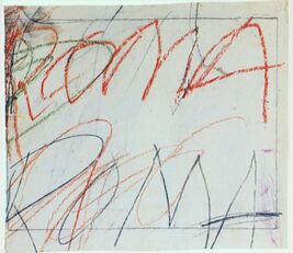
Fig 2. Cy Twombly.1957. Untitled. Gouache, wax crayon, pencil on irregularly cut cardboard. 31x35.8 cm
www.cytwombly.org/artworks/drawings/4 (accessed 24/10/20)
In 1974 Twombly created 'Natural History, Part 1: Mushrooms', which was a series of 10 prints combined with collage. They are all initiated by images he found in magazines, which he then proceeded to surround with other pictures, photographs, text and drawing. See fig 3:
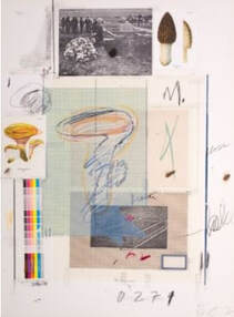
Fig 3. Cy Twombly. 1974. Natural History, Part 1: Mushrooms. Collage, colour lithograph, collotype, chalk on velin. 75.5x55.7 cm. https://www.artsy.net/artwork/cy-twombly-natural-history-part-1-mushrooms-1 (accessed 24/10/20)
In this series of work, it isn't always immediately obvious which is collage, and which drawing or print, although in fig 1 there is a photograph of what appears to be a graveyard next to two collaged images of fungi at the top. These collaged pieces stand out from the rest because of their clear-cut edges, which I think makes them fundamentally different from Twombly's drawing and text.
For me, this feels quite a disjointed composition overall, but there are certain things that unite it; the repeated rectangular shape of the photograph throughout, and the overlapping collaged area in the centre. This overlapping feels as if it blurs the difference between the collage, and the drawing and text.
I have a definite preference for Cy Twombly's work over that of Toby Paterson. Visually, I find I am resistant to Paterson's architectural, straight lines and structures, because they strike me as cold, clinical, and lacking in colour. Twombly's work, on the other hand, feels confusing, sometimes disjointed, and not always easy to look at, but I have a curiosity about his work, and a desire to understand what he was aiming to do, which I don't have about Paterson's work.
Contextual study point 7.
Anna Bu Kliewer and Flynn Cameron Jones:
Anna Bu Kliewer (b.1987) is a German/Ukranian artist. Much of her mixed media collage work is about merging human figures with nature, in which the nature seems to be taking control. See fig 1:
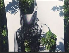
Fig 1. Anna Bu Kliewer https://www.bing.com
In an interview, Anna Bu Kliewer described her creative process as, ''playful and intuitive', and stated that she doesn't start with any plan.
It is difficult to understand whether her work is intended primarily to create visually shocking images, or whether there is another underlying message. On https://trendland.com/anna-bu-kliewer-mixed-media-collages, it states that Bu Kliewer is interested in 'the deconstruction and reconstruction of images', and that,
'She challenges our perceptions of identity and nature by transforming found imagery into a new surreal context.'
Flynn Cameron Jones works a lot with collaged strips of paper overlaid on photographs or other images. In some cases this causes the images to break up, and in others, it creates a superimposed grid-like impression, which stands out strongly against the background. Both create interesting optical illusions. See figs 2 and 3:
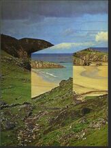
Fig 2. Flynn Cameron Jones. 2014. Collage on paper.
Fig 3. Flynn Cameron Jones. 2014.
https://www.bing.com
Although these are visually intriguing, it is difficult to assess what, if anything, their message or narrative is. I don't have a strong liking for either of these two artists, but have a slight preference for Cameron Jones for his use of juxtaposition and layering with collage, and also for his use of colour.
Both Anna Bu Kliewer and Flynn Cameron Jones feel very different to Toby Paterson and Cy Twombly. Twombly in particular integrates collage very much into his drawing practice, using it to compliment drawing and text, whereas for both the artists in this study point, collage, and strong colour is the main media for communicating their ideas. The imagery of both Bu Kliewer and Cameron Jones is visually shocking or arresting, but by comparison, I would say I find some of Twombly's work indecipherable, and consequently more intriguing, rather than shocking.
Frank Bowling. (b. 1934)
Frank Bowling was one of the artists my tutor recommended I should investigate. Bowling was born in a town called Bartica in British Guiana. In 1953, at the age of 19, he moved to London and joined the Royal Air Force, where he met artist and architect Keith Critchlow. This association was the start of his interest in art, because he visited the National Gallery with Critchlow, and was very moved by the paintings of Gainsborough, Turner, and Constable.
Much later, another influential association was with the American art critic, Clement Greenberg. Greenberg promoted the view that 'the visual aspects of an artwork are more important than the narrative content'
https://www.tate.org.uk/whats-on/tate-britain/exhibition/frank-bowling/exhibition-guide.
In the early 1970s, Greenberg was influential in Bowling's shift from a figurative style to abstraction, as his practice evolved towards being 'process based', and his work was about exploring the properties, possibilities and effects of paint.
The 'poured paintings' of 1973-78 are visually stunning examples of this. Bowling poured paint directly onto the canvas, so that it slowly flowed to the bottom, creating, as it did, a direct record of the making of the work. See fig 1.
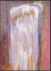
Fig 1. Frank Bowling. 1974. Ziff. https://www.bing.com
In an article entitled, 'Awash with the colour of Life' in the Summer 2019 of the 'Tate Etc' magazine (issue 46), Matthew Collings describes how Frank Bowling makes, 'the medium into a subject.' (p.77). Most people, when looking at a work of art, might be interested in the meaning or the message the artist is trying to convey, but Collings uses the painting 'Towards Crab Island' to illustrate how Bowling didn't start out with the idea of painting this place, 'but it seemed vividly there once the painting was done.'(p.77) See fig 2:
In an article entitled, 'Awash with the colour of Life' in the Summer 2019 of the 'Tate Etc' magazine (issue 46), Matthew Collings describes how Frank Bowling makes, 'the medium into a subject.' (p.77). Most people, when looking at a work of art, might be interested in the meaning or the message the artist is trying to convey, but Collings uses the painting 'Towards Crab Island' to illustrate how Bowling didn't start out with the idea of painting this place, 'but it seemed vividly there once the painting was done.'(p.77) See fig 2:
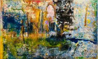
Fig 2. Frank Bowling. 1983. Towards Crab Island. Acrylic, acrylic gel, acrylic foam & other materials on canvas. 175.3X289.6 cm
https://www.thelinocut.art/ (accessed 31/10/20)
In this painting, Bowling has used collage, as well as paint. According to Matthew Collings,
'......the whole point was to make something surprising, non-planned, using bizarre methods. Pouring; sticking things in; following the movement of the material that might be liquefied, thick, viscous, trickling or heaving.' (p.81 Tate Etc magazine. (issue 46).
This is an interesting and important concept, and something I am aware of in my own work. For example, I sometimes struggle to find a subject, yet have an instinct that I want to use a particular medium or technique. Ex 2.4 has illustrated this; after a few days of trying to find interesting subjects, I decided to go with my instinct of not what to draw, but how to draw, and which materials to use, which had a liberating effect on the way I approached my work.
Peter Doig. b.1959)
Peter Doig is another artist my tutor suggested I investigate. Doig had a very transitory early life, moving from Edinburgh at the age of two, to Trinidad, to Canada, to London, where he trained at St. Martin's School of Art, and finally back to Trinidad. Much of Doig's work is about the many different landscapes he has encountered during his transitory life, which he imbues with a feeling of mystery, memory, and sometimes foreboding.
Peter Doig's style of painting has been described as 'Magic Realism', a term which refers to combining everyday situations with a sense of the spiritual, uncanny or supernatural. I was interested to discover that this term was also applied to the work of 20th century landscape artist Eric Ravilious.
Doig is skilled at using colour to create evocative and eerie atmosphere. He once commented, '....you are constantly looking through things, seeing the foreground and the background at the same time.'
https://www.theartstory.org/artist/doig-peter/
https://www.moma.org/artists/8087
I am particularly interested in these paintings, because they remind me very much of some of my own work, where I have tried to capture distance and depth by portraying one thing in front of another. This concept of seeing many layers at the same time, so skilfully depicted by Doig, seems to be a developing feature of my work, and evolved as one of the aspects of assignment 2. See figs 1 and 2.
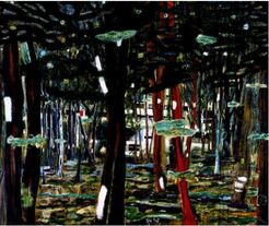
Fig 1. Peter Doig. 1992. Concrete Cabin. https://www.wikiart.org/en/peter-doig/concrete-cabin-1992 (Accessed 4/11/20)
Fig 2. Peter Doig. 1991. Architect's home in the ravine.
https://www.wikiart.org/en/peter-doig/architect-s-home-in-the-ravine-1991 (Accessed 4/11/20)
Barbara Rae (b. 1943)
I have a very immediate emotional response to the work of Scottish painter and master printmaker Barbara Rae, who uses an abstract style to capture the essence of landscape. www.openeyegallery.co.uk/artists/barbara-rae/. Most of Rae's landscapes have a clear horizon line, with bands of powerful colour, and expressively drawn shapes and lines in the foreground. This combination of expressive line and vibrant, or darker, more atmospheric colour is what attracts me to Barbara Rae’s work, and some of my sketchbook experiments during part 2 have been influenced by her. 'Beach Stream Lacken' is a good illustration of this - I especially like the juxtaposition of the vibrant blues and red-oranges, with the slight appearance of yellow on either side. See fig 1.
Barbara Rae's interest lies more in the history and the people of a place - especially in the effects of human activity and passing time - than in the geographical or topographical features of the landscape, although these are not ignored if they work for the composition. Her main focus is always initially to meet local people and to research local history before starting artwork.
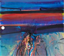
Fig 1. Barbara Rae. Beach Stream Lacken Mixed media on paper. 100X115 cm. https://www.bing.com (accessed 1/11/20)
Eric Ravilious (1903-1942)
Ravilious was a British artist best known for his compositions of the environment he grew up in – the South Downs. He was taught for a short period by Paul Nash at the Royal College of Art, and Nash had an influence on his style.
https://en.wikipedia.org/wiki/Eric_Ravilious
Eric Ravilious had a passion for watercolour, but he often combined pencil drawing with his watercolour painting, which added texture and depth. To quote information from the Towner Gallery in Eastbourne:
‘The essence of Ravilious’s work lies in his ability to see design qualities within a landscape, coastal scene or objects – such as old machinery.’ See Fig 1:
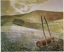
'Fig 1. Eric Ravilious. 1934. Downs in winter. Watercolour and pencil. style: Magic Realism.
https://www.wikiart.org/en/eric-ravilious/downs-in-winter-1934 (accessed 12/11/20)
It was this composition I had in mind when I was working on the sketchbook work of landscape, which included the farm implement. I had the idea of doing a composition that was a 21st century version of this 1934 Ravilious composition, combined with colour and compositional influences from Barbara Rae.
Magic Realism
The German photographer and art critic Franz Roh first coined the term Magic Realism in 1925, as a way to describe modern realist paintings 'with fantasy or dream-like subjects.'
https://www.tate.org.uk/art/art-terms/m/magic-realism
The Magic Realists, who emerged in 1920s Germany, distinguished themselves from The Surrealists in that they were not interested in exploring the unconscious, but were concerned instead with depicting the strangeness of everyday life. The invention of new or strange objects, unusual juxtaposition of objects, the merging of past and present and the distortion of space were some of the techniques and ideas they used to achieve this.
https://www.theartstory.org/movement/magic-realism/
Reflection on tutor feedback. Part 2:
I felt very encouraged by my tutor's feedback for part 2. He made a number of observations, for example:
Research.
Critical thinking and analysis.
I was very happy with this feedback, and had been aware throughout part 2 that my work was stronger and improved from part 1. I very much agree that my work can be compartmentalised sometimes, and that I need to make stronger, more in-depth links between the work of others and my own, and also between sketchbook and more finished work.
Part three: Drawing in three dimensions.
Contextual study point 8.
Extending a line into space.
An exhibition entitled, 'Drawing: Sculpture' at The Drawing Room from Feb 14th - April 6th 2013 is the subject of the two websites mentioned in the course material. It was comprised of twenty one pieces of work by seven contemporary artists to explore the connections between drawing and sculpture. This idea was not new, however and as long ago as the late 1920s, Julio Gonzalez, working closely with Alexander Calder and Pablo Picasso, built 3D 'drawings in space' by welding linear pieces of metal together. It was the expressed aim of Gonzalez to combine the two disciplines of drawing and sculpture.
In thinking about the relationship between two dimensional and three dimensional drawing, as seen in the work of the 'Drawing:Sculpture' exhibition, I came to the conclusion that in the work of the artists I researched in more detail, these two processes are very closely linked, but in different ways.
Anna Barriball (b. 1972)
British artist Anna Barriball is probably best known for her graphite frottages of everyday objects, such as doors, walls, and windows. Her work is inspired by objects, but instead of drawing them in a traditional still life style, she 'pulls the object towards the drawing', establishing a closer intimacy between the object and the drawing ( Mark Godfrey.)
'Vitamin D. New Perspectives in Drawing.' ( p 28)
Barriball believes that drawing should have a physical presence, and that there should be no need for, 'translation between looking and describing.' ( Anna Barriball.) The physical act of creating the many repeated marks that go to make up the frottages is evident in the end product. See fig 1.
https://www.wikiart.org/en/eric-ravilious/downs-in-winter-1934 (accessed 12/11/20)
It was this composition I had in mind when I was working on the sketchbook work of landscape, which included the farm implement. I had the idea of doing a composition that was a 21st century version of this 1934 Ravilious composition, combined with colour and compositional influences from Barbara Rae.
Magic Realism
The German photographer and art critic Franz Roh first coined the term Magic Realism in 1925, as a way to describe modern realist paintings 'with fantasy or dream-like subjects.'
https://www.tate.org.uk/art/art-terms/m/magic-realism
The Magic Realists, who emerged in 1920s Germany, distinguished themselves from The Surrealists in that they were not interested in exploring the unconscious, but were concerned instead with depicting the strangeness of everyday life. The invention of new or strange objects, unusual juxtaposition of objects, the merging of past and present and the distortion of space were some of the techniques and ideas they used to achieve this.
https://www.theartstory.org/movement/magic-realism/
Reflection on tutor feedback. Part 2:
I felt very encouraged by my tutor's feedback for part 2. He made a number of observations, for example:
- I experimented with collage, monoprint and drawing to achieve some interesting and exciting results. The 'insect' monoprints from Ex 2.3, in particular, were achieved through a complex, improvised process, which demonstrated an ability to experiment with different techniques and media to make effective images.
- My comparison of the collages in Ex 2.2 with previous drawings enabled me to understand the power and immediacy of collage.
- Much of the work of part 2, including the assignment piece, is inventive, and demonstrates good creative decision-making. This is good material research, which would benefit from stronger links to the work of other artists to develop better contextual research.
Research.
- The research into the work of other artists would benefit from more 'cross-pollination' with practical work.
Critical thinking and analysis.
- The analysis of your own work has improved a lot from part 1. You are making judgements about what is and isn't working, and analysing why. Think about which work is pointing the way forwards and/or hinting at solutions.
- There is some interesting sketchbook work, but, much as with research, try and make stronger links from sketchbook work to the more finished work you're doing for exercises and assignments.
- Frank Stella's 'Construction' paintings.
I was very happy with this feedback, and had been aware throughout part 2 that my work was stronger and improved from part 1. I very much agree that my work can be compartmentalised sometimes, and that I need to make stronger, more in-depth links between the work of others and my own, and also between sketchbook and more finished work.
Part three: Drawing in three dimensions.
Contextual study point 8.
Extending a line into space.
An exhibition entitled, 'Drawing: Sculpture' at The Drawing Room from Feb 14th - April 6th 2013 is the subject of the two websites mentioned in the course material. It was comprised of twenty one pieces of work by seven contemporary artists to explore the connections between drawing and sculpture. This idea was not new, however and as long ago as the late 1920s, Julio Gonzalez, working closely with Alexander Calder and Pablo Picasso, built 3D 'drawings in space' by welding linear pieces of metal together. It was the expressed aim of Gonzalez to combine the two disciplines of drawing and sculpture.
In thinking about the relationship between two dimensional and three dimensional drawing, as seen in the work of the 'Drawing:Sculpture' exhibition, I came to the conclusion that in the work of the artists I researched in more detail, these two processes are very closely linked, but in different ways.
Anna Barriball (b. 1972)
British artist Anna Barriball is probably best known for her graphite frottages of everyday objects, such as doors, walls, and windows. Her work is inspired by objects, but instead of drawing them in a traditional still life style, she 'pulls the object towards the drawing', establishing a closer intimacy between the object and the drawing ( Mark Godfrey.)
'Vitamin D. New Perspectives in Drawing.' ( p 28)
Barriball believes that drawing should have a physical presence, and that there should be no need for, 'translation between looking and describing.' ( Anna Barriball.) The physical act of creating the many repeated marks that go to make up the frottages is evident in the end product. See fig 1.
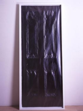
Fig 1. Anna Barriball. 2004. Door. Pencil on paper. 208.5 X 88 X 6 cm. https://saatchigallery.com/artist/anna_barriball (Accessed 10/12/20)
See fig 2:
See fig 2:
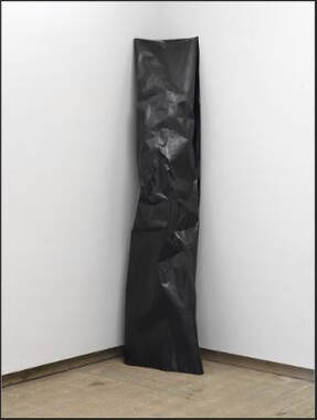
Fig 2. Anna Barriball. 2008. Untitled. Ink on paper. 234 X 54.5 X 28.5cm. www.bing.com (Accessed 18/12/20)
This is a large sheet of paper, saturated in ink, and formed into a column. This drawing has solidity, and on first appearance, looks much more like a piece of sculpture than a drawing. At first glance, I thought it was a piece of wood.
Similar to the work of Anna Barriball is that of Dan Shaw-Town (b. 1983), who also uses repetitive graphite mark making. In addition, uses a series of processes including folding, crumpling, flattening, erasing, sanding and re-working to create a range of textures, transforming the paper from a support for drawn marks into something new.
https://www.lissongallery.com/exhibitions/kitty-kraus-dan-shaw-town-and-gedi-sibony-surface-tesnion
Like Anna Barriball, Shaw-Town describes his process as being very much concerned with creating a surface, and with emphasizing the purely physical nature of his material. See fig 3.
Fig 3. Dan Shaw-Town. 2009. Untitled (Chevrons) Graphite, spray paint on paper with metal fixings. 29.5 X 22 ins.
https://www.artsy.net/artwork/dan-shaw-town-untitled-chevrons (Accessed 17/12/20)
The constructed nature and appearance of the work of both Anna Barriball and Dan Shaw-Town demonstrates a symbiotic relationship between drawing and sculpture.
Sara Barker and Aleana Egan also exhibited work in the 'Drawing: Sculpture' exhibition. Just as there were parallels in the work of Barriball and Shaw-Town, the link between the work of these two artists is linear, rather than solidity and physicality.
Sara Barker builds aluminium and steel into rectangular shapes which seem to hang in the air, and Aleana Egan uses paper, tape, thin metal strips, and cardboard in her linear work. See figs 4 and 5.
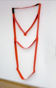
Fig 4. Aleana Egan.
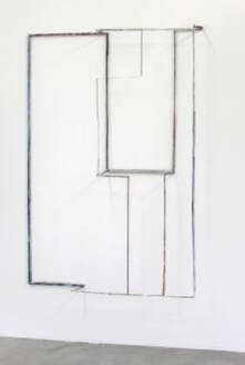
Fig 5. Sara Barker. 2010. Words Are Form. Aluminium, grey & white metal filler, primer, gouache, oil paint, glue, rivets, bolts. https://www.saatchigallery.com/artist/sara_barker (Accessed 02/01/21)
Writing on this website, Ben Street commented that Barker's linear forms 'are those of sketches, not sculptures'. Aleana Egan's work is inspired by observations of everyday life, but also by childhood memories and works of literature. This process was well illustrated in a press release describing her work in a solo exhibition at 'The Drawing Room' in 2011:
'......it was the aura of tightness, a certain tension, that reading Jean Rhy's novel, 'Good Morning Midnight', left her with, and it was this quality that she sought to engender in a sculptural form, 'Character' (2010), although quite different from the drawing that Egan made after reading this story, does retain some of its characteristics.'
https://contemporaryartdaily.com/2011/02/aleana-egan-at-drawing-room/
These observations on the work of Sara Barker and Aleana Egan illustrate the close connection between their two dimensional drawing, and their three dimensional work.
Contextual study point 9.
Roman Ondak and Karina Smigla-Bobinski.
Slovak artist Roman Ondak first installed 'Measuring the Universe' in the Pinakothek der Moderne in Munich in 2007. It is a site-specific installation, dependent on the participation of visitors for its creation. Beginning with the four white walls of the gallery, the work slowly grows, as one by one, each visitor has their height measured and recorded on the wall, along with their name. See figs 1 and 2:
Fig 1. Roman Ondak. Measuring the Universe
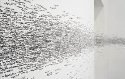
Fig 2. Roman Ondak. Measuring the Universe
Ondak wanted to make work that had a connection to everyday life, and this idea grew from the practice of measuring childrens' height as they grew. Fig 1 reminds me of a flock of birds.
Karina Smigla - Bobinski created a transparent helium globe, approximately three feet in diameter, and covered its surface with three hundred sticks of charcoal. The globe floats around the gallery space, creating marks made by the charcoal sticks whenever they come into contact with a surface. Visitors to the exhibition can interact with the globe to try and influence its movement, but the resulting marks are unpredictable. The globe was called 'Ada', after Ada Lovelace. See fig 3.
Fig 3. Karina Smigla-Bobinski. Ada
All images, https://www.bing.com (Accessed 06/01/21)
Of these two pieces of work, I prefer the second, Karina Smigla - Bobinski's kinetic sculpture. I think this is because the helium filled globe almost feels like a living creature, and I enjoyed its movement, which feels as much a part of the whole experience as the marks it makes. I also preferred the unpredictability of the marks it made, as opposed to the more predictable, controlled marks made by the measuring in Ondak's work.
Whilst both are dependent on the interaction and participation of people, in Ondak's Measuring the Universe, participation is fairly passive, and ends once the measurement has been taken and recorded, except for the participants' viewing of the work, whereas with Smigla - Bobinski's Ada, human participation and interaction is much more active and involved. People seemed to be trying hard to think of ways to affect the marks made by the globe, but also to be enjoying the fact that it seemed to have a mind of its own, and that the marks were random.
The work of Roman Ondak and Karina Smigla-Bobinski reminded me of an artist I researched in my last course, 'Drawing Skills':
British artist Tim Knowles adopted a very different approach to drawing trees; he created a series of drawings by attaching pens and other drawing materials to the branches of trees, and recording the marks made when the branches were moved by the wind and other weather conditions. See fig 4:

,Fig 4. Tim Knowles. Weeping willow tree drawing.
https://www.plantpropaganda.com/tim-knowles-tree-drawings/
Knowles used different types of trees, including weeping willows and oaks, and the resulting marks were said to be characteristic of the individual tree species.
The thing that all these works have in common is the absence of the artist in the actual mark making. The artist's idea is the catalyst, and in the case of Roman Ondak and Karina Smigla-Bobinski, other people are essential for making the idea work to produce the drawing, whereas for the tree drawings of Tim Knowles, it is the elements, and perhaps animals, that make the idea work.
Researching these artists has highlighted for me how diverse the discipline of drawing is, and emphasised the importance of exploring the less obvious and conventional methods of mark making.
Part four.
Process.
Study point 10: Notations Exhibition.
The suggestion for this study point was to read through the essay entitled, 'The Porous Practice of Drawing' which was written by Meredith Malone, the curator of this exhibition. The essay was written to accompany the exhibition, and describes how the contributing artists use drawing, either as finished work, or as preparation work.
In her essay, 'Minimal and Conceptual Drawing and its Legacy.', Malone observes that the artists in the 'Notations' exhibition were, 'self-consciously rethinking and challenging established traditions of artistic practice.'
It was suggested that a good way of understanding the essay would be initially, to read it through, highlighting anything that seemed significant, then to revisit the highlighted parts, saying why they seemed important.
1. The first thing I read that immediately seemed important to me was:
' While some artists tended to foreground thought and knowledge as the essential components of an artwork, others focused on the materials themselves with an equal degree of concentration. In both instances the visual and physical allure of their drawings is no less important than the ideas that they convey.'
This was important because it is something I have noticed about my own way of working recently. In the past, prior to beginning study with the OCA, any drawing that I did was concerned with realistic representation. Over the past two years I have noticed that I am more interested in exploring materials than ideas, and sometimes I have been aware of enjoying the process of exploring materials, and of adding an idea the work may express as an afterthought, because I felt it needed this justification. As a result of the work I have done on this course however, both through drawing and research, I have come to understand that sometimes the exploration of the materials, and the action of making a drawing IS the subject.
2. This description of the varied role of drawing in the work of artist, Dan Flavin seemed important:
'The artist drew incessantly and for a variety of purposes: to notate an idea or create working drawings for artworks in other media; to make quick renderings of nature; to execute finished presentation drawings for sale; and to commission 'final finished diagrams - drawn in coloured pencil on graph paper by his wife, son, and studio assistants - which acted as records of his site-specific fluorescent light installations.'
This seemed important because it highlighted the many different ways drawing can be important. The 'quick renderings of nature' was the most significant thing for me, because I am aware that I struggle to make quick drawings, and this is a skill I would like to develop.
3. Richard Serra didn't use working drawings for his sculptures, and instead, reversed the process by drawing his sculptures after they had been completed, 'as a means of thinking through formal problems and understanding what he sees and encounters.'
Serra stated:
'Sculptors who work from drawings, depictions, illustrations, are more than likely removed from the working process with materials and construction.'
This resonated with me because this is something I experienced in Ex 3.3 of part 3. It didn't make sense to try and draw what I was going to construct for the installations; it seemed to make more sense to build them then sketch them afterwards, and to see where the materials and the building process had led. Trying to work to a drawing felt very restrictive and limiting, and I felt, as Serra describes, 'removed from the working process with materials and construction.'
4. 'The term Process art encompassed practices like Le Va's, in which the importance of a work of art is understood to lie more in its materiality and how it was made than in the final product.'
This highlights Barry Le Va's work as an illustration of point No.1 - the importance of process and materials over the end result (See fig 1).
As mentioned earlier, I am aware of some of my own work falling into this category, but am still struggling with the concept of 'meaning.' Below is an installation I made for exercise 3.3 from the previous part of the course. This was first and foremost about the materials used, and the method employed to construct the piece. I had no meaning nor message in mind when I made it.
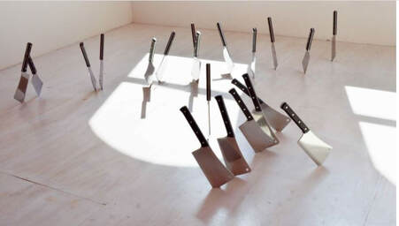
Fig 1. Barry Le Va. 1969/2016. Four (Cleaved Floor). 20 meat cleavers. Dimensions variable.
https://www.davidnolangallery.com/artists/barry-le-va?view=slider#3 (Accessed 25/02/21)
https://www.davidnolangallery.com/artists/barry-le-va?view=slider#3 (Accessed 25/02/21)
5.'Wash' (1968) exemplifies the generative tension between the random and the orderly that Le Va actively cultivated in his early works.'
This statement refers to Le Va's work entitled 'Wash',(see fig 2) and the words that particularly appealed to me were, 'tension between the random and the orderly'. This seems relevant to a point made by my tutor in his feedback from part 3; he mentioned that visual interest is increased when the marks made are varied, and not all of the same character, illustrating the point by describing a live band that just shouted every song, without varying their performance with slower, more subtle and gentle singing. I recognised that this applied to some of my drawing from exercise 3.2, where scraping the gesso to reveal the acrylic or ink underneath was a vigorous activity, and the end result was similar marks throughout the composition:
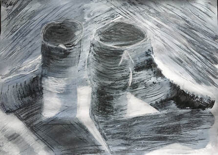
Drawing from Ex 3.2, part 3.
Fig 2. Barry Le Va. 1968. Wash. https://www.bing.com (Accessed 25/02/21)6.
6. 'William Anastasi's subway drawings engage a similar process-driven dynamic - highly prescribed yet open to unforeseen occurrences.'
This refers to Anastasi's blind drawings, pocket drawings and subway drawings, which began in the 1960s and were a
'.....means of abdicating rather than establishing control by submitting the graphic process to chance.'
'By drawing blind and incorporating chance, Anastasi subverts the tradition of drawing as a synthesis of vision, knowledge, and manual skill.'
This description of Anastasi's work illustrates a very important aspect of my learning since engaging with the study of drawing, because blind drawing was my first experience of making an interesting drawing by abdicating control. I have included these quotations about Anastasi's work for similar reasons to including the point in no. 2 about Dan Flavin's use of drawing for 'quick renderings of nature' - because I am aware that I need to keep these points in mind, and practise them.
7. Sol Le Witt emphasized the importance of intervening steps in the process of translating an idea into visible form:
' All intervening steps - scribbles, sketches, drawings, failed works, models, studies, thoughts, conversations - are of interest.'
I have found this to be very true in my own work, especially when working towards an assignment piece, because the preparation work can take on a life of its own and lead me towards a final resolution. I found it particularly interesting, though, that Le Witt valued conversation as well as visual work as an intervening step, because I have frequently found that when I feel stuck, if I talk through what I'm feeling and thinking, it usually helps me to clarify why I'm stuck, and how to move forward. This acts as a mirror to my internal process so that I can see it reflected back, and without it, my thoughts and feelings about where my work is going can become locked in a repetitive downward spiral. Given that I spent over twenty years training and working in the field of counselling this comes as no surprise, because it is very like the counselling process.
8. The next three quotations from the essay are about the importance of the use of the body in drawing. The works of Eva Hesse, Jill O'Bryan, and N. Dash all demonstrate the effects of bodily actions on marks created:
'Eva Hesse also probed the relationship between order and disorder.'
Working with the grid of graph paper, Hesse filled the small squares with a series of circles:
' Diversity and variation are achieved not as a function of rules of permutation, as in Le Witt's drawing, but as a result of the uneven pressure of the artist's hand on the paper. This endows the drawing with a decidedly personal, tactile dimension that opposes the strict reductivism of Le Witt.' See fig 3.
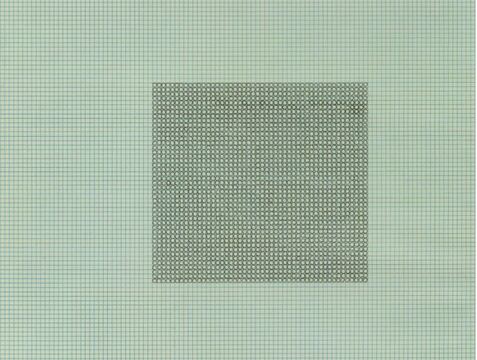
Fig 3. Eva Hesse. 1967. Untitled. Black ink on graph paper. 278 X 216mm.
https://www.tate.org.uk/art/artworks/hesse-untitled-t04151 (Accessed 26/02/21)
A quote from the above website describes this work, saying it 'yields unexpectedly non-mechanical and lightly textured drawings.'
I experimented with this for Ex 4.2. I didn't use graph paper, but tried drawing repetitive loops on cartridge paper, using oil pastel:
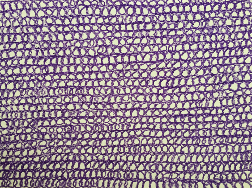
These were the first two of five drawings; I continued adding loops in different colours for Ex 4.2.
I set out by trying to keep these marks uniform in shape and tone, but found it impossible, because the pressure of my hand on the media naturally varied, depending on a number of factors such as my level of energy, my state of mind, and the quality of the pastel.
9. Jill O' Bryan's 'Breath' drawings are similar to the work of Eva Hesse:
'Jill O' Bryan's large scale '40,000 Breaths Breathed between June 20, 2000 and March 15, 2005 (2000-2005) also turns drawing into a recording device as the artist meticulously tracked her individual breaths over the course of five years, using only pencil marks on paper.............the graphic patterns that emerge across O' Bryan's large sheet are not rigid or precise but rather organic and irregular, undulating with a gradation of tones based on the amount of pressure the artist exerted on the paper.'
10. Closely related to both O'Bryan and Hesse, is the work of N. Dash, who makes drawings by folding, creasing, rubbing and refolding paper, before applying indigo powder to it, thereby recording the effects of bodily actions on the paper. This reminds me of the work of Dan Shaw-Town, an artist I researched in part 3, who said that his work was concerned with creating a surface and emphasizing the purely physical nature of his materials.
These three artists seemed important because I am interested in the concept of the use of the body in drawing. In Ex 4.1 I experimented with dropping and throwing chalk at black paper, with carbon paper underneath to make a secondary drawing:
This was an exciting experiment, because the actions of dropping and throwing created a surprising variety of marks, not only from the direct hits, but also from the splinters of the disintegrating chalk. The concept of time is also fascinating with this because the South Downs chalk took millions of years to form and just a few minutes to disintegrate in the creation of this drawing.
Another experiment with the use of the body was this drawing, which I have included in the Sketchbook section at the end of part 4:
21 X 35in. Charcoal and chalk pastel.
Drawing made by jumping as high as possible and marking the paper with charcoal and pastel. I found it interesting that this seemed to portray the energy that was used to make it.
Drawing made by jumping as high as possible and marking the paper with charcoal and pastel. I found it interesting that this seemed to portray the energy that was used to make it.
Study Point 11. Grayson Perry.
Investigate how Grayson Perry uses drawing as a tool for thinking:
I discovered two very good articles from 'The Guardian' in which Grayson Perry talks about his work. The first was suggested in the course material; https://www.theguardian.com/artanddesign/2009/sep/19/grayson-perry-on-drawing in which Perry describes how he draws,
'as a collagist, juxtaposing images and styles of mark-making from many sources', emphasizing that the most important thing is the meaning the images bring to his work rather than replicating how things look. See fig 1.
Fig 1. Grayson Perry. Man made man, and man made woman. https://bing.com/images (Accessed 02/03/21)
Perry emphasizes the importance of capturing ideas quickly before they disappear. He does this with a few brief marks, or a few lines of writing. If he goes on to refine these, he says that he usually returns to the initial spark of the idea in these early quick sketches and notations.
The other way in which he uses drawing is the opposite of this urgent capturing of ideas. Perry describes it as 'the obsessive labour of intricate detail.' He collects a variety of source material from books, magazines, and a computer which he uses to embark on 'marathon drawings'. He mimics styles and copies images from his source material because he is 'keenly aware of the limits of my imagination.'
This is highlighted in the book, 'Steal Like an Artist' by Austin Kleon, where the author emphasises the importance of learning from, and being inspired by other artists in order to develop an idea of our own.
The Guardian also published an article entitled, 'Inside Grayson Perry's Sketchbook' on 19/02/16. In this article, Grayson Perry describes how his use of sketchbook drawing has changed over time. He believes his way of filling pages with densely drawn images can be traced back to his childhood, when his grandmother gave him a stack of notebooks which he filled with drawings of fantasy aircraft, racing cars and scenes from adventure comics. See fig 2.
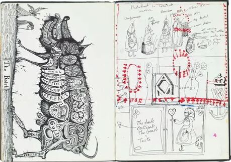
Fig 2. Grayson Perry. The Beast. https://www.theguardian.com/artanddesign/2016/feb/19/inside-grayson-perrys-sketchbook (Accessed 02/03/21)
After establishing his first ceramic studio in 1986, Grayson Perry said that he became focussed on clay and only used drawing to remind him, 'what to do and in what order.' It was only when he started drawing with his young daughter in the mid 1990s that he returned to use drawing in his sketchbooks as he had earlier in his life: 'With Flo I had learned to play on paper again.'
Perry describes how, because of his success, his drawings on loose paper have become much less free and spontaneous because he is extremely conscious of their monetary value. He is able to be more free and playful in his sketchbook drawing, however, and it has become vital to his work.
Grayson Perry is best known for his ceramic vases, on which he depicts images of significance to him. See fig 3.
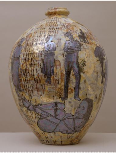
Fig 3. Grayson Perry. 2001. Aspects of myself. Earthenware 550 X 410 X 410mm. 17kg.
https://www.tate.org.uk/art/artworks/perry-aspects-of-myself-t07904
https://www.tate.org.uk/art/artworks/perry-aspects-of-myself-t07904
Study point 12.
Annette Robinson and Sue Gilmore.
Annette Robinson's exhibition entitled 'Transformer' at the Uppsala Museum in Sweden was held over a five month period. Robinson constructed twenty-seven different stamps which were based on the child's game, 'Sticklebrick', and the exhibition was created by the audience using the stamps to make drawings on the walls and freestanding forms throughout the five month period. See figs 1 and 2:
Figs 1 & 2. Annette Robinson. Stickle drawings.
This is reminiscent of Roman Ondak's Measuring the Universe, where the audience was invited to measure their height and record it, along with their name, on the gallery walls, which was another example of the audience being an integral part of the work. However, Annette Robinson's Transformer exhibition differed from this because the stamps could produce repetitive and multiple forms, and
'It is thus made to be in a state of flux through imagination and a vast permutation of construction possibilities' (Annette Robinson) See fig 3:
Fig 3. Example of stickle drawings.
https://www.annetterobinson.co.uk/work/interactive-stamp-drawings/transformer/
Sue Gilmore:
In her Artist Statement, Sue Gilmore describes how her interest and curiosity in the natural world, which is the result of growing up in rural Somerset, is the main focus of her work. For her, working with nature highlights the issues of time, uncertainty, and change which reminds me of Henry Moore's assertion that the constant flux of nature - birth, growth, death, decay and rebirth - provides a 'limitless variety of shapes and rhythms.'
Gilmore manufactures her own charcoal from willow, then uses it to make drawings of willow. See figs 1 - 3:
Fig 1. Sue Gilmore. Salix Alba Chermesina (Scarlet Willow)
Fig 2. Sue Gilmore. That's just how it is. Charcoal and acrylic medium on canvas board prepared with gesso. 60 X 60cm.
Fig 3. Sue Gilmore. It has come to this. Charcoal, charcoal dust, and sand. 60 X 60cm. Floor based work.
https://sue-gilmore.com/work/trace-drawings/
I enjoy Sue Gilmore's work, because the texture and pattern of the natural world is a major source of inspiration for me also. I especially like the subtlety and feeling of ephemerality she has achieved through using charcoal in different ways, and the texture and sculptural quality she has achieved in Fig 3 is a source of inspiration for my work in part 4.
Study Point 13.
Jonathan Owen and Absence.
'Making by taking away' is a phrase that Jonathan Owen uses to describe his work in a video on www.inglebygallery.com
Owen transforms both objects and images through the process of removing. his eraser drawings, described as 'carvings in two dimensions', are made by removing ink from the surface of photographs found, most recently, in books on the history of American and European cinema. See fig 1:
Fig 1. Jonathan Owen. 2018. Eraser drawing (Paper). Partially erased book page. 29.6 X 23.9cm
https://www.artsy.net/artwork/jonathan-owen-eraser-drawings-lot (Accessed 11/03/21)
Describing how he works with sculptures Owen stated,
'My intervention involves carving sections of the statue into moveable interlinking rings which causes the figure to partially collapse or slump into a different posture.'
https://www.inglebygallery.com/artists/54-jonathan-owen-overview/
In an interview with NGV Magazine, Owen stated that he learns as much as possible about the neoclassical European marble sculptures he transforms before he works with them, and maintains that his intention is not to commit acts of vandalism. He looks for the potential for the unexpected to happen, and says that he wants to reactivate the sculpture and to enable it to say something new - especially about the questions of permanence and control. See fig 2:
Fig 2. Jonathan Owen. 2017. Untitled. 19th century marble bust with further carving. 75 X 54 X 32cm
https://www.artsy.net/artwork/jonathan-owen-untitled-7 (Accessed 11/03/21)
Richard Deacon.
Deacon is an artist suggested by my tutor for research, because he works with both sculpture and drawing. Born in Wales in 1949, Richard Deacon works with a variety of materials including wood, vinyl, steel and ceramic, to create abstract three dimensional works. He is especially interested in exploring contradictions or opposites, and his 1980 'Untitled Drawing' was inspired by the harmonious interaction between opposites as expressed in Yin/Yang. See fig 1:
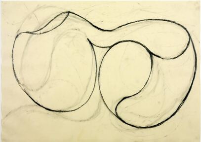
Fig 1. Richard Deacon. 1980. Untitled drawing. Graphite and ink on paper. 460 X 645mm.
https://www.tate.org.uk/art/artworks/deacon-untitled-drawing-t05208 (Accessed 24/03/21)
The familiar symbol of Yin/Yang, of a circle equally divided by a curved line, is alluded to in the shape on the right. In earlier drawings Deacon had used precise geometry and carefully constructed grids, but this was made in a much more free and rhythmic way, with lines being drawn, erased and drawn over, leaving faint ghost images which add interest to the drawing. This departure from earlier, more rigid drawing may have been another exploration into the nature of contradiction and opposites.
Deacon felt this drawing to be related to the sculptural work he did from 1987 - 1988 entitled, 'Before my very eyes.' See fig 2:
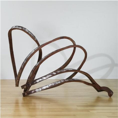
Fig 2. Richard Deacon. 1987-1988. Before my very eyes. laminated masonite and aluminium foil. 147.3 X 216.5 X 116.8cm
www.artnet.com/artists/richard-deacon/ before-my-very-eyes (Accessed 24/03/21)
www.artnet.com/artists/richard-deacon/ before-my-very-eyes (Accessed 24/03/21)
Richard Wilson is another artist my tutor suggested would be interesting to research, especially his installation entitled 20:50, because it is an interesting example of dramatically changing the perception of a space, which had been my aim in Ex 3.3 when building installations.
Wilson apparently had the idea for this work after spending time by a swimming pool on holiday. He stated in 'The Guardian',
'The idea of a tardis-like space, where the internal volume is greater than its physical boundaries, had always appealed to me.'
20:50 is named after the recycled engine oil that Wilson used to flood a room with, to create this installation. When viewers walked along a metal walkway, which had been constructed through the middle of the flooded room, the glossy surface of the oil was about waist level, which,
'conjures up the illusion that you are suspended somewhere heady and precarious.'
https://elephant.art/extraordinary-effect-richard-wilsons-20 50-room-flooded-black-oil/
See figs 1 and 2:
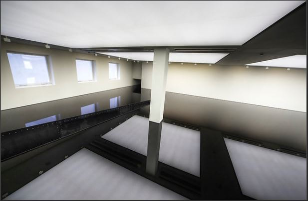
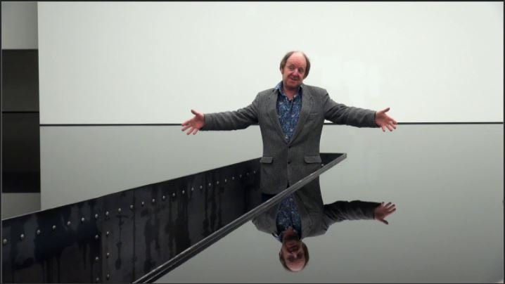
Fig 1. Fig 2. Richard Wilson. 20:50
https://www.bing.com (Accessed 25/03/21)
Writing in 'The Independent' on the 18th January 2010, Michael Glover described his experience of 20:50 at the Saatchi Gallery. Glover likens it to an 'Alice in Wonderland' experience, describing the unnerving optical illusions created by the oil. He noticed a narrow aluminium bridge within the room, which was off limits to viewers, but requested to go down some steps and onto the bridge. After signing a disclaimer, he was allowed to do so, and once there, discovered that he could touch the oil if he wished. The oil's density meant that, unlike water, it remained very still,
'so that it is not immediately obvious that reflections are not realities.'
Although it gave the illusion of great depth, Glover later discovered that the oil was only inches deep.
Glover maintained that installations are sometimes unsuccessful because they almost try too hard to demand the viewer's attention by being, 'too obvious', 'too fussy', 'too noisy', or 'too unclear in their purpose.' The fairly simple idea - although undoubtedly logistically difficult to achieve - behind 20:50 is clear in its purpose, and powerful in its effect.
https://www.independent.co.uk/arts-entertainment/art/reviews/20-50-richard-wilson-saatchi-gallery-london-1870805.html
Louise Bourgeois. (1911-2010)
Throughout her very long life Louise Bourgeois combined sculptural with two-dimensional work, and both vacillated between abstraction and figuration. She used a variety of materials, including wood, glass, metal, fabric, latex and marble to create sculptures, the main purpose of which was to express an emotional or psychological state. From the late 1950s, following the death of her father, Bourgeois was engaged in psychoanalysis in order to cope with the depression and anxiety which resulted from her father's death, and her artwork seems to have developed alongside this.
In 1999, at the age of eighty-eight, Bourgeois made 'Maman', the sculpture of a giant spider, for the Tate Modern's Turbine Hall. See fig 1:
Fig 1. Louise Bourgeois. 1999. Maman. Bronze, stainless steel, marble. 30ft X 33ft.
https://www.bing.com (Accessed 03/04/21)
The image of the spider was important to Bourgeois because for her, it symbolised the mother figure, who could be experienced as both predator and protector. Louise Bourgeois summarised the main purpose of her work in this quote:
'I need to make things. The physical interaction with the medium has a curative effect. I need the physical acting out. I need to have these objects exist in relation to my body.'
https://www.tate.org.uk/art/artists/louise-bourgeois-2351/art-louise-bourgeois
As with her sculptural work, Louise Bourgeois also used drawing in a therapeutic way, as a form of treatment for her anxiety. See fig 2:
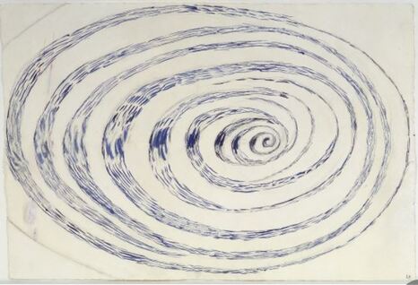
Fig 2. Louise Bourgeois. 1970. Untitled. Watercolour and charcoal on paper. 69.9 X 101.6cm
https://www.galleriesnow.net/shows/louise-bourgeois-drawings-1947-2007/ (Accessed 03/04/21)
This spiral symbolised the ambivalence Bourgeois felt about control; both the fear of losing control, and the freedom of letting it go.
https://www.galleriesnow.net/shows/louise-bourgeois-drawings-1947-2007/ (Accessed 03/04/21)
This spiral symbolised the ambivalence Bourgeois felt about control; both the fear of losing control, and the freedom of letting it go.
For her work across both 3D and 2D, my tutor also suggested that Sally Barker may be of interest. Barker's work is mainly about the areas of feminism and the environment, and links between the two. She is specifically concerned with issues of damage, control, change and power.
During the corona virus lockdown period, Barker appealed for photos of old and discarded bras and vests, which she then used to make layered compositions with paint and print. See fig 1:
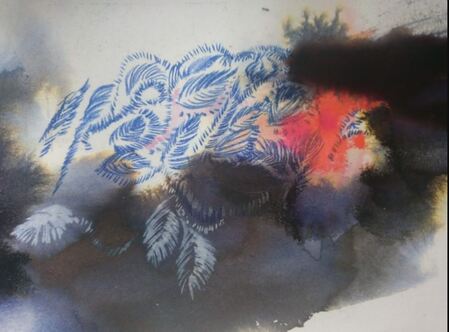
Fig 1. Sally Barker. From The Bra Rifle Range series. 2020.
She developed these ideas further by making sculptures of bras using plaster, and combining these 3D structures with print. See fig 2:
She developed these ideas further by making sculptures of bras using plaster, and combining these 3D structures with print. See fig 2:
Fig 2.
The process of change for women, whether through ageing, pregnancy, surgery, or illness, was the focus of this work.
'We only print in blood red' is a body of ceramic work which Barker made to, quite literally, illustrate the 'mark' we make on the environment. By squeezing into clay she made thousands of black and red fingerprints, then installed them in a variety of outdoor locations, including walls, trees and stones. See figs 3 and 4:
Fig 3.
Fig 4.
https://sallybarker.org (Accessed 16/04/21)
I have been considering the possibility of making combinations of 2D and 3D work the subject of part 5, and have found discovering Sally Barker's work a source of great inspiration and encouragement.
https://sallybarker.org (Accessed 16/04/21)
I have been considering the possibility of making combinations of 2D and 3D work the subject of part 5, and have found discovering Sally Barker's work a source of great inspiration and encouragement.
Part five.
Exploring Drawing media.
Three artists that my tutor suggested may be of interest from part 4 feedback were Therese Oulton, Eva Hesse and Anthony Caro.
I began by looking at the sculptural work of Eva Hesse:
Eva Hesse (1936-1970)was born in Germany just prior to the second world war. She was sent to the Netherlands by her parents to escape Nazi Germany. The family reunited briefly in England in 1939 before eventually settling in New York City.
Between 1960-1965, Hesse produced mainly abstract paintings, and from 1965 onwards, sculpture became the main focus of her work. She always maintained that the drawings and sculpture were created separately, and, 'weren't related in one completing the other.'
This is interesting in relation to some of my own work, because since part 3 of the course, one of the recurring themes in my work has been the dialogue between 2D and 3D work. Sometimes a sculptural piece can transform a 2D drawing into something very different, which then, in turn, can generate something new in 2D. This is a two-way process, rather than one completing the other. This is probably due to the fact that my aim at the moment is to experiment and explore, rather than to produce 'finished' pieces of work.
In his description of Eva Hesse's work for the Camden Arts Centre in London, Barry Schwabsky stated,
"Things folded, things piled, things twisted, things wound and unwound; tangled things, blunt things to connect to; materials that have a congealed look, materials that seem lost or discarded or mistreated; shapes that look like they should have been made of flesh and shapes, that look like they might be made of flesh but should not have been – you can look at these things, these materials, these shapes, and feel the shudder of an unnamable nanosensation, or you can let your eye pass by them without reaction; maybe you can do both at once. All of her work, and especially her drawings, are based on repetition and simple progressions.
https://enwikipedia.org/wiki/Eva_Hesse
In a diary entry from November 4th 1964, Hesse wrote:
I destroy - rebuild and so it goes. I wonder how much I must impose my preconceived ideas and to what degree I must be alert and willing to go along with what happens at the moment on canvas.'
This is another interesting concept, and very relevant to my own process. Throughout this course I have become more and more aware of being led by what is happening 'in the moment' This seems to happen more often with 2D mixed media drawing, because sometimes the practical problems of creating a structure dominate in 3D work.
Two of Eva Hesse's sculptures that I found especially interesting were figs 1 and 2:
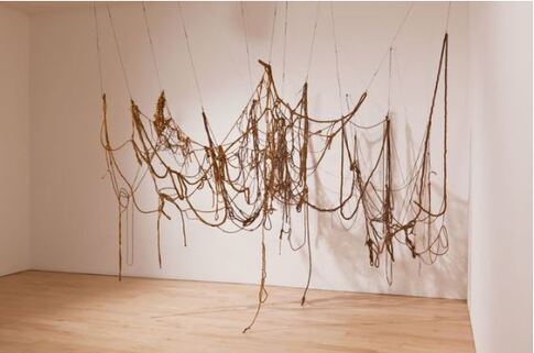
Fig 1 Eva Hesse 1969 - 1970 No Title Latex, rope, string, wire.
https://www.artsy.net (Accessed 22/05/21)
I liked this piece because of its linear quality, and because I am currently working on a 3D structure in which I am also trying to create linear quality, by using wood and wire.
https://www.artsy.net (Accessed 22/05/21)
I liked this piece because of its linear quality, and because I am currently working on a 3D structure in which I am also trying to create linear quality, by using wood and wire.
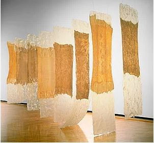
Fig 2 Eva Hesse 1969 Contingent Cheesecloth, latex, fibreglass.
https://nga.gov.au (Accessed 22/05/21)
I was drawn to this structure because it reminded me of the site specific installation I did in part 3 of the course, which was composed of a variety of suspended pieces to represent shadow and transparency. I find it interesting that the sculptures of Eva Hesse I have found the most interesting are invariably suspended works; this is possibly because I am also working on suspended 3D structures for part 5.
Therese Oulton (b.1953) is known for her abstract paintings of rocky landscape. Oulton herself, however, refutes this, saying:
'The paintings were never abstract, they were always engaged with representation, the how of representation, the effect of that.'
https://thereseoulton.com/texts/interviews/interview-with-therese-oulton/
Oulton doesn't work from preliminary sketches, but seems to mould and shape her paintings into life. Her technique is described by John Parker:
She prepares a coloured ground and on a palette sets out pools of turpentine-thinned oil paint. She then pushes wet paint into wet paint using either her hands or a sable brush, producing forms that, 'seem to have been caressed, pushed and battered into shape.'
https://www.artistjparker.art/at-12
See figs 1 and 2.
Fig 1 Therese Oulton 2005 Camera Obscura 173X203cm oil on linen
Fig 2 Therese Oulton 1988 Sea Garden II 59.9 X 48.3cm
https://thereseoulton.com/portfolio/exhibitions/new-paintings/ (Accessed 30/05/21)
In an article by Germaine Greer in 'The Guardian' on 28/02/10, Greer describes Oulton's work as making the viewer feel as if they are, 'hanging in space in freefall', saying that Oulton's paintings are able to create an impression of vastness within a small canvas.
https://www.theguardian.com/artanddesign/2010/feb/28/germaine-greer-therese-oulton-landscapes
In this sense, Oulton's work reminds me of Peter Lanyon's paintings. Due to his love of gliding, Lanyon created many paintings in which he attempted to portray the feeling of floating in the air, and the rush of movement through space experienced in a glider. Like Oulton, Lanyon's landscapes combine elements of land, sky and sea, but seem to be predominantly about the air, and sky.
In 2019 I saw a painting entitled, 'Ground Sea' by Lanyon in the 'From Figure Study II: Joe Hill curates the Towner collection' exhibition at The Towner gallery in Eastbourne. I was so struck by the illusion of space Lanyon had created within such a small canvas that I felt compelled to photograph it without the frame, an impulse generated by my need to give it more room to expand. See fig 3.
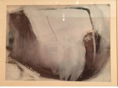
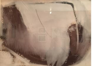
Fig 3 Peter Lanyon 1961 Ground Sea Gouache on paper 70 X 50cm.
Of these two artists, I prefer the work of Therese Oulton, because I enjoy the textural quality she achieves with paint in depicting the natural world, which seems very relevant to some of my own work.
Anthony Caro (1924-2013) instigated a revolution in the world of sculpture. From 1960 onwards, in place of the recognised methods of carving in stone or wood, or casting in bronze, Caro used scrap metal, welded together and brightly painted. In the place of solid form, he made structures that were linear and open, and instead of recognisable imagery he made sculpture which, 'referred to nothing outside itself.'
https://www.tate.org.uk/whats-on/tate-britain/exhibition/anthony-caro-room-guide
From 1966 Caro began to make sculptures that were created to be viewed on a table top. These were not maquettes for larger work, but pieces in their own right. Many incorporated everyday tools, such as scissor handles, and all made use of the table edge as an integral part of the whole. See fig 1.
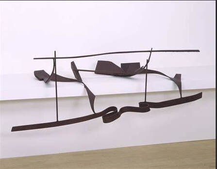
Fig 1 Anthony Caro 1975 Table Piece CCLXV1. Steel 795 X 2055 X 1250mm
https://www.bing.com (Accessed 04/06/21)
This is an example of one of Caro's later table sculptures, in which he extended the work beyond its supporting surface and into the surrounding space. To me, this feels very much like a drawing in space. I find this linear construction, which is a combination of straight, angular lines and more flowing lines, especially interesting because I am currently experimenting with a linear structure for my work in part 5 - although I am working with a more organic, flowing form.
One Caro sculpture that caught my attention, and which I especially like is Night Movements. See fig 2.
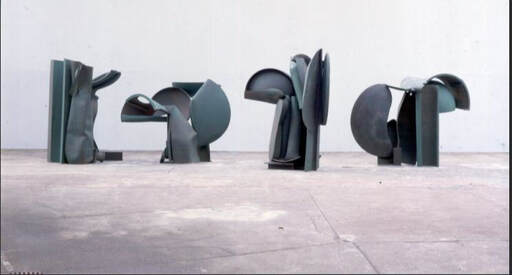
Fig 2 Anthony Caro 1987-1990 Night Movements https://www.bing.com (Accessed 04/06/21)
This sculpture is made up of four parts, and constructed from various pieces of scrap metal that Caro found in scrapyards which he bent, twisted, and welded together. Although this work was reputed to be inspired by the tree paintings of the 19th century French realist painter Gustave Courbet, it bears no realistic resemblance to trees. Caro has created a sculpture 'whose forms are fully resolved in their own right.'
https://www.tate.org.uk/art/artworks/caro-night-movements-t06793 (Accessed 04/06/21)
I like the fact that the viewer becomes part of this sculpture, by walking around it and inhabiting the negative spaces between the pieces. Much of Caro's work is also straight, and hard-edged, but this piece, because of its influence of trees, has more organic shapes within it, which appeal to me.
