Part 1:
Ex 1.1.
Experimenting with immediacy and fluid line.
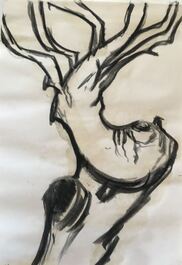
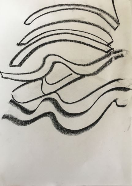
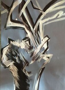
I decided to use a piece of flint with an interesting pattern as a starting point for this exercise. Using diluted acrylic paint on A4 paper, I began tentatively, but relaxed as I worked through the exercise. I found the action of drawing, using the fluid media, was relaxing in itself. The pace of my drawing remained fairly slow throughout the exercise, and I noticed that I enjoyed the interplay between the thick lines and the more feathery ones. In some places I decided to continue the line into the next piece of paper, and in others, the drawing is contained within the A4 paper.
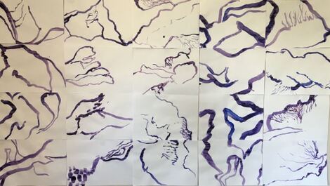
Ex 1.1 Reflecting on the drawing after a few days, I felt there was a natural rhythm to it - the thicker lines coming forward, and the thinner, more feathery lines receding. So I decided to use chalk pastel as a counterpoint medium to try and accentuate this. I added vibrant pink, purple and blue to the lines I wanted to come forward, and white to those that I wanted to recede. I was aiming to create movement through the whole drawing.
Ex 1.1 summary: I thought this worked well, although perhaps a darker colour pastel would have been more successful. I also noticed that my drawing with the pastel was much more tentative than it had been with the paint. There seems to be balance between the two elements of power and fragility, and adding the dry media has given it more depth.
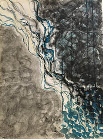
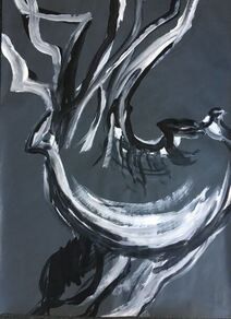
I took another photo of the drawing from an oblique angle because I wanted to see how this image would be different seen in this way. I think this is more visually interesting, because there is greater contrast between the elements of power and fragility.
I took another photo of the drawing from an oblique angle because I wanted to see how this image would be different seen in this way. I think this is more visually interesting, because there is greater contrast between the elements of power and fragility.
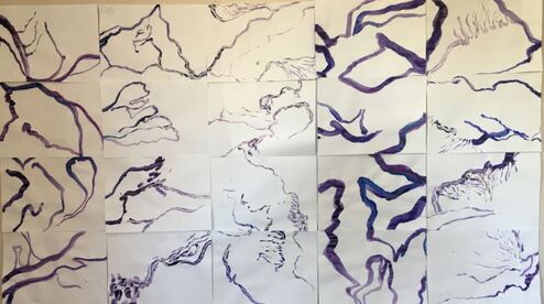
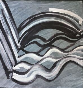
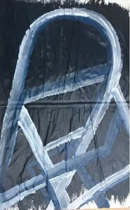
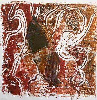
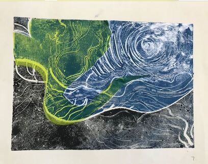
Following my tutor's suggestion that I explore this exercise further, I began by constructing this drawing, made up of six of the A4 panels, which seemed to work well together because their lines created a flowing motion through the drawing.
When I had looked at this drawing for a few minutes, I felt it needed the addition of a different colour, so I added the small orange marks in florescent marker pen:
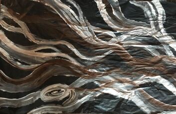
This drawing reminded me of some of Simon Ling’s paintings that I had seen in the Towner gallery in Eastbourne last year. One of the most striking aspects for me about Ling’s work was his use of colour, and this is an extract from my learning log about the exhibition:
I had an emotional response to his work, which could best be described as excitement, or feeling overwhelmed. His paintings of logs are powerful and vibrant, and have probably changed the way I look at wood for ever! I felt I could sense how the wood felt, I could imagine lifting it up and being greeted by hordes of insect life, I could smell it. It practically tumbled off the canvas at me. The gallery’s information on this exhibition described Simon Ling’s practice as aiming to portray, ’the animated nature of perception, the movement and construction involved in looking, and the creative position the mind has in seeing the world.’
The way Simon Ling achieves such power and drama is by creating a 3D effect in his painting through the skilled use of perspective and tone, through the marks he makes to represent texture, and through his use of colour. There are strong contrasts of light and dark, and texture is achieved by small irregular shapes outlined in a darker colour to represent the thick, rough bark. The overall impression of colour is of blues with orange highlights along the surface of some of the logs, but closer inspection reveals a wide variety of purples, browns, blues and greens. Small flashes of bright greens, yellows, and orange dance throughout the compositions. See fig 1:
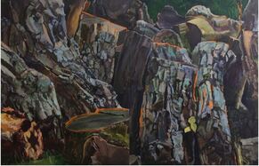
Fig 1. https://www.townereastbourne.org.uk/exhibition/simon-ling/
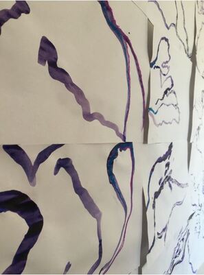
My tutor had asked me which marks and lines in the original drawing felt like my own, so I looked at the drawing again, and choose three which I felt a stronger connection to. They were drawings that contained more light, feathery marks than strong, thick lines:
My tutor had asked me which marks and lines in the original drawing felt like my own, so I looked at the drawing again, and choose three which I felt a stronger connection to. They were drawings that contained more light, feathery marks than strong, thick lines:
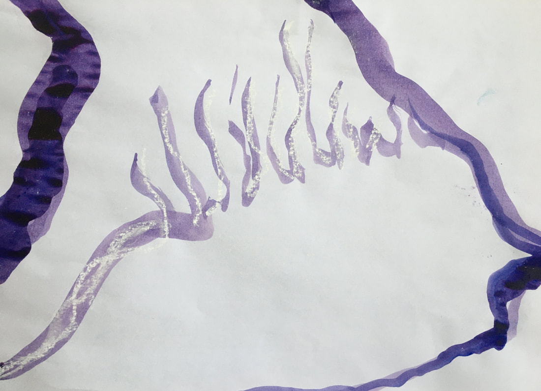
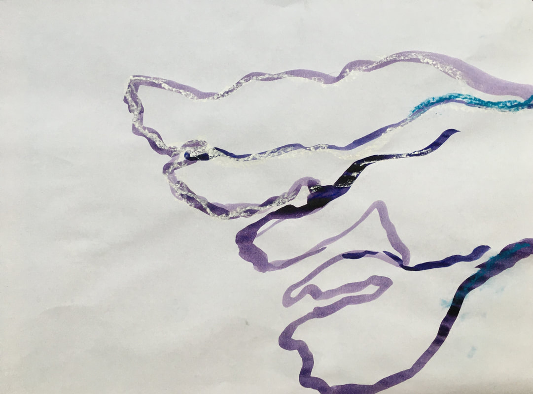
I choose one of these images to enlarge into an A1 drawing, using ink, then chalk pastel and charcoal when dry:
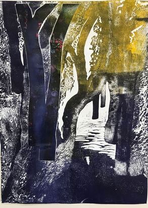
I did this drawing on an easel, because I wanted to experiment with allowing the media to drip and run. I wasn't comfortable with the resulting image, because the ink ran down in straight parallel lines which didn't seem to work with the flowing, organic lines of the drawing. This made me feel out of my 'comfort zone', and my first response was to try and paint the parallel lines out, but then I thought it would probably be an interesting experience to stay out of my comfort zone with it for a time, and see where this led. Eventually I decided to draw over the marks with compressed charcoal and water, to create a textured area, then turned the image upside down, which gave the impression of something being suspended by the partially obliterated, but still visible parallel lines. In retrospect, if I hadn't drawn this on an easel, and had to make decisions about the resulting drips and unintended lines, it wouldn't have been such an interesting learning experience.
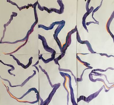
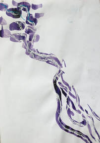
Then I tried combining all three of these chosen A4 drawings into a whole:
Then I tried combining all three of these chosen A4 drawings into a whole:
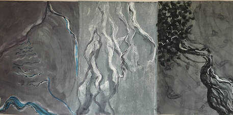
X3 A2 panels. 23.5ins X 49.5 ins. Acrylic, ink, compressed charcoal, chalk pastel.
What do I feel worked well?: I feel these three drawings work well together as a triptych, because they all have lines which compliment each other, and the different tonal backgrounds add visual interest. I like the fact that they all look like sea creatures or plants, even though their original inspiration was from a piece of flint. I think the ink, charcoal and pastel work well together to create atmospheric drawings on the acrylic wash support.
What worked less well?: The third drawing on the right feels as if it has run out of space at the top, and I would like to extend this drawing into the one on the left, to see how this affects the whole.
Happy accidents: The ink on the drawing on the right started to drip, so I used a sponge to wipe the drips. I discovered that the sponge was a very useful tool to paint with, to make broad, sweeping marks. When the pools of ink had dried out in the third drawing, it left behind darker marks, which I felt really worked well with the composition.
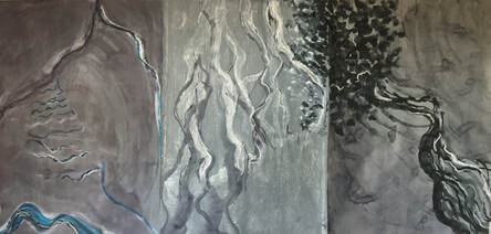
Extending the drawing on the right into the one in the centre improves the overall image, I think, because it provides a link between them, and there's not such a strong feeling of disconnectedness.
Ex 1.2.
Using fluid media to add tone.
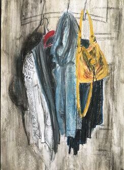
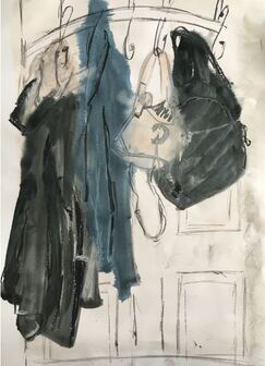
I tried two different subjects to explore this exercise. Firstly, coats and bags hanging over a door:
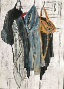
A2 cartridge paper. I used black and grey acrylic paint to block in the tonal areas first. When this was dry I did the drawing with oil pastel.
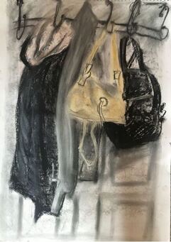
A2 cartridge paper. Oil pastel.
I quickly lost interest in this second drawing. After about 10 - 15 minutes I decided to use white spirit with the oil pastel. This had the effect of turning the oil pastel into a fluid media, and it felt like drawing with thin oil paint. On reflection, I think I was trying to recreate the feeling of the first drawing, which had flowed much more easily, and been more enjoyable to do.
Of these two, I prefer the first drawing, because it seems to have more energy and vibrancy.
Ex 1.2 cont...I looked for a different subject, and decided on a still life, using two vases, a bottle, and a bowl.
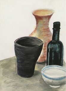
A3 cartridge paper. I used ink to block in the tonal areas first, then chalk pastel to draw into it.
These objects were chosen for their tonal contrast. Their clearly defined shapes led me to do an almost finished drawing with the inks, and I don't think the pastels added much. So I tried a second drawing, with much more loosely drawn blocks of tone:
These objects were chosen for their tonal contrast. Their clearly defined shapes led me to do an almost finished drawing with the inks, and I don't think the pastels added much. So I tried a second drawing, with much more loosely drawn blocks of tone:
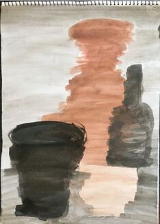
A3 cartridge paper. Inks.
Over this I used willow and compressed charcoal, and white chalk pastel. I prefer this drawing to the first one. Drawing the objects over the tonal patches, with some areas of tone extending beyond the objects gives them an ethereal feeling.
Then I did the second part of the exercise, using chalk pastels over white gesso:
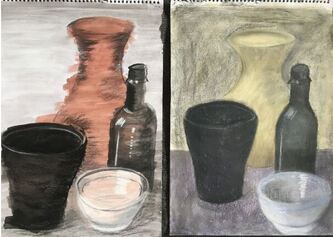
For the second drawing, where there were no tonal areas added first, I was inspired by the work of Georgio Morandi. I think it's interesting to compare these two drawings, because they each seem to have a very different kind of energy - the pastel drawing on the right feels calm and contemplative, whereas the one on the left feels more energised.
Giorgio Morandi. (1890-1964)
Morandi arranged his small still lifes of bottles, jars, vases and boxes against simple backgrounds, and it was his work I had in mind when I did the second drawing. Julian Kreimer describes how, although Morandi's approach was repetitive, each of his still life paintings had a unique quality:
' '......all the great qualities are simply there: the quivering negative space between the bottles; the just-so brushwork, loose without being arrogant; and the gently heartbreaking disproportion of background to objects, the space a bit too vast, making us empathise with the small, huddled groups.'
Julian Kreimer. (25/02/2016) https://www.artnews.com/art-in-america/aia-review/giorgio-morandi-62106/
Aware that I have been working in my usual way, spending more time than I probably should with each drawing, I decided to return to my original subject, and set myself a strict time limit:
A2 cartridge paper. 20 minute drawing. Tonal areas drawn with inks first, then compressed charcoal to draw into the ink before it dried.
A2 cartridge paper. 25 minute drawing. No tonal areas added first. Compressed charcoal and chalk pastels.
Ex 1.2 summary: I intended both these drawings to be 20 minutes, but I became absorbed in the second one, and it was therefore a bit longer.
Rather like the still life drawings, I think these both have a different quality to the first drawings. They were more enjoyable to do, and of all four drawings of this subject, I prefer the 20 minute drawing above because it feels more expressive, and gives the best impression of the objects randomly draped over the coat hooks, whereas in some of the other drawings, I think the clothing and bags look more rigid.
Overall, I have enjoyed drawing into the tonal areas to create a drawing more than doing the drawing without the tone added first, because this technique enables me to be more free and expressive.
Exercise 1.3.
Experimenting with dynamic gesture.
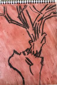
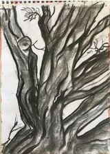
I noticed that I was looking for subjects that were irregular in construction, or from the natural world. I returned to the trees that I worked on for the 'personal project' of my last course to begin with, starting with a silver birch with a very interesting, deformed trunk.
Ex 1.2 summary: I intended both these drawings to be 20 minutes, but I became absorbed in the second one, and it was therefore a bit longer.
Rather like the still life drawings, I think these both have a different quality to the first drawings. They were more enjoyable to do, and of all four drawings of this subject, I prefer the 20 minute drawing above because it feels more expressive, and gives the best impression of the objects randomly draped over the coat hooks, whereas in some of the other drawings, I think the clothing and bags look more rigid.
Overall, I have enjoyed drawing into the tonal areas to create a drawing more than doing the drawing without the tone added first, because this technique enables me to be more free and expressive.
Exercise 1.3.
Experimenting with dynamic gesture.
I noticed that I was looking for subjects that were irregular in construction, or from the natural world. I returned to the trees that I worked on for the 'personal project' of my last course to begin with, starting with a silver birch with a very interesting, deformed trunk.
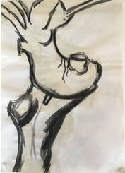
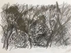
A blackthorn tree presented a different challenge, with many branches weaving in and out:
I noticed a pile of old tiles in my neighbour's garden, which looked interesting, because they formed strong shapes and lines:
Aware that I am naturally drawn to subjects with organic shapes or curving lines, I decided to find a subject with straight lines for the next drawing:
I tried an A2 drawing of the silver birch tree, working from the first sketchbook drawing:
A2 blue sugar paper. White emulsion house paint and acrylic.
I tried to capture the lines and angles of the tree. I didn't want the paint to run, so did this on a table. It felt a bit cramped, and that the drawing needed to be bigger.
I tried to capture the lines and angles of the tree. I didn't want the paint to run, so did this on a table. It felt a bit cramped, and that the drawing needed to be bigger.
Ex 1.3 cont..... A1 cartridge paper, with a grey/blue acrylic background. White emulsion and acrylic.
I used the third tree sketch for this painting. Whereas the first tree drawing had mainly angular shapes, this one was broad, sweeping curves. I enjoyed using the white and black paint together, using big movements to capture the tree's form.
I still felt the drawing needed to be bigger, so for the next one I used brown wrapping paper, 28 X 29 ins, which I covered initially with a brown/purple acrylic wash:
I used the sketchbook drawing of the tiles for this. I felt I wanted to draw on a wet surface, because I thought this would enhance the big sweeping movements I needed to make to capture the shapes made by the tiles,so I covered the paper with a diluted mix of white 'readymix' paint, which was thin enough to allow some of the colour underneath to show through. I used white with a dark redish-brown acrylic to draw the tiles, and found that the wet surface helped in moving the paint around and drawing the shapes I was aiming for.
After these three drawings I took some time to reflect on this exercise. I was aware that I was unsure how to approach the drawings, as they were very different to anything I've done previously. It was as if they had a lot of potential power that I wasn't sure how to handle or control, and I thought that perhaps I shouldn't try to control it? Then I remembered that Franz Kline's paintings had the appearance of having been made quickly and spontaneously, but that they were, in fact, meticulously planned and executed.
The thing I felt fairly certain of was that they needed to be big, so for the next two, I joined together two sheets of flip chart paper to make drawings of 45 X 29 inches:
45 X 29 ins. White emulsion and acrylic on wet acrylic background.
I used the sketch of the blackthorn tree for this. Using house painting brushes, I tried to draw the strength and movement of the tree's interweaving branches. As with the previous drawing of tiles, I found a wet surface really helped in making the movements I needed to make with the brush, and it felt easier to move the paint around in the way I wanted to than it had on a dry surface. However, I still found that I was drawing in a fairly considered way, and wanted to experiment with being more spontaneous.
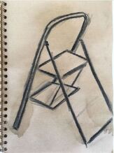
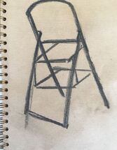
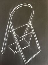
I also felt I needed to try a drawing on this scale of a subject that had a different kind of structure, so used one of the sketches of the stepladder for this:
I used the sketch of the blackthorn tree for this. Using house painting brushes, I tried to draw the strength and movement of the tree's interweaving branches. As with the previous drawing of tiles, I found a wet surface really helped in making the movements I needed to make with the brush, and it felt easier to move the paint around in the way I wanted to than it had on a dry surface. However, I still found that I was drawing in a fairly considered way, and wanted to experiment with being more spontaneous.
I also felt I needed to try a drawing on this scale of a subject that had a different kind of structure, so used one of the sketches of the stepladder for this:
45 X 29 inches. White emulsion and acrylic on wet acrylic background.
I found it more difficult to draw the straight lines and angles of this subject, and still struggled to draw in a spontaneous way.
Ex 1.3 summary: From this exercise I have learned that I enjoy using wet-on-wet fluid media, and the physical experience of making big movements to draw, and capture the strength, angles and movement of the subject. I noticed that the feeling I have when drawing in this way is also different from how I feel when drawing in other ways, and I feel more energised - whereas when doing exercise 1.1, for example, I felt more contemplative. In this respect, I can see parallels with my own work and the way in which Franz Kline worked. Throughout the exercise I felt drawn to making bigger, stronger drawings, and also felt the need to refer to previous sketches to depict the subjects as accurately as possible.
I think this way of working could be quite helpful for my development, because it involves making fairly quick decisions, and feeling the marks that need to be made, instead of deliberating over them, as I am often apt to do.
Exercise 1.4
Invention and mystery.
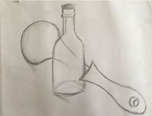
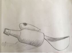
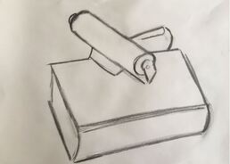
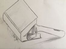
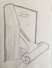
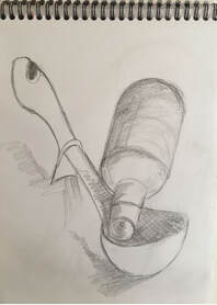
I found this the most challenging exercise of part 1. I choose two different pairs of objects to work with - a bottle with a ladle, and a book with an ink roller. To begin with I made 12 sketchbook drawings, experimenting with different interrelationships between the objects:
I found it more difficult to draw the straight lines and angles of this subject, and still struggled to draw in a spontaneous way.
Ex 1.3 summary: From this exercise I have learned that I enjoy using wet-on-wet fluid media, and the physical experience of making big movements to draw, and capture the strength, angles and movement of the subject. I noticed that the feeling I have when drawing in this way is also different from how I feel when drawing in other ways, and I feel more energised - whereas when doing exercise 1.1, for example, I felt more contemplative. In this respect, I can see parallels with my own work and the way in which Franz Kline worked. Throughout the exercise I felt drawn to making bigger, stronger drawings, and also felt the need to refer to previous sketches to depict the subjects as accurately as possible.
I think this way of working could be quite helpful for my development, because it involves making fairly quick decisions, and feeling the marks that need to be made, instead of deliberating over them, as I am often apt to do.
Exercise 1.4
Invention and mystery.
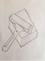
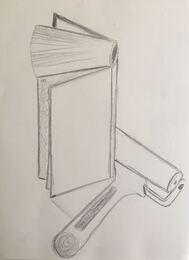
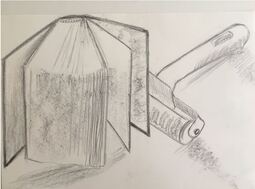
I found this the most challenging exercise of part 1. I choose two different pairs of objects to work with - a bottle with a ladle, and a book with an ink roller. To begin with I made 12 sketchbook drawings, experimenting with different interrelationships between the objects:
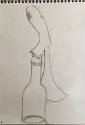

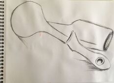
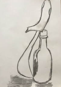


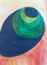
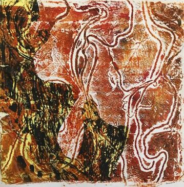
Ex 1.4 cont..... The objects I had chosen didn't physically join together very easily, and I was unsure which option to develop, so I decided to work with ink, acrylic and watercolour paint on some of the sketches, and see what developed. I looked carefully at each drawing, and extended some of the lines, and by doing this I discovered that I seemed to have a natural tendency towards the third option:
Allow the two objects together to suggest a new object, and extend this in a surreal way:
I choose these sketches to work with, using ink and acrylic paint:'
Allow the two objects together to suggest a new object, and extend this in a surreal way:
I choose these sketches to work with, using ink and acrylic paint:'


As I worked on this image, I realised that the lines and shapes within it reminded me of a Downland landscape.
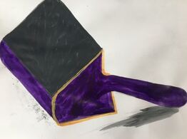
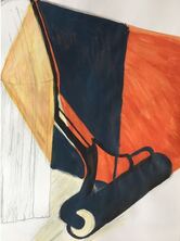
I found it difficult to find another object from this image, probably because I made the shape of the roller too defined. I was very aware that I was finding the bottle and ladle sketches easier to work with than the book and roller sketches; they contained more organic lines and shapes, which I am naturally drawn to, whereas the book and roller sketches had more straight lines and sharp angles.
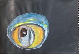
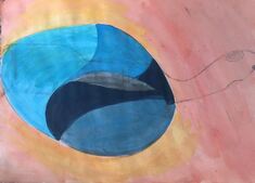
This is the drawing I think works best. It reminds me of some of the mysterious, dreamlike charcoal drawings that Odilon Redon produced. Because I felt this had worked well, I decided to experiment with another ladle and bottle sketch:

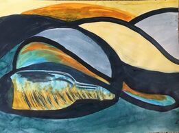
Looking at all the drawings that developed from the original sketches, I felt the one that reminded me of a Downland landscape, and the ones that looked like giant eyeballs would combine well together to create an imaginative composition:
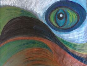
29 X 23 ins. Flip chart paper. Ink and acrylic over acrylic and emulsion base.
I was aware of being influenced by the charcoal drawings of Odilon Redon with this drawing. See fig 1.
I was aware of being influenced by the charcoal drawings of Odilon Redon with this drawing. See fig 1.
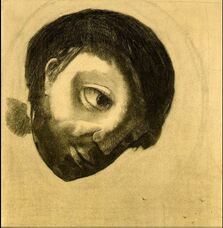
Fig 1. Odilon Redon. 1878. Guardian Spirit of the Waters. Charcoals, black and white chalk on cream wove paper. https://www.wikiart.org (accessed 2/9/2020)
Ex 1.4 summary: I chose the third option for this exercise: 'Allow the two objects together to suggest a new object, and extend this in a surreal way. 'I made this choice firstly, because this is the way my work led me when I started to explore, and secondly because I was inspired by the drawings of Henry Moore.
If I had to name three good things about this drawing, I think they would be, firstly, that I think the composition works, because it feels balanced, secondly, I think the colours work well together, and thirdly, it could inspire imagination. Regarding the question of whether fluid media enabled or hindered these things; it definately helped in achieving the broad sweeping shapes of the composition. The inks and acrylic paint also resulted in good colours when used over the base colour, which had a slight sheen because it was 'mid sheen' emulsion house paint. Chalk pastels, however, may have achieved a more atmospheric result, because it would have been possible to draw more subtle tonal changes and contrasts.
Occlusion.
According to the 'Collins Shorter English Thesaurus', to occlude means to block or to obstruct. Occlusion is important in rendering believable interior space, because it is necessary to be able to show that certain objects or areas are obscured by others, yet still exist within the composition.
The expressive use of occlusion was important in Exercise 1.4, because the end composition was created through using occlusion to create new forms from the still life drawings. It is also important in assignment 1, because it was through obscuring some areas and highlighting others that I built depth into the composition.
Assignment 1:
The exercises that I wanted to develop for the assignment were Ex. 1.2,' 'Using fluid media to add tone', and 1.3, 'Experimenting with dynamic gesture.' I chose a subject where I felt I would be able to incorporate both these techniques, and which I was aware would be a challenge - the wild undergrowth in a hedgerow.
After researching the work of two artists I discovered on the 'Art and Ecology Painting and Drawing Group' on the OCA website - (https://www.oca.ac.uk/wp-content/uploads/2020/08/Art-Ecology-FINNISAGE.pdf) - Jindra Jehu and John Wolseley, I was particularly inspired by the expressiveness of Jindra Jehu's mixed media work. I have discussed the work of these artists briefly in the 'Research' section.
Eliot Hodgkin. (1905-1987)
Several months after I had completed this assignment, I discovered Hodgkin's 1941 composition, Undergrowth. I was fascinated to find an artist who had been inspired by exactly the same subject as myself, and to see how he approached it.
By the 1930s Hodgkin had become well known for his landscape and still life painting. During WW11, when he worked as an air raid warden, he made drawings of plants which sprang up in London's bomb sites. In 1957, Hodgkin described his interests as,
'.......to show the beauty of natural objects which are normally thought uninteresting or even unattractive: such things as Brussels sprouts, turnips, onions, pebbles and flints, bulbs, dead leaves, bleached vertebrae, an old boot cast up by the tide......'
https://en.wikipedia.org/wiki/Eliot_Hodgkin
Tempera was Hodgkin's chosen medium, because it provided the clarity he needed to achieve the definition of his intricate subjects, combined with 'a certain feeling of remoteness.'(Hodgkin)
When I discovered Undergrowth in the Summer 2020 issue of the 'Tate Etc' magazine (issue no. 49, p. 16-17), I saw a very skilled execution of some of the things I was trying to achieve in assignment 1. See fig 1:
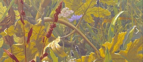
Fig 1. Eliot Hodgkin. 1941. Undergrowth. Tempera on board. 411 X 364mm.
https://www.bing.com (Accessed 11/02/21)
https://www.tate.org.uk/art/artworks/hodgkin-undergrowth-no5558 (Accessed 11/02/21)
I didn't set out to achieve the realistic detail that Hodgkin achieved, but was aiming to depict texture, tonal variation, depth and colour. Hodgkin has achieved these, as well as realistic representation of light, through the juxtaposition of colour and tone, and highly detailed mark making. One similarity with my own work that I noticed was his use of a small area of contrasting colour amidst the greens, ochres and browns to depict the small blue flower, similarly, in assignment 1, I used a small area of orange and purple to depict berries.
This painting has really highlighted the importance of the contrast of colour and tone in achieving depth; the strong image of the red/brown plant in the foreground, contrasting with the green/yellow leaves behind it is particularly effective in helping to create the feeling of depth.
Preparatory work for assignment:
A4. 9B graphite.
Then I did a series of tests with mixed media, trying to capture the immediacy of the first sketch:
Then I did a series of tests with mixed media, trying to capture the immediacy of the first sketch:
10 X 14 in acrylic paper. Ink to draw tonal areas first, then hard pastels and acrylic to draw into the tonal areas when dry.
A4 cartridge paper. Tonal areas drawn with ink first. Oil pastel, chalk pastel, and diluted acrylic to draw into the tonal areas when dry.
A4 cartridge paper. Ink for tonal areas. Oil pastel, white spirit, and diluted water based paint.
At this point I felt my work was quite repetitive, and not really moving forward. I was aware that I wanted to try and depict the subject as it is actually seen, rather than just produce a pleasing picture. I asked my partner to say what it was he thought I'd drawn, and after some consideration, he replied, 'wallpaper.' This was a really helpful observation for me, because it highlighted what I needed to try and do; work on capturing the real character and immediacy of the subject.
Inspired by the work of Jindra Jehu I decided to experiment with incorporating some dried plants into the drawing:

A3 cartridge paper.
I began with inks for the tonal areas again, then collaged the dried plants over this with PVA. When dry, I used diluted PVA, acrylic, and ink to draw into the collage. I was aiming for an image with more depth and contrast. This was an interesting experiment which proved difficult from a practical point of view, as some of the plants were much more difficult to stick down than others.
I began with inks for the tonal areas again, then collaged the dried plants over this with PVA. When dry, I used diluted PVA, acrylic, and ink to draw into the collage. I was aiming for an image with more depth and contrast. This was an interesting experiment which proved difficult from a practical point of view, as some of the plants were much more difficult to stick down than others.
A4 watercolour paper. An experiment to test out diluted oil paint in conjunction with oil pastel and white spirit.
6 X 8 in cartridge paper. Ink for the tonal areas, drawn into whilst still wet with compressed charcoal and hard pastels. When almost dry, chalk pastels used to draw the lighter tones.
This small drawing was, I think, the most successful so far in portraying the subject. It was using fluid and dry media alongside each other that seemed to work better than waiting for the fluid media to dry before using the dry media.
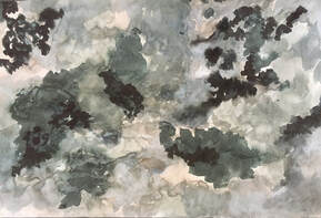
Although these tests were on a small scale, I felt the final drawing needed to be bigger, because I wanted to try and portray a snapshot of a wider scene. The next drawing is on cartridge paper, 33 X 21 ins. I divided it into sections, because I wanted to compare different media side by side:
This small drawing was, I think, the most successful so far in portraying the subject. It was using fluid and dry media alongside each other that seemed to work better than waiting for the fluid media to dry before using the dry media.
Although these tests were on a small scale, I felt the final drawing needed to be bigger, because I wanted to try and portray a snapshot of a wider scene. The next drawing is on cartridge paper, 33 X 21 ins. I divided it into sections, because I wanted to compare different media side by side:
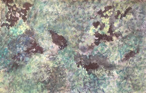
On the left I used ink for the background tonal areas again, and hard pastels for the undergrowth, then taped a brush to the end of a stick and used diluted acrylic to draw the vegetation in the foreground. When this was dry, I used chalk pastels for the lightest tones. This resulted in a pale, ethereal image.
On the right I used ink and oil pastels brushed with white spirit for the vegetation in the background, then diluted oil paint over this to draw the lighter tones of the vegetation in the foreground. When dry I used white chalk pastel on its side to make marks that represented some of the plant stalks, then added some areas of black oil pastel and white spirit to create some areas of darker tone. This drawing is closer to an impression of the subject, because in reality, the hedge has some very dark tonal areas. For the final drawing, I will aim to make some darker areas of tone using ink, and keep them fairly free of other marks, so that I don't need to add them later.
I decided to do the final drawing on 33 X 21 in cartridge paper. I started with the tonal areas in ink, making sure I included some darker tones:
Then I used oil pastels to draw the undergrowth, and brushed this with white spirit:
I continued to draw into this with oil pastel and white spirit, to improve the colour and tone:
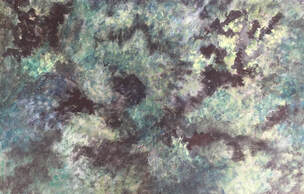
Finally I added the lighter tones of the plants in the foreground, using diluted oil paint, and water-based paint. Before dry, I added more texture to the plant stalks by dragging the end of a thin brush covered in tissue over the paint, then when completely dry, I used chalk pastel to add more texture and tone, and finally, an eraser to draw into the chalk pastel:
ASSIGNMENT 1:
ASSIGNMENT 1:
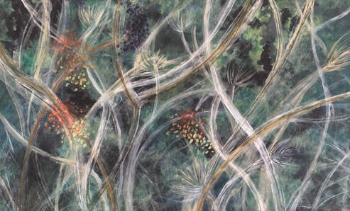
33 x 21 in cartridge paper. Ink, oil pastel, white spirit, oil paint, water based paint, chalk pastel.
This assignment has been a journey of discovery, through various combinations of media and techniques, as I investigated how to draw a section of the hedge. It was the variety of tonal change, and marks made by the undergrowth that first attracted me to this subject. I tried to capture the depth through using a range of tones, and the movement of the plants through dynamic gestural drawing. I think the use of a variety of media and techniques has worked well and achieved this aim, because the oil paint, water based paint, and chalk pastels all result in different marks and tones, which helped in portraying the different layers of vegetation. The oil pastel and white spirit over ink provided the darker tones I wanted for the undergrowth in the background.
The biggest challenge with this drawing was knowing when to stop. I am aware that my drawing was becoming obsessive and less spontaneous towards the end. It would be an interesting experiment to draw the same subject again, with a short time limit, and compare the result with this drawing.
Review of Part 1:
Demonstration of technical and visual skills. Use of materials, techniques, observational skills, composition.
I experimented with scale, media, and techniques throughout the exercises, which I think improved my understanding of combining fluid and dry media. I feel this worked best in Exercises 1.2, 1.3, and the assignment, and it was in these exercises, and in my work for the assignment that I explored some problems and questions; slow versus fast gestural drawing, and how to represent depth using a combination of fluid and dry media, for example. I felt more out of my comfort zone with Exercise 1.4, but researching the drawings of Henry Moore was very inspirational in extracting new forms from within simple still life. I think my skills of observation and composition have improved through part one, but specifically in the areas of dynamic gestural drawing, and the use of tone.
Quality of outcome. Content, application of knowledge, presentation of work in a coherent manner.
I feel that I was able to use the increased knowledge I gained from experimentation as I worked through the exercises. I’m aware that I spent longer on the exercises I found most enjoyable, and these were probably the areas that I learned most from. I enjoyed working with a combination of fluid and dry media in Exercise 1.2, for example, and was able to use what I learned about media and tone from this exercise in the assignment. I was reasonably happy with the quality of my work throughout part 1, but feel I could have explored Exercise 1.1 in more depth.
Demonstration of creativity. Imagination, experimentation, and the development of a personal voice.
Again, I think these qualities were strongest in Exercises 1.2, 1.3 and the assignment. Part 1 taught me a lot about the development of my personal voice, because I found it very interesting to notice which areas of work I was very drawn to, and those I felt less drawn to. I struggled with Exercise 1.4, for example, but was excited to investigate dynamic gestural drawing, and the combination of fluid and dry media to explore tone and composition. I also enjoyed using imagination and creativity in my sketchbook work.
Context. Reflection, research, links to other artists.
Researching the work of Franz Kline and Henry Moore was the most helpful aspect of the research points for me. I was especially interested in Kline’s technique of working in a thoughtful, considered way to produce painting that looks spontaneous and quick. Henry Moore’s drawings were very interesting in the area of observing form and shape, and extracting new forms from within a composition. I was very interested in the work of many of the contemporary artists featured on the 'Art and Ecology Painting and Drawing Group' from the OCA website (see reference above), especially the work of Jindra Jehu and John Wolseley. Jindra Jehu’s inspiration from her immediate rural environment, expressive drawing, use of mixed media and of colour very much illustrate the way in which my own work seems to be evolving, and I would like to investigate her work in more detail.
