Part 2:
Collage.
Ex 2.1. Using collage to extend mark making:
I tried to find a good variety of offcuts and pieces of old drawings, which included colour as well as textured marks. These are some of the compositions I found:
Collage.
Ex 2.1. Using collage to extend mark making:
I tried to find a good variety of offcuts and pieces of old drawings, which included colour as well as textured marks. These are some of the compositions I found:
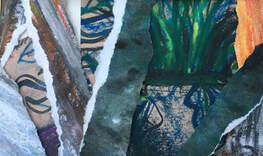
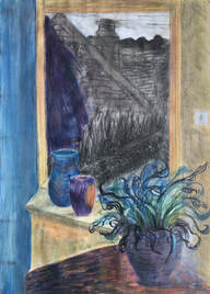
I decided to base the collage on the first composition, because I felt it contained a good balance of texture, colour and shape:
Ex 2.1: Using collage to extend mark making. A2.
What do I feel worked well about this, and why? :
I think the combination of torn and cut pieces of collage work well together because the torn edges resulted in some areas of white, which contrast with the darker areas, adding vibrancy and drama.
The composition has a feeling of foreground, middle, and background, because the abstract shapes weave in and out of each other, making some areas appear in the foreground, and others behind.
The colours seem to work well together, and form a good balance with the monochrome textured areas.
The dark blue/black areas in ink, added later, brought clarity to some areas that had become too confusing, which had made the image difficult to read.
What do I feel worked less well, and why?:
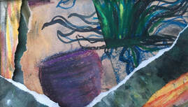
The original focal point of the big plant, and plant pot, isn't as strong as I had originally intended; it became a bit lost in the making of the collage when the strong textured areas began to take over. On a practical level, I found it difficult to find many areas of old drawings that didn't contain texture.
The composition felt as if it was beginning to break down in the top left corner, where I was trying to represent the plant leaves, because there were too many small pieces of collage. However, using ink to make the background darker helped to clarify this area.
Deciding whether or not to draw into the collage:
I didn't feel I needed to draw into the collage, except to clarify some of the areas using blue/black ink. The plant pot had been made from a piece of paper with a grey ink wash, so I gave this more definition with ink. This led me to do the same with other areas on the left of the composition. This helped to make it less visually confusing.
Review against a previous drawing:
I chose a drawing from my previous course, 'Drawing Skills', to compare with this collage, because it features the same plant:
What do I feel worked well about this, and why? :
I think the combination of torn and cut pieces of collage work well together because the torn edges resulted in some areas of white, which contrast with the darker areas, adding vibrancy and drama.
The composition has a feeling of foreground, middle, and background, because the abstract shapes weave in and out of each other, making some areas appear in the foreground, and others behind.
The colours seem to work well together, and form a good balance with the monochrome textured areas.
The dark blue/black areas in ink, added later, brought clarity to some areas that had become too confusing, which had made the image difficult to read.
What do I feel worked less well, and why?:
The original focal point of the big plant, and plant pot, isn't as strong as I had originally intended; it became a bit lost in the making of the collage when the strong textured areas began to take over. On a practical level, I found it difficult to find many areas of old drawings that didn't contain texture.
The composition felt as if it was beginning to break down in the top left corner, where I was trying to represent the plant leaves, because there were too many small pieces of collage. However, using ink to make the background darker helped to clarify this area.
Deciding whether or not to draw into the collage:
I didn't feel I needed to draw into the collage, except to clarify some of the areas using blue/black ink. The plant pot had been made from a piece of paper with a grey ink wash, so I gave this more definition with ink. This led me to do the same with other areas on the left of the composition. This helped to make it less visually confusing.
Review against a previous drawing:
I chose a drawing from my previous course, 'Drawing Skills', to compare with this collage, because it features the same plant:
Assignment 2 from 'Drawing Skills' course. A2 drawing in watercolour pencils, charcoal and chalk pastel.

I much prefer the collage to the earlier drawing, for a number of reasons:
The bigger range of marks and tone in the collage take the eye on a more interesting journey than the interior scene, which depicts a straightforward pathway.
There is more tonal contrast in the collage, creating energy and interest. The interior scene feels dull and tired by comparison, even though it contains more colour.
The collage portrays an image of a place that feels a bit chaotic, overgrown and unkempt, whereas the interior scene depicts a more clinical, clear-cut space. I would much prefer to visit the place where the plant in the collage is growing, than where it is in the interior scene.
Although at times frustrating and technically difficult, I really enjoyed making this collage. By contrast, I can recall how painstaking I found the interior drawing, and I think these two very different experiences are revealed in the end results. This exercise has demonstrated for me how the use of collage can result in some dramatic and unexpected visual images, and I will consider using collage in combination with other drawing media in the future, perhaps especially at times when I feel stuck, unmotivated or uninspired. However, I have also learned that, when using collage, there can be a fine dividing line between energy, interest and movement, and over complicated confusion.
Ex 2.2: Using collage to be specific about tone:
I tried two different subjects for this exercise; for the first I used a pair of boots. I found this quite a difficult subject to do because the boots were black, so I positioned them in bright light, to get some strong tonal contrast. I did this quick A4 sketch first, covering the black paper with white chalk pastel, then using an eraser to draw into the pastel, and lastly, white pastel and charcoal to emphasize the strongest light and dark tones.
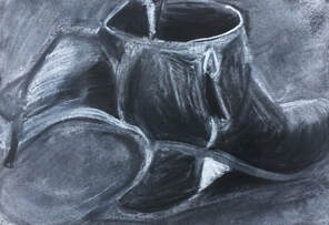
A4 black paper. White chalk pastel, eraser, charcoal.
For the collage, I changed the position of the boots slightly to maximize the tonal contrasts:
For the collage, I changed the position of the boots slightly to maximize the tonal contrasts:
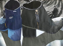
Ex 2.2: Using collage to be specific about tone.
A3 Collage using paper from magazines, and offcuts from drawings.
What do I feel worked well about this, and why?
This was an exercise about tone, and I think the dark shadow cast by the boots onto the shiny surface, as well as the bright light on the toe of the black boot, and the thin lines of light at the top of the boots have all worked well. I think this has worked because I deliberately placed the boots in a position to cast strong shadows, and choose the colour, tone, and shape of the collage material carefully.
The textured background seems to highlight the boots, and gives an illusion of depth.
Having one black and one blue boot adds interest to the composition.
What do I feel worked less well, and why?
I think the blue boot worked less well than the black one. I think this was because it was a more foreshortened shape than the black one, and more difficult to represent in collage. The light on the toe of the boot was a particularly difficult area, as well as the very small patch of light on the side. This was because I found it more difficult to find the right gradual tonal changes in blues than I had in black and greys.
Overall, the boots were quite a difficult subject, because the tonal changes over them were very slight and subtle, apart from on the toes.
Were there any surprises?
I was surprised at the strength of the image, which I think was due to the tonal contrasts.
What would you do differently?
I would spend more time collecting collage materials.
Review against a previous tonal drawing:
Tonal drawing from 'Drawing Skills' course. A1. Charcoal.

This tonal drawing in collage is very different to the earlier drawing in charcoal. I think it is a stronger, firmer drawing, and a more dramatic image, whereas the charcoal drawing is probably more accurate in terms of the shape of the objects, but is a softer, more subtle image. I think the charcoal drawing is overall, more accurate in tone than the collage, although the parts of the collage that are accurate - the black boot and its shadows - are much more striking than the charcoal drawing, and this is what I think gives the collage more depth and a greater sense of 3D.
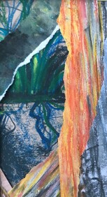
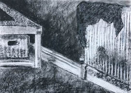
I felt I needed to attempt a different subject. I noticed the bright sunlight and shadow on this stile, which I thought would make a good subject for this exercise:
I felt I needed to attempt a different subject. I noticed the bright sunlight and shadow on this stile, which I thought would make a good subject for this exercise:
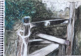
A4 sketch. Charcoal and chalk pastel.
The composition changed slightly as the collage progressed, but I tried to focus on the tonal changes:
The composition changed slightly as the collage progressed, but I tried to focus on the tonal changes:
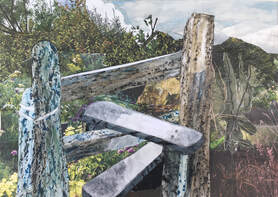
Ex 2.2: Using collage to be specific about tone.
A3 collage using paper from magazines, offcuts from drawings, frottage, and tissue paper.
What do I feel worked well about this, and why?
The lightest areas were the sky and the two diagonal planks in the stile, because there was bright sunlight on them, and I think these areas have worked well.
I made some textured paper by taking rubbings from tree bark to use for the stile, along with white tissue paper for the lightest tonal areas, and this has made a good contrast with the background of undergrowth and trees, which is collaged from magazine paper.
There is a feeling of depth, which I think is the result of the tonal changes between the stile and the background, along with colour - the yellow-green plants close to the stile give a sense of foreground - and the trees being silhouetted against the sky give a feeling of distance.
What do I feel worked less well, and why?
The shape of the stile isn't quite right, specifically the angle of the bottom plank, and it is drawn more accurately in the preliminary sketch.
I would have liked to get more tonal changes in the stile, as in the preliminary sketch
Were there any surprises?
I was surprised at how being able to see the light of the sky through the trees created such an illusion of distance.
Review against a previous tonal drawing:
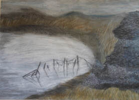
Assignment 3 from 'Drawing Skills' course. A1. chalk pastel, charcoal, ink.

I think these two drawings make an interesting comparison, because they are both landscapes and similar in colour. Perhaps because they are so similar, I found it difficult to make comparisons between them.
There seems to be less contrast between them than there was between the boots and the still life, although the collage does have more tonal contrast between the trees and the sky, and on the stile, and the more subtle tonal contrasts in the earlier drawing are between the surface of the water and the flint wall. The focal point of the collage is the stile, with the vegetation and trees in the background, which gives it a good feeling of depth, but the earlier A1 drawing also has a feeling of depth, which has been created through the use of chalk pastels and ink, with the focal point being the posts in the water.
Although the collage may be a stronger image, the drawing has a more evocative, atmospheric feeling, which I think would be more difficult to achieve with collage.
Part of the remit for this exercise was also to do some drawings, aiming to accurately transcribe tone, rather than the shapes of objects:
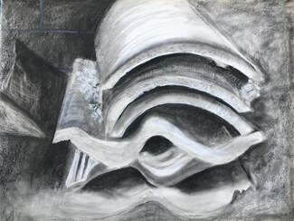
A3. Charcoal.
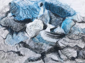
A3. Oil pastel, white spirit, chalk pastel over gesso. Stones.
A1. Charcoal and chalk pastel. Tiles.
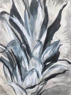
14 X 10 in acrylic paper with graphite base. Pineapple leaves. Ink, charcoal and eraser.
I found it difficult to ignore the shapes of the objects, especially in the first drawing of an interior, and the third drawing of tiles. The stones and the pineapple leaves were better subjects, I think, for concentrating solely on tonal values.
Ex 2.3. Putting one thing next to another:
These are the images I chose to work with for this exercise:
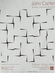
John Carter. 2012. Archipelago. Ink, gouache and crayon on paper 50X50 cm.
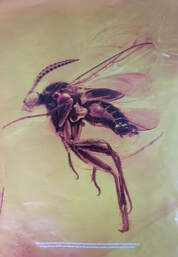
British photographer Levon Biss photographed prehistoric insects, trapped for 45 million years, and uncovered by miners and the sea. Originally they had been stuck in tree resin, but over time, this hardened to form amber. I discovered these pictures in a Sunday supplement magazine. My first response to them was one of complete awe and amazement at their age and preserved intricate beauty, and a strong feeling of wanting to set them free:
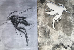
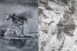
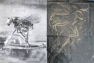
A2 tissue paper mounted on cartridge paper. Monoprints.
These monoprints on white tissue paper achieved the kind of ghostly images I was hoping for. The first one is made by a simple silhouette of the insect, which is then drawn into with an acrylic paint marker pen.
The second one is a combination of drawing directly onto the same plate as the first print, turning the silhouette over, and placing it down inked side up, to take another print.
The third one is made by drawing directly into the ink, then placing orange paper behind it when dry.
What do I feel worked well about these drawings, and why?
I think the monoprints have an ethereal feeling, and portray the insects being set free, which is what I had hoped.
I especially like the third one, which was drawn very quickly into the ink, and reminds me a bit of a prehistoric cave drawing. I also like the orange showing through the tissue paper, because it is representative of the amber. Whereas I was undecided about whether or not to draw into the other two prints, I felt certain that this one was a stronger image left as it was.
What do I feel worked less well?
I decided to add the white marker pen drawing to the first print, but on reflection, I think the drawn marks are too defined, and needed to be more ephemeral.
I think there is a harmonious relationship between the photos of the insects and the prints. The technique of drawing directly onto the plate definately affected my drawing, because it didn't allow for any deliberation or correction, and I had to draw spontaneously and quickly to try and capture the feeling and shape of the insect.
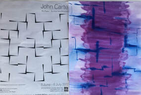
I found this page advertising an exhibition by John Carter in issue no. 46 from Summer 2019 of the 'Tate Etc' magazine. I found it interesting, because it reminded me of Ex 1.1 from part 1, where, from one angle, the edges of the paper were not flat against the wall and created a 3D instead of a flat image. I had a strong feeling of wanting to respond to this in colour:
These monoprints on white tissue paper achieved the kind of ghostly images I was hoping for. The first one is made by a simple silhouette of the insect, which is then drawn into with an acrylic paint marker pen.
The second one is a combination of drawing directly onto the same plate as the first print, turning the silhouette over, and placing it down inked side up, to take another print.
The third one is made by drawing directly into the ink, then placing orange paper behind it when dry.
What do I feel worked well about these drawings, and why?
I think the monoprints have an ethereal feeling, and portray the insects being set free, which is what I had hoped.
I especially like the third one, which was drawn very quickly into the ink, and reminds me a bit of a prehistoric cave drawing. I also like the orange showing through the tissue paper, because it is representative of the amber. Whereas I was undecided about whether or not to draw into the other two prints, I felt certain that this one was a stronger image left as it was.
What do I feel worked less well?
I decided to add the white marker pen drawing to the first print, but on reflection, I think the drawn marks are too defined, and needed to be more ephemeral.
I think there is a harmonious relationship between the photos of the insects and the prints. The technique of drawing directly onto the plate definately affected my drawing, because it didn't allow for any deliberation or correction, and I had to draw spontaneously and quickly to try and capture the feeling and shape of the insect.
I found this page advertising an exhibition by John Carter in issue no. 46 from Summer 2019 of the 'Tate Etc' magazine. I found it interesting, because it reminded me of Ex 1.1 from part 1, where, from one angle, the edges of the paper were not flat against the wall and created a 3D instead of a flat image. I had a strong feeling of wanting to respond to this in colour:
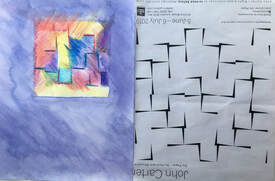
A2 cartridge paper. Ink. Blue ink drawn over wet surface.
I think this is a dissonant relationship. The lines of the ink drawing are inexact and blurred, in contrast to the straight crisp lines on the left, and the ink drawing feels like a section of something bigger which continues beyond the paper, whereas the drawing on the left is more contained within the paper.
I think this is a dissonant relationship. The lines of the ink drawing are inexact and blurred, in contrast to the straight crisp lines on the left, and the ink drawing feels like a section of something bigger which continues beyond the paper, whereas the drawing on the left is more contained within the paper.
A2 cartridge paper. Water soluble pencils and ink.
I began this with the idea of making a small square of concentrated colour using the pencils, but when I added the ink wash to the background, the idea of merging some of the edges of the square with the background developed. Then the background started to encroach into the square, and it turned into an interesting exercise in the relationship between figure and background.
I think this is another dissonant relationship, because, again, the lines and shapes are brightly coloured and merged, in contrast to the monochromatic drawing on the right.
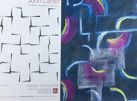
A4 black paper. Ink and chalk pastel on black paper.
I felt I wanted to change some of the straight lines into curves. This seems to be a bit ambiguous, in that it is both dissonant and harmonious. I wanted to include a shape I could see in the John Carter drawing, so have superimposed this in white pastel over the lines, which feel disjointed, unlike the lines of the drawing on the left, which have a harmonious pattern to them.
I'm struggling to answer the questions I've tried to answer for other work with these drawings, because I wasn't really interested in whether or not they worked, I was more interested in making a response to the original image. The most significant thing for me was observing my responses, noticing my strong instinct to use colour and to subvert the strong, crisp lines of the original image.
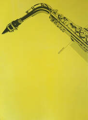
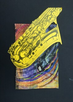
I found a this print in a book in a charity shop. The saxophone was the centre fold, and divided in half, which gave me the idea of completing it in a very different way:
I felt I wanted to change some of the straight lines into curves. This seems to be a bit ambiguous, in that it is both dissonant and harmonious. I wanted to include a shape I could see in the John Carter drawing, so have superimposed this in white pastel over the lines, which feel disjointed, unlike the lines of the drawing on the left, which have a harmonious pattern to them.
I'm struggling to answer the questions I've tried to answer for other work with these drawings, because I wasn't really interested in whether or not they worked, I was more interested in making a response to the original image. The most significant thing for me was observing my responses, noticing my strong instinct to use colour and to subvert the strong, crisp lines of the original image.
I found a this print in a book in a charity shop. The saxophone was the centre fold, and divided in half, which gave me the idea of completing it in a very different way:
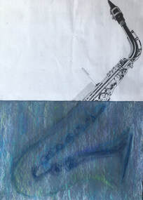
A2 sugar paper with a blue-grey acrylic wash. Chalk pastels.
What do I feel worked well, and why?
The drawn part of this looks as if it's under water, which I think makes it visually interesting. I think it could be interpreted as both harmonious and dissonant.
I wanted to make a drawing that was very different to the printed image, and this has worked from that point of view. I also think the colour works well, because the subtle blues, greens and white are a good contrast to the stark black printed image. I used the pastels very lightly, barely touching the paper; they were short, half length pastels, which made it possible to use them on their side to make broad sweeping marks. I wanted to make just a trace of the shape of the saxophone, so I think the drawing has been successful in that.
What worked less well?
The drawing of the saxophone isn't technically accurate, but for the effect I was hoping to create, I don't think this matters, and in fact, probably adds to the distorted 'underwater' effect.
I'm not entirely happy with the image being divided in half in the centre. This wasn't deliberate, and I think it may have been more visually interesting to divide it higher or lower.
Were there any surprises or happy accidents?
I hadn't set out to make a drawing that gave the appearance of something under water, so it was both a happy accident and a surprise that using chalk pastels on the acrylic wash in this way achieved this effect.
14 X 12 in. Monoprint and chalk pastel on newspaper, with collage.
This image arose from a sketchbook drawing of the shell. I thought this would make a good background for the other half of the saxophone.
What do I think worked well and why?
I think this works well because the colours and marks of the monoprint drawing seem to fit well with both the shape, and the music of the saxophone.
I like the fact that the saxophone appears to be thrown forwards by the drawing, which makes a dramatic composition.
This was made quite spontaneously and quickly, unlike the previous work in this exercise, which has been mostly deliberate and thoughtful. This is valuable learning learning for me, because I like the result, and it demonstrates the value of spontaneity and working instinctively.
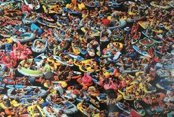
The next picture is from a Sunday supplement magazine. It is a photograph of people sunbathing in boats and a variety of inflatables on Lake Lucerne in Switzerland.
This image arose from a sketchbook drawing of the shell. I thought this would make a good background for the other half of the saxophone.
What do I think worked well and why?
I think this works well because the colours and marks of the monoprint drawing seem to fit well with both the shape, and the music of the saxophone.
I like the fact that the saxophone appears to be thrown forwards by the drawing, which makes a dramatic composition.
This was made quite spontaneously and quickly, unlike the previous work in this exercise, which has been mostly deliberate and thoughtful. This is valuable learning learning for me, because I like the result, and it demonstrates the value of spontaneity and working instinctively.
The next picture is from a Sunday supplement magazine. It is a photograph of people sunbathing in boats and a variety of inflatables on Lake Lucerne in Switzerland.
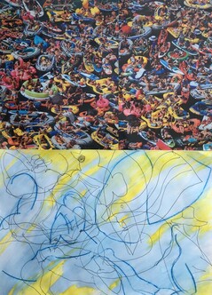
A2 cartridge paper. Fine liner pen, water soluble pencils and water.
I found this the most difficult to respond to, and it highlighted the issue of responding purely to the visual image, or responding to the message of the image. My first instinct was to try and draw a bleak, desolate landscape, with either one solitary figure, or no figures at all, but I found I was being pulled more towards making a visual response to the shapes and colours.
What do I think has worked well, and why?
I think the photo affected my drawing in that it invited me to make a freely drawn, 'blind' drawing, which I really enjoyed, and which seems to have resulted in a harmonious response.
Although most of this is drawn blind, I did consciously try to pick out some of the most dominant shapes, and I think this makes it work well as a response, because it provides tenuous links to the picture.
I added the areas of bright yellow later, because yellow is one of the most dominant colours in the photograph, and this seems to have made it a more harmonious response.
Ex 2.4. Adding a collaged element:
The aim of this exercise was to experiment with the techniques of adding a collaged element into a drawing, or of extending a drawing out of found material. As I worked through the exercise, I found the drawing and the added collage became more merged together, and I was thinking more about the whole composition and how the two different elements would work together, rather than thinking about them separately.
Looking back over the work I have done so far in the course, I decided to start by experimenting with the idea from assignment 1:
A3 brown paper. Ink, chalk pastel, charcoal, fabric.
I did the drawing first, then added the collaged fabric. After the fabric had been added, I felt it dictated the colours of the drawing, so I added more red, brown, blue and yellow ochre to the drawing. It reminds me of a tropical bird walking through a forest.
The next experiment was very different, because it was dictated by the collage, which I had found in a magazine:
14in X 10in acrylic paper. Chalk pastel over ink and gouache texture, magazine cutting collage.
I used a piece of paper which had been part of a previous experiment, with a drawing in gouache which had been covered with black indian ink, then washed. This had left the paper covered with an interesting texture, which I thought would be a good background to extend the idea of an arctic landscape, to fit with the collage.
For the next drawing,I used a monoprint from the previous exercise of the prehistoric insect, and felt this would be interesting to experiment with using collage and more drawing:
A3. Monoprint, oil pastel, plastic netting.
I used oil pastel to draw into the monoprint, then collaged plastic netting over the image. In this instance, the drawing dictated the collage, because I wanted to try and depict the feeling of the insect escaping its captivity. This was the opposite process to the previous experiment.
Stuck for inspiration and finding it difficult to move forward, I returned to some of the subjects I'd enjoyed drawing in my previous course - organic objects such as shells, driftwood and seaweed. I had a strong instinct that I wanted to use compressed charcoal on a wet surface, because this seems to help me to draw more spontaneously and intuitively.
This drawing is inspired by the delicate lines and marks of a shell:
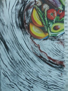
A4. Compressed charcoal and chalk pastel on damp cartridge paper, with collaged paper from a magazine.
It was difficult to find a piece of collage for this drawing, but I felt this image of fruit and veg fitted well with the drawn lines. The question of whether this is a harmonious or a dissonant relationship is ambiguous, because I think the shapes in the collage are harmonious with the drawn lines, whereas the colours could be seen as dissonant.
Continuing with the technique of compressed charcoal on a damp surface, I experimented with driftwood as a subject:
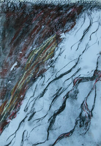
A3. Compressed charcoal and chalk pastel on damp cartridge paper, with collaged frottage in chalk pastel.
This collage reads as being part of the same space as the drawing, and makes a harmonious relationship with the drawing.
I found the next experiment more interesting, because it is formed of three layers; the randomly collaged support, with charcoal drawing, and finally, the attached collage:
This collage reads as being part of the same space as the drawing, and makes a harmonious relationship with the drawing.
I found the next experiment more interesting, because it is formed of three layers; the randomly collaged support, with charcoal drawing, and finally, the attached collage:
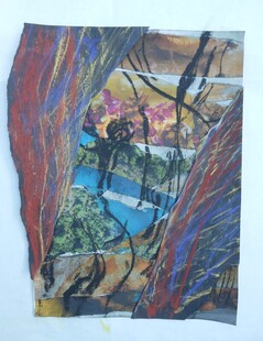
A4. Collage from magazines, compressed charcoal, with attached collage made using chalk pastels and frottage on black paper.
I like this small composition, because I think the colour works well - I have been looking at the work of Scottish artist Barbara Rae, Barbara Rae: Documenting the margins of the world | Rise Art, and am aware of her influence with colour in this experiment. I also like the fact that the layers give it a feeling of depth, and because the collaged piece top left adds interest by creating an asymmetrical shape.
For the final piece of work in this exercise I decided to return to the subject of the shell:
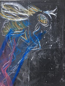
A2. Monoprint, white acrylic pen, collaged bubble wrap and tissue paper.
This drawing was also inspired by the marks of a shell. I mounted the A3 monoprint on a piece of A2 cartridge paper with some drawing from previous work, because the marks seemed to compliment the print.
What do I feel worked well about this drawing, and why?
I think this is an unusual composition, and the things that I think work about it are i) the merging of the print with the frame, especially on the left hand side. ii) the combination of monoprint with the pen drawing and the collaged pieces, iii) the use of colour, and tonal change.
What do I feel worked less well?
Some of the drawn marks at the top feel forced, and less in harmony with the printed image. My intention had been to disrupt the boundary of the print by extending the marks outside it, and I feel this has worked less well on the right than on the left. I think I have over complicated this drawing, and feel the drawing of the shell above ( with the fruit/veg collage) is more successful.
One practical issue that didn't work well was that the water based ink took a very long time to dry on the tissue paper, which made working on the drawing frustrating.
Were there any surprises?
I was surprised at how effective the bubble wrap was for creating tone.
What would you do differently?
I would use oil based ink, or a different support, such as newspaper or newsprint for the monoprint, because of the practical problem of drying.
I would mount the print on a plain paper of a different colour, then create marks outside the print into the mount, rather than trying to fit the print to a pre- existing drawn mount.
Assignment 2:
Preparatory work:
I found it difficult to decide on a subject for this assignment, and for a time, there were three ideas progressing simultaneously; the sketchbook work inspired by Scottish artist Barbara Rae, the work inspired by the shell, and, following a trip to the beach, work inspired by marks and lines made by the sea in sand.
I had also become aware of certain themes developing in my work, which could be summarised as: flowing lines moving diagonally across the paper, an inclination to extend outside the boundary of a rectangle or square into the border or mount, and the technique of layering to create the illusion of depth. I didn't necessarily want to be consciously influenced by these themes, but found it interesting to notice them.
I decided that the drawings on the subject of the shell had evolved more naturally from the work of part 2 than the landscapes inspired by Barbara Rae, so initially I continued to explore this. I did another monoprint by drawing directly into the plate, and printed it on newsprint instead of tissue paper, which dried more quickly. When this had dried, I cut out some sections of it, and stuck it onto a piece of A3 cartridge paper covered with tissue, and painted with purple acrylic:
A3. Monoprint on tissue covered cartridge paper.
The idea of making this into a 3D composition evolved as I was trying to stick the cut monoprint down. I like the fact that it changes, depending on which angle it's seen from:
The idea of making this into a 3D composition evolved as I was trying to stick the cut monoprint down. I like the fact that it changes, depending on which angle it's seen from:
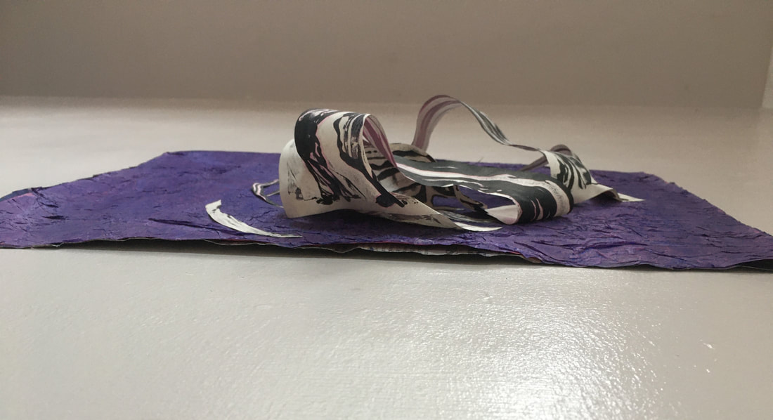
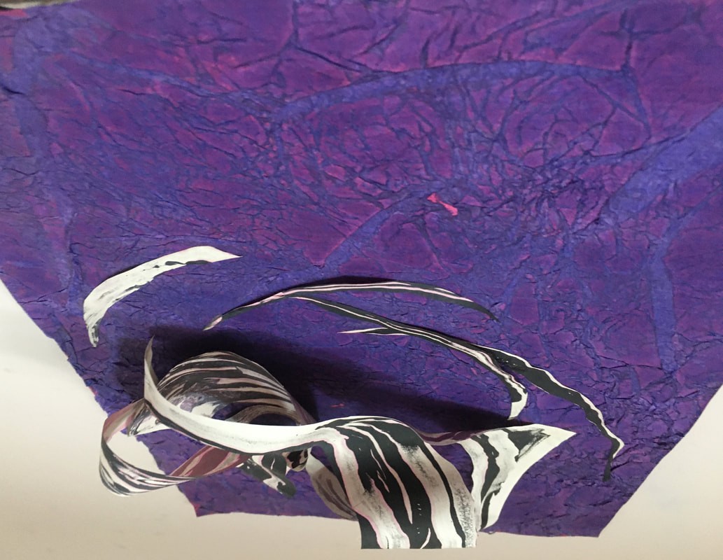
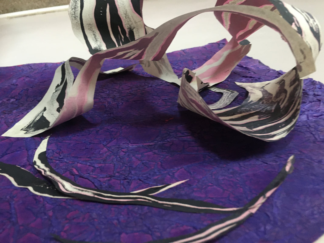
These remind me skeletons and bones.
Continuing with the subject of the shell, I mounted this monoprint on collaged multicoloured tissue. This was a development from the final piece from exercise 2.4.
Continuing with the subject of the shell, I mounted this monoprint on collaged multicoloured tissue. This was a development from the final piece from exercise 2.4.
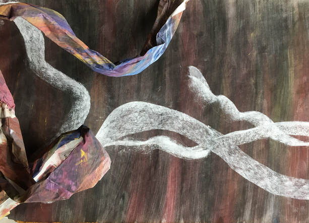
A2. Monoprint over collaged tissue paper and magazine cuttings.
The monoprint formed a rectangle, and, as with the final drawing in ex. 2.4, I felt that I wanted to soften the hard edges of this shape. This was more difficult than I had anticipated, and having collaged some white tissue paper over some of the straight edges, I felt that it may have been better to leave it as it was because the tissue shapes disrupted the lines of the drawing too much. I overcame this by using water to draw over the collaged tissue strips with the printing ink on the right hand side, which I think helped to re establish some of the lines that had been lost. But this was an experience that made me reflect on the issue of over - working a drawing, instead of just letting it 'rest'
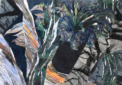
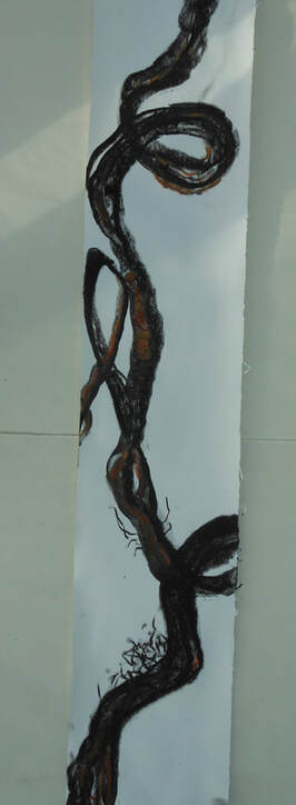
I returned from a trip to the beach, where I had gone hoping to find more inspirational shells, inspired by these drawings in the sand, made by the outgoing tide:
The monoprint formed a rectangle, and, as with the final drawing in ex. 2.4, I felt that I wanted to soften the hard edges of this shape. This was more difficult than I had anticipated, and having collaged some white tissue paper over some of the straight edges, I felt that it may have been better to leave it as it was because the tissue shapes disrupted the lines of the drawing too much. I overcame this by using water to draw over the collaged tissue strips with the printing ink on the right hand side, which I think helped to re establish some of the lines that had been lost. But this was an experience that made me reflect on the issue of over - working a drawing, instead of just letting it 'rest'
I returned from a trip to the beach, where I had gone hoping to find more inspirational shells, inspired by these drawings in the sand, made by the outgoing tide:
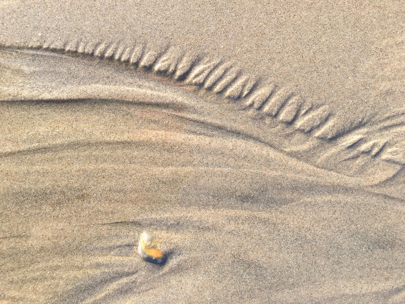
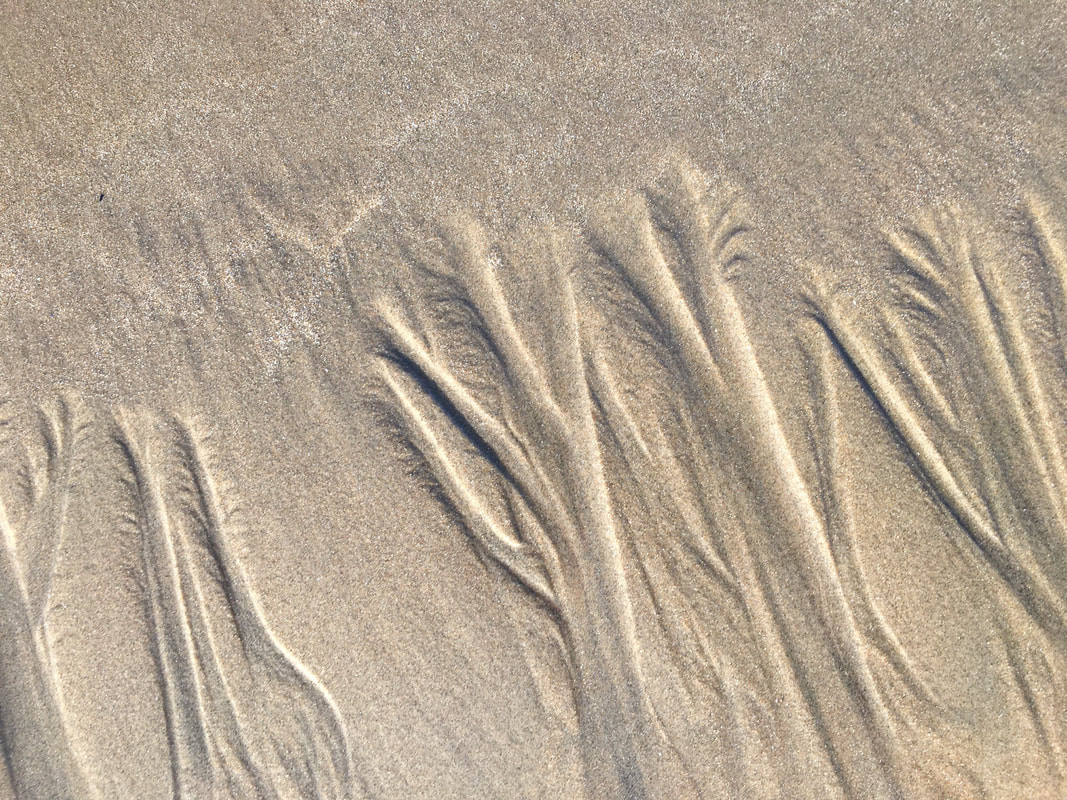
I really like these flowing lines and marks, which reminded me of the drawing I had done in ex.1.1 of part 1. These photos inspired thoughts of the sea bed, deep water, and underwater flowing objects such as seaweed, sea creatures and fish:
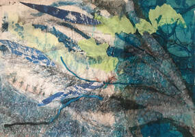
A3. Tissue paper, ink, bubble wrap and string.
I decided to develop this idea for assignment 2, because I felt the combination of collage and drawing would work well with the subject of a sea bed, and it offered a lot of scope for layering, and creating depth. I started by making a collagraph plate, using a variety of materials such as fabric, bubble wrap, plastic netting, string and bandages:
I decided to develop this idea for assignment 2, because I felt the combination of collage and drawing would work well with the subject of a sea bed, and it offered a lot of scope for layering, and creating depth. I started by making a collagraph plate, using a variety of materials such as fabric, bubble wrap, plastic netting, string and bandages:
A2 corrugated cardboard. Collagraph plate and water based printing ink.
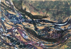
I took a print from this on torn newspaper, collaged onto sugar paper:
I took a print from this on torn newspaper, collaged onto sugar paper:
A2 Collagraph print over newspaper, oil pastel, chalk pastel.
I used water to extend and clarify some of the printed lines, and to try to create the feeling of the movement of the sea.
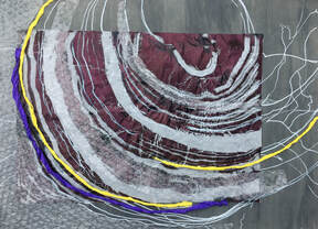
ASSIGNMENT 2:
I used water to extend and clarify some of the printed lines, and to try to create the feeling of the movement of the sea.
ASSIGNMENT 2:
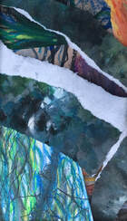
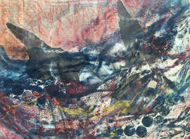
30 X 23.5 ins. Collagraph print, monoprint, and collage.
What do I feel worked well, and why?
Before I embarked on this assignment, I gave some thought to the questions posed in the course information, but didn't have definate answers for all of them because I wanted to see where the process led me. I was fairly sure, however, that I wanted to make a drawing which would have ambiguous, embedded layers, and that it was unlikely to contain clean, crisp lines. Having experimented a little with sculptural work, I thought I may want to include this element, but didn't have a clear idea about how I would do this.
I started out with the same collagraph print I had used in the previous drawing, over a coloured tissue support, then allowed the process to lead me from there. I had done some sketchbook work experimenting with various materials to produce printed marks, which gave me the idea of using the crepe paper to print the bubble-wrap and the netting, which I then made into the sculptural forms to represent the plants. Continuing with the idea of merging a drawing with the border, I decided to continue the same colours and textures into the border, then had the idea of extending the plants outside the frame and into the border, which I think has emphasized the movement more successfully, and become a focal point.
I think the collage and the printed marks work well together, especially with regards to the colour, the textures, and the movement.
What worked less well?
Some of the materials I used for the collagraph plate were very difficult to stick, either because they were plastic and/or had a small surface area, so it would have been better to spend some time finding more suitable materials, which might have given a better print.
What would you do differently?
I would like to experiment with this idea and try a composition that had less tonal change, and also one in which more marks are extended into the border. I also think I would try this composition on a larger scale to allow more freedom for the marks and lines expressing the movement of water.
Review of part 2:
1. Demonstration of technical and visual skills.
Materials and techniques: I explored a variety of collage materials, including cuttings from magazines and drawings, tissue and crepe papers, fabric, and plastic materials such as bubble-wrap, netting and string. I combined these with techniques such as monoprint and collagraph, as well as a variety of drawing media, and both wet and dry supports. I explored both 3D and 2D compositions, as well as colour.
Observational skills: I aimed to demonstrate observational skills in Ex 2.2, both in the collages and in the tonal drawings. It was also interesting to make comparisons between the collages and previous drawings in Ex 2.2, and to observe how powerful collage can be in depicting tone.
Composition: I focussed on trying to create interesting compositions throughout all the exercises, and also in the assignment. Some of the compositional ideas I explored were diagonal flowing lines inspired by nature and organic subjects, creating depth through layering, and extending the drawing beyond the confines of a rectangle into the border.
2. Quality of outcome.
I think the content of part 2 was fairly varied. I was reasonably happy with the quality of outcome throughout, but, as I frequently find, I discovered things along the way that, in retrospect, may have resulted in better outcomes, and have noted these. Apart from the first collage in Ex 2.2, I didn't really plan anything very much, and tried to allow the process of each piece of work to lead me.
3. Demonstration of creativity.
Imagination and experimentation: I think this improved from Ex 2.3 onwards, and into the assignment. I believe this was partly due to a change of thinking in my sketchbook work, which became more free and experimental as a result of the issues raised in the crit group on 15/11/20. One area I feel I might have explored more was scale, however, and this is something I will be more aware of for part 3.
Personal voice: I noticed certain recurring themes which may contribute towards the growth of a personal voice, which are noted in 1. above; the flowing lines and marks inspired by nature, layering to create depth, and creating asymmetrical compositions by extending outside the rectangle. Whilst I'm aware that I don't want to feel defined by certain ways of drawing, it is also very interesting to notice the things that seem to inspire me; the lines in sand made by the receding tide, the movement in driftwood, created by many years in the sea, or the delicate marks of a shell. This has made me reflect on the influence of environment on the development of 'personal voice', as I have lived in rural or coastal environments for most of my life.
4. Context.
Reflection, research, and links to other artists: I found several artists inspirational in different ways throughout part 2. Barbara Rae for her use of colour and composition, Eric Ravilious for his composition of the Southdowns, Peter Doig for his compositions that depict depth by showing some things very close and others in the far distance, and Frank Bowling for his use of media, materials and colour, and for the notion of exploring the properties of materials. I have reflected on how each has either inspired me, and how I might try to incorporate something from their work into my own.
