Ex 5.2. Review.
Throughout this course, the process of investigating form, line, texture and tone in the natural world, has been a recurring theme in my work. I will examine how the work of two very different artists – David Nash and John Wolseley – inform this investigation, and are also relevant to my own work.
Both artists have a deep concern for ecology and the natural world, and both have a unique way of portraying it. Whereas I am drawn to the simplicity and strength of Nash’s work, what attracts me to John Wolseley’s is its subtle colour and delicacy.
David Nash (b. 1945), makes Land Art and sculpture from wood, sometimes using whole trees, occasionally combining his 3D work with large charcoal drawings. Nash’s starting point is always the natural form and character of the tree, or piece of wood, from which he explores and develops form, line and texture. Although I don’t envisage working on the same scale as Nash, wielding chainsaws and axes, I relate strongly to his affinity with wood, and to the way in which he allows himself to be led by his material. See fig 1.
Much of my work throughout the course has been influenced by trees, and I am aware that I notice any unusual form, texture and pattern within trees, as well as other subjects within the natural world.
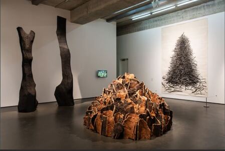
Fig 1. Exhibits of David Nash's work from the '200 Seasons' Exhibition at the Towner Gallery, Eastbourne. 29/09/19-02/02/20.
https://www.townereastbourne.org.uk/exhibition/david-nash-200-seasons/ (Accessed 18/05/21)
The forms that Nash creates are invariably based around the basic geometric forms of cube, sphere and pyramid. One notable piece of work in which he combined sculpted wood with 2D drawing is 'Pyramid, Sphere, Cube.' See fig 2.
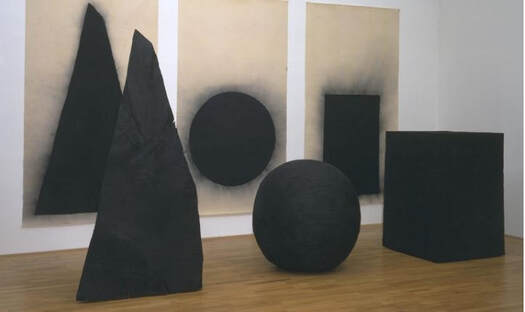
Fig 2. David Nash. 1997-1998. Pyramid, Sphere, Cube. Installation, charcoal drawing. 1530x2750mm.
https://www.tate.org.uk/art/artworks/nash-pyramid-t07542 (Accessed 17/05/21)
The charred wooden sculptures in this installation are the same scale as the shapes in the drawings. By combining these sculptures with the drawings the viewer is compelled to grapple with a continuous 'optical shift' which, according to the art historian Julian Andrews induces 'two different kinds of comprehension.'
The process of translating 2D drawings into 3D structures, then back into 2D drawings and noticing the metamorphosis that occurs is something that has developed within my own work, but what I will also take from the work of David Nash is the concept of clarity and simplicity, which is one of the things I believe makes his work so powerful.
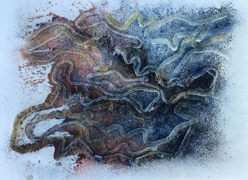
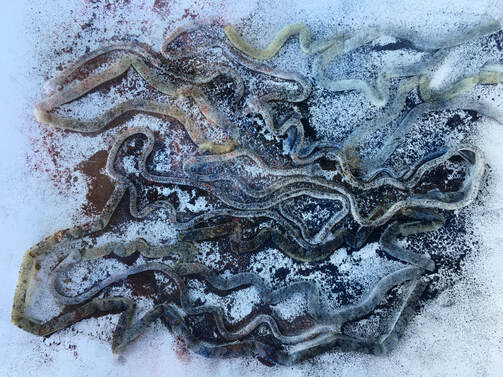
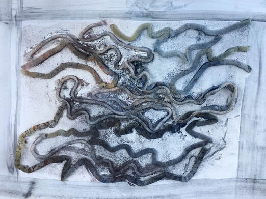
By contrast, John Wolseley (b.1938), is fascinated with small, often unnoticed creatures and plants, which he portrays through the use of watercolour, collage, frottage, printing, and other methods of direct physical contact with his subjects.
Referring to his use of the lines and marks made by beetles to create frottage as, ‘allowing the maps of the life cycle of unknown beetles to float onto the paper’, Wolseley adds that he does not consciously try to control this process. See fig 3.
https://www.tate.org.uk/art/artworks/nash-pyramid-t07542 (Accessed 17/05/21)
The charred wooden sculptures in this installation are the same scale as the shapes in the drawings. By combining these sculptures with the drawings the viewer is compelled to grapple with a continuous 'optical shift' which, according to the art historian Julian Andrews induces 'two different kinds of comprehension.'
The process of translating 2D drawings into 3D structures, then back into 2D drawings and noticing the metamorphosis that occurs is something that has developed within my own work, but what I will also take from the work of David Nash is the concept of clarity and simplicity, which is one of the things I believe makes his work so powerful.
By contrast, John Wolseley (b.1938), is fascinated with small, often unnoticed creatures and plants, which he portrays through the use of watercolour, collage, frottage, printing, and other methods of direct physical contact with his subjects.
Referring to his use of the lines and marks made by beetles to create frottage as, ‘allowing the maps of the life cycle of unknown beetles to float onto the paper’, Wolseley adds that he does not consciously try to control this process. See fig 3.
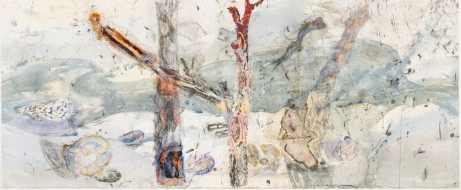
Fig 3. John Wolseley. 2019. The hidden territories of the mangrove worm mollusc - Arafura Sea. 114x225cm. watercolour, carbonized wood, graphite, relief prints chine-colle on paper. https://www.roslynoxley9.com.au/artwork/john-wolseley (Accessed 17/05/21)
This piece of work was made by frottaging the tracks made by shipworms on the stems of mangrove trees and the timbers of wrecked ships, which Wolseley then collaged onto a larger painting, to which further drawings were added. Another technique he uses, which Wolseley attributes to the surrealists, such as Max Ernst and Joseph Beuys, which was originally used by 15th century illustrators, is that of nature printing, whereby objects from nature are inked-up, and prints or rubbings taken from them.
The process of combining print, collage and frottage with mixed media drawing, particularly combining fluid and dry media, have developed naturally in my own work throughout the course, and John Wolseley's work is very inspirational in these areas.
John Wolseley | Home | John Wolseley (Accessed 17/05/21)
Ex. 5.1
Having reviewed all my work throughout the course, I concluded that there were several ideas I would like to develop further. Finding it difficult to make a decision, I decided to make some initial visual enquiries to explore a variety of subjects from the natural world that interested me because of their texture, line, form, tone, pattern, or any combination of these elements.
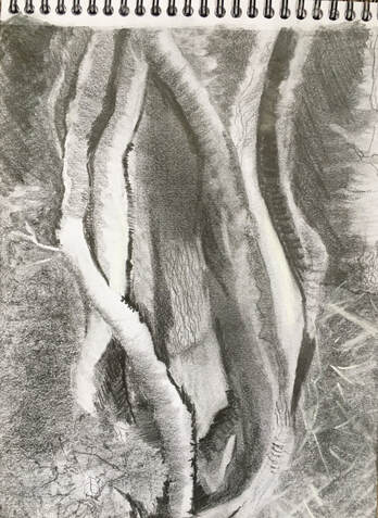
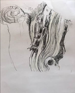
I had noticed this tree stump on a walk, and was fascinated by its combination of natural and man-made lines and marks:
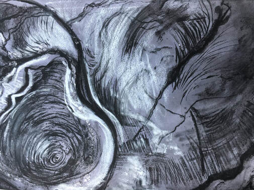
A3 cartridge paper with a blue/black ink wash. Compressed charcoal and white pastel drawn into the wet surface.
This tree had been cut by a chainsaw at some point in its life, which had left behind straight, repetitive lines which contrasted with the curved and circular organic lines. I like the composition these differing lines textures and tones make because it feels naturally balanced, and found the charcoal and pastel on a wet surface to be very effective in capturing them.
This tree had been cut by a chainsaw at some point in its life, which had left behind straight, repetitive lines which contrasted with the curved and circular organic lines. I like the composition these differing lines textures and tones make because it feels naturally balanced, and found the charcoal and pastel on a wet surface to be very effective in capturing them.
A3 newsprint. Two 8X8in drawings of tree stump.
L: marker pen, biro, graphite powder, rubber. R: Graphite, charcoal.
Two smaller studies of the above tree stump, looking closely at the shapes, marks and tone. I felt the drawing on the right needed to extend beyond the boundaries of the frame, an experiment which I feel works.
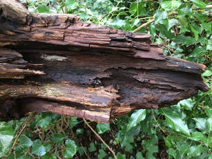
I noticed the texture of this dead tree, and thought it would be a challenge to draw:
L: marker pen, biro, graphite powder, rubber. R: Graphite, charcoal.
Two smaller studies of the above tree stump, looking closely at the shapes, marks and tone. I felt the drawing on the right needed to extend beyond the boundaries of the frame, an experiment which I feel works.
I noticed the texture of this dead tree, and thought it would be a challenge to draw:
12X24in. Cartridge paper. Compressed charcoal, white chalk pastel, ink.
This drawing had four processes:
i) Charcoal and white pastel rubbed into the surface.
ii) A damp sponge used to draw into this to create some areas of lighter tone.
iii) Diluted black ink used to create darker tonal areas.
iv) Compressed charcoal and white pastel to give some lines and marks more definition.
I was pleased that this drawing was fairly successful in capturing the splintered texture and tonal changes of the subject.
The extreme tonal contrasts of this tree wrapped in ivy caught my attention:
A4 cartridge paper. Graphite, white chalk pastel, rubber.
I found the technique of covering part of the drawing with graphite powder, then drawing into this with a rubber was effective in creating tonal change.
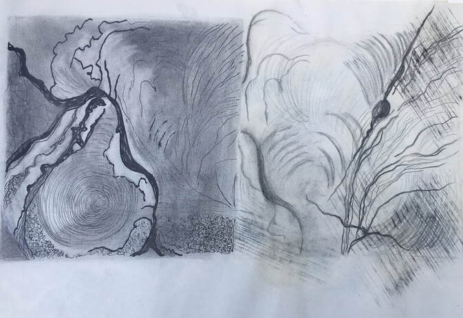
At this point I remembered the words of John Wolseley, when he spoke about the small, unnoticed, hidden things - the minutiae of life - which led me to notice this seed pod in a clump of wild irises. In an enlarged photo it was possible to see the complexity and intricacy of shape, tone and texture:
I found the technique of covering part of the drawing with graphite powder, then drawing into this with a rubber was effective in creating tonal change.
At this point I remembered the words of John Wolseley, when he spoke about the small, unnoticed, hidden things - the minutiae of life - which led me to notice this seed pod in a clump of wild irises. In an enlarged photo it was possible to see the complexity and intricacy of shape, tone and texture:
A4 cartridge paper. Graphite.
The experience of finding and drawing this seedpod made me more aware of seeking out the small, hidden things, and I developed an awareness of looking at sections and parts of objects, rather than the whole.
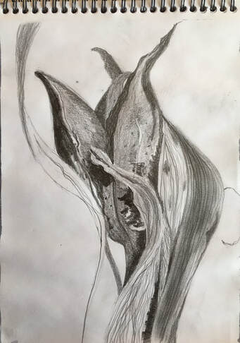
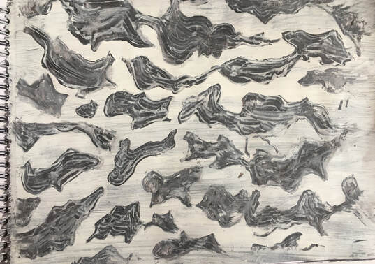
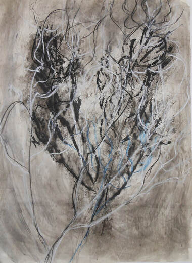
I was still unsure of what I wanted to develop as the main focus of part 5, so I returned to a subject that I had found fascinating and which I felt could be developed further from part 4; the tree fungus:
The experience of finding and drawing this seedpod made me more aware of seeking out the small, hidden things, and I developed an awareness of looking at sections and parts of objects, rather than the whole.
I was still unsure of what I wanted to develop as the main focus of part 5, so I returned to a subject that I had found fascinating and which I felt could be developed further from part 4; the tree fungus:
12X24in cartridge paper. Graphite, ink, compressed charcoal.
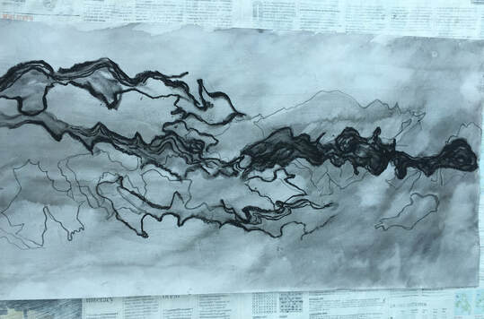
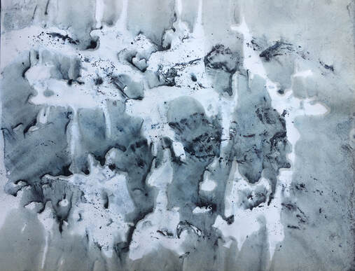
When I looked closely at this subject I realised how intricate and complex its shapes were, so I decided to try and focus on the negative spaces, and draw blind. I did the initial drawing in 2B graphite, washed this with diluted ink, did more drawing with 8B graphite, and finally applied water and did some drawing with compressed charcoal. This combination of media has produced a drawing with quite a variety of interest through its tone and line.
This drawing inspired me to continue to focus on the tree fungus. My aim for part 5 is to create some studies and exploratory work on this subject, culminating in a series of both 2D and 3D drawings which investigate its form, shape, line and texture.
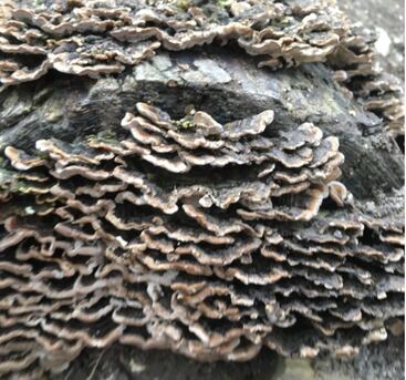
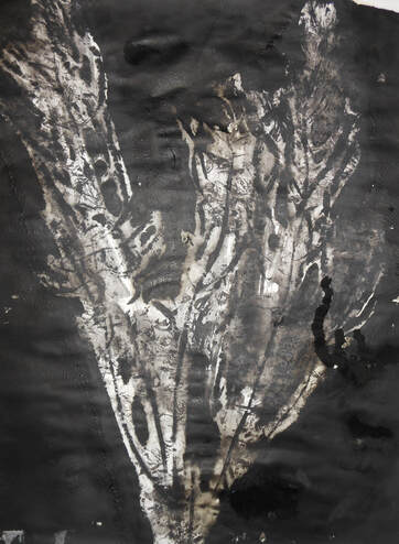
Tree fungus.
A4 cartridge paper. Ink, acrylic.
White acrylic drawn into an ink wash, with diluted black and purple ink drawn into this. Trying to capture the feeling of the lines and shapes of the subject.
White acrylic drawn into an ink wash, with diluted black and purple ink drawn into this. Trying to capture the feeling of the lines and shapes of the subject.
A3. White tissue collaged to sugar paper. Ink, ready-mix paint, white chalk pastel.
I used the white paint on a damp surface, then added the white pastel when dry, which gave it some depth, as the white pastel drawing seems very much in the foreground.
I used the white paint on a damp surface, then added the white pastel when dry, which gave it some depth, as the white pastel drawing seems very much in the foreground.
A3 newsprint. Graphite powder, graphite, charcoal, white chalk pastel, rubber.
I covered the paper with graphite powder, made a quick graphite drawing over this, used a rubber to lift off some of the graphite powder to create lighter tone, then used compressed charcoal and white pastel to emphasize tonal areas.
I prefer this drawing to the previous one because I like the contrast between the more tonal area and the linear drawing.
I was aware of feeling quite frustrated with this subject. I wanted to try and capture its 3D quality, but was finding this difficult. I did a sketchbook drawing to try and understand the shapes, form and textures that were inspiring the experimental work, then did these two drawings, exploring materials and media:
A2. Newspaper stuck to sugar paper. Charcoal, white paint, glue.
i) I began this by drawing lines with diluted PVA on the newspaper, then shaved compressed charcoal over this, and turned it upside down to shake the excess charcoal off.
ii) Next I used white ready mix paint in the negative spaces.
iii) Aware that I had preferred the previous image, I then decided to see what happened if I folded the paper in half, both lengthways and widthways. This action resulted in the marks becoming less clear, and some being lost completely, so
iv) Finally I used compressed charcoal to draw into it when still wet.
A3. Cartridge paper. Compressed charcoal, white chalk pastel, water.
I covered the paper with water and charcoal shavings, then used a sponge to draw into it whilst it was still wet. I used the white pastel to draw into it before it was completely dry, which has resulted in an image that is almost like the reverse of the previous one.
I was curious to try a technique I had used in part 4, because I felt it would work well for this subject. I started with blue oil pastel, on A4 cartridge paper, then selected green, black, yellow, blue and brown oil pastels, drawing each colour over the previous one to create rich, deep colour:
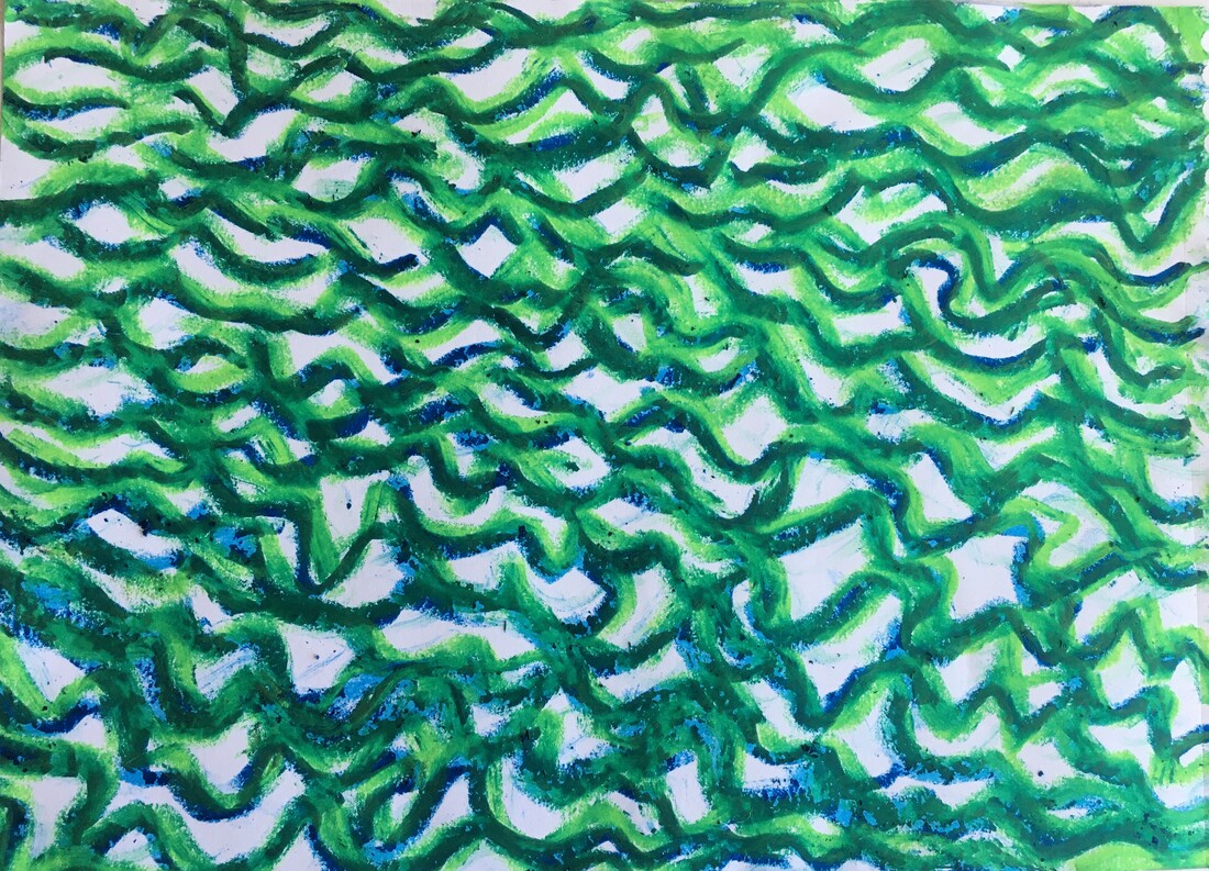
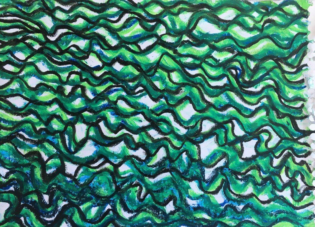
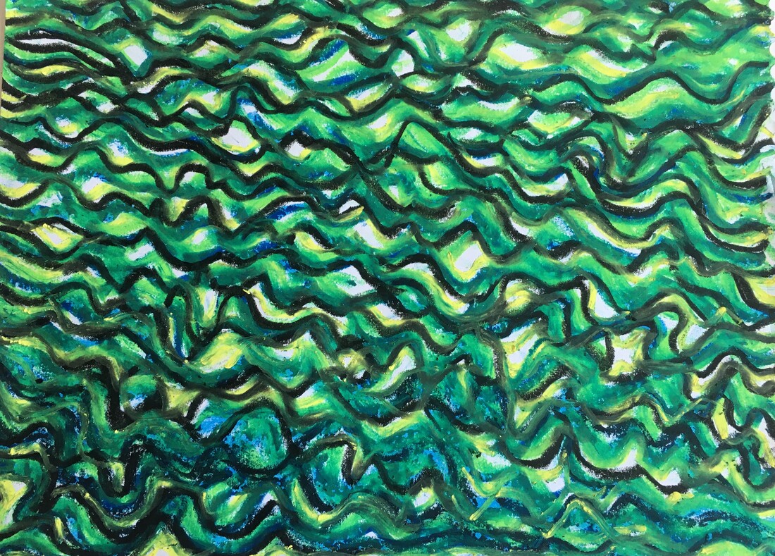
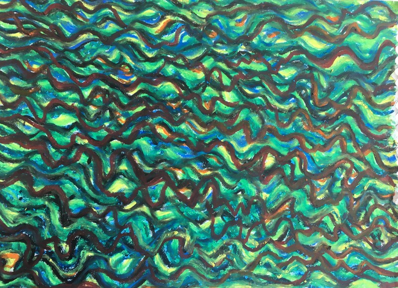
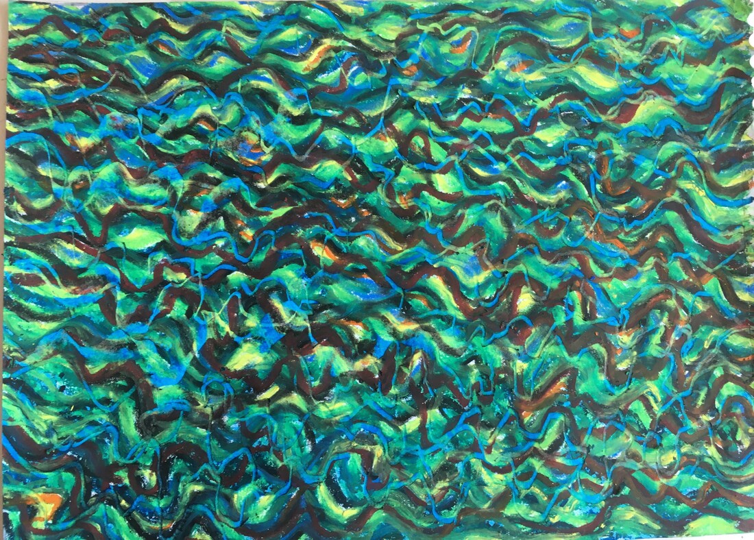
A4 cartridge paper. Oil pastel.
On the final drawing I used a palette knife and my finger nail to scrape away the layers, which revealed lighter blue lines. This experiment illustrated how having a lighter colour underneath would probably have resulted in a clearer, brighter line being revealed when the other layers were scraped away.
On the final drawing I used a palette knife and my finger nail to scrape away the layers, which revealed lighter blue lines. This experiment illustrated how having a lighter colour underneath would probably have resulted in a clearer, brighter line being revealed when the other layers were scraped away.
All these experiments were very enjoyable to do, and although they are all fairly similar in that they are representative of the lines, marks and shapes I was able to see within the tree fungus, they are all subtly different because of the different materials and media used. Because of their 'all over' covering of the paper, they remind me of the work of Mark Tobey, which some of the work I did in part 4 also reminded me of.
I felt I needed to move on from these two dimensional drawings at this stage, and try a different technique. I also wanted to try drawing without covering the whole surface of the paper. Returning to another technique I had explored in part 4, I decided to make a textured collage, using shoelaces and strips of draught excluder to create lines and shapes to represent the fungus. This idea really took off and assumed a life of its own, producing 10 different images in total:

1) A3 cartridge paper with gesso. Charcoal and chalk pastels.
I used a knife to shave the charcoal and pastels over the built-up lines. In part 4, I described how, as a child, I had discovered sifting sand and grinding down bricks to make different coloured brick dust, and it occurred to me that shaving the pastels and charcoal over this textured surface was, as a close friend observed, 'not a million miles away from grinding bricks.'!
I used a knife to shave the charcoal and pastels over the built-up lines. In part 4, I described how, as a child, I had discovered sifting sand and grinding down bricks to make different coloured brick dust, and it occurred to me that shaving the pastels and charcoal over this textured surface was, as a close friend observed, 'not a million miles away from grinding bricks.'!
2) I moved the paper slightly, and the charcoal and pastels shifted resulting in slightly more energy on the left hand side.
3) Holding the paper horizontally and shaking it gently created more movement in the materials, which resulted in a more energised image.
Moving the pastels and charcoal created more tonal areas, introduced more shapes and changed the character of some of the lines, to make an image that appeared to be coming to life. I prefer this image of the three, because of its energy.
Moving the pastels and charcoal created more tonal areas, introduced more shapes and changed the character of some of the lines, to make an image that appeared to be coming to life. I prefer this image of the three, because of its energy.
4) Charcoal and pastels removed by tipping the paper upside down. Border drawn using a damp sponge.
I like the way the lines made by the laces and draught excluder have been changed by these processes; they have grown more interesting due to colour and tonal changes, and the residue of charcoal and pastel dust has added textural interest.
I like the way the lines made by the laces and draught excluder have been changed by these processes; they have grown more interesting due to colour and tonal changes, and the residue of charcoal and pastel dust has added textural interest.
5) Charcoal and pastel dust tipped back onto the drawing, and rubbed into the negative spaces.
I learned from the experiment I had done in part 4 that the compressed charcoal needed a rougher surface to adhere to, which is why I used gesso on the cartridge paper for these. The thing I like about this drawing is the small flecks of white, which make it a lively image.
I learned from the experiment I had done in part 4 that the compressed charcoal needed a rougher surface to adhere to, which is why I used gesso on the cartridge paper for these. The thing I like about this drawing is the small flecks of white, which make it a lively image.
6) Collaged pieces removed, and drawn into with the end of a damp sponge.
Where some of the backing from the draught excluder has been left on the paper it has resulted in small textural marks, and this, along with the tonal contrasts, has added interest to this image.
Where some of the backing from the draught excluder has been left on the paper it has resulted in small textural marks, and this, along with the tonal contrasts, has added interest to this image.
7) i) Some lines painted with diluted PVA, ii) more red and blue pastel scraped over the surface, iii) sprinkled with water and drawn into using the end of a paintbrush, iv) blue and yellow ochre pastel, and charcoal added to extend some lines into the border.
I like the feeling of movement the extended lines create, and it feels as if this is trying to escape from its frame.
I like the feeling of movement the extended lines create, and it feels as if this is trying to escape from its frame.
8) Using a sweeping motion, I brushed from left to right with a wet sponge.
This is a more subtle, atmospheric version of the previous drawing. I like the feeling of it merging with the border.
This is a more subtle, atmospheric version of the previous drawing. I like the feeling of it merging with the border.
9) Print taken of no. 8) on newsprint.
L: 10) Blotted with a tissue. Diluted PVA and shaved white pastel added, drawn into using finger.
R: 1) First image.
I find it interesting to view these side by side, to compare the difference and reflect on all the processes it went through to achieve this change. I am aware that the first three, because the media wasn't fixed, are temporary stages, and could only be viewed flat. I would need to find a method of fixing the charcoal and pastel in place if I wanted to make work using this method in future, which needed to be viewed on a wall.
I was surprised at how much work this generated in a short space of time. I enjoy the process of combining fluid and dry media, and with this technique I found I had a continuous, fast flow of ideas. I found it a very exciting, energising experience.
Aware that this sequence of work resulted in one final piece, which had been through all the processes, I decided to make a bigger, more finished piece of work using these ideas. I did some further exploratory sketchbook work before embarking on this A2 composition:
Stage 1: A2 cartridge paper. Nylon cord, shoelaces, sewing silk and plastic tape all collaged to the paper.
Stage 2: Covered with diluted PVA, and shaved chalk pastels.
With the earlier experiment, the pastels were shaved onto dry paper, which meant that they were able to move to produce interesting results, but also, that the composition wasn't permanent, so I used PVA to secure the coloured chalk in place.
With the earlier experiment, the pastels were shaved onto dry paper, which meant that they were able to move to produce interesting results, but also, that the composition wasn't permanent, so I used PVA to secure the coloured chalk in place.
Stage 3: Sprayed with water, and drawn into with fingers and a stick.
As this was an A2 piece of work, the PVA began to dry out too quickly in places, so the sprayed water enabled me to draw into a wet surface.
As this was an A2 piece of work, the PVA began to dry out too quickly in places, so the sprayed water enabled me to draw into a wet surface.
Stage 4: Some collaged material removed to reveal white lines of varying thickness.
Stage 5: More pastels & compressed charcoal added onto diluted PVA. More collaged laces.
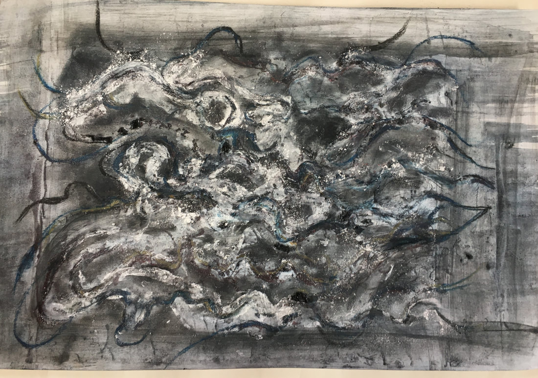
This idea was based on some of the shapes I was able to see within a close up photo of the fungus, and as I worked through the stages, it became an exercise in balancing line, colour and tone. I am struck by the similarity between this piece of work and the work of Bernard Cohen, which was a source of inspiration in part 4. I wasn't thinking consciously of Cohen's work during the making of this piece, which indicates how strongly his work impacted on me, and exerted an unconscious influence. Each stage changed the character of the composition, and my preference is for stage 3, because its darker tones have a more dramatic feeling, and the lines made by the collage are more subtle, and seem to give the illusion of movement more than in the later stages.
Making this bigger composition was a different experience to the experiment I did earlier, in that it was much more considered whereas the earlier work was a rollercoaster of ideas. I like the results, and it has been a valuable learning experience because it has been a good illustration of the differing effects of each stage of the process.
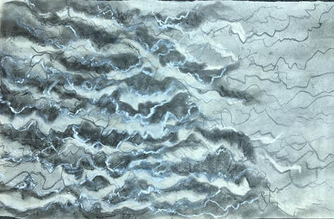
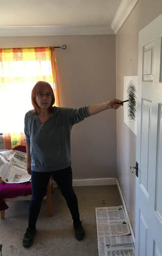
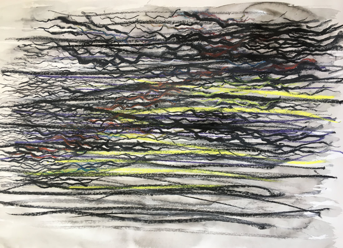
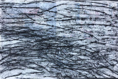
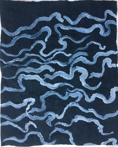
I had done a sketchbook experiment, using movement to produce a drawing, in a similar way to the drawing made by jumping in part 4. This time I had made the drawing by standing at arm's length from the wall-mounted paper, and making marks by twisting. The sketchbook drawing had worked well, so I decided to try another one using compressed charcoal on wet paper, because I thought this might produce a different kind of mark. This didn't work as expected, because I had anticipated lines that were more blurred - however, I sensed there would be potential to use this drawing for more exploration of the tree fungus, because the repetitive, closely grouped lines were reminiscent of its texture:
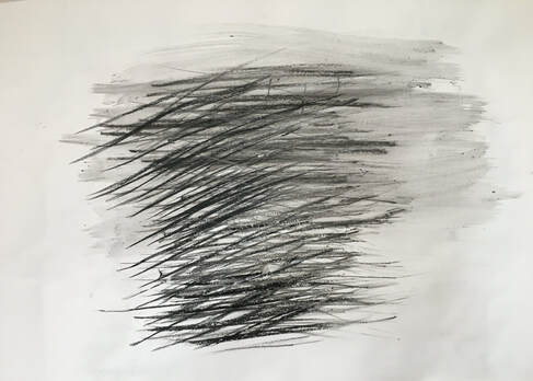
36X22in cartridge paper. Compressed charcoal, water.
Drawing made by holding charcoal at arm's length and twisting, then changing hands, so that the marks crossed.
Drawing made by holding charcoal at arm's length and twisting, then changing hands, so that the marks crossed.
Then I used white oil pastel to draw into this:
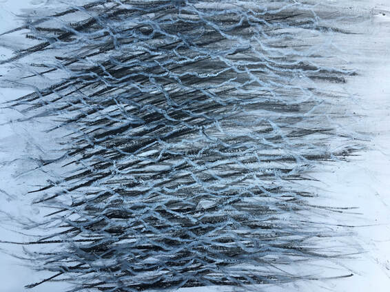
Compressed charcoal, oil pastel.
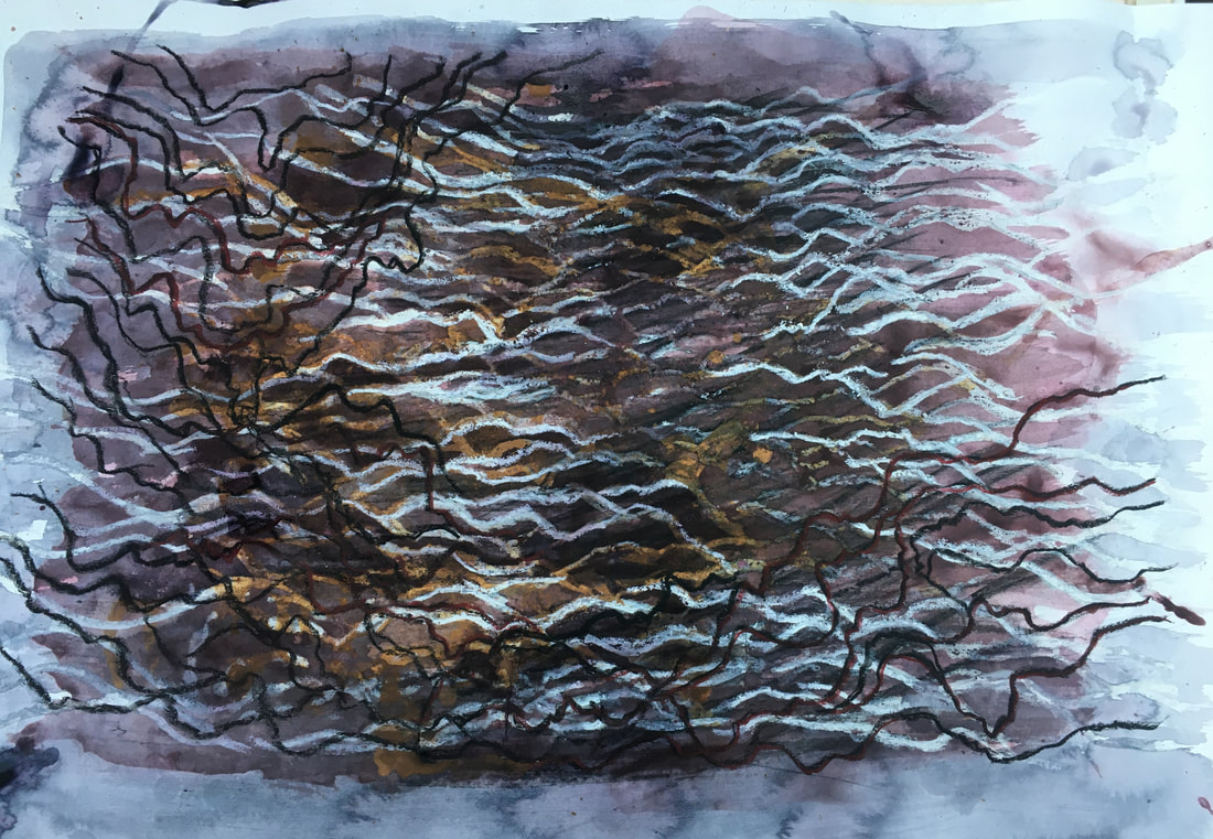
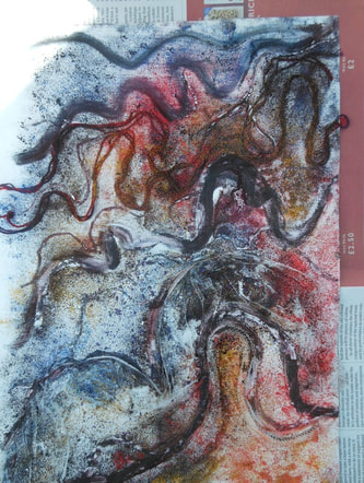
Aware that one of the suggestions made by my tutor was to explore some quick, out of control processes, I poured diluted watercolour over the oil pastel drawing, then before this had completely dried, dripped diluted oil paint over it:
Aware that one of the suggestions made by my tutor was to explore some quick, out of control processes, I poured diluted watercolour over the oil pastel drawing, then before this had completely dried, dripped diluted oil paint over it:
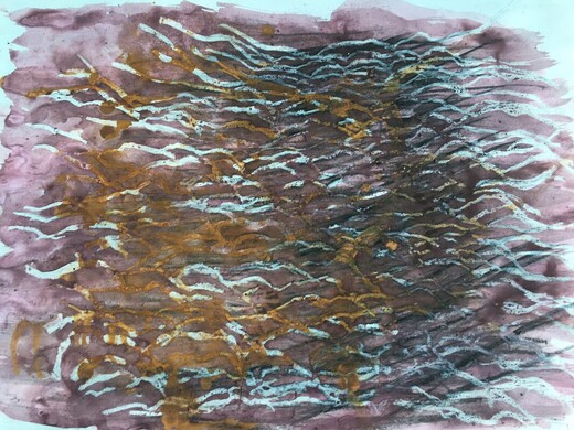
Compressed charcoal, oil pastel, diluted watercolour, oil paint thinned with white spirit.
I noticed that some of the oil pastel marks were getting lost under the paint, so used a dry paintbrush in some areas to lightly brush the surface, which revealed them again. Finally, I sprayed it with water.
I liked the end result, but it felt a bit flat, so I added some white oil pastel to reinforce the white marks, and black oil pastel drawing:

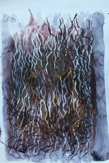
Compressed charcoal, oil pastel, diluted watercolour, diluted oil paint, diluted ink.
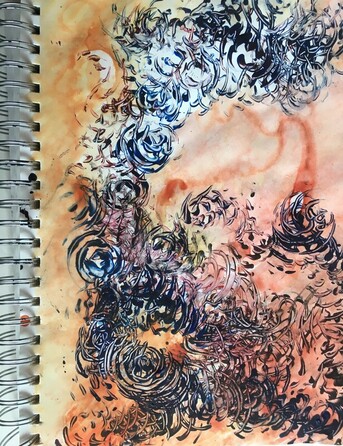
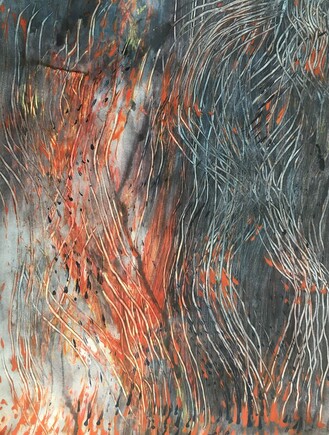
I think the added black oil pastel lines add depth, because they make a good contrast to the white marks, and appear to be in the foreground. Finally, I used a very diluted blue/black ink to brush the whole drawing. I also thought it would be interesting to see it in portrait format. This seems to have more energy than the landscape format, and is reminiscent of a bonfire, with flames leaping skywards.
I think the added black oil pastel lines add depth, because they make a good contrast to the white marks, and appear to be in the foreground. Finally, I used a very diluted blue/black ink to brush the whole drawing. I also thought it would be interesting to see it in portrait format. This seems to have more energy than the landscape format, and is reminiscent of a bonfire, with flames leaping skywards.
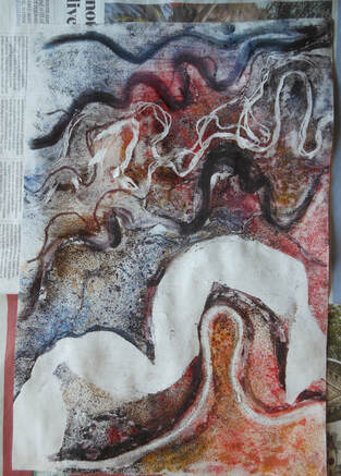
As this piece of work progressed I became increasingly aware if its similarity to a drawing I did in part 4, which had also started out as a 'movement' drawing:
I really enjoy the process of making a drawing into another drawing. I think this is because I enjoy making a response to different marks and colour. In both these, I started with the straight, direct lines made by movement, and made curved, flowing marks into them as a response. In the drawing on the left the original straight marks have been completely obliterated, but in the one on the right, the original marks can still be seen. This is probably due to the media used, because in the drawing on the left I used fluid media combined with dry, whereas in the one on the right I just used chalk pastels and charcoal, although it was lightly brushed with water when I had finished the drawing.
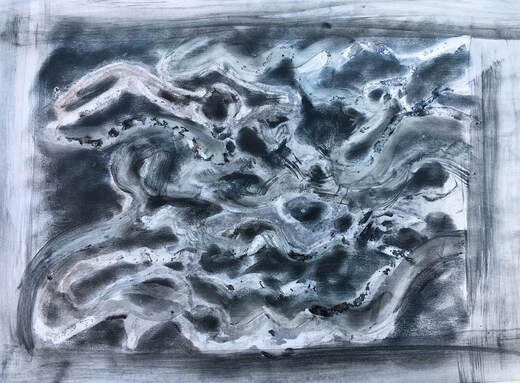
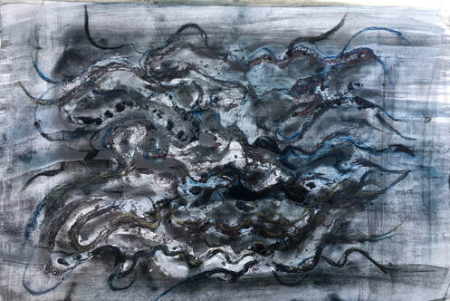
This series of work felt similar to the previous series of ten pieces, which grew from the idea of combining charcoal and chalk pastel dust with a textured surface. I like the results of both, for similar reasons - the combination of texture, line, and colour to create compositions that have energy, depth and interest. Although in some, their connection to the original subject seems fairly tenuous, the image of the undulating form of the tree fungus, and the irregular negative shapes it created, was ever present in my mind.
This series of work felt similar to the previous series of ten pieces, which grew from the idea of combining charcoal and chalk pastel dust with a textured surface. I like the results of both, for similar reasons - the combination of texture, line, and colour to create compositions that have energy, depth and interest. Although in some, their connection to the original subject seems fairly tenuous, the image of the undulating form of the tree fungus, and the irregular negative shapes it created, was ever present in my mind.
One of the aspects that fascinated me about the subject of the fungus was its structure, which I found quite a challenge to draw two dimensionally, but which seemed to inspire 3D and structural work. I liked how the textured collage combined with charcoal and pastels had worked, so decided to try another experiment involving collage and structure.
I had no clear idea of how this would work when I began, but was very happy with the way it evolved:
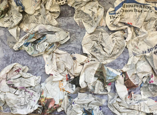
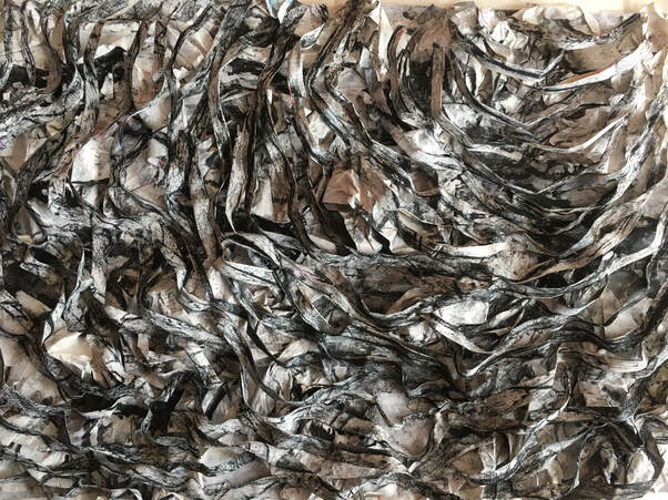
A2 sugar paper covered with newspaper, then white tissue paper.
Stage 1): Scrunched-up newspaper randomly stuck onto the tissue covered sugar paper.
Stage 1): Scrunched-up newspaper randomly stuck onto the tissue covered sugar paper.
Stage 2): Painted with white acrylic. Black ink.
Continuing with the idea of quick, out of control process, I tipped black ink through the collaged newspaper and tipped it in different directions then sprayed it with water. This had a transformative effect because the ink added dark tonal areas which seemed to breathe life into it and already, at this stage, seemed to add much more potential for an interesting composition.
Continuing with the idea of quick, out of control process, I tipped black ink through the collaged newspaper and tipped it in different directions then sprayed it with water. This had a transformative effect because the ink added dark tonal areas which seemed to breathe life into it and already, at this stage, seemed to add much more potential for an interesting composition.
Stage 3): A separate sheet of newspaper painted with white acrylic, and charcoal plant frottage added when dry.
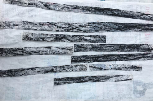
Stage 4): Above frottage cut into thin strips, which I folded and used to construct a textured, layered surface over stage 2:
A2. Sugar paper, newspaper, acrylic, ink, charcoal.
I folded the strips of frottage in half to create extra thickness, then starting from the top right hand corner and working diagonally across, collaged them across the scrunched-up newspaper in an attempt to create a layered, three dimensional composition. I like this piece of work because of its texture, tone, line and balance. Very like the earlier textured collage series, it gathered momentum and took on a life of its own.
www.youtube.com/watch?v=V5zQ257XUR0
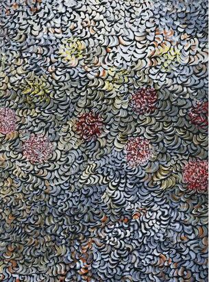
Fig 1. Mark Tobey 1970 Interspersed Gouache on black paper 100X70cm.
Mark Tobey's work had been an inspiration during part 4, and I feel the work I have done in part 5 has been an extension of some of the work of part 4. Tobey's interest in philosophy and Eastern religions strongly influenced his work. His compositions of densely structured marks and delicate overlapping lines covering the whole surface of the paper were inspired by Asian calligraphy and meditation, and came to be known as his 'white writing.' Despite some similarities to the action painting of Jackson Pollock, Tobey's 'all over' abstraction was spiritually, rather than physically generated, and independent of any school or movement. See fig 2:
Mark Tobey's work had been an inspiration during part 4, and I feel the work I have done in part 5 has been an extension of some of the work of part 4. Tobey's interest in philosophy and Eastern religions strongly influenced his work. His compositions of densely structured marks and delicate overlapping lines covering the whole surface of the paper were inspired by Asian calligraphy and meditation, and came to be known as his 'white writing.' Despite some similarities to the action painting of Jackson Pollock, Tobey's 'all over' abstraction was spiritually, rather than physically generated, and independent of any school or movement. See fig 2:
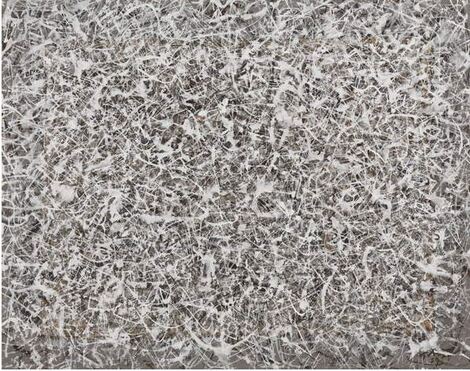
Fig 2 Mark Tobey 1959 Cosmic Tensions Tempera on paper. 24.4X31.1cm.
Fig 1 & 2 : https://www.bridgemaneducation.com (Accessed 29/05/21)
Fig 1 & 2 : https://www.bridgemaneducation.com (Accessed 29/05/21)
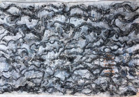
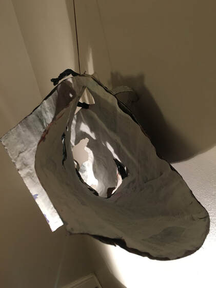
I wanted to push the textured, structural work further by making a 3D structure. Again, I had no plan for how this would turn out, but started by gluing five sheets of newspaper together, so that I had a fairly thick, strong material to work with. Then I painted one side dark purple, and the other side white, and cut it to an interesting shape:
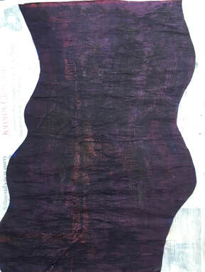
19 X 28in.
I painted a piece of black tissue paper in dark blue acrylic, and when dry, made some drawings on this using white acrylic.
Tissue paper, acrylic.
When this had dried, I cut it into strips.
Thinking about the negative spaces within the fungus growth, I cut some shapes in the painted newspaper:
When this had dried, I cut it into strips.
Thinking about the negative spaces within the fungus growth, I cut some shapes in the painted newspaper:
I added some white chalk pastel drawing, then collaged some of the tissue paper strips, along with some strips of twisted newspaper:
19 X 28in. Newspaper, acrylic, tissue paper, chalk pastel.
I wanted to create a structure that was firm enough to work with but also flexible enough to bend and twist into different positions, and this worked well. As with the 3D experiment I did in part 4, this became much more interesting and full of exciting possibilities once it began to move:
I wanted to create a structure that was firm enough to work with but also flexible enough to bend and twist into different positions, and this worked well. As with the 3D experiment I did in part 4, this became much more interesting and full of exciting possibilities once it began to move:
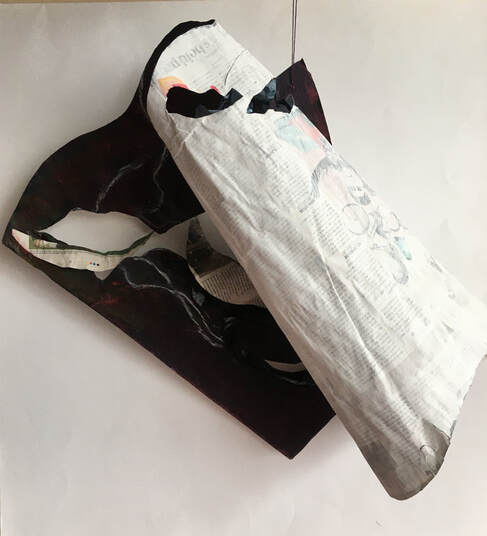
I curved it round, slotted a corner through one of the cut out shapes, and attached thread to hang it up.
I did a drawing of part of this view:
I did a drawing of part of this view:
20 X 15in. Compressed charcoal and white chalk pastel on wet cartridge paper.
I experimented with lighting, and suspending it in a variety of positions:
I experimented with lighting, and suspending it in a variety of positions:
The use of a lamp produced some really interesting shapes and dramatic tonal changes. I like the way the door frame and corner of the table became part of the composition in this and the next view.
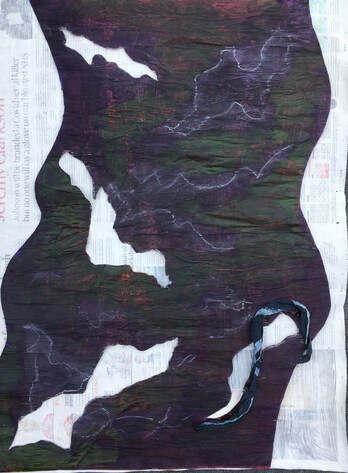
Thinking back to part 2, I felt this would be interesting to explore with collage, because of its strong tonal contrasts:
Thinking back to part 2, I felt this would be interesting to explore with collage, because of its strong tonal contrasts:
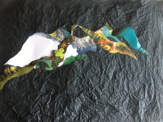
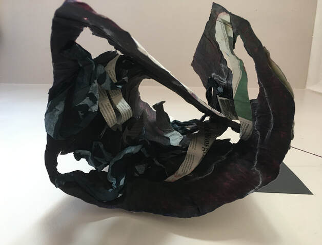
A2. Black tissue paper and magazine collage.
The light shining on the textured black tissue made me see this image as a giant sea creature.
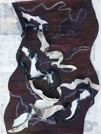
I decided to experiment with more collage and drawing:
The light shining on the textured black tissue made me see this image as a giant sea creature.
I decided to experiment with more collage and drawing:
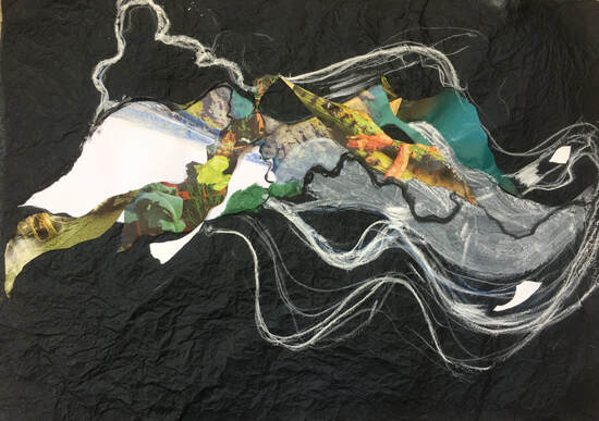
Collage, white pastel, compressed charcoal and white diluted readymix paint.
I added the small areas of collaged white paper to depict some of the contrasts in tone, and the pastel and charcoal drawing to accentuate the flowing lines. I prefer this to the previous collage because I think it's a stronger, more interesting image - perhaps due to the white marks on a black background.
I added the small areas of collaged white paper to depict some of the contrasts in tone, and the pastel and charcoal drawing to accentuate the flowing lines. I prefer this to the previous collage because I think it's a stronger, more interesting image - perhaps due to the white marks on a black background.
25 X 12in. Cartridge paper. Compressed charcoal, rubber, chalk pastels, ink.
This is a drawing based on part of the above view.
I covered the paper with charcoal dust and rubbed this in with a soft tissue. Then I used a rubber to lift off some areas of tone. Then I brushed the drawing with water and used compressed charcoal and white chalk pastel to draw into it. My aim was to create an interesting composition using line and tone. When it dried, I tried using red ink in some areas but discovered that this left very little impression once dry, so used red, purple and black chalk pastels which gave a more dramatic result and reminds me of a thunder storm.
I found it fascinating to notice how these images conjured up ideas in my imagination - sea creatures, thunderstorms - and this one reminded me of meat hanging up in a butcher's shop.
I like the dramatic tonal contrasts, and the shadows in this view, created by being lit from underneath.
This view is one I like very much because of its form and texture.
I kept this structure hanging on the wall, and virtually every time I looked at it I could see another interesting shape. One of the things that created so much interest was the extreme tonal change caused by light coming through the cut out spaces, which was an idea my tutor had suggested in part 4 feedback. As I had discovered in part 4, the potential from a simple idea, with very basic materials seemed limitless.
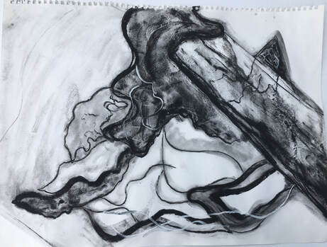
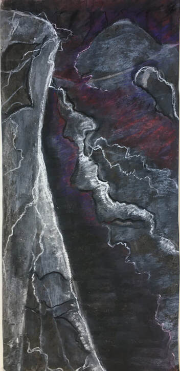
This 3D piece had been based on an impression of the shapes and lines within the tree fungus, but I still felt I hadn't really been able to capture its structure very well, so I decided to do a sketchbook drawing which focussed on one small area:
I kept this structure hanging on the wall, and virtually every time I looked at it I could see another interesting shape. One of the things that created so much interest was the extreme tonal change caused by light coming through the cut out spaces, which was an idea my tutor had suggested in part 4 feedback. As I had discovered in part 4, the potential from a simple idea, with very basic materials seemed limitless.
This 3D piece had been based on an impression of the shapes and lines within the tree fungus, but I still felt I hadn't really been able to capture its structure very well, so I decided to do a sketchbook drawing which focussed on one small area:

5 X 20in. Cartridge paper. Charcoal, ink, water soluble pencil on wet paper.
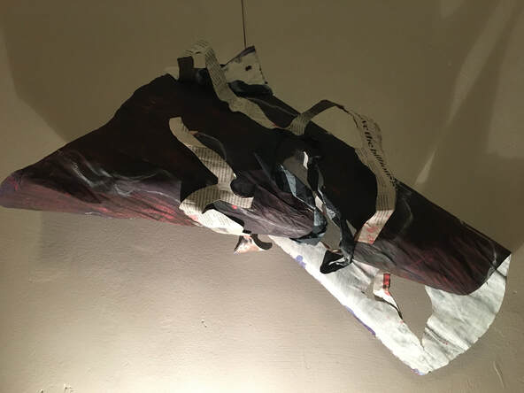
This drawing gave me inspiration for another 3D idea. I have a collection of interesting pieces of wood, and had two which, when joined together formed a shape which I felt would form a good basis to work with. I taped them together, covered them with cling film and newspaper, intending to make a papier mache cast. This was very difficult to remove, however, without splitting, so I painted it black, then added wire to represent the curving shapes of the fungus:
This drawing gave me inspiration for another 3D idea. I have a collection of interesting pieces of wood, and had two which, when joined together formed a shape which I felt would form a good basis to work with. I taped them together, covered them with cling film and newspaper, intending to make a papier mache cast. This was very difficult to remove, however, without splitting, so I painted it black, then added wire to represent the curving shapes of the fungus:
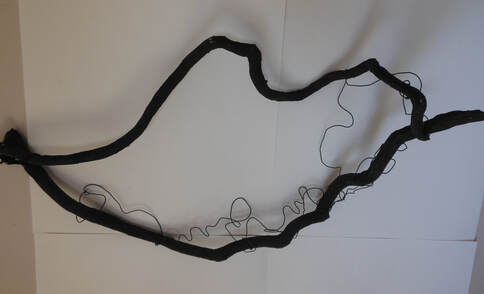
42 X 20in. Wood, newspaper, acrylic, wire.
L: Detail R: View from underneath.
At this stage, this was a 3D composition of line and form, the wire making a good contrast to the thick lines of the wood. By using some basic materials, it gradually developed into a more complex composition:
At this stage, this was a 3D composition of line and form, the wire making a good contrast to the thick lines of the wood. By using some basic materials, it gradually developed into a more complex composition:
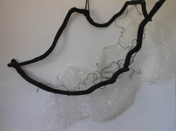
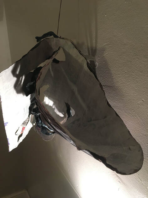
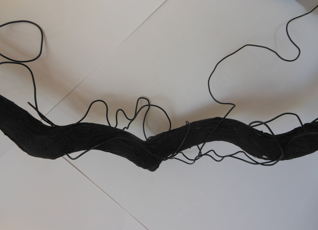
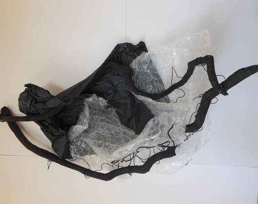
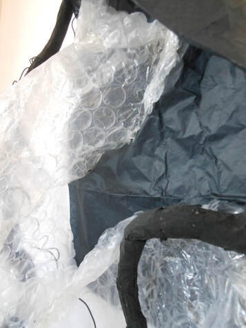
Bubble wrap added interest, because its shiny, light transparent nature made a good contrast to the matt black lines of the wood and the wire. I think this works especially well in the second of these examples because arranging the bubble wrap so that it moved around the structure resulted in some interesting tonal areas. It also added texture, in contrast to the smooth, clear lines.
Detail.
I felt the composition was growing in interest, and this detailed view is one I particularly liked because of the contrasts of tone and line.
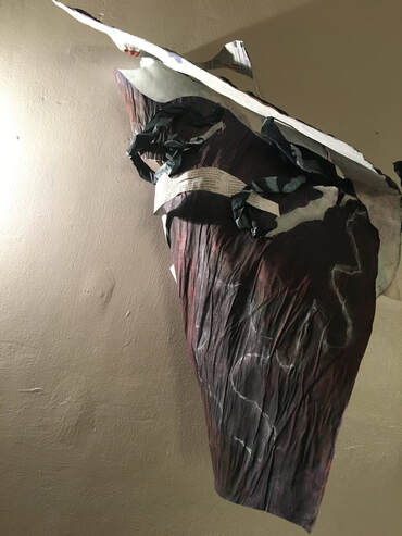
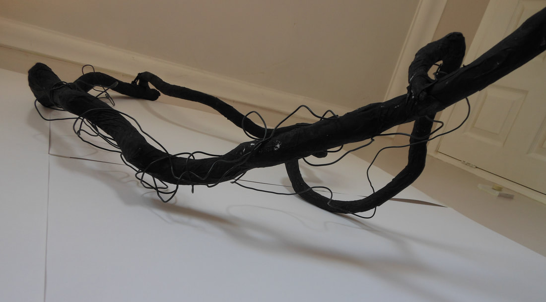
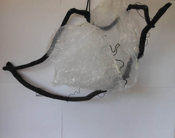
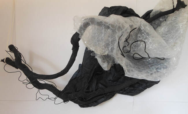
Aware that the bubble wrap was being seen against a white background, I was curious to see how things changed with the addition of darker tone:
I felt the composition was growing in interest, and this detailed view is one I particularly liked because of the contrasts of tone and line.
Aware that the bubble wrap was being seen against a white background, I was curious to see how things changed with the addition of darker tone:
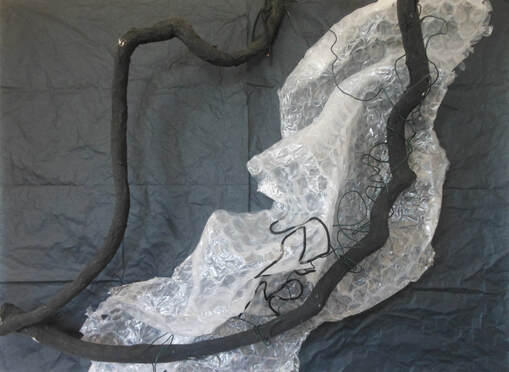
Initially I used black tissue paper to provide a darker tone to give the bubble wrap more significance, which changed the character of the composition, because the line of the wood against the black background became more subtle, and made a contrast to the line against the bubble wrap. This seemed to bring more depth to the composition, and I prefer it to the earlier ones on a white background because there seems to be a simplicity and a strength about it.
Then I realised there was more potential within the tissue paper:
Then I realised there was more potential within the tissue paper:
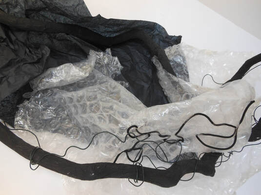
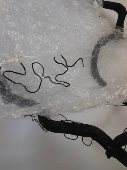
Using the tissue paper in the same way as I had the bubble wrap, as an integral part of the whole composition instead of simply a background, created more levels, more visual interest, and a greater feeing of three dimensions. This was partly because of its colour, but also, I think, because it added another layer of interesting texture.
Detail.

This is one of the compositions I feel is balanced and has a lot of textural and tonal interest.
As with the earlier 3D structure, I could see many interesting compositions within this. Whereas the earlier 3D using collage and spaces had been interesting for the interplay between positive and negative space, shape, and light, this one had felt more like a balancing act between line, tone and form, which reminds me of how working with the earlier textured collage had felt- balancing line, tone and colour. The challenge had been to make it visually interesting without it becoming overwhelmed.
Whilst working on this piece I was very aware of the work of Sally Barker, who is an artist my tutor had suggested may be of interest to me earlier. Sally Barker's work encompasses printing, installation, video and sculpture, and I especially like her series entitled, 'breathe, inflate, deflate' which is about our relationship with trees and the destruction of the rainforest. In this work Barker uses trees and branches, along with latex and stone to create sculpture. See figs 1 and 2:
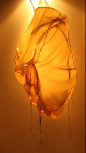
Fig 1.
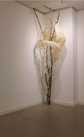
Fig 2. Sally Barker breathe, inflate, deflate
https://sallybarker.org (Accessed 10/06/21)
I am aware of certain parallels between Sally Barker's work and some of my own; the use of tree branches, suspension as a way of displaying the work, and the use of lighting and shadow as part of the composition, for example. In another series entitled, 'The Bra Rifle Range', Barker also combines 2D and 3D work, making prints and drawings of old bras which she then casts in plaster to make sculptures, to illustrate the process of change and transformation that womens' bodies undergo through age, pregnancy or surgery. Although I wasn't consciously thinking of Barker's work when I made the 3D work in part 5, I wonder whether my earlier research about her work may have exerted an unconscious influence.
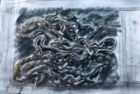
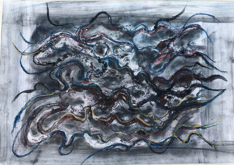
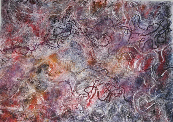
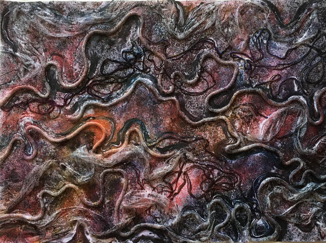
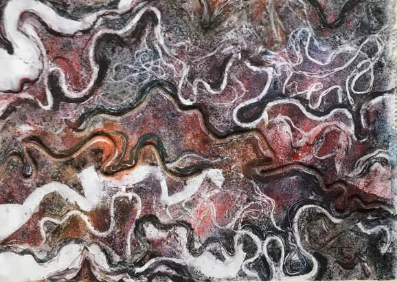
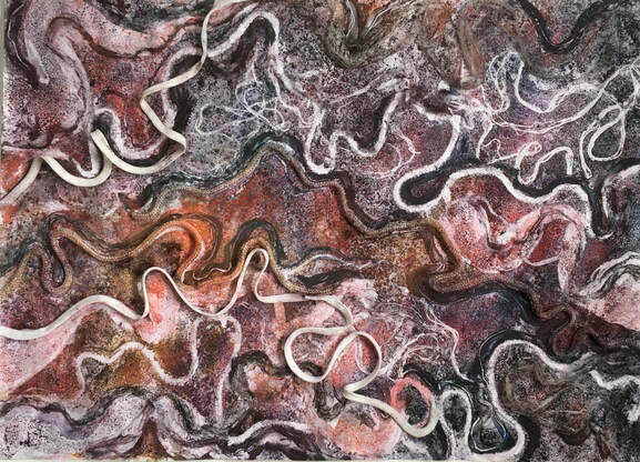
In part 5 my aim was to make a series of two and three dimensional drawings which investigated the form, texture and line of the tree fungus, using mixed media and a variety of techniques. I would select these four examples as being some of the most interesting and best work:
https://sallybarker.org (Accessed 10/06/21)
I am aware of certain parallels between Sally Barker's work and some of my own; the use of tree branches, suspension as a way of displaying the work, and the use of lighting and shadow as part of the composition, for example. In another series entitled, 'The Bra Rifle Range', Barker also combines 2D and 3D work, making prints and drawings of old bras which she then casts in plaster to make sculptures, to illustrate the process of change and transformation that womens' bodies undergo through age, pregnancy or surgery. Although I wasn't consciously thinking of Barker's work when I made the 3D work in part 5, I wonder whether my earlier research about her work may have exerted an unconscious influence.
In part 5 my aim was to make a series of two and three dimensional drawings which investigated the form, texture and line of the tree fungus, using mixed media and a variety of techniques. I would select these four examples as being some of the most interesting and best work:

I like this because the technique of collaging the strips of paper with frottage over the newspaper has achieved an overall texture, and the ink resulted in some darker areas of tone which combined to make a balanced composition. Working diagonally from the top right hand corner to the bottom left has also achieved a feeling of movement.

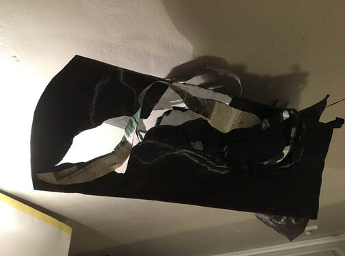
This 3D piece had many options for interesting composition, but this is one of my favourites, because of the shape, the extreme tonal contrasts due to light and shadow, and the textural interest the newspaper combined with the collaged tissue creates.
As with the previous 3D piece, this made several interesting compositions. I particularly like using the natural lines of wood, and the tonal contrasts and interesting textures created by the various materials seem to compliment the wood well in this composition.
Both these 3D structures are interesting from the point of view that they never fully resolve, and can change depending on positioning and light. This is an interesting concept, which I would like to explore further in future work.
Both these 3D structures are interesting from the point of view that they never fully resolve, and can change depending on positioning and light. This is an interesting concept, which I would like to explore further in future work.

I choose this piece because I like the combination of collaged and drawn lines, together with the colour. The subtle highlighting of the collaged cord and plastic tape also create flowing movement, which is characteristic of the subject. I find this quite an atmospheric image.
Thinking back to early on in part 5, when I was unsure whether the tree fungus would provide enough interest for a body of work, these words from Mark Tobey were very inspirational;
'On pavements and the bark of trees I have found whole worlds.'
The work of part 5 has taught me that there is so much to explore in the most seemingly insignificant subject.
What do you feel worked well, and why?
I spent some time making initial visual enquiries with a variety of subjects before deciding what to focus on, and this led to some good ideas which I think will prove interesting for future work.
Early on in the work I considered the possibility of focussing on two different subjects, because I was unsure whether the tree fungus would provide enough interest, but I worked at understanding and drawing its form and texture, which maintained my motivation. I was also inspired by the thought that it’s not really the subject that’s important, but how you interpret and work with it.
I was aware of the importance of remaining open to improvisation and change, noticing developments in the work and responding to them, and this enabled me to be creative with the use of materials and techniques which enabled me to produce a varied range of both 2D and 3D work.
I drew inspiration from, and saw links with other artists as the work progressed.
What do you feel worked less well, and why?
I feel the first 3D piece lost touch a little with the subject, and became more about making an abstract 3D object which nevertheless, was interesting because of the use of light and tone.
Were there any surprises or ‘happy accidents’?
I was surprised at how much work the techniques I used with the textured collage generated.
I was fortunate to have two pieces of wood which combined to make the second 3D piece, which I feel had more connection to the subject than the first 3D piece.
What can you take forward?
I would like to develop some of the work I did in the early visual enquiries, especially the tree stump with the interesting combination of natural and man made marks.
I was interested in, and excited by the work I did with the textured collage and pastels, and think this has much potential for further development.
I would like to keep developing the relationships between 2D and 3D work.
What have you learned about drawing materials and their potential?
I think the most important thing I have learned about drawing materials is that it is important to stay open to all possibilities, to explore and experiment, and use materials in unconventional as well as conventional ways.
I have also learned that many materials, not ordinarily considered to be associated with drawing can be used both in 2D drawing and to draw ‘in space’, in 3D work.- for example, I used shoelaces, nylon cord, draught excluder, sewing thread and plastic tape in some 3D compositions.
I have also become more aware of drawing that occurs naturally within the environment – lines made in sand by the sea and in the earth by rain, marks left by climbing plants which have been removed from walls, and cracks in dry earth are some examples I have noticed.
What have you learned about your own process?
I have learned that I am able to discover through making - improvising along the way and allowing the work to lead, rather than always having a preconceived idea of the result I want to achieve. I am often able to notice what work needs, and act on the discovery. My tutor highlighted these points, and when I reflected on them, it occurred to me that working in this way is very much part of my personality, and through my tutor’s guidance I’m aware this is a skill that has grown and developed throughout the course.
My reflection led me to realise that I recognise these ways of working from previous work in a very different area. As a person centred counsellor, which was my profession for over twenty years, I employed the same techniques with clients, working alongside them on their journey rather than pushing them in a definite direction, remaining open-minded, enabling them to find their own ways forward, occasionally noticing something which I would draw their attention to. I find these parallels fascinating.
Sketchbook Work.
I used sketchbook work to make some studies of form from the natural world, and also to continue exploring materials and techniques.
Before deciding to explore the tree fungus in detail, I made some studies of various subjects:
I used sketchbook work to make some studies of form from the natural world, and also to continue exploring materials and techniques.
Before deciding to explore the tree fungus in detail, I made some studies of various subjects:
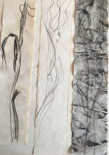
Three 29 X 5.5in Newsprint. Drawings of a dead wild iris.
L: Willow charcoal, Center: Fine liner pen, R: Charcoal over ink wash.
I tried to focus on the line and characteristic form of the plant.
L: Willow charcoal, Center: Fine liner pen, R: Charcoal over ink wash.
I tried to focus on the line and characteristic form of the plant.
Two A4 Cartridge paper. Part of dead tree.
L: Graphite and fine liner pen. R: Ink on wet paper.
I wanted to compare a controlled process with a more out- of- control one. I prefer the ink drawing to the more controlled graphite and pen drawing, because it is more expressive. The challenge with less controllable processes for me is to not completely lose touch with the form of the subject. This is less difficult with dry media, but I find using fluid media is sometimes better for expressing the essence or nature of a subject, especially subjects from the natural world.
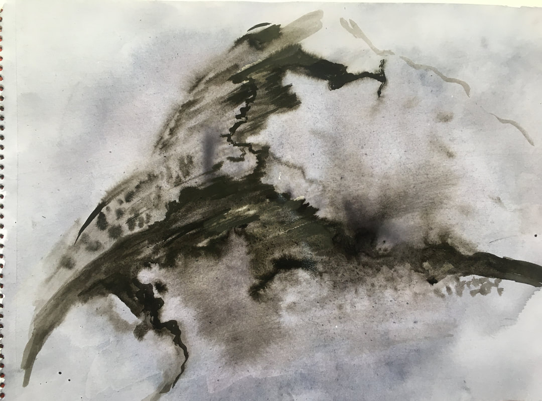
I found this object on the beach - a piece of chalk which has spent some time in the sea:
L: Graphite and fine liner pen. R: Ink on wet paper.
I wanted to compare a controlled process with a more out- of- control one. I prefer the ink drawing to the more controlled graphite and pen drawing, because it is more expressive. The challenge with less controllable processes for me is to not completely lose touch with the form of the subject. This is less difficult with dry media, but I find using fluid media is sometimes better for expressing the essence or nature of a subject, especially subjects from the natural world.
I found this object on the beach - a piece of chalk which has spent some time in the sea:
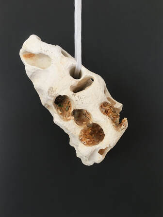
5.5 X 4in at widest points.
Having suspended this against a black background, I saw its potential as an interesting natural 3D object, so I experimented with a variety of angles and positions:
Having suspended this against a black background, I saw its potential as an interesting natural 3D object, so I experimented with a variety of angles and positions:
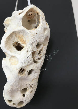
I realised the white lace that I used to suspend it could become part of the composition:
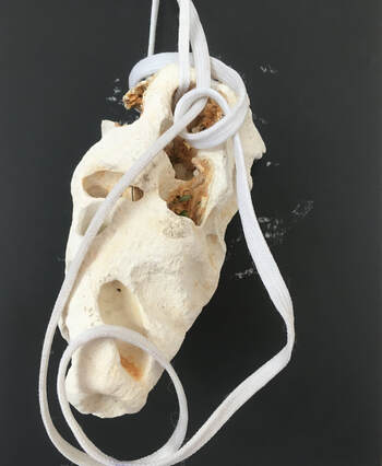
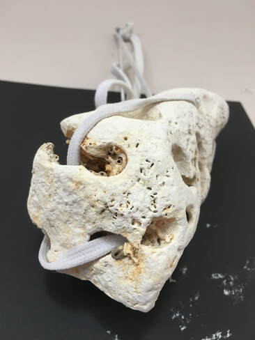
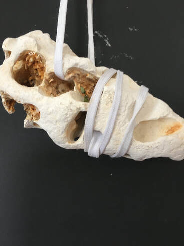
This piece of chalk became like one of the suspended sculptures I've made, in that I could see endless possible interesting views of it. It was another example of drawing by nature, having been created over time by the sea, various sea creatures, and pebbles.
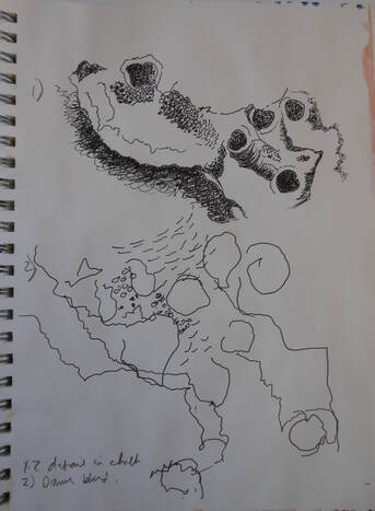
9 X 12in. Fine liner pen. Detail in the chalk.
As with the earlier drawing of a dead tree, this was another experiment with comparing a controlled process with a less controlled one. Neither of these drawings is a particularly accurate representation of the subject, but I much prefer the 'blind' drawing because its marks and lines seem to have more life.
As with the earlier drawing of a dead tree, this was another experiment with comparing a controlled process with a less controlled one. Neither of these drawings is a particularly accurate representation of the subject, but I much prefer the 'blind' drawing because its marks and lines seem to have more life.
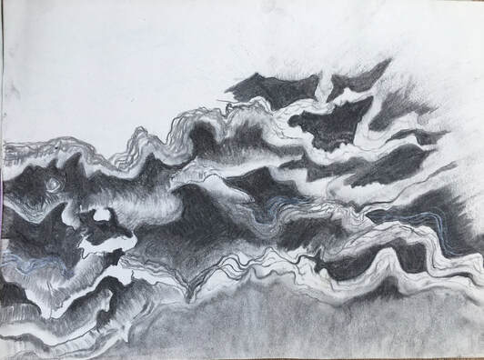
A3 newsprint. Charcoal.
This is an attempt to capture the form, line and tonal changes within the tree fungus. I found it a challenge to capture its three dimensional quality.
This is an attempt to capture the form, line and tonal changes within the tree fungus. I found it a challenge to capture its three dimensional quality.
A4 cartridge paper. Ink, gesso.
I covered the paper with a black ink wash, then added the gesso when this had dried. Drawing into the gesso with the end of a wooden peg, I tried to capture the negative shapes of the fungus. This worked well, until the gesso started to become too dry, so I added water which gave me a bit longer to work with it.
I covered the paper with a black ink wash, then added the gesso when this had dried. Drawing into the gesso with the end of a wooden peg, I tried to capture the negative shapes of the fungus. This worked well, until the gesso started to become too dry, so I added water which gave me a bit longer to work with it.
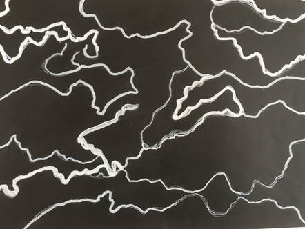
A4 black paper, acrylic marker pen.
This is an attempt to follow some of the lines of the positive shapes, so the opposite to the previous drawing.
I was curious to see how this would look on a smaller scale:
This is an attempt to follow some of the lines of the positive shapes, so the opposite to the previous drawing.
I was curious to see how this would look on a smaller scale:
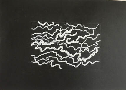
6.5 X 4.5 drawing on A4 black paper. Acrylic marker pen.
I much prefer this smaller drawing, because the compressed white lines seem to have more power and energy. I experimented with drawing a frame around it, but prefer it without a frame, because it seemed to contain its energy too much.
I much prefer this smaller drawing, because the compressed white lines seem to have more power and energy. I experimented with drawing a frame around it, but prefer it without a frame, because it seemed to contain its energy too much.
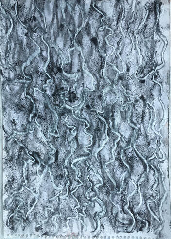
20 X 5in cartridge paper. Compressed charcoal, ink, water soluble pencils on wet paper.
This is one small area of the fungus. I found the charcoal, pencils and ink on a wet surface to be good for capturing the flowing, indistinct lines and shapes. This small drawing was the inspiration for the second 3D structure, using wood, bubble wrap and tissue.
Inspired by the work of John Wolseley, I experimented with some frottage and printing from nature:
A2 tracing paper. Print taken from dried grasses
20 X 15. Compressed charcoal, ink.
This is an old drawing from part 3 with frottage of bark added.
Staying with the idea of printing from nature, this rapeseed plant made a good subject to experiment with:
This is an old drawing from part 3 with frottage of bark added.
Staying with the idea of printing from nature, this rapeseed plant made a good subject to experiment with:
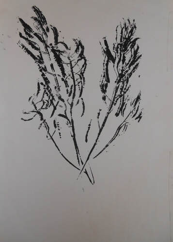
A4 newsprint. Monoprint of rapeseed plant.
A3 newsprint. Plate inked up, plant placed onto plate and print taken. drawn into with white oil pastel when dry, and diluted blue/green watercolour brushed over.
A3 newsprint. Plant placed inked side up onto plate, where the ink is now much thinner. Paper placed over the plate and print taken. drawn into when dry with charcoal and white pastel, and charcoal dust rubbed into background.
A3 newsprint. Plant inked up and printed over the ghost image. When dry, brushed with water, and blotted with soft tissue, which allowed the subtle marks of the printed plant to come through.
The next experiments are made by using a plastic dog toy, and readymix paint:
The next experiments are made by using a plastic dog toy, and readymix paint:
Dog toy.
9 X 12in. These were made by covering the toy with paint, then making rolling and twisting movements with it over the paper.
A4. Made by dragging the toy upwards through paint.
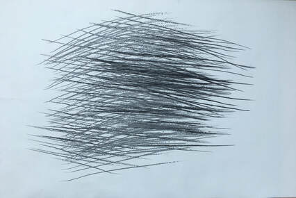
40 X 21in. Lining paper. Graphite, charcoal.
This is the 'movement' drawing I used as a basis for the drawing included earlier. It is made by standing at right angles to, and arms length from the paper, twisting, so that the graphite makes a mark, then, without losing contact with the paper twisting back again, then turning to face the opposite direction so that the marks made cross over the first marks. I used compressed charcoal to contrast with the graphite marks, but this exercise could be done with many different media. What I find interesting about this drawing is that I think it would be very difficult - perhaps impossible - to produce it in any other way.
This is the 'movement' drawing I used as a basis for the drawing included earlier. It is made by standing at right angles to, and arms length from the paper, twisting, so that the graphite makes a mark, then, without losing contact with the paper twisting back again, then turning to face the opposite direction so that the marks made cross over the first marks. I used compressed charcoal to contrast with the graphite marks, but this exercise could be done with many different media. What I find interesting about this drawing is that I think it would be very difficult - perhaps impossible - to produce it in any other way.
10 X 20in black paper. Newsprint, acrylic paint.
I painted newsprint different tones of grey and cut it into strips of varying thickness. The idea for this was to make collaged lines to represent the the undulating lines and shapes of the fungus, but I found working with the straight cut lines of the paper uninspiring.
The next three drawings are further experiments arising from the earlier textured collage series:
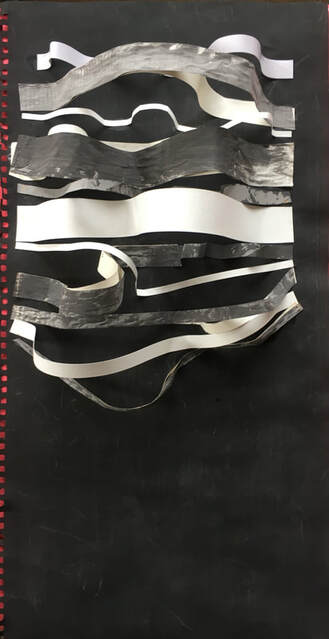
14 X 10in. Lining paper. Gesso, PVA, chalk pastels, shoelaces, nylon cord, plastic tape.
Some collaged material removed.
Clear plastic tape collaged.
The transparent tape gives an illusion of 3D, because part of the drawing can be seen behind it.
I photographed these on newspaper, purely by chance, but really liked it as a border, partly because the colours seemed to work well together. This is a technique I feel I will definitely return to in the future.
Review of part 5:
Demonstration of technical and visual skills.
Part 5 has been very much a continuation of the work of part 4, through experimental, exploratory work with a variety of materials, techniques, and fluid and dry media.
I continued to experiment with the connections between 2D and 3D work, using a range of materials to explore light, tone, texture, form and line. There were practical problems to resolve, especially within the 3D work, but I feel these were resolved successfully.
I practised observational skills by doing sketchbook studies of subjects from the natural world.
Quality of outcome
I selected four pieces at the end, which I considered to be some of my strongest work, and representative of the wide range of work I produced in investigating the subject. These pieces were three dimensional and textural, which I feel are two of my strongest areas.
Demonstration of creativity.
I tried to continue working in the same way I had with part 4 - being open to improvisation, allowing the making of work to lead me, discovering and noticing along the way. When I have been able to do this I think I have produced some of my most creative work - the four pieces chosen as the best work are all examples of work which has resulted from working in this way.
I think this way of working with subjects from the natural world is the beginnings of my personal voice.
Context.
I have been aware of the influence of other artists throughout part 5, and integrated research into their work into my own work. I found it quite difficult to choose two artists for Ex 5.2, because several other artists were relevant to me - notably Sally Barker and Mark Tobey - but I choose John Wolseley and David Nash because of their work with the natural world, and David Nash in particular because of his strong affinity to trees and wood, which I also share. I was also inspired by the work of artists that my tutor suggested may be of interest - Therese Oulton for her beautiful textural marks and her ability to create space within her paintings, and Eva Hesse for her thoughts about responding 'in the moment' rather than working to a plan.
